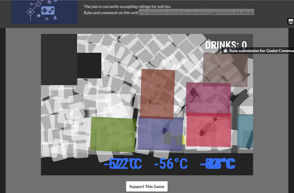
I believe there should be either walk and E interaction, or button mouse click, not both at the same time. Also, I appreciate the spin on clicker mechanic, but unfortunately it's not a fun one - being unable to spend all the money fast to maximize the production immediately feels ineffective instead of rewarding.
Dimonasdf
Creator of
Recent community posts
Thanks for playing!
Yeah, the explanations are minimal, and the gameplay does not really guide you. Slapping the "what to do l" sentence in Scores was literally the last thing I added to the game, hoping that people will see it eventually out of curiosity)
I'm sure I can compete for "The Worst UX" prize, but I'm still amazed by the fact, that I was able to finish a project from scratch in 3 days. I had a number of projects before, but they went on for months and never got done. So I'm really looking forward to the next Jam!
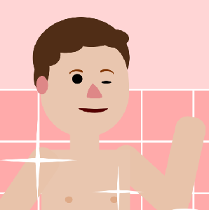
I'm also sorry it was not mentioned, but the boy and a part of background are not my work, they were found on the internet, and I'm also not sure, whether they are free or not.. I hope I'm not getting into trouble)
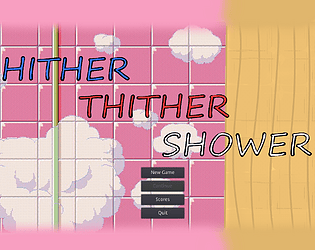
I am not a native speaker and have never used this idiom, but I really hope it's correct) It is supposed to mean something like "here and there", or "this way and that way", like tuning the water..
But I guess there is something from your one too, - you start as a black ginger boy, and next moment you die for no reason. 🙄
Well, look:
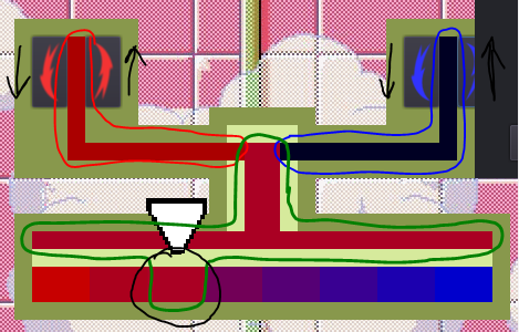
What's in red - is red component, what's in blue - blue component.
And what's in green - is all the same color all the time. Effectively, you don't have to look at the top part of the tap, as it's just a supporting graphics. You can play only looking at the black circled rectangle. And at the boy's status, that helps a lot.
Yeah, I've given the game to another person to test, and she caught the way pretty fast, and found even better strategy than the one I used the whole time while testing. The only problem she reported was no signs on the buttons. That's why I added some arrows and rearranged buttons, to "open" counter-clockwise. _I've literally just realised, and the arrow facing down, which is meant to "close" the handle, is actually facing the same "oppening" direction xD_ But if I'd made it looking up, as clockswise "closing", that would just leave us with 2 buttons showing "up" (hence - "increase"), which would be even worse.
So, we have 1 up - more - and 1 down - less - button on each side, and a nice reck just in the middle in gamma, to easily spot if it's redder or bluer than needed.
I'm guessing it's just terrible design and graphics, if this is not as intuitive as I supposed. I'm really bad at those, sorry(
The horizontal mixture bar is just there for the "water flow" not to be abruptly cut upon entering the play area)
And it was unneededly hard to make she whole flow go to the correct spot, as would either need manual locating for any level and any random spot, or a whole lot of code to position all the rects via script.
I've decided to go for compromise and make top part fully static, while the bottom play area creates itself completely automatically, based on just two variables - "quantity" and "correct rectangle".
Also, what "large bar" do you mean? The rectangle which is black in the gamma is always the same color as the big horizontal one, and same as little vertical one above that. These are rectangles, showing mixture. The ones going from the handles are either only red or only blue.
The goal is to make mixture color be in line with the rest of the gamma. It should not be the same as the one on the right or one on the left. They may sometimes look visually same, but actually they are not, if the game catches a win state.
My Shower Game I've been making - https://itch.io/jam/godotjam062018/rate/270323 :)
Graphics are 210% worse, but I went for that Blendoku-like gameplay.


