Play game
Hither Thither Shower's itch.io pageResults
| Criteria | Rank | Score* | Raw Score |
| Theme interpretation | #57 | 2.677 | 2.923 |
| Overall | #79 | 2.196 | 2.397 |
| Gameplay | #80 | 2.043 | 2.231 |
| Graphics and Sound | #97 | 1.867 | 2.038 |
Ranked from 26 ratings. Score is adjusted from raw score by the median number of ratings per game in the jam.
Source code
https://github.com/Dimonasdf/Hither-Thither-Shower
First Godot game
No
You already had experience with Godot
Leave a comment
Log in with itch.io to leave a comment.



Comments
Neat concept! I included it in my Godot Community Jam compilation video series, if you’d like to take a look. :)
Thanks for doing this for this Game Jam. Means a lot to game makers to get even the smallest review on YouTube. And also helps the whole community to grow.
I did not understood the exact mechanics, a tutorial/help may come handy (just an initial layer of labels indicating what means each part).
Yeah, that's a common request.
I read title as "Hitler's ..."
I am not a native speaker and have never used this idiom, but I really hope it's correct) It is supposed to mean something like "here and there", or "this way and that way", like tuning the water..
But I guess there is something from your one too, - you start as a black ginger boy, and next moment you die for no reason. 🙄
Nice work! The art is nice and it's a good concept for the temperature theme :)
It took me a while to understand the gameplay, as I find that the temperature buttons are not very identifiable as buttons, and I did not notice initially that the mix influenced the color in the pipes and that I had to do the right mix to fit the black square. I was mostly focused on the rising heat and cold in the shower animation.
Thanks for playing!
Yeah, the explanations are minimal, and the gameplay does not really guide you. Slapping the "what to do l" sentence in Scores was literally the last thing I added to the game, hoping that people will see it eventually out of curiosity)
I'm sure I can compete for "The Worst UX" prize, but I'm still amazed by the fact, that I was able to finish a project from scratch in 3 days. I had a number of projects before, but they went on for months and never got done. So I'm really looking forward to the next Jam!
I'm also sorry it was not mentioned, but the boy and a part of background are not my work, they were found on the internet, and I'm also not sure, whether they are free or not.. I hope I'm not getting into trouble)
Nice! My real life experience with the shower has made me a pro in this game.
Funny! Nailed the first four but killed the fifth in a lava shower, hehe.
Keep trying and you shall succeed)
You need to include the .pck file along with the executable.
It's a funny game, and a good idea, but it's quite hard to match the color if there's a large bar separating both. Good job.
I presume you are talking about Linux version, because I am aware of packs for Windows. Sorry, had no idea what should go with Linux, I just ran it's export along with Windows, hoping it would work as is. I'll reattach a correct zip soon.
If packs are interchangeable, you can grab one from Windows archive, or go for an online version of the game on my github.io, link is below.
Thanks, that's what I did.
Also, what "large bar" do you mean? The rectangle which is black in the gamma is always the same color as the big horizontal one, and same as little vertical one above that. These are rectangles, showing mixture. The ones going from the handles are either only red or only blue.
The goal is to make mixture color be in line with the rest of the gamma. It should not be the same as the one on the right or one on the left. They may sometimes look visually same, but actually they are not, if the game catches a win state.
The horizontal mixture bar is just there for the "water flow" not to be abruptly cut upon entering the play area)
And it was unneededly hard to make she whole flow go to the correct spot, as would either need manual locating for any level and any random spot, or a whole lot of code to position all the rects via script.
I've decided to go for compromise and make top part fully static, while the bottom play area creates itself completely automatically, based on just two variables - "quantity" and "correct rectangle".
I'm talking about this bar silly, which is part of the background, The one that adds a nice touch of difficulty to the game.
It would be nice to know which button increases and decreases the flow. I had to click around to figure it out since it wasn't instant (just like in real life :p)
Well, look:
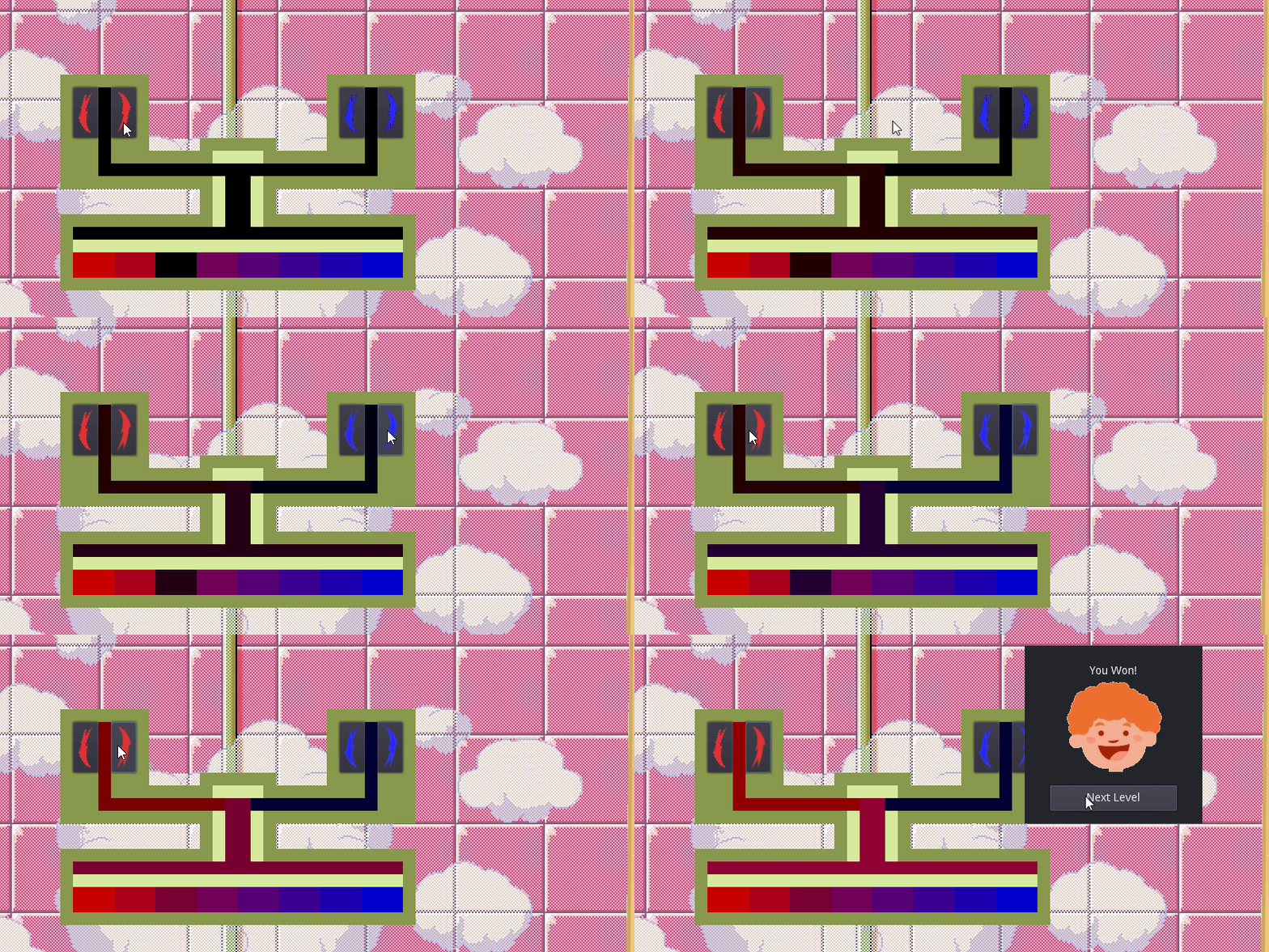
What's in red - is red component, what's in blue - blue component.
And what's in green - is all the same color all the time. Effectively, you don't have to look at the top part of the tap, as it's just a supporting graphics. You can play only looking at the black circled rectangle. And at the boy's status, that helps a lot.
Yeah, I've given the game to another person to test, and she caught the way pretty fast, and found even better strategy than the one I used the whole time while testing. The only problem she reported was no signs on the buttons. That's why I added some arrows and rearranged buttons, to "open" counter-clockwise. _I've literally just realised, and the arrow facing down, which is meant to "close" the handle, is actually facing the same "oppening" direction xD_ But if I'd made it looking up, as clockswise "closing", that would just leave us with 2 buttons showing "up" (hence - "increase"), which would be even worse.
So, we have 1 up - more - and 1 down - less - button on each side, and a nice reck just in the middle in gamma, to easily spot if it's redder or bluer than needed.
I'm guessing it's just terrible design and graphics, if this is not as intuitive as I supposed. I'm really bad at those, sorry(
I'm sorry, while I fiddled my way to victory I missed several details. I was mostly looking at the man through most play-troughs.
Here's a picture to break this chain of misconceptions. We can ignore the top part as it's static.
First off, I was joking and referring to 2 and should have pointed to it from the side.
Secondly, I thought the purpose was to match the color in 1 with the value in 3. Of course, as you explained, 1 = 3. You should probably add some indicator of where 3 is and either leave it empty (so the player has to visualize 1 in 3) or maintain the same functionality. Either way is fine.
And third, I thought the down/up buttons had parenthesis and didn't notice they were arrows. Making those arrows wider would help.
So there it is, focusing on the bars instead of the man would make it clear. But I was watching to see how he'd react to me fumbling with the temperatures.
Also, color changes are instant, they are just not very big, otherwise the game would be unplayable, as you need fine tuning, instead of skipping half of color range in one click.
Sorry for bad graphics and weird UI, but I really hope you enjoy the gameplay.
Try it online and share scores! - https://dimonasdf.github.io/hts/Hither-Thither-Shower.html
your link is fucked up. youre missing the '-' ^^
That is a one weird feature. Fixed it, ty.