Indie game storeFree gamesFun gamesHorror games
Game developmentAssetsComics
SalesBundles
Jobs
TagsGame Engines
(1 edit)

Whow! Such a great thing! This bullet hell game is probably the most original I've seen in this game jam. I really like that the supply for health and amo only stays for a short amount of time, forcing me to be constantly on the move. The blocking of the rings indirectly create some very interesting bullet patterns and there were definitely space to dodge bullets so I really appreciate that. However, there are certain elements in the games that makes me feel a bit unfair. First, one bullet pattern is impossible to dodge. 
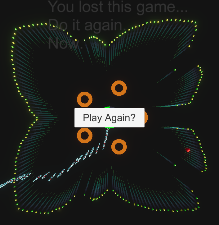

I die a little inside every time this comes up because it feels like a forced hit except if I were on the middle right of the screen. Second,  I can't really accept that the precision of my gun is so low that its target is always offset to the left of the boss. Timing the shoot so that the bullet comes to contact with the ring I want is very finicky, and in the heat of the fight I usually leave it to my luck.  I understand that it makes hitting more challenging but it'd make more sense to me if the rings apply negative/positive attraction forces and bend the trajectory of my bullets - still very challenging but more intuitive and fairer: I don't have a faulty gun.

Some more smaller feedback: Sometimes the amo and health pack dont appear on the beat, Idk if that's intended. The avatar stops following me if the mouse position is too far to the left or right of the screen - only the center square registers mouse position it seems, which leads to unresponsive controls at times. This last bit is nitpicking but I know you could do better with the end/restart screen. That would significantly increase the immersion ;D.

All in all, a very innovative bullet hell. Well done!

(+1)

Hey man, thanks for the review.  I totally hear you on all of these points.  A little dev told me "PUT IN THE BUTTERFLY, I LIKE IT" so... that happened (the pattern you snapped =P).  Overall, we needed more time to develop, we only got a few hours between the three of us because of life issues.  I would like to see a lot more responsive systems overall, the mouse controls were added pretty last minute and we didnt't have a lot of time to debug.  The timing on all of the bullets/ammo/etc was all put together using unity's music analyzer, so that DEV WINK WINK STORMY said it was perfect and I believed him =P  IT's a pretty powerful system but needs a good tuning.  I was happy that we got a rough prototype working but I really wanted more time to work on this.  The win screen, I put together and I'm indignant that you don't like it.  It's beautiful and definitely not a last minute way to give us an actual game loop ;)

I'm still interested in giving this project some updates so your feedback is really appreciated =D

Thanks for playing !

(+1)

Ahh I see. I wanted to use the output from Unity getspectrumdata as well, which is like you said, very powerful but not quite reliable and so I ditched it and went with another solution. Now I understand why sometimes the health and amo pack doesnt appear. I think the controls were responsive, just that it didnt cover the whole screen so I had to be careful not to move the mouse outside the central square. Butterfly pattern was cool to see, but I think there are cooler patterns such as the flower you had, which still gives room to dodge. Don't get me wrong that I didnt like the win/lose screen. I just thought it's not up there with the beautiful graphics of the game and the win screen specifically didnt give enough satisfaction when winning. I mean mine didnt have an end screen to start with so I cant really complain about that haha, I do look forward to seeing a more visually appealing win/lose screen =D.