Day 12, there are no designs today because I'm focusing on uploading the game's prototype and art. Don't worry, the art is only for the player, the weapon, and the gems ;)
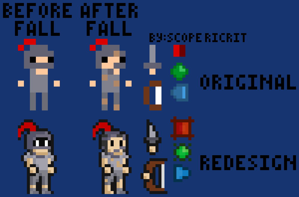
Here's the art design for the original and redesign, this time is in png.

There's a lot of differences between the original I made before this project and the redesign.
1. The art is super simplistic and small in the original, so no outline for the original.
2. Green gems originally be timed and stop for few seconds if activated by attacking left click.
3. The Blue ones originally is shooting blue bullets for the puzzle and a special tile reflects the bullet to other directions.
4. The redesign player is gonna holding a lantern tied on the plume (the red feather thing on the helmet)
5. The original is very short sword, the redesign is dagger. The bow is thicker and longer in length in the redesign.
The art is not gonna have animations yet, because its gonna be pain to make :/ Also gonna put 'by : ...' thingy for the image, it might be dumb :|
Okay now that's out of the way, now I want to ask:
1. Is this design and style good? I mean I see it good, but different perspective have very different taste, maybe need a feedback on it.
2. Is copyright infringement a big problem for starting people like me? I'm worried that my work is stolen. I need a little bit of tips about that, Null is literally just a white cube (from my previous game, you can check that out if you want, not really good though). This question is optional to answer (doesn't mean the first one is required)
Well, that's all people, goodbye and most likely will not see you tomorrow because I want to make the prototype now :/

