. zip the folder of the game, not the files, it should be: "game.zip/game/game.exe"
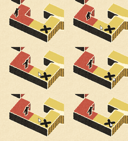
. on hover button effect is extremely slow, whereas the sound is a quick pop, match their speed
. the menus are cute, but disobey the idea of being sewn (?) on: no reason for them to flash or text to "spill over" and the inconsistencies push it from "neat" over into "pretentious" territory
. there's like 6 different font size on the level select screen and it hurts
. I've seen some gifs of it before and still don't know what I'm supposed to do, would be nice to have basic controls / goals on F1 / setup screen
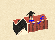
. image below is how I "solved" the first step and it didn't feel intended: x is where the guy stood, arrow is where he ended up by somehow climbing the stairs
. reset time after falling is way too slow even for the first time, just snap him back to reality, or let me mash R to instantly restart
. I'm having a rough time appreciating the concept when I don't know which perspectives work and which don't, this seems like it's better lined up than the image above, but it's not valid
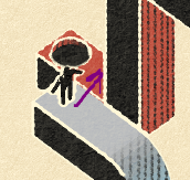
. you're allowing horizontal 360, but not vertical and I have no clue why, more frustration
. the rotation controls are not what I'd expect in general: the camera rotating around the game plane insted of around the screen-up direction when in some cases is just annoying:
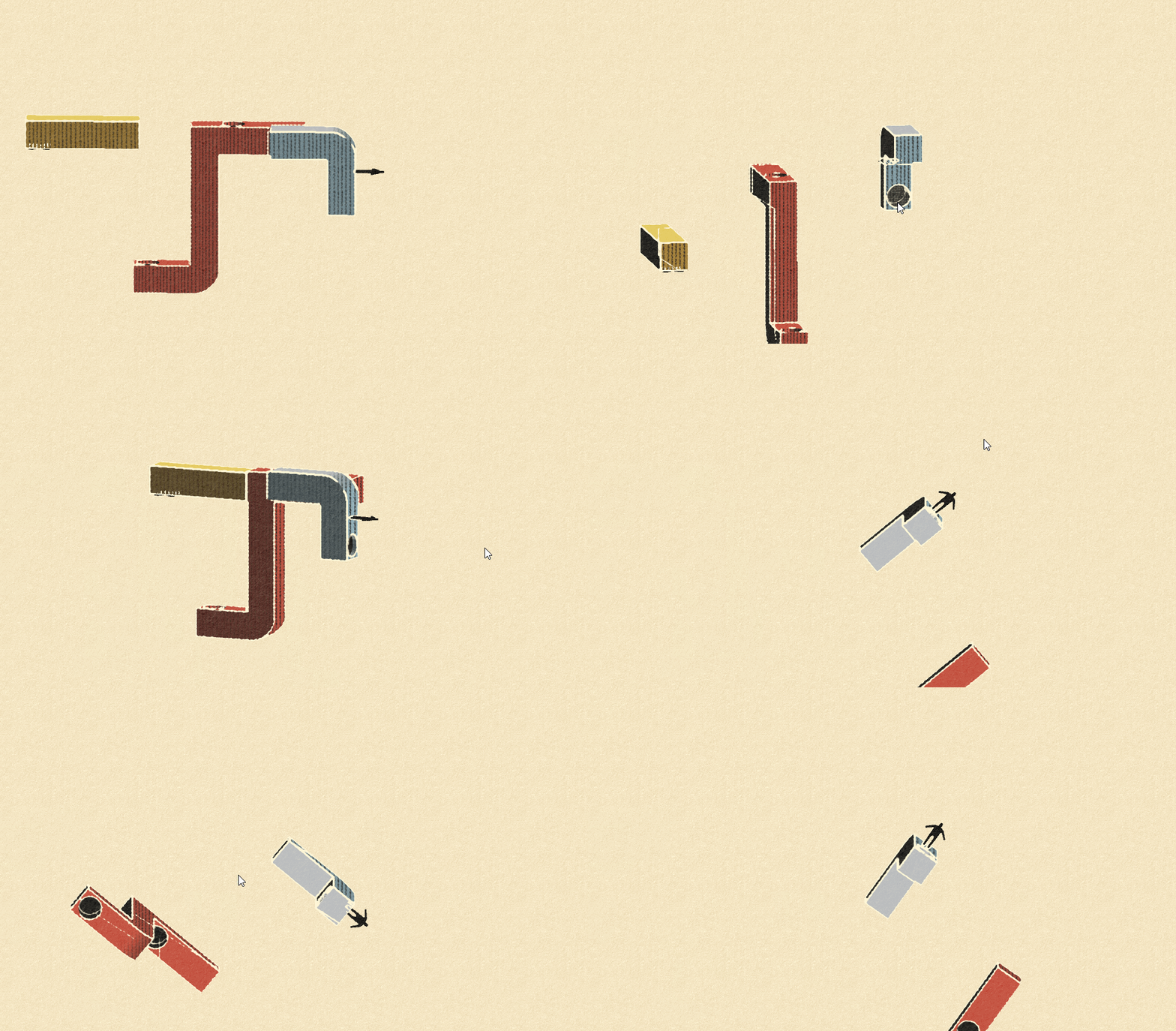
. I think this is to do more with holes being introduced on level 2 than the controls themselves, I want to understand what I'm doing before getting thrust into new mechanics
. played around for 20+ min and need a break, my guess is that skipping out on easy (and I mean babby tier from your paraperspective) levels is what's doing the damage
. consider the name "Paraspective" instead
You one mechanical breakthrough away from a 200+ review game at $10 minimum.
Round 2:
. I read the posts below and only now realized there's tutorial levels: it's on me being retarded and playing late, but consider offering other retards like me a "Would you like to play the tutorial?" so they don't autopilot into the main levels like I did
. I didn't get why I couldn't just cross over the "colors"
. it was unclear that you could only switch guys with RMB (tried LMB many times)
. image below not being valid is just ???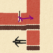
It's a strong base for a strong long-remembered game, keep pushing.


