Could it have been "Ace clear!"?
That means you used the entire deck -- no skipped cards. Nice.
Rokas
Creator of
Recent community posts
> Then I would get asked why they cannot be rebound.
All keys can still be rebound in this solution.
>I have 3 of the 4 main buttons in a controller used
you can do something like (hold L1 + regular quick switch button)
Feels like you're dead set on no changes, which is at least respectable I guess. Still reconsider.
Solved the level pretty easy now yeah, thanks, definitely a retard moment.
>Leaving out WASD can create a lot of issues
I mean you make WASD do movement by default, but not show that the keys are assigned in the options menu. You go to options, and it says W is not assigned. When you press W and it is not assigned, it moves you up. If the W is assigned to something by the player, then W no longer moves up.
>I prefer to reduce keys used as much as I can
I don't understand this at all, why force me to play how you want me to play, but also let me rebind keys. Optional functions that you never mention in the game and the player can discover hurts no one at worst and helps someone enjoy the game more at best.
>You need to press the yellow button to progress
That's the problem. I'm clearly missing something, but if you need to press the yellow button, that means one of the muscle fairies has to stay on the first island. If one has to stay, only one can move away from it, since there's no way to return. The only way to press the red button then is to throw the blue fairy on the red buttons. In that case, gates open, but you can't exit. Also, if you don't catch the reading fairy at the start, you can't use the muscle fairies, so the first move is forced. I've accepted my IQ to not be high enough for this.
>I prefer to keep it simple
You have about half the buttons on the controller unused, I don't what's wrong with people using only one button, but those who find it useful using both
>removed WASD
if you can't assign multiple keys to a binding, then you can leave out the WASD for rebinding, just overwrite their function if the user binds something to them, no reason to keep them unused by default
> each fairy in the level has a purpose, figuring it out is key to beat the level
Huh, do I also have to use the movement keys to beat the level?
- "south button" based
- I despise the heavy screenshake on every shot, that alone already makes this iteration a huge downgrade and there's no way to turn it off
- clicking the options button automatically clicks the resolution button
Tried it for a few more min and the shaking is really insufferable. Let me know when I can toggle it off, was looking forward to replaying this.
Played this before.
- can't scroll the patchnotes window with a controller
- add WASD
- have a confirm dialogue on pressing exit
- game shows kb tutorial when playing with a controller, makes it seem controller is not intended
- auto select the next level on the map
- no restart button on the controller
- permanent buttons feel bad without being able to rewind time for a second
- would be nice to cycle "backwards" somehow when there's many units
- the meme trap boosts feel bad when you have to restart the whole level (1s rewind would fix this)
- would be nice to be able to put down the fairy instead of throwing
- got stuck for a long time on 2-12 (an hour?), even though you want me to go through the yellow thing on the brief moment the tongue pulls the fairy over the button, but nope, decided I'm either retarded or this is impossible and I hope it's not impossible
Quick switching makes the game much better.
- feels very floaty from the first few seconds, more like I'm controlling a car than a human
- game is much more visible with the lighter E toggle
- Q wheel + click the hand you want the spell in is not instantly obvious, usually games do drag into the direction and release, might need to be more explicit
- game just alt+f4s on death, brutal
- discouraging the player from using the same spell on both hands feels bad
- the pixel map is unreadable and looks more like the thanks doc meme than anything usable
- restarting the whole game on death is also tedious
- cleared maybe 6 rooms, didn't feel like trying to figure out where I didn't go, jumped in the pit, died, can still shoot while dead
- in the end, the gameplay becomes strafe in a circle while dash jumping and holding both mouse buttons down
Lacks tension for me, but I feel like you could easily pivot this into one of those meme survivor games, but 3D, haven't seen one of those yet and they thrive on no tension.
This will largely be nitpicks, because the game seems done and polishing is the only thing left.
- thanks for zipping it properly
- the "work in progress" screen feels like an insult to all the other submissions here with the state of the game that this is in
- always support WASD, even if the intended way is to play with a controller (you're already accepting space instead of enter)
- if the intended way to play is with a controller (suggested by the pre-start cutscene), then say it explicitly, so that I don't bother with the keyboard first
- you have an option for the "step sound", make the sound when I toggle it, so I know what is being switched to
- music is early gran turismo
- at the end of a level, show "next level" as the default option above level select
- the realistic backgrounds seem out of place if you focus on them
- not sure about this, but consider highlighting the target tile (option?) when you are about to do a 3D fall down
- the colors of the stage seem to hold no meaning (?) could be nice to be able to select what color to paint them if that's the case
- death seems like a heavy punishment that spikes instantly and you feel like shit, it would be nice to have a warning sign (say a yellow triangle) on all the dangers when you are 1 tile away from them to emphasise the danger, especially the tiny patrol spheres, which don't seem threatening at all other than for their color
Overall good job, feels like a AA PS2 game. Even thought it's not my type of thing with how "simple" it is, it has no real roadblocks that would have easily excuse dropping the game early. PGDG awaits.
- the pixel locked menu animation doesn't work visually
- always include WASD movement, even if you think it's for mongoloids
- I changed tabs to type this and when I returned the game no longer worked (web version), downloading
- remove the pay what you want button from a demo
- oh, nvm it's zipped wrong: zip the game folder, not the files (correct: Game.zip/Game/Game.exe, wrong: Game.zip/Game.exe)
You have a lot of "style" elements, which are great on their own, but don't make a convincing whole. Not sure why, but my guess is that it's because the platformer, as a genre, fundamentals are too weak to support it. I get the cutesy thing, but it doesn't resonate to me because they seem to be meaningless in the context of the game.
- add a master volume slider (+ can't see the values in the volume boxes at 1440p)
- enemies jitter if moving fast
- I always miss headshots in these games
- didn't expect the game to be so rigid on ammo, wasting very few bullets and still running out
- nice, two pistols, I can deplete the ammo even faster
- playing it carefully makes much more sense
Pretty good, died 4-5 times due to dumb mistakes, was compelling enough to finish anyway.
- the introduction text is hard to read (small size + a lot of text + fancy display font)
- you give the player a sword and a bow at the start, it would be a good time to show you can toggle between two weapon sets (pressing Q on most diablers)
- the game feels too dark, would be nice to have a gamma option
- mauler as the first enemy makes anticipating the stronger ones to be even bigger
- still no double-wielding, a real shame
- only some of the barrels being destroyable feels inconsistent
- outline colour to indicate health state is nice
- damage numbers would be nice to see how the rng rolls work
- blue spell to restore health and red spell to restore mana is bold
- the pathing gets finnicky when you hold mouse across a wall, I think you should move the player in the direction of the mouse instead of pathfinding to the location being held, died because of this
- not seeing the xp bar at all times definitely adds tension, not sure if intensional
- second run got door stuck:
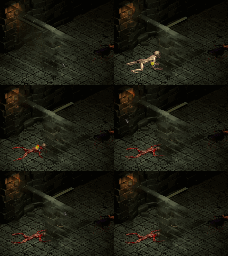
- I guess the game is teaching me to save often
- door stuck on the next run too, right after the boss, good thing I saved this time
- lightning seems op, but switching spells is hard to do fast, so probably balanced
- not a big fan of the "find the lever" levels
- it's hard to tell the stronger mobs from the weaker ones
- the large blue two handed items never feel worth it over one hand + shield
- unequipped the +1 all stats ring multiple times and now all my stats are -1 (the one real bug)
Good and clear improvement since the last time I played. All I really have is nitpicks, which you seem to continue to iron out. Balance was nice, mobs were always dangerous. Gonna make it for sure.
Thanks for mentioning the stream, wouldn't have seen it otherwise.
> there are many directions you can take your game
You're right, it'll be interesting to see what you think about the changes in the next demo, since most of it can be considered "cosmetic", I'm curious if that's the same intuition for someone looking from the outside in.
Interesting to see you use the rolling mode by default and extend it only in short bursts, a strong case for holding button to extend as an alternative to toggling. I also appreciate you being determined to use the vertical wall edge (ignoring it is easier, but slower). Thanks for playing and the feedback, useful.
> Why though?
1. when I click download on your zip, the zip shows up at the bottom of the browser
2. when I click the bottom browser zip, 7-zip shows me the contents of the zip
3a. if it's a single folder (correct), I can drag that to wherever I put demo day games
3b. if it's a bunch of garbage files (wrong), I have to now create a new folder for your game so the files don't mix with other demos, which is (click target folder, right click > new folder, give name, click back on the zip window, drag your garbage to the folder) much more inconvenient, and a waste of time that adds up over many bad zips. If you think that's very little work, then do it for me by zipping it right. Or you can keep doing it wrong and I'll just not bother with the game the next time, since now you're doing with full awareness.
- performance is garbage, unless at 300x200, even then it's not much better
- custom mouse icons are cute
- you forgot to add alt+attack for standing attacks
- nice that armor appears on the model
- shame there's no dual wielding
- can't click around the orb ui to move on the map
- pitch black level 2 is demonic and I'm already dealing with painfully slow movement
I think I killed all the goblins on level 2 and got all the possible items. Seems like I'd enjoy this if it didn't play 4 frames per second and move even slower.
Windows 10, Chrome, 1050ti if it's issues on my end.
- zip the game folder, not the files (correct: Game.zip/Game/Game.exe, wrong: Game.zip/Game.exe)
- I appreciate the 4mb download
- add [Alt+Enter] as a fullscreen toggle
- would be nice for the analog stick to work for movement too
- [Down] to read is unusual, most games do [Up]
- camera pan is way too slow, make it no more than 0.3s, ideally 0.1s or customizable
- I think for a skillcheck game, the camera being so limited is unexcusable, missing shots and losing is fair, but having to memorize out of sight walls for optimal play feels terrible and removes value from physical skill
- hat dropping as health is cute
- "press up or down to look around" even you admit tiny boxed vision is a hindrance, just increase the view sight by 4x and have the game improve dramatically
- toggling line enemies should reset after you die / wait enough time, otherwise you're forcing manual resetting for optimal play
- air movement is pure hell with this camera, clearing sections feels more lucky than rewarding
- don't know if it's intended, but the optimal play on the enemy next to spikes and metal wall is to hit yourself against it, I hope it's not intended, otherwise the only "life" you have being used as a mechanic makes you have no lives and too scary for casual play
- I think it would be nice if you had some leeway, an extra time delay, after the rope pull ends that allows to still jump
- I am not a fan of mob priming (setting up their correct position for a jump)
- I also despise mountain-climber sections (failing a jump lands you few jumps backwards), but I recognize it's a popular setup
- same wall multi jumps with odd-metal plates is just bullshit and you know it with how tight the rope jump timings are
I enjoyed the game quite a bit, but I think I would have enjoyed it much more if not for the artificial resolution and camera limitations, which felt cheap. The frustrations I had weren't the "damn I wish I could clear this" type, more like "damn, I can't wait for consoles to improve, so I can see more of the screen". I cleared the game in about 50min, most of it spent on 4 and 5 bullshit parts. Instead of feeling good about doing it, I hate you as a person.
Thanks for playing.
I'll take this post as an opportunity to explain (not defend, there's no argument, it stays) my blind-alive state, which covers the eye recovery on checkpoint, "forced suicide" and even unlimited slow-motion:
- The game is focused on you completing the level in the shortest possible time.
- Losing eyes means you made mistakes.
- Losing eyes does not mean you lost time, which is the only valuable punishment, so instead it removes vision, which loses you time indirectly: you choosing to restart because you can't see wastes you seconds, which makes the run worse.
- As a bonus, you can reach the checkpoint even blind, which raises the stakes, making it both more tense and rewarding if you pull it off.
Same reasoning holds for infinite slow-motion: when you slow down, the game timer continues at the same speed. That means, by using slow motion, you are spending your time (measure for run quality) for improving your jump: you are choosing to get a worse time than you would if you made the jump without slow-motion.
However, that doesn't mean the feedback is wasted or ignored, I think it highlights a crucial flaw within the game, which is that the emphasis on the level timer is nearly non-existent, since people do not value the time lost by suiciding, which is helpful and I am thankful and glad to know it needs more work.
- zip the game folder, not the files (correct: Game.zip/Game/Game.exe, wrong: Game.zip/Game.exe)
- since mouse does no aiming, add a keyboard button to shoot with (F/Space)
- custom engine vibes, rare in a unity game
- does the game end? got to level 3 (4?), where there's 3 turrets in a vertical tunnel and 3 falling books, when I try going right, the camera doesn't pan, but there's things shooting from there
Started off feeling pretty jank and I was about to start nitpicking, but then the mechanics clicked and it felt pretty good. Smooth and responsive movement + hard enough to feel challenging and encourage getting good. Struck a good balance on the spawners, where you have to both clear the spawns or get swarmed and do it fast enough to get hits in against them. I generally despise platformers/metroidvanias because of how tedious and braindead they are, but this got me engaged. Did not expect much going in based on the screens, but the sharp mechanics won me over fast. Extremely tense on 1hp, I love it. Good game, thanks for making it.
- zip the game folder, not the files (correct: Game.zip/Game/Game.exe, wrong: Game.zip/Game.exe)
- very cute aesthetic, always missed it in games
- not sure how I feel about the low vision range and instant dis/reappearing
- text is tiny on 1080p
- let me pause the game and not hit walls to write this text
- 400 balls is way too many, I lose interest instantly due to how slow the collection is
- at 30 I'm already disengaged and need 250 to buy something and the collecting isn't even exploring, it's more optimal to stay at one pool and circle around
- got to 100, no more thanks
Game was at 95% excitement from starting to running the PC thing to get balls and dropped to 5% after seeing I need 250 of them. The aesthetic is well fleshed out both visually and auditorily but I'm not grinding for something I don't even know if I want mechanically.
- zip the game folder, not the files (correct: Game.zip/Game/Game.exe, wrong: Game.zip/Game.exe)
- everything is pretty unique and developed, uncommon for a DD game
- I feel like music doesn't fit the tone of the game, game is extremely punishing, but the music is airy casual shampoo commercial tier and there's no way I could find to disable it, so I just muted the game
- I like the dark souls pattern recognition combat and skill flexibility
- took me 3-4 times to kill the axe enemy, but it gives a good introduction to what the game is
- not sure how to cycle between the different types of consumables (missed a hint somewhere maybe)
- it's uncomfortable to have LMB control the item on the right side of the UI, consider flipping them
- moving through water seems like padding more than exploration
I can see the appeal shining through, but as is the interactions feel more difficult than challenging. I think it's one or two design breakthroughs from being a dark souls (best game) levels of enjoyable -- as is, the game is on a verge of being either 1/10 or 10/10.
- I appreciate the 4mb zip
- not seeing enemy health is wild
- gaining gold and xp on losing removes a lot of the risk from picking tougher battles, not sure if that's desirable
- nothing stopping me from grinding slimes, but maybe that's the intention
- unlocking items instead of buying them is interesting
- would be good to see gold at all times (or at least in the post-fight arena screen)
- different weapons using different attack animations is rewarding
- was going to cheese my way through with physical attacks only, good that you added enemies to prevent it
- Battle 3 gives 1100 gold, but 4 only 550 even thought it's much longer?
- killed the demo boss while skipping some fights
Seems like you have a decent system base for a fun game. I think even while keeping the art as is, you'd exponentially improve it by giving the player easy access to more information about all possible actions/progression/items/stats. I'd focus on nailing the balance + interface (not art) and it would probably yield a 50x more casual friendly experience as a baseline and then art improvements would be an up top 5x multiplier on top of it.
- zip the game folder, not the files (correct: Game.zip/Game/Game.exe, wrong: Game.zip/Game.exe)
- when you end a level, set the level [] cursor on the next level (not the one you just finished)
- mixels make the game look much worse than the quality of individual assets
- X should toggle automatically between fairies (manual select is a waste of inputs)
- was expecting frogs to be able to eat each other, could be something to explore
- you piece of shit, taught me about quick switch after 20 levels, make that the default or tell me early
- gameplay is much more fluid with quick switching
- shame only got to use it on the last level
Very smooth experience, the overall structure and level transition feel like from a finished steam game. The switching requiring 3 buttons instead of 1 became annoying fast, I feel like I was spending more effort fighting the inputs than solving the puzzles. I feel like that ruined the whole experience. Good job otherwise. Gonna make it.


