Indie game storeFree gamesFun gamesHorror games
Game developmentAssetsComics
SalesBundles
Jobs
TagsGame Engines

Thank you so much for such detailed feedback.


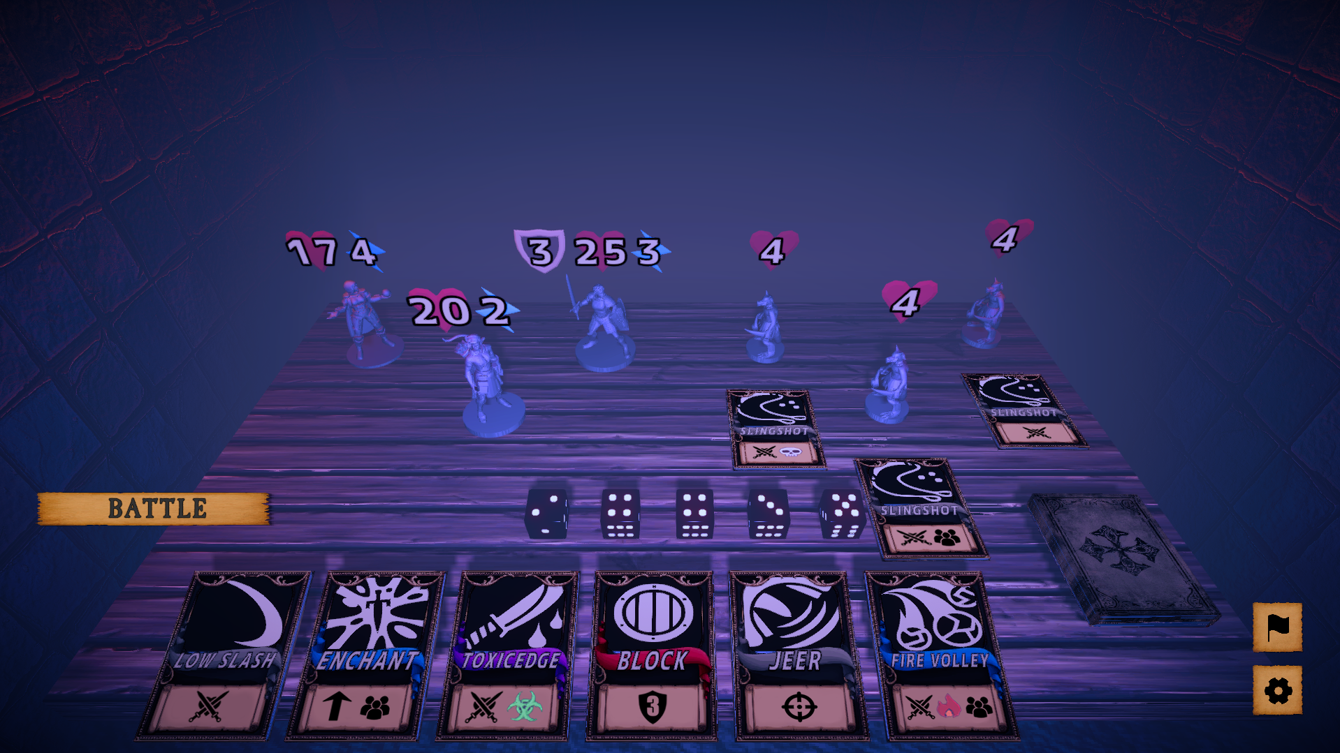
Are the rogue and mage cards the same color? blue and purple? hard to tell, maybe red is a good color for rogue, also, the symbol below the cards, thought they had meaning but not really(realized they stood for cost later), the cost could be in the top corner and the bottom could have something that represents things like single and aoe target, damage, effects, if the info is already on the card, lots of time could be saved from hovering for details. 

The initial plan was to have most of the necessary info visible on the card itself, but it quickly became apparent that with this perspective the cards would be unreadable. I later checked out how other card games have managed to solve this and it has become obvious to me now why card games use 2d cards and a "top down" perspective with multiple layers. 

Inscryption cleverly uses 2 different perspectives to circumvent this issue, but the same approach wouldn't work for my game, so if I ever decide to make a full game out of this, I'd have to find a proper custom solution for this. (The problem with using icons for such information was that outliers like "Meteor" exist, which is a single target card with an aoe burn effect and trying to come up with a system that accounts for all these unique cases seemed unfeasible with the limited time of the jam)


Currently, the deck is scattered over the board, would appreciate it if there would be some sorting options, like into classes and then by cost, which will make card replacing a lot faster.

100% agree with this and should there ever be a full version, it'd definitely include such QOL features.


During battle, if can take back cards/dice that are assigned this turn, the option to see your deck and discard pile would be great too.

TBH I hadn't thought of takebacks at all during development. Cards with effects which activate (either partially or fully) right away as they are assigned, were part of the initial design, but had to be cut when the scope was downscaled. I might do an update to implement this in the near future.


Honestly regret sleeping on this cause of the cover, get a better cover if you can asap

Art and visual design has always been one of my weakest points and without any artist friends to consult, this is sadly the best I can do. (The cards feel too ugly, which made me super hesitant about using them on the cover, even though that seems like the obvious thing to do for a card game lol) 


the board game aesthetics, sounds of cards shuffling and other effects are all great, especially the gameplay, played many roguelike deck builders and got really sick of them since they all play the same, but this one offers something unique, cards that belong to certain classes, the dice rolls to match the action cost, allowing some creative card effects, different enemy designs and encounters. Some cards could use a bit more balancing tho, enemies likewise but honestly already super good, especially when compared to other games.

Sadly, the game I would have liked to make was far too ambitious for a jam, however without the pressure of a tight deadline, I probably wouldn't have even made the current "vertical slice". 

A lot of the mechanics, both for combat and general progression, had to be cut or altered to ensure that it could be finished in time.

Here are some of them:

  • A map system with branching paths and varied event tiles.
  • A separate currency awarded at the end of a run for Rogue-lite progression to soften the difficulty and speed up early waves.
  • Acquiring cards as reward for combat or in exchange for currency via a shop.
  • A card collection that's separate from the deck and the ability to alter your deck however you want in-between fights.
  • Hero specific card pools (i.e. evolving your Fighter into a Juggernaut would add different fighter cards to the pool of available cards).
  • Special properties for some dice (i.e. a fire D20 might give your hero + burn damage on the turn it is used).
  • The ability to select your targets and different types of enemy AI.
  • On play effects for some cards as mentioned above.
  • Cards which can change the turn order (similarly to priority moves in pokemon).

and so on... 


Spent many hours playing and would play more to try out different builds if not for the random crashes that seem to happen at the start of a battle, hope to see further developments.

Some of my play testers have reported crashes in earlier builds, but everything seemed to be working fine after I rewrote parts of my code to manually kill tweens and sequences.

I, myself, have been unable to reproduce a game crashing bug even after a ton of full playthroughs. I'm not entirely sure what's even causing these issues. If you could provide additional information, I will definitely try looking into what the potential culprit might be in your case.


As for the future of this project:

I will release a final build to fix some small bugs and probably add card takebacks, but that's going to be it for the web version of the game. 

I am still undecided if it's worthwhile to make this into a commercial game and working on it alone seems impossible. Right now, I'd say that it's not very likely. Mostly because finding the right people seems too big a hurdle.

(The problem with using icons for such information was that outliers like "Meteor" exist, which is a single target card with an aoe burn effect and trying to come up with a system that accounts for all these unique cases seemed unfeasible with the limited time of the jam)

Kinda see what you mean but also no, agree having text will not be a good idea since with the perspective and size, yes "Meteor" is a bit of an outlier but it can still be shown with just three icons (ST att, fire, aoe), many cards are already very clear with their intentions such as Block and Fire Ball/Volley but there are also many cards that have you question whether they attack, add a buff or applying status effects, such as "Toxic Edge", the cards don't need to tell you exactly what they do with the specific numbers, having some indication, to if the cards dealing damage(single or aoe), buffing, defending, healing, cleansing, what status they apply, etc, know there are a lot of effects but you can generalize if needed and the scrolls look like they can fit 3 icons comfortably.

TBH I hadn't thought of takebacks at all during development. Cards with effects which activate (either partially or fully) right away as they are assigned, were part of the initial design, but had to be cut when the scope was downscaled. I might do an update to implement this in the near future.

The takeback was just a me problem since I'm one of those people that like to play things out asap, was a bit bummed when cards and dice are gone, but it was okay after a few times. No takebacks will force the player to spend more time thinking before making a move which is not bad. See you what you mean with activation when assigned, what effects do you have in mind? Will say though, while playing around, gave an 8 dice to the warrior with 3 cost and no cards, then gave him Blade Spin c5, and now he requires 5 action points, not sure if you care about that. 

(The cards feel too ugly, which made me super hesitant about using them on the cover, even though that seems like the obvious thing to do for a card game lol)

What are you talking about, yeah sure the card images are black and white but not even that bad, they got colors and boarders, anything better than letters. 
Since you have 3 heroes why not show the heroes like this.

Sadly, the game I would have liked to make was far too ambitious for a jam, however without the pressure of a tight deadline, I probably wouldn't have even made the current "vertical slice".

Haven't seen this term in a while but you nailed it, keep forgetting this was made during a 2 week jam, and yeah, you got some really ambitious ideas, so are you really done with this game? You can really play around with the dice mechanics, like cards that require certain numbers, omg the possibilities. 

If you could provide additional information, I will definitely try looking into what the potential culprit might be in your case.

Not a clue, tried to recreate it too cause thought it was opening the menu before a battle and it was not, were you playing on the web? Suspect it's chrome memory overloading or something, kept the game opened for long periods but it's fine, doesn't happen for other games, though they are not as long, likely a problem on my end, if no other people are experiencing this. 
As mentioned before, think it was happening during the start of battles when things are loading in, any chance you can give a download copy, came really close to beating the game, and want to play some more, but the crashings are really discouraging.

(2 edits)
having some indication, to if the cards dealing damage(single or aoe), buffing, defending, healing, cleansing, what status they apply, etc, know there are a lot of effects but you can generalize if needed and the scrolls look like they can fit 3 icons comfortably.

I guess I was just overthinking it by trying to come up with a system that automatically determines the correct icons to use but I suppose just manually assigning them would work. I will try to look for some fitting icons and might implement this if I can find some.


The takeback was just a me problem since I'm one of those people that like to play things out asap, was a bit bummed when cards and dice are gone, but it was okay after a few times. 

Several people have requested this so I think it definitely makes sense.


 See you what you mean with activation when assigned, what effects do you have in mind?

Basically 3 types of on play effects: 

  • A bonus effect such as discard/draw a card or reroll all your unused dice.
  • Split effects where a part of it's effect happens right away and the rest during your turn if you also have the necessary ap.
  • The entire effect happens upfront and then you'd eventually have to pay the cost to free up your character's card slot.


What are you talking about, yeah sure the card images are black and white but not even that bad, they got colors and boarders, anything better than letters. 
Since you have 3 heroes why not show the heroes like this.

As I've mentioned before, visual design isn't one of my strengths and despite trying out a couple of things, everything just ended up looking weird and badly composed to me, which is why I ditched those and went with something super simple in the end.


you got some really ambitious ideas, so are you really done with this game? You can really play around with the dice mechanics, like cards that require certain numbers, omg the possibilities. 

I definitely do think that the game has a ton of potential, but at the same time it's kinda niche and looking for the right people to work with seems like such a pain or maybe it's because I feel a bit burnt out after those 2 weeks of heavy crunch lol.


Not a clue, tried to recreate it too cause thought it was opening the menu before a battle and it was not, were you playing on the web? Suspect it's chrome memory overloading or something, kept the game opened for long periods but it's fine, doesn't happen for other games, though they are not as long, likely a problem on my end, if no other people are experiencing this. 

All my tests have been on the browser version using chrome. I will try to do some minor optimizations and hopefully that'll fix the problem for you if it's memory related.

Can make a cover for you that you can use until you find an artist, if interested DM me some hero models LLQ#9169.
Also, forgot to ask, which games did you take inspirations from?

I have played a ton of card games (some very competitively), RPGs and other games over the years so it's hard for me to say which might have actually influenced me.

I didn't look at anything specific while making this, but if I had to name a game, I'd say it was "Die in the Dungeon" that inspired me to make a combat system utilizing dice and cards in an interesting way.