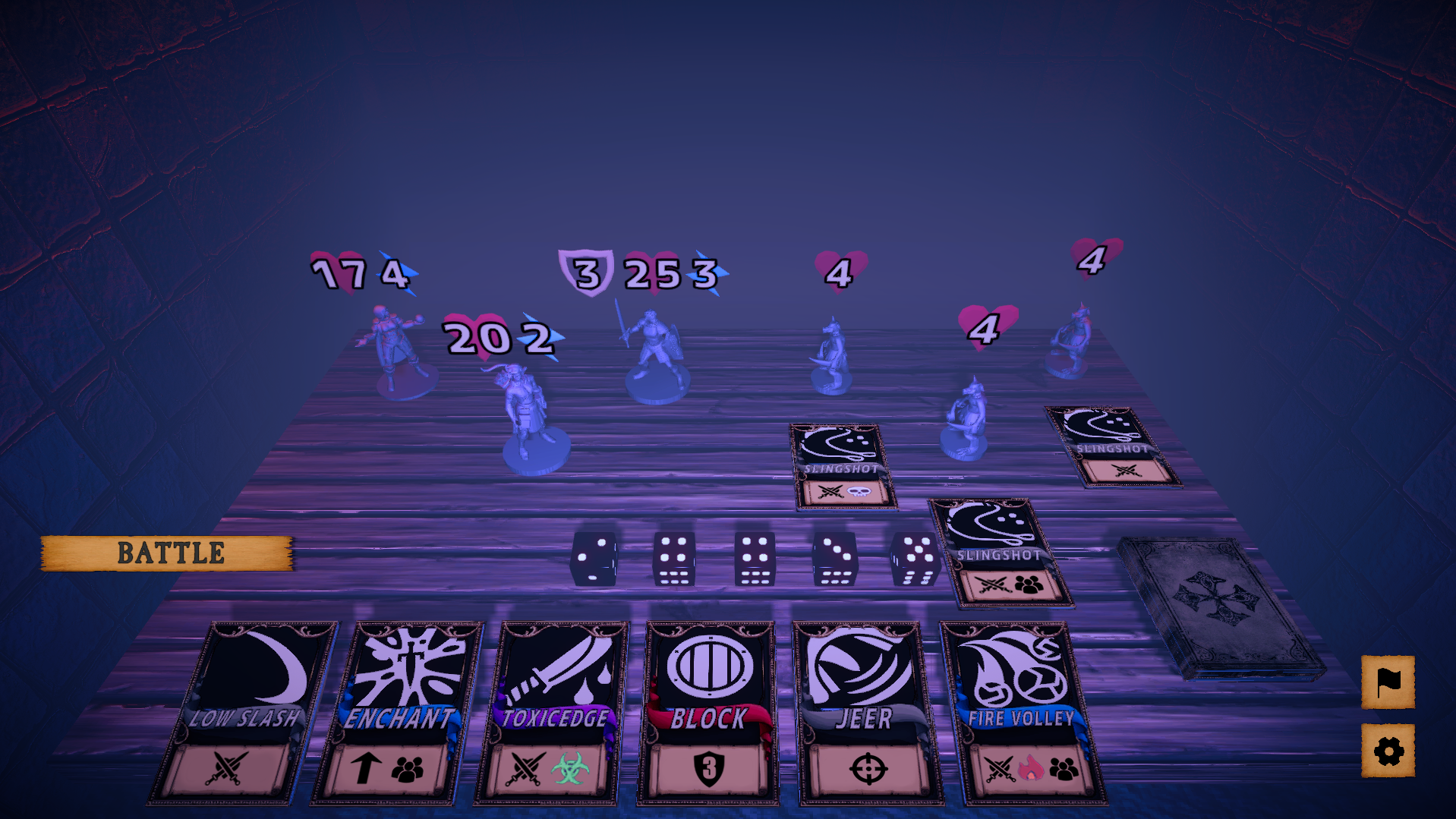
(The problem with using icons for such information was that outliers like "Meteor" exist, which is a single target card with an aoe burn effect and trying to come up with a system that accounts for all these unique cases seemed unfeasible with the limited time of the jam)
Kinda see what you mean but also no, agree having text will not be a good idea since with the perspective and size, yes "Meteor" is a bit of an outlier but it can still be shown with just three icons (ST att, fire, aoe), many cards are already very clear with their intentions such as Block and Fire Ball/Volley but there are also many cards that have you question whether they attack, add a buff or applying status effects, such as "Toxic Edge", the cards don't need to tell you exactly what they do with the specific numbers, having some indication, to if the cards dealing damage(single or aoe), buffing, defending, healing, cleansing, what status they apply, etc, know there are a lot of effects but you can generalize if needed and the scrolls look like they can fit 3 icons comfortably.
TBH I hadn't thought of takebacks at all during development. Cards with effects which activate (either partially or fully) right away as they are assigned, were part of the initial design, but had to be cut when the scope was downscaled. I might do an update to implement this in the near future.
The takeback was just a me problem since I'm one of those people that like to play things out asap, was a bit bummed when cards and dice are gone, but it was okay after a few times. No takebacks will force the player to spend more time thinking before making a move which is not bad. See you what you mean with activation when assigned, what effects do you have in mind? Will say though, while playing around, gave an 8 dice to the warrior with 3 cost and no cards, then gave him Blade Spin c5, and now he requires 5 action points, not sure if you care about that.
(The cards feel too ugly, which made me super hesitant about using them on the cover, even though that seems like the obvious thing to do for a card game lol)
What are you talking about, yeah sure the card images are black and white but not even that bad, they got colors and boarders, anything better than letters.
Since you have 3 heroes why not show the heroes like this.

Sadly, the game I would have liked to make was far too ambitious for a jam, however without the pressure of a tight deadline, I probably wouldn't have even made the current "vertical slice".
Haven't seen this term in a while but you nailed it, keep forgetting this was made during a 2 week jam, and yeah, you got some really ambitious ideas, so are you really done with this game? You can really play around with the dice mechanics, like cards that require certain numbers, omg the possibilities.
If you could provide additional information, I will definitely try looking into what the potential culprit might be in your case.
Not a clue, tried to recreate it too cause thought it was opening the menu before a battle and it was not, were you playing on the web? Suspect it's chrome memory overloading or something, kept the game opened for long periods but it's fine, doesn't happen for other games, though they are not as long, likely a problem on my end, if no other people are experiencing this.
As mentioned before, think it was happening during the start of battles when things are loading in, any chance you can give a download copy, came really close to beating the game, and want to play some more, but the crashings are really discouraging.

