The monster is nice and scary, but the gameplay is a significant downgrade from the prestigious Touhou Crisis😞
Amberkazefan69
Creator of
Recent community posts
Thought this was a grappling hook game💀, movement does not feel too good, quite awkward at times, the map feels huge for how slow you are moving and climbing, getting lost and having no idea where to go feels terrible💀.
Felt the pathing was a bit hidden, gotta make it more intuitive.
However the boss fights was really fun, it was very difficult at first and thought the leaf part was impossible but aye, it was great, and the Marisa fight was pretty but also very short.
Would like to see more stuff focused on shooting and bullet dodging rather than moving around fighting basic enemies, unless you make it more fun and challenging.
Not what I was expecting from the screenshot, but interesting concept, played two runs then checked out the tutorial then did like 3 more runs after but still feels like I'm not understanding what people do and stuff, like the healer, sometimes it's an aoe but other times its a line and sometimes it doesn't heal(It is lined up). Think the tutorial is fine, as it gets the basic mechanics through, but what the characters actual do needs better explanation.
The pushing mechanic is nice, since its on a short timer, it's great to risk pulling off a big turn.
Think the game is quite easy, last run took 17 turns, think it can be 12 and lower if optimized. Since everything is like one shot, can easily take out two a turn, and some enemies has 2 or 3 turn cooldowns on them, can clear them all without having them move. Cause of it, didn't really need to mess with the healer nor the classes advantages. If you just line your people up, it's pretty straight forward, the horse does make things a bit more interesting.
It would be nice if the AI is more optimized, like the horses, checking if it could hit multiple targets and prioritizing lower health or class advantaged enemies. Which in turn will make you think about your own turn more.
Yeah umm, when first looking at this, knew it wasn't going to be something I'd like since horror is not my genre. Being slightly hemophobic, felt anxious ever since the content warning, the atmosphere felt very eerie and it slowly built up making me feel more and more uncomfortable to the point where I was scared to even talk to people or interact with things. Then the first dream came, and I thought about quitting, but my curiosity was piqued.
When I gave the first flower and solved the first problem, it felt really rewarding and made me keep going, then meeting new characters and talking to them became what I look forward to daily, I liked many of the characters, very unique, memorable, the dialogues are simple yet brilliant. Though, I was a bit disappointed when I thought I could share one last word with them saying goodbyes or something before resting since not resting yet was an option.
Before I knew it, I wasn't scared or anxious anymore, even during the dreams. It's a real wonder from being scared to I don't know, like heartwarming, it's like my feelings progressed alongside the game and the character. From just a cover to this, Well done.
Some minor personal preferences: an option to turn off the blur effects and saturation when you're low, motion sickness, interacting with the plants from the top side, and do plants sometimes die randomly, was kinda confused. Switching to bat form or something to move faster. Mouse controls, smart pathfinding, clicking the things to interact, or having right click doing what the E key does.
For sure, the UI/UX has alot to improve on, found myself misclicking or losing track of my mech many times.
Holy shit, could've sworn I've covered it when playtesting, wasn't able to recreate it at first, but now I can do the exploit you found everything time, thanks for playing, the feedbacks, and the discovery of this major bug!
(The problem with using icons for such information was that outliers like "Meteor" exist, which is a single target card with an aoe burn effect and trying to come up with a system that accounts for all these unique cases seemed unfeasible with the limited time of the jam)
Kinda see what you mean but also no, agree having text will not be a good idea since with the perspective and size, yes "Meteor" is a bit of an outlier but it can still be shown with just three icons (ST att, fire, aoe), many cards are already very clear with their intentions such as Block and Fire Ball/Volley but there are also many cards that have you question whether they attack, add a buff or applying status effects, such as "Toxic Edge", the cards don't need to tell you exactly what they do with the specific numbers, having some indication, to if the cards dealing damage(single or aoe), buffing, defending, healing, cleansing, what status they apply, etc, know there are a lot of effects but you can generalize if needed and the scrolls look like they can fit 3 icons comfortably.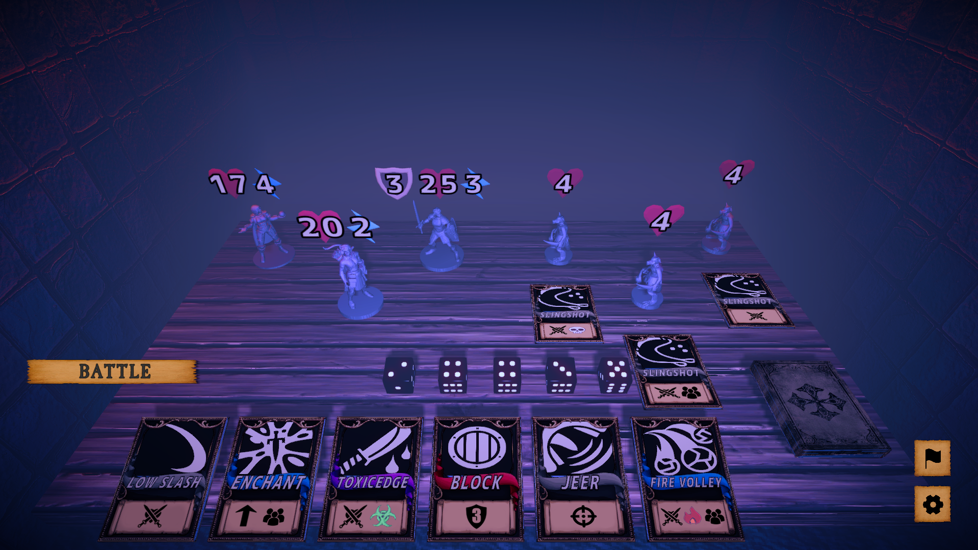
TBH I hadn't thought of takebacks at all during development. Cards with effects which activate (either partially or fully) right away as they are assigned, were part of the initial design, but had to be cut when the scope was downscaled. I might do an update to implement this in the near future.
The takeback was just a me problem since I'm one of those people that like to play things out asap, was a bit bummed when cards and dice are gone, but it was okay after a few times. No takebacks will force the player to spend more time thinking before making a move which is not bad. See you what you mean with activation when assigned, what effects do you have in mind? Will say though, while playing around, gave an 8 dice to the warrior with 3 cost and no cards, then gave him Blade Spin c5, and now he requires 5 action points, not sure if you care about that.
(The cards feel too ugly, which made me super hesitant about using them on the cover, even though that seems like the obvious thing to do for a card game lol)
What are you talking about, yeah sure the card images are black and white but not even that bad, they got colors and boarders, anything better than letters.
Since you have 3 heroes why not show the heroes like this.

Sadly, the game I would have liked to make was far too ambitious for a jam, however without the pressure of a tight deadline, I probably wouldn't have even made the current "vertical slice".
Haven't seen this term in a while but you nailed it, keep forgetting this was made during a 2 week jam, and yeah, you got some really ambitious ideas, so are you really done with this game? You can really play around with the dice mechanics, like cards that require certain numbers, omg the possibilities.
If you could provide additional information, I will definitely try looking into what the potential culprit might be in your case.
Not a clue, tried to recreate it too cause thought it was opening the menu before a battle and it was not, were you playing on the web? Suspect it's chrome memory overloading or something, kept the game opened for long periods but it's fine, doesn't happen for other games, though they are not as long, likely a problem on my end, if no other people are experiencing this.
As mentioned before, think it was happening during the start of battles when things are loading in, any chance you can give a download copy, came really close to beating the game, and want to play some more, but the crashings are really discouraging.
Are the rogue and mage cards the same color? blue and purple? hard to tell, maybe red is a good color for rogue, also, the symbol below the cards, thought they had meaning but not really(realized they stood for cost later), the cost could be in the top corner and the bottom could have something that represents things like single and aoe target, damage, effects, if the info is already on the card, lots of time could be saved from hovering for details. Currently, the deck is scattered over the board, would appreciate it if there would be some sorting options, like into classes and then by cost, which will make card replacing a lot faster. During battle, if can take back cards/dice that are assigned this turn, the option to see your deck and discard pile would be great too.
Honestly regret sleeping on this cause of the cover, get a better cover if you can asap, cause the board game aesthetics, sounds of cards shuffling and other effects are all great, especially the gameplay, played many roguelike deck builders and got really sick of them since they all play the same, but this one offers something unique, cards that belong to certain classes, the dice rolls to match the action cost, allowing some creative card effects, different enemy designs and encounters. Some cards could use a bit more balancing tho, enemies likewise but honestly already super good, especially when compared to other games. Spent many hours playing and would play more to try out different builds if not for the random crashes that seem to happen at the start of a battle, hope to see further developments.
Platforming felt a bit weird and frustrating at first, mostly due to how the platforms are not clipped all the way, so you have to jump early, otherwise, you would just run off. After realizing that, the second playthrough felt alot better. Also why not bind jump to W key, showing WASD for movement but W and S doesn't do anything.
Interesting game, lots of potentials with the core mechanics, would like to see more levels and harder difficulties.
Would appreciate a sensitivity slider in pause maybe, high sens with the glitchy lights on the space level made me feel a bit sick, you can hug the wall and get stuck during the free fall, when small, the barrier around the desk felt a bit odd.
Other than that, great game, idea, theme and execution with good use of visual and sound cues, small details such as note pads and the small room that add to the theme and atomosphere.


