Hi! I made an illustrated feedback for this game.
Actually, I thought that it is a pretty toxic level design here: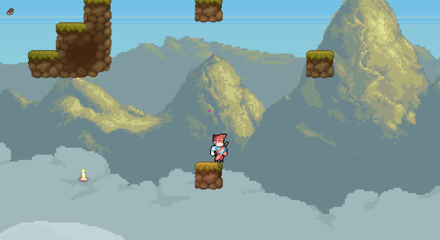
Then I understood that the previous decision was just fine here:
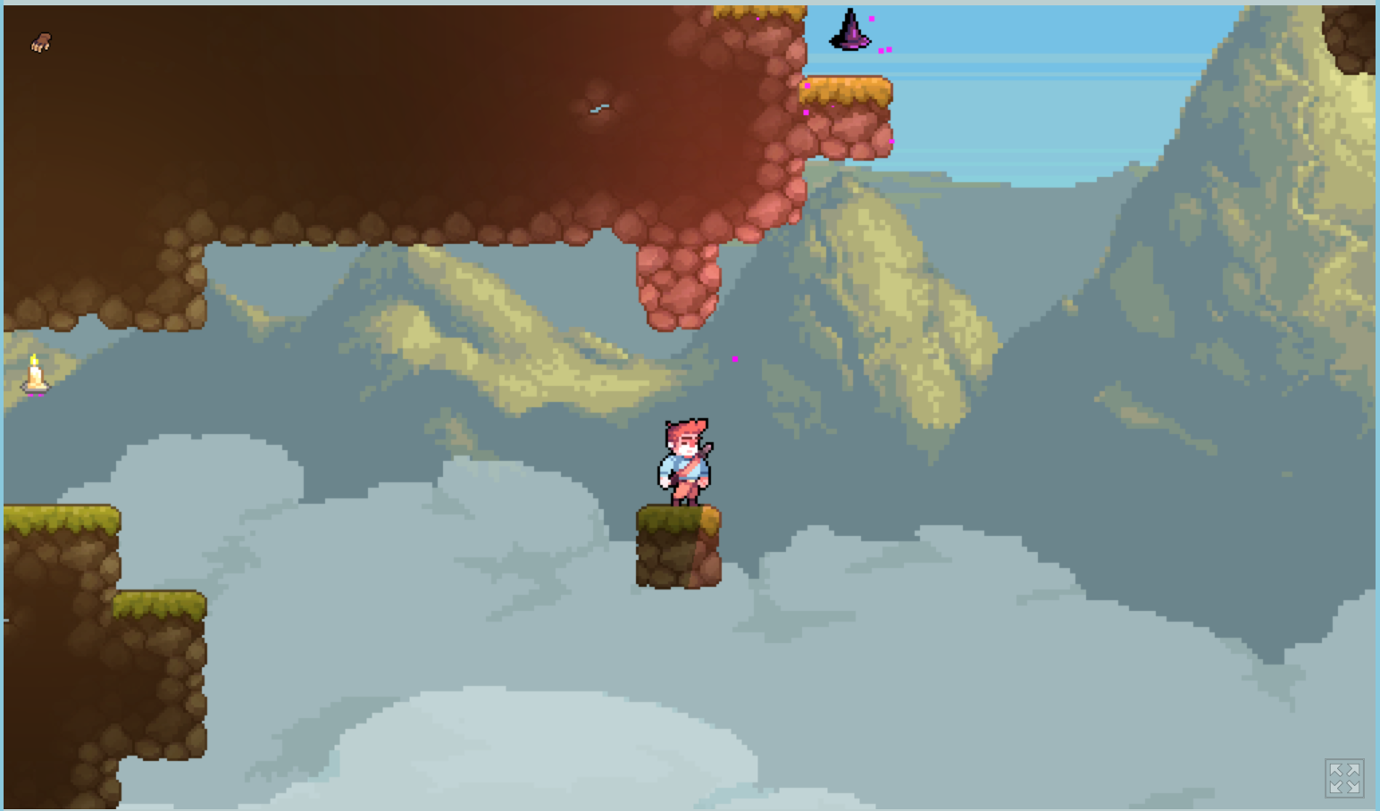
I still wonder what you planned to place here:

More hatred I felt here:
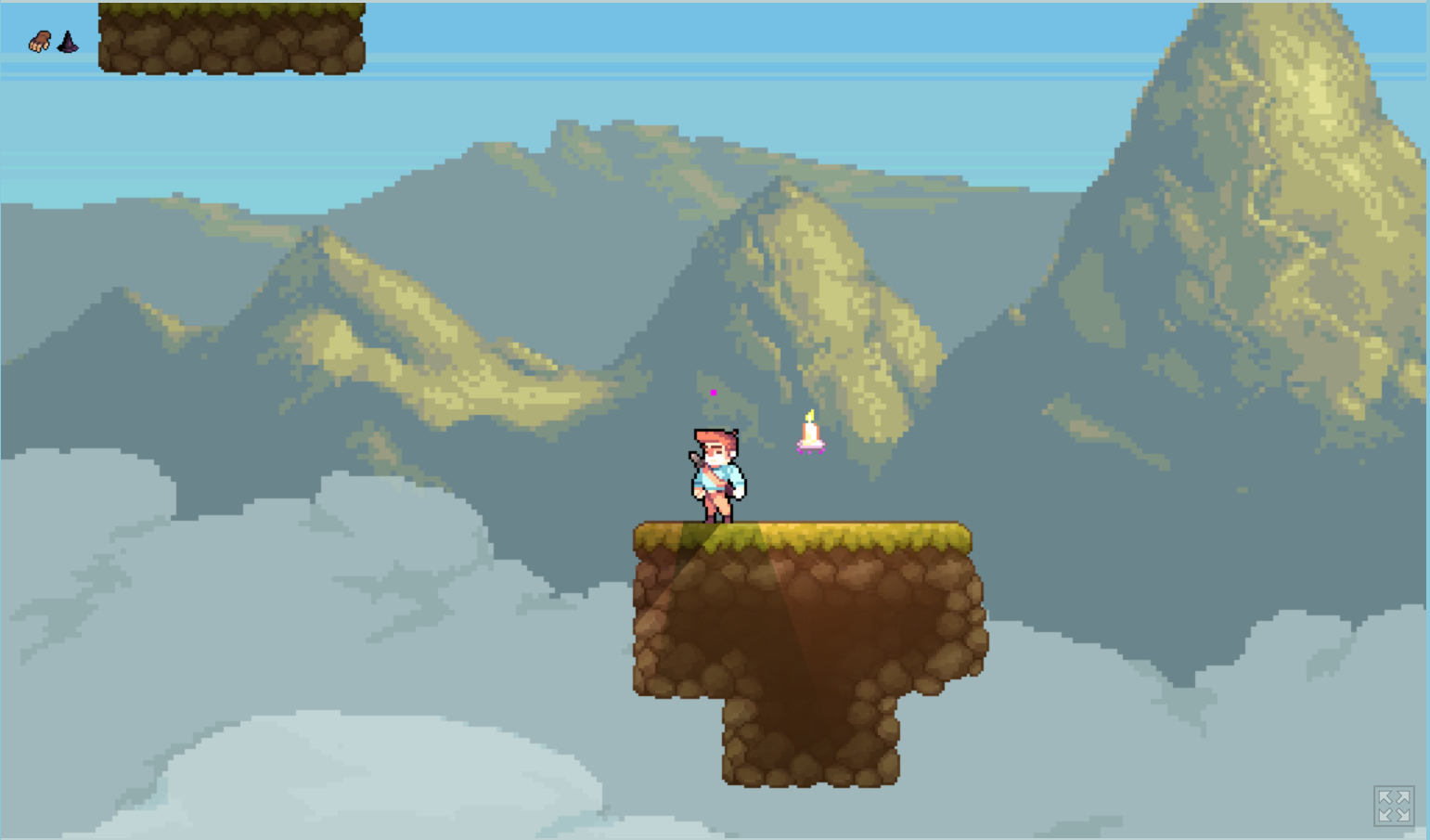
And more here:
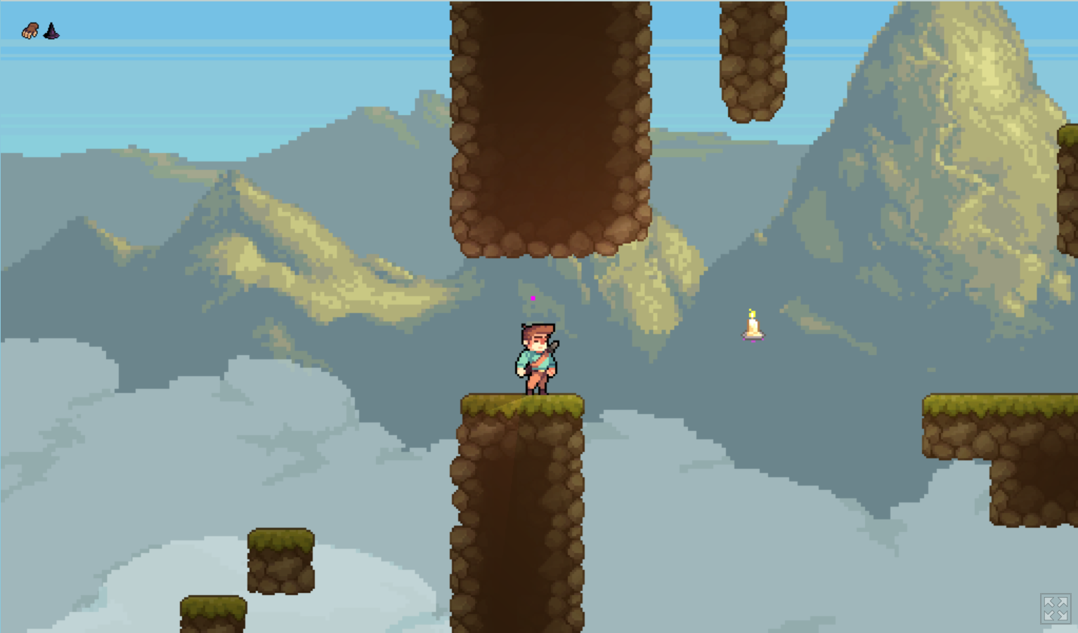
But I get used to this jump, and felt hatred here:
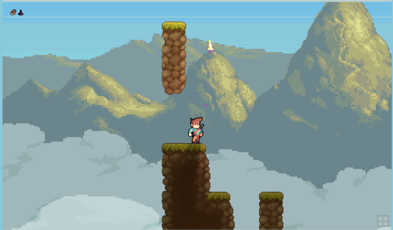
Then I fell down a few times near the end, but I was not able to screenshot it because hatred blood covered my eyes.
Here I finally passed the game:
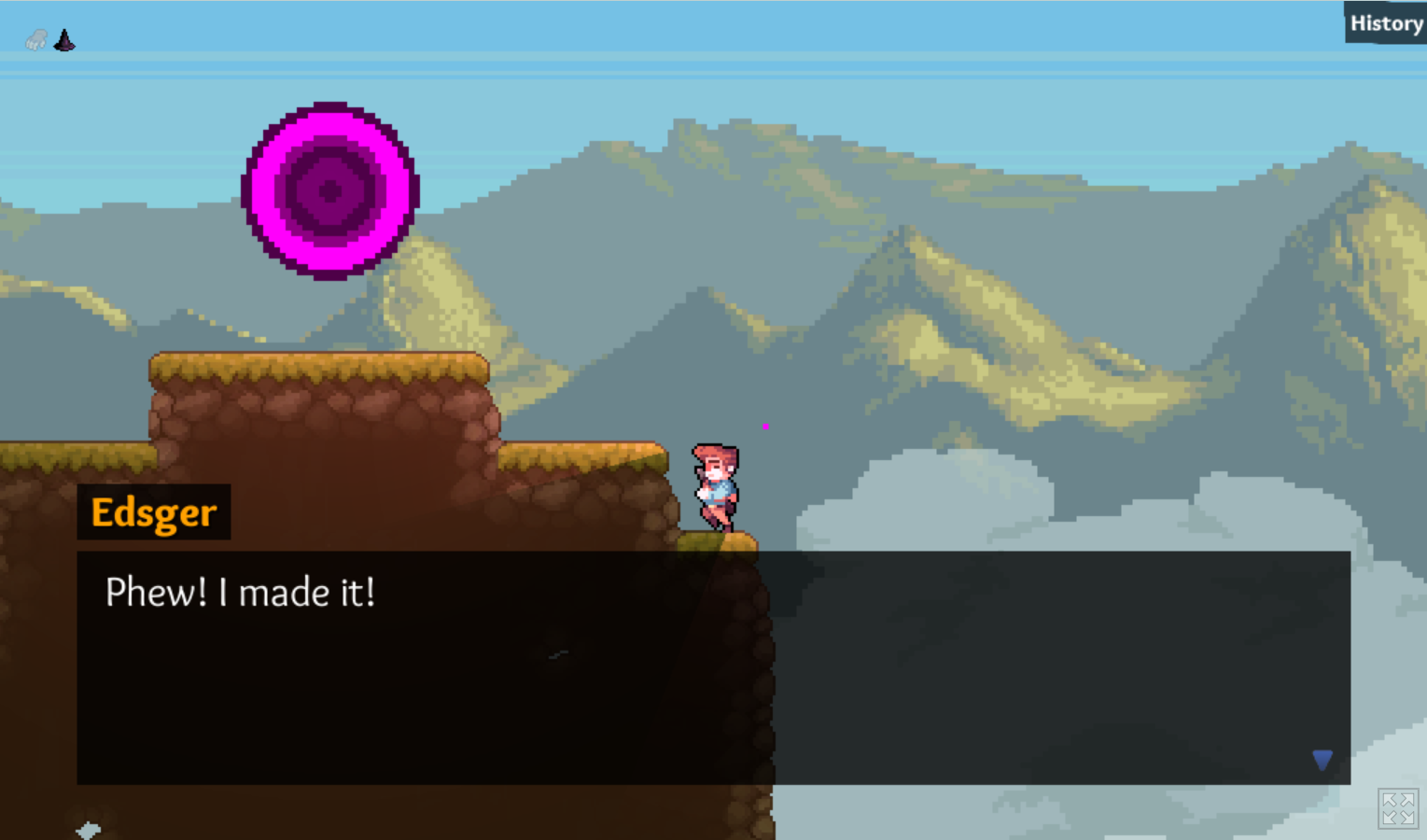
I smoked a lot, exercised, slept a lot, brought back some happiness to my life, and understood that the game was not that bad. To be honest it was pretty nice!
Glad you did it in a few days. Pretty polished for such estimation.
But it would be really nice if you:
1. Make the character not slide on all the surfaces. Or place visual ice on them to make it less questionable.
2. Make an instant update of character direction. In the description of a hat, there is a line that the player teleports in the direction of view. Maybe it works another way, but the visual makes it not clear.
3. Make checkpoints. This game so needs checkpoints.
This stuff is most important to make the gameplay not so frustrating as it is for now.
But I really encourage you to finish it!
It is good, and you have talented level design ideas, I believe you can make it a finished nice platformer. I would buy it on Steam if you complete it to the level of a full-scale polished game.

