As others have said already, it's hard to plan ahead because it is just hard to mentally visualize 3D rotations of a cube especially when you combine rotations on different axes. The visualizations you added post-jam help a bit but ideally the player should be able to plan several moves ahead, or you just can't expect players to have any sense of self-direction or volition as they're solving any given puzzle.
Many commenters also asked for a grid; to clarify, I think the underlying problem is that the tile art is visually confusing.

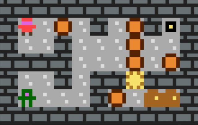
My first read of this is that it was 6 tiles wide, so I was surprised to find that it's actually 4. The 3/4 perspective is not helping with legibility either, because at least in my head I start to expect that the squares should be wider than they are tall, due to the perspective skew, which further messes with my ability to accurately measure grid squares. For a puzzle game like this readability is way more important than nice art. For example this is way more readable:
 \
\I'm curious if you explored the simpler premise of navigating the dice from point A to point B with the same rules but just in an open area, without the added limitations of bottomless pits? Was that too easy? Too open-ended?
I'm also curious if you explored using smaller numbers? 6 is a little too many squares to reasonably expect anyone to be able to eyeball, but 1 or 2 is fine. Can you still make interesting puzzles with say, just 1, 2 and 3? Have you explored using different rules for how the values change as you move? Maybe the value just increase by 1 every move, wrapping around after it reaches the maximum.

