i had fun playing this game!
i hope you don't mind an honest review btw
the art is ok
the music was also ok
i'm very glad you added sound effects and music, that gets left out a lot
when i say ok i mean that it wasn't bad, nor was it great
but it definitely added to the experience, this game would've been way more boring were it not for them.
so i'm glad you put in the effort
that being said, i think all three of those could've been better, but that's nothing impossible to improve upon.
if either of the team members want to make music, that's great!
make a lot, improve, get inspired.
however, if you don't plan on putting a lot of effort into learning that skill.
that's ok too.
i just recommend getting your music from some creative commons website in that case.
i want you to know that there's no shame in that.
your goal should be to deliver an experience, and if some other music fits better, that's ok!
other games that i've played that used creative commons music actually had some of my favourite music in the jam!
while i do make music myself, unfortunately i can only give you very few good tips on it, because it's something that i haven't learned based on rules, i learned it by developing an intuition, and that intuition took me many years to develop. if there's any rule in music i would say that it's a combination of creating patterns and breaking them. also, one thing i tend to do a lot myself is have a melody with a unique rhythm, and repeat that rhythm with different notes. that kind of thing usually sounds pretty good. i believe it's called a "sequence" in music theory.
as for the art, the rocks in particular looked very cool
i recommend significantly reducing your colour palette, and working with that
once you do that i think you'll realise that no matter how amazing the shape of something is, it's the colours that make it truly pretty. simply using the same colour palette throughout a whole game or level can make it seem very polished.
one art tip i recommend in particular is to stay away from the corner.
by the corner i mean the corner of the colour picker that has the most saturation.
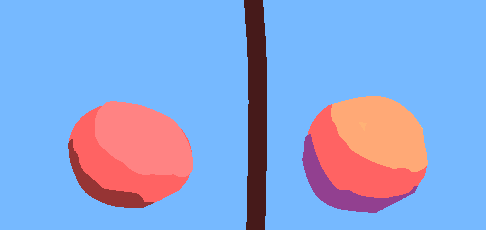
and the last art tip is that strong realistic lighting looks pretty.
when a red, diffuse object is strongly illuminated by the sun, it will not be light red, it will be closer to milky orange. that's also the reason why in art tutorials people will recommend you to do a "hue shift". this is a simplified version of mixing the colour of the light with the colour of the object.
this is of course highly stylised, but i hope you get the point with mixing the colour of the object with the colour of the light that is illuminating it
now
there is one thing i noticed in your game that might've been a lucky accident, or might've been a deliberate decision. but i just love that that actually worked.
as i was playing the game, i threw a grenade quite hard against another player, and the grenade did damage to the character! i did not expect it to because i thought only bullets would work that way, but the grenade damaged the character without exploding.
anyway, that was my review.
the game was very fun to play, and i think that's really something to be proud of.
great job!

