Incredibly fun game!
It was a bit awkward when the player was rendered on top of the UI.
But other than that it's so good it's hard to believe it was made for the jam.
Graphics and sound design are nice.
Gameplay really good.
Great job!
domjanabi
Creator of
Recent community posts
Cool idea and implementation of the game mechanics.
The art is very surreal and you probably could've had some humor there by leaning into it.
Unfortunately the sound design is missing completely, and the way the levels are currently designed all you're really required to do is walk to the right.
Judging by when you've created your account i think this is your first game, meanwhile my first gamejam attempt resulted in a failed project that didn't work and i ended up not uploading anything.
Therefore, i think you did a good job! You should be proud.
Love the humor and definitely didn't expect an intro and tutorial with voice acting. No doubt about fitting the theme. Enjoyable game mechanics, though sometimes you'll be next to an item but can't pick it up even though you have enough space, and it only gets picked up once you exit and enter its pickup area again.
Great job!
alright soo
i couldn't jump over any of the gaps in the web version
the widest jump was shorter than the first gap at the beginning
so then i tried out the downloaded version and it worked flawlessly!
i ended up finishing the game, it was really nice.
although the level was a bit short!
the shader effect when you get hurt looked really cool, but it seems like something that wouldn't be that easy to get working. so maybe it was misallocated effort?
i feel like you could've polished the response to getting hurt, by placing the player in some spot that is definitely safe. when i touched a spike i'd get flung upward and land on the spike again lol.
i like the atmosphere that you created with the sound, however i think it would've been nice to hear some music too.
and lastly the art is ok, i really wish there were some cool tiles for the ground, but the important part is that the game is working, and your totally is
not only that, it was even fun!
the different effects were really interesting, especially the flashlight mode, or whatever you might call it.
good job!
we had to design the character movement without the use of kinematicbody2D because it wouldn't interact with the die properly (infinite inertia). so we somehow made a character controller with the rigidbody2d node in character mode, which i don't recommend at all using in case you're considering it. move_and_slide() wasn't available
also in your code i recommend storing the player's velocity
and then doing
velocity = move_and_slide(velocity, Vector2.UP)
otherwise the player will continue moving in a certain direction even though there's an obstacle in the way
(like continuing to move upward after hitting the ceiling)
easily 5 star presentation
the art is amazing, and the sound effects are too
a different music could've been chosen, but it's not a big deal
as for the gameplay, i think the enemies are too hard by default.
it feels quite tedious to chase after them and get punished for doing so, especially with how slow the attack is.
other than that,
amazing work!
i love the use of sound effects.
the art is great
the gameplay was nice
some issues i had were an enemy being right in the entrance of a room and instantly killing you as you
enter. also pls add potions lol this game is hard.
one time i believe the enemy just didn't want to move?
my game might have been unselected, but i thought i clicked on it a couple times, yet the enemy's moves never decreased.
anyway, very cool concept.
nicely executed
good job!
quite nice game!
i have to say the tutorial was really good at the beginning.
i think later on a bit of a more gradual introduction to the game's complexity could've been good, but i did end up playing all of the levels!
i really like the design decisions you made with animating the tiles that match the pips on top of the die. and that they represent well what they do once you're on them.
adding the map of the cube was a great idea, some games overlapped it onto the tiles, which might not have worked greatly here, but is preferrable if you want the player to know where they can move.
i think adding some music, any music really, would've been a good idea.
it feels a bit empty without music.
the sound effects are nice, though they don't seem to always play, and the visual design is quite nice.
great job!
great game!
great art!
very enjoyable, it was nice to see another story based game.
as another commenter already mentioned, there's a lot right with this game, so i'll focus on things you might wanna improve imo.
i think adding more music depending on the scenario might've been a nice idea.
i think the map could be displayed as a minimap in the corner instead of having to press on the map button, i didn't actually notice the button for the majority of the game.
the game was quite fun, i just wish restarting and the transitions would've happened faster, it would've kept the action going, was a bit frustrating to wait for the screen to do its thing.
i would've liked to see the buttons for movement be in a consistent place on the screen.
the watch and time running out is a nice idea, maybe making it a bit bigger would've been a good decision for the sake of readability though.
other than that, great work
especially for a jam game!
certainly enjoyed playing it!
i had fun playing this game!
i hope you don't mind an honest review btw
the art is ok
the music was also ok
i'm very glad you added sound effects and music, that gets left out a lot
when i say ok i mean that it wasn't bad, nor was it great
but it definitely added to the experience, this game would've been way more boring were it not for them.
so i'm glad you put in the effort
that being said, i think all three of those could've been better, but that's nothing impossible to improve upon.
if either of the team members want to make music, that's great!
make a lot, improve, get inspired.
however, if you don't plan on putting a lot of effort into learning that skill.
that's ok too.
i just recommend getting your music from some creative commons website in that case.
i want you to know that there's no shame in that.
your goal should be to deliver an experience, and if some other music fits better, that's ok!
other games that i've played that used creative commons music actually had some of my favourite music in the jam!
while i do make music myself, unfortunately i can only give you very few good tips on it, because it's something that i haven't learned based on rules, i learned it by developing an intuition, and that intuition took me many years to develop. if there's any rule in music i would say that it's a combination of creating patterns and breaking them. also, one thing i tend to do a lot myself is have a melody with a unique rhythm, and repeat that rhythm with different notes. that kind of thing usually sounds pretty good. i believe it's called a "sequence" in music theory.
as for the art, the rocks in particular looked very cool
i recommend significantly reducing your colour palette, and working with that
once you do that i think you'll realise that no matter how amazing the shape of something is, it's the colours that make it truly pretty. simply using the same colour palette throughout a whole game or level can make it seem very polished.
one art tip i recommend in particular is to stay away from the corner.
by the corner i mean the corner of the colour picker that has the most saturation.
and the last art tip is that strong realistic lighting looks pretty.
when a red, diffuse object is strongly illuminated by the sun, it will not be light red, it will be closer to milky orange. that's also the reason why in art tutorials people will recommend you to do a "hue shift". this is a simplified version of mixing the colour of the light with the colour of the object.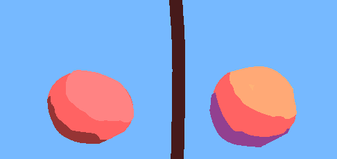
this is of course highly stylised, but i hope you get the point with mixing the colour of the object with the colour of the light that is illuminating it
now
there is one thing i noticed in your game that might've been a lucky accident, or might've been a deliberate decision. but i just love that that actually worked.
as i was playing the game, i threw a grenade quite hard against another player, and the grenade did damage to the character! i did not expect it to because i thought only bullets would work that way, but the grenade damaged the character without exploding.
anyway, that was my review.
the game was very fun to play, and i think that's really something to be proud of.
great job!
very fun game!
the art is amazing
the music is amazing
this turned out to be one of the games i actually played til the end
i wish you would've given more visual and auditory feedback as to what's going on
for example when the player is shielding you'd display a shield, and play an according sound effect.
that kinda stuff
also, this game deserves WAY more ratings but it's so sad that getting it to run is so difficult.
this could've definitely been up there.
other than that very, very impressive for a gamejam
great job!
very cool game!
i really liked that backspace was used for undo
it seems like such a natural key to be used for that.
the art was nice
music was great!
sound design was great, i doubt you could've added many more sfx
you communicated well how the game works
as many people have probably mentioned already, it would've been cool to see a preview of the other sides of the die, or maybe just change the view angle?
it didn't make a big difference when i could move around, but when there was nowhere to move i couldn't rotate the die to figure out what its other sides are
i really liked the last level with the credits rolling, i don't believe i've seen that in other games.
enjoyable puzzles that didn't have me stuck for too long at any point
great job for a jam game!
there are many competitors, but maybe this game could be continued?
very cool
i really didn't expect to find a story based game with this theme
the mechanic is so unique
the art is great too
and most improtantly the game is very interesting and enjoyable
i think the only thing you should maybe add is a small in-game tutorial
other than that
you should totally make this a full release, spend a month on it maybe and get it out there
this was definitely one special submission for a 50 hour game jam
and i believe you're the first person i will give 5 stars on creativity
great work!
i'm sorry, after trying for a good 15 minutes i still didn't know how to play your game.
I took a look at the comments, and at the screenshot, but still had no idea how to actually record anything.
a tutorial would've been greatly appreciated
other than that,
the art looks really great
the sound design is great too
the game has such a nice atmosphere and honestly looks like a final release
it's a real shame because it looked interesting
nevertheless very impressive as a jam game
great job!
your game has a unique concept that i haven't seen in the other submissions yet
i think i would've really enjoyed the gameplay had it not been for the framerate which dropped every time the next plate was above the die.
this reduced framerate, and the way unity progresses time irrespectively of the framerate meant that the plate was teleporting by pseudorandom offsets every frame which were very unpredicatble.
i would like to mention that this might've been because i played the game without having my laptop plugged in.
besides that, the game was enjoyable.
the presentation was a bit lacking with the default unity background.
you could've put the die on a textured plane or something like that
i wish there had been music and sound effects.
the menu didn't look breathtaking but i think that's really not a big issue for a jam game.
but the important part which was to get something working is definitely there, and if it wasn't for the performance issues i think i would've actually had a nice time.
overall nice enjoyable little game.
good job!
although i've already played this game, i felt like leaving a bit of a longer review
sadly i didn't get past level 4
the art was ok, it could've been better.
i really liked the visual cue for when the die has reached the goal
some art tips if you're interested:
for game art and especially pixelart it helps to have a very reduced colour palette that you use for the entirety of a game or level.
this, for example, is an early version of the colour palette i used for my game
other than that, i recommend looking at colour theory, and trying to see colours for what they are instead of your idea of what they should be.
for example, a white chair could be pink, it could be green, it could be black, it could be brown, it could be all kinds of colours, all that depends on what light is actually illuminating the chair.
you can exercise seeing colours for what they are by looking at images, picking some random part of an object, opening a colour picker and trying to replicate its colour, and then seeing how far off you were.
very important thing if you want pretty art: strong, realistic, lighting makes images look pretty.
seeing some animations would've been nice, when it comes to running animations there's an image that i used to make my character's running animation. you might find it useful.
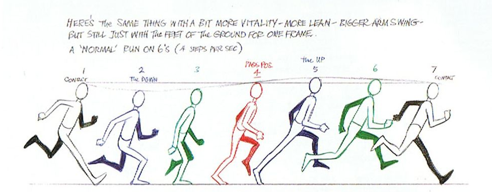
i would've enjoyed more sound effects in your game, i think that would've given it a way more polished feel. i'm glad that it's something you're already planning to add in the updated version.
the level design was a bit problematic imo. the way the level works has too many variables and as such is quite unpredictable.
i like that you had many movement mechanics in the game and instructions on how to use them, the font could've looked nicer though. it's a font i'd expect to see in a word document, and not a game.
what might've been even better would be explaining them with symbols instead of text.
it was a good decision to not mount the camera on the player but have it be static instead. for puzzle games seeing the entire level is probably a good idea!
more levels could've been added, but this is a gamejam game. it was not meant to be a final product.
as such i personally would've first cleaned up the existing levels before adding new ones.
it's the experience that matters, even if it's short
very adorable penguin character.
if you're planning to make games in the future it would be cool to reference him in those.
overall this game was actually quite enjoyable.
i just want you to know that for your first gamejam game, you did significantly better than me.
last year i did not end up uploading anything.
good job!
alright
i think it is in your best interest for me to be honest about this review
i did not find the game that enjoyable
as to give you an idea of how it went: i needed 6 whole minutes just to get through the second level lmao.
that being said, the idea for what you wanted to do is quite creative
your game has a very similar issue to mine, the randomness of the die makes the game more frustrating because you rely on the die to give you a specific value (or in your case position) in order to be able to progress. this leads to a lot of time spent bruteforcing the value you want. meanwhile i have a solution for that for my game waiting to be implemented, but i don't quite know how i would fix yours (or maybe i do? keep reading to find out). the huge problem is that it's not only one die that your game relies on, it's multiple. so if there's a probability of one die landing in the correct place (= p), the probability for all the dice to do so is more or less p to the power of the amount of dice (p^dicecount).
now to the other stuff
the art is nice, not great, not terrible
sound effects are there, though the bell sound effect was a bit weird
your level design is definitely a lot better than mine, mostly because you actually have some levels lmao.
where did you find that music tho cos it sounds pretty good?
i played this game with headphones on, so i noticed something peculiar
the music only plays on the left ear, and the sound effects on the right?
my right ear felt quite lonely
i recommend having the music keep playing independently of the level you're in, or just making the levels longer so that the music is not constantly restarted.
i also noticed a weird bug: i think when you jump and then collect a key the music just stops playing.
also in the first level once you pick the key up the music becomes significantly quieter.
i think you should make the bell more interactive, and allow the player to look into the future before they make a decision to ring the bell in the way they're about to. making it entirely skill based instead of random. perhaps you could have the dice roll for a length of time the player decides? and the player can scroll through the future positions the dice will be in and then pick at what time they want them to stop.
anyway, nice concept, a bit frustrating to play.
nonetheless, it's a gamejam so
good job!
very cool concept!
i really like how the mechanic is introduced to you by requiring the enemy next to you to open your door
speaking of that, it's very cool that enemies are even able to do that
good idea with introducing more enemies in further levels btw
seeing all of them at once could've caused a massive headache.
it's sad that there was music in the menu but not during the gameplay, would've made it more enjoyable
the art imo was nice, not breathtaking, not horrible
i feel like you could've improved your art by downloading a small colour palette and using it for your sprites.
definitely good choice to make the floor a checkerboard though
it really made it apparent whether the snake/shrimp was able to get me or not.
good job!
great art
i really liked the presence of sound effects in your game
and the music wasn't missing either, though it wasn't that great.
not something i'd listen to in my free time
very cool movement mechanics and creative game concept
it took me quite a bit of time to understand it though, a tutorial would've been nice
good job!
i would like to thank you a lot for this review.
that's a great idea for the rolling mechanic
i think i will make it so that you can see a prieview of the trajectory + what value will be rolled at each point in the trajectory.
this will allow to make the rolling more skill based without getting rid of its 'randomness'
i think i will actually try implementing this for the post jam version
very fun game and visually obvious mechanics!
i really like the concept of your game, i haven't come across it yet, though admittedly i don't play many such games
unfortunately while playing, the game froze in this state
at least that's what i thought happened, after some further playing i realised that it didn't actually freeze, but the die for some reason didn't want to jump whenever it encountered a platform at that angle, it just stayed there.
this happened multiple times, but moving it made it jump up from the block again.
i like how your game doesn't lack anything you could put on a checklist.
the visuals are there, the sound effects are there, the music is there, the gameplay is there.
your game could use some background art (thought it may or may not be a bit distracting from the level), and i'd rate the music an ok
but other than that
great job!
quite the unique review tbh
i was actually worried about what the point is in making the die roll random densities if you can just bruteforce whichever of those you want, but once i made the game and added the soundeffects i found rolling the die actually quite satisfying to the point where doing that on its own was fun to me.
you're the only person so far that pointed out my doubts about that exact thing!
i am planning to make a post jam version, and already working on it.
what do you think of having a non-roll throw option (right click) and the preexisting roll throw(left click)?
i don't think i could've designed the concept of this game in any other way, because dice inherently don't always give you the result you want, but i think giving the player the choice to throw the die without rolling it would make bruteforcing the correct density its own, deliberate part of the game. perhaps i could use that somehow for branching paths, where the random value of the die decides where you can go?
i feel like the only part truly ruined by this were the last two rooms in level 2.
because:
* for the 2nd room it was just designed really poorly.
* for the 3rd room the throw without roll mechanic would've probably made things less unnecessarily cumbersome
please tell me what you think
i was hesitant to give this game a proper try because i don't like figuring out game mechanics without a tutorial, but i'm so glad i did
i played this game quite a bit longer than expected, it was really fun
the art is nice, but there is a problem, your sprites don't have consistent pixel size.
this is negligible in high res games, but in pixelart it's a problem
the music was quite lacking but for me it's better than nothing, i can't stand silent media lol
same thing goes for the sound effects, they were not amazing, but i'm so glad they're there
very cool game mechanic, interesting spin on the whole "the die decides your damage" idea
definitely a submission to be proud of
great work!
i wish it had been more interactive, but it kept me engaged until i couldn't roll the dice once i came back from the phone call.
as many people pointed out printing the text faster would've been nice
also the font doesn't look nearly as nice as the art
nevertheless pretty fun, interesting, and for sure unique
good job!


