Indie game storeFree gamesFun gamesHorror games
Game developmentAssetsComics
SalesBundles
Jobs
TagsGame Engines
(1 edit) (+1)

First of all, the music, it's very, very beautiful. Honesly one of the best musics I've heard in a jam game.

Even though the gameplay isn't anything revolutionary, the fluid and fast movement makes travelling through mazes quite fun.

The art looks really good. Very unique visual style compared to usual game jam art. If I have to nitpick, in some places (like in the pic below) it's quite hard to differentiate background from walls.The small story scene in the beginning adds a fine amount of context which I like. 
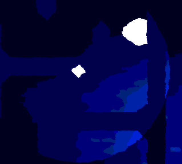

Overall, polished and beautiful experience, well done Theo.

(1 edit)

I feel flattered. :')

Honestly, I just took it easy and tried to combine things I already had in ways they would complement each other.

For example, I had the shader, so I generated some low res and not so impressive quality pictures generated by AI and they made for great backgrounds.

The shader inspired the gameplay using light, as that seemed like it would lead to great visuals. This then inspired the very simple gameplay as well.

I'm happy you enjoyed this small creation :)

(As for the background and walls having the same color, the shader uses color reduction, so that would have been pretty difficult to change. It's fine imo, cause you can still eventually figure out which are walls and which aren't.)