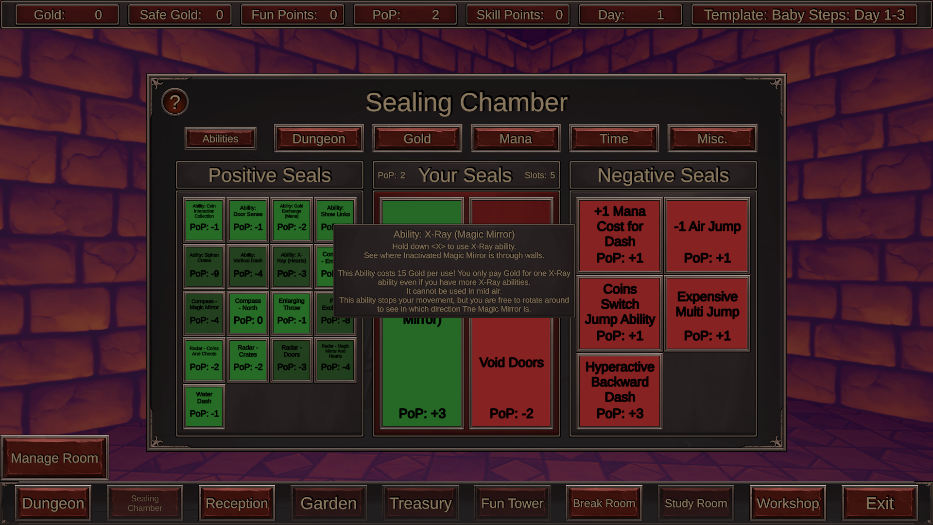
Hey, im gonna try to not reiterate what others say. I know you've already been told that the "management" UI is intimidating for new players but I want to add something, my problem with it is that it triggers the feeling of choice paralysis. You have so much stuff that you can click that you really don't know where to click, especially the sealing chamber section. I would also add that the Dungeon button should either be somewhere else or be way bigger than the other buttons, after all it's that button that makes you start the game so I feel like it should attract the eye instantly. Im not sure about the seals mechanic, I get that it allows you to make your own difficulty in a way but personally i'd rather have a normal difficulty curve where you unlock powers the more you play and you could choose dungeons with more difficulty that give more coins/lust but are hard(but maybe possible?) to finish without the powers.
As for the gameplay I liked it, you go fast and it's responsive, coin sound is kind of unsatisfying though. I played until day 5, the generation for the day 4-6 took significantly more time than the others, maybe add a small loading indicator? Also I noticed that if you're close enough to the ceiling you can jump and see the whole level.


