Thanks a lot for playing and all the feedback!
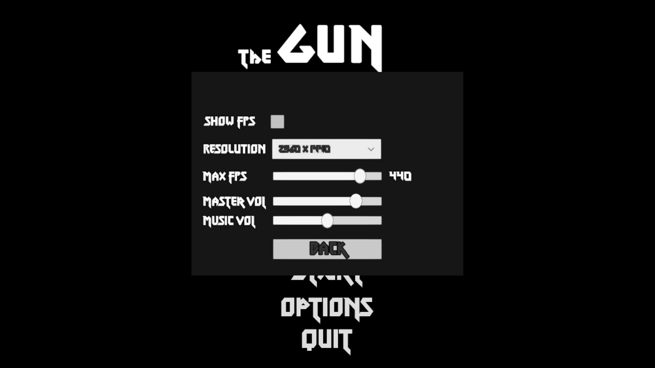
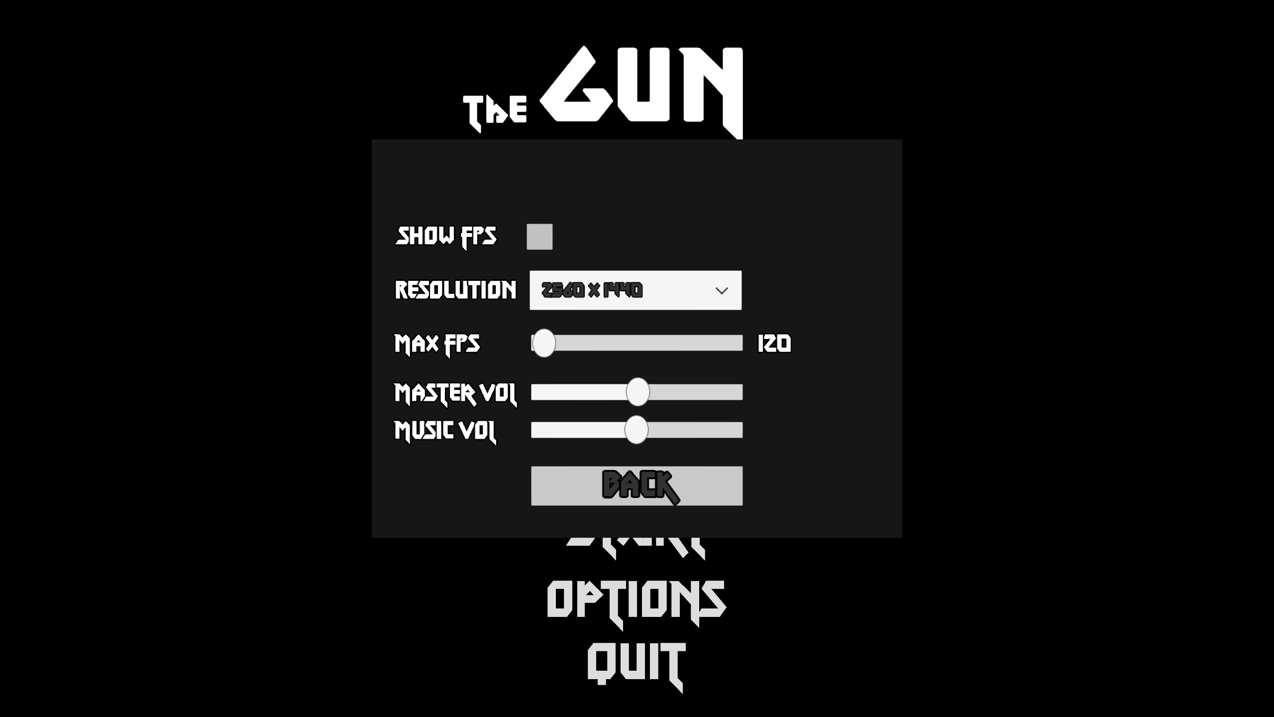
I'm a bit surprised about the blurriness at higher resolutions, you're the only one that's mentioned it. I know it happens at lower res. for the sidepanels right now because I haven't set it up properly, but it definitely should not be on 1440p (I use it on my main monitor too). If you could give me a screenshot as an example, preferably in a shop, I would really appreciate it. Although if you mean what the shopkeeper says you're not meant to understand him. Out of curiosity, what size is your monitor?
About the UI, the reason for it taking up so much space is to make the viewport more square and normalize threat assessment. In widescreen you'll overestimate danger from the the horizontal axis because you can see more enemies - even though it might be inaccurate because there are just as many in the same radius to north and south for example. A lot of this is inspired by Nuclear Throne, although there are things I really disagree with that they did like running the game at an awful 30 FPS for no real reason, thank you mods.
The actual locations of the different elements I'll be honest and say its not been given nearly as much thought, but I do like keeping them separate from the game view. Maybe people really dislike having so much of it in the periphery though. I'd say out of everything the UI is the least set in stone though so might change it all entirely. I will have to do some tinkering to what feels best.
The demon counter is really just there because I think its fun hehe. I think I've said it before but I really don't want people to be staring at the minimap all the time so it won't be filled with useful information. In the earlier levels its probably mostly used for finding lone enemies, and finding your way back to the portal if you run off for some reason. Its a blue dot on it now. On later levels its good for quickly finding a good angle of attack for a level. For example after playing a lot you'll start to recognize some minimap signatures for specific spawn formations such as the scepter ones, stationary shooters, which you'd probably want to take out first. Or find an area where the density is lower and start from there. Also special objectives will show up on it, on the boss for example where you really need to find your way to them.
But maybe I could come up with a better solution for all that.
I'm glad you like the map, will probably make it larger. The intent is to have you travel to, at least, a new map after finishing this one.
Not exactly sure how I want to handle leveling up actually, at least before a level is probably better - I've considered it too. Or having the option to do so whenever you like. Or only once per level, we'll see!
Being allowed to screw yourself by thinking you know better than the game, like selling all your weapons, is in my opinion a really fun thing about rogue* games.
Regarding the spawners, I'll paste a response I gave earlier about them:
Also enemies have armor and that one in particular has a high amount, all guns and effects have different amounts of armor piercing so if you used the SMG vs them it'll take a lot of bullets but others can kill them really quick. I know its not obvious at all right now so you might have missed it, but if you hover the cursor over the guns in the UI to the left you can see their stats (AP for armor piercing). And if you stand on top of a dropped gun you'll see its stats after a moment, can also compare stats if you hover at the same time. For now I think I'll upload a new version with the spawners starting at later levels.
Blue and red levels are indeed generated differently, I see what I can come up with for the crystals (I guess exploding crystals isn't the most intuitive thing to begin with haha). Tweaking level generation and balance will be a constant thing so its always good to hear what people think about it.
Right now the UI sidebars flash red when you get hit, but I will give it more feedback - sounds, obviously. Enemies deal the same amount of damage at all levels at the moment. Comments about ammo is good, and you're not the first to say so, I've been testing so much that I'm never close to running out. I actually increased the drops slightly just before DD. I might lower the importance of ammo management, its something I obsess about pretty much subconsciously in all games I play.
In this version there are 18 different gun templates that can have 28 different modifications on them, number and quality of them depending on the rarity of the gun dropped. I don't think it will change much more than that system, except some very minor crafting. And a lot more of both of course. I'm curious if you noticed that guns can have different mods on them at all though? Because I know I haven't made it clear at all here...
Its very reassuring to hear that you seemed to enjoy it though and played it for some time!


