I'd played the game before in a previous build before the art swap, and it's still as solid as it was. Now that you've gone and updated the art though, I've got a couple nitpicks that you'll maybe be interested in, amongst a couple other things:
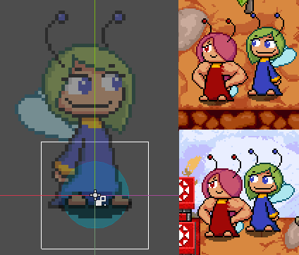
- The player hitbox is weird; it starts at the shadow and goes up some distance. You have a nice circle at the base; why not center it around that? It would make more sense imo. But I guess then you'd need a different hitbox/target point for the tongues maybe.
- I keep waiting for the level titles to transition automatically. Maybe you could add that in, but maybe it's just me.
- The pixel-perfect option seems to not hold true, unless it's just for scaling. Clouds and characters move off the pixel grid.
- I think the upscaled clouds at the bottom of the title screens are very jarring.
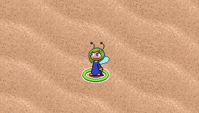
- The sand tiles feel too noisy
I've gotta say the art is very charming now, although I'll miss the smug energy of the old blue fairies! These animations are very good.


