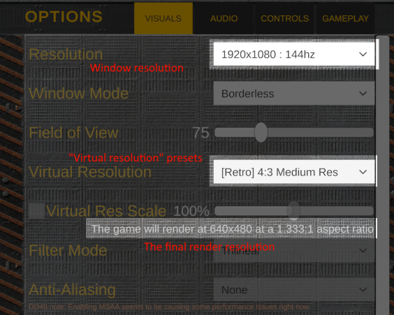
- List actual resolutions instead of just Low/Medium/High. Actually, just drop the "retro" bullshit entirely. I think you could count the amount of people who would want to play a 3D game at 640x480 or at 4:3 on your fingers, and I doubt the game is going to be demanding enough to justify a resolution scale slider.
- What exactly does the filter mode affect? Rephrase it to make it more clear.
- I get that it's a placeholder, but the controls list is an absolute mess with everything being center-aligned. At least separate the keys and actions and align them to opposite sides.
- The instant action menu should list your team above the enemy team instead of the other way around.
- Being able to adjust armor values this precisely doesn't make sense (what does adding 10 armor entail for the mechanics?) and I feel like it just adds bloat. Having different armor types per part is enough.
- The mech bay UI feels cramped and overwhelms you with too much information at once. You should separate it into multiple tabs for chassis/structure/engine, armor, loadout, ammo, and cosmetics.
- Needs a HUD indicator to show torso/leg facing along with the turn limit of the torso. The animated model in the corner isn't very helpful.
- How are you supposed to avoid damage? Combat just seems like a DPS race.
- The TTK is absurd. I ran out of autocannon ammo for the Orion-C and it took me like 3 minutes to finish the guy off with the laser firing constantly. I don't think it's even possible to kill an enemy with just guns.
- Mechs overheating from firing guns/missiles makes no sense. How does the heat get from the barrel to the engine (presumably)?
- Wish it had actual penetration mechanics instead of armor just reducing damage. Would help differentiate guns and lasers, too.
- Make the right mouse button go back in menus.
Viewing post in Mech Encounter jam comments
I absolutely agree with a majority of this. Thank you for the feedback.
>List actual resolutions instead of just Low/Medium/High
The actual resolution of the game window is modifiable with the resolution dropdown. The "virtual resolution" dropdown allows you to preset resolution / aspect / filter settings. It shows the actual in-game resolution below.
I'm sorry that I really don't explain this in-game, same with stuff like "filter mode", which changes the virtual res upscale/downscale filter, which I added last minute and didn't really think about it making sense.

>Actually, just drop the "retro" bullshit entirely
I agree somewhat, but I'm targeting a specific audience which played mech games in the 90's. All of the [Retro] 4:3 presets were actually options in Mechwarrior 2.
I'm going to be keeping it for "nostalgia factor", and because I've already implemented it and I don't like removing options from the player, but I've been starting to move away from it. The 'welcome' screen that has you pick 'classic', etc. will not exist in the final game, making the retro feature optional and essentially hidden.
>Being able to adjust armor values this precisely doesn't make sense
Armor can be used as 'filler' for when you have, for example, 64t / 70t used by equipment / weapons and want to simply fill the remaining space - that's why it has to be granular like it is.
Unfortunately I forgot to re-add a feature that would have made this make more sense. You should in the future be able to just click a button to 'auto-fill' armor into components, up to the tonnage limit.
>Mechs overheating from firing guns/missiles makes no sense.
I agree, and my original game jam version had each weapon take heat damage separately, but I decided to go back towards a single heat bar because it's a decent enough abstraction and leads to more interesting gameplay decisions. It's not going to be a "strictly simulation" game.
>The TTK is absurd.
You're absolutely right, and the main answer to this is that I have not balanced the game whatsoever, and the default stock designs are shit. If you were to use two particle cannons, you could almost instakill most mechs. I'm not going to be balancing (at least, not much) until I've finished two more features that will drastically effect the balance, otherwise I'll have to do it all over again. Features such as...
>How are you supposed to avoid damage? Combat just seems like a DPS race.
Active and passive equipment should be one solution to this, but I know it's an issue. My other plans are improved maps with cover, team coordination with your battery of mechs, and more complex mission objectives that will hopefully lead to interesting encounters.
>Wish it had actual penetration mechanics
Weapons are going to be customizable with a "tag" system and I'm considering adding penetration so that the gauss cannon can be tagged to become a railgun that goes straight through armor and does high crit to destroy equipment easily.
Sorry for the longform response, once again I really appreciate it - It's difficult to get quality feedback, especially honest feedback, while working on a project like this.

