Indie game storeFree gamesFun gamesHorror games
Game developmentAssetsComics
SalesBundles
Jobs
TagsGame Engines

Qwott

134
Posts
2
Followers
A member registered Nov 04, 2022 · View creator page →

Creator of

Recent community posts

>in the specific: when big cherry splits, it spawns two little cherry and an explosion that damage you in you are in range, also cherry themselves hurt on contact, so you should never go near him in the first place

The explosion looks identical to the one from your weapon, which doesn't hurt you, and doesn't make any (noticeable) sound. It's hard to even tell it's there. I think I've mentioned the same issue before with the slimes. It can also hurt you through the platform in the center. You should probably add a LoS check.

>Btw you have any opinion on the powerups? my tutorial about them was very bad, so you might have missed them entirely.

I only noticed them after beating it. They're all pretty basic and don't seem like they'd make a huge difference with how easy the game is, so I didn't bother testing them.

  • Destroyed the last of the first boss's adds while it was doing the ram attack and it didn't disable the boss's collision, so I couldn't hit the weak spot.
  • The sword is too spammable. You never have to dodge anything while you have it.
  • No idea how you're meant to get past the tall crusher moving horizontally in the crusher challenge.
  • I'm not liking this dumb-looking thing that's following me around everywhere. It can be distracting when there's a lot going on, too.
  • Why do you take damage from being near the second boss when it splits? What's supposed to be hurting me?
  • The placement on those first three enemies in the poke challenge is really cheap. You're given no time to react, so you're guaranteed to die immediately on the first try, and if you wait even a second, they'll have blocked the path. It's pure trial and error.
  • What was different for the hard mode boss? I didn't notice anything except it having a lot more health.
  • The dive feels stiff. Give it some upwards force and allow limited steering.
  • Repeatedly diving is much faster than sprinting.
  • Needs an impact animation when hitting something while diving.
  • The turn-around jump isn't noticeably higher than a normal jump and doesn't let you grab ledges, so it just seems detrimental.
  • Needs some equivalent to Mario's long jump. The jump button not doing anything until you've come a full stop or let go of the movement keys when crouching feels clunky.
  • The character should only wall slide if you're moving towards the surface within a certain angle range.
(1 edit)
  • The view tilt is too extreme and too jerky. The gun goes all over the place just from making small aim adjustments.
  • Highlight the ammo type for your current weapon.
  • The helmet HUD being fake and having a second HUD on top of it feels like wasted potential.
  • Picking up a weapon when you have an empty slot should automatically put it in that instead of replacing your current weapon.
  • Opened and unopened ammo boxes need to be better differentiated. Do they even need to stick around permanently?
  • Enemies blend in with the environments. Environment textures should have a narrower value range.
  • Why are dead enemy sprites not billboarded?
  • Having the ammo display next to the crosshair would be nice.
  • I don't like how the weapons switch places at the bottom. It means you have to memorize which weapon is on which key. Do you ever get more weapon slots? If no, why not just have one key to switch weapons?
  • I never know what I'm picking up since the text is attached to the thing I just ran past instead of being displayed on the HUD.
  • All the enemies are complete non-threats with how few there are and how wide the levels are.
  • I don't see any incentive to kill enemies instead of just running past them. It just wastes ammo.
  • Showing a healthbar on screen at the start of a level for a boss I have no clue where it is and that I confuse for a normal enemy half the time just looks silly.
  • Some bosses spawn right next to you and start attacking you as soon as you enter the level.
  • Explosive weapons seem really bad. They barely do any damage.
  • Why can the starting pistol spawn in crates?
  • The 2 weapon limit encourages you to pick whatever weapons are the most efficient overall while ignoring niche weapons. It also limits the depth of the combat since the player won't be making any decisions about what weapon to use for different situations.
  • Picking up weapons while there's enemies around can be finicky. Make the pickup collision bigger. The box also obscures the weapon a lot of the time.
  • What's the point of the bosses? All you get for killing them is ammo; weapons are found just found lying around wherever. You don't even need to kill them to exit the level.

Is it too late to persuade you to ditch the roguelike nonsense for actual levels? You have a good base for a shooter, but mindlessly wandering around copy-pasted featureless mazes looking for a tiny teleporter that you can barely see unless you're standing right next to it simply isn't fun. At all.

  • Please provide a downloadable version. I hate the web player.
  • Pressing up to jump sucks. Use ZXC.
  • Make jump height variable based on how long you hold the jump button.
  • The character sometimes get caught on the sides of the platforms, but most of the time I can jump through them fine.
  • Instead of left and right canceling each other out, make the last one pressed override the other.
  • Movement feels too slippery when changing directions. It's fine when you just release the movement keys
  • The player's collision box is too wide; you can stand on the edge of a platform with both your feet off the ground.
  • Jumping has no momentum; you immediately lose all forward velocity when you let go of the movement keys.
  • Needs input buffering.
  • The collision for boxes (and everything else) should be disabled immediately when they're destroyed.
  • The player's attack hitbox lingers for too long. The timing on the animation seems a bit off, too. The swing should be faster and it should linger on the last frame for longer.
  • You can get stuck between the bug enemies and the ceiling when dropping down to them.
  • The skeletons' attack hitboxes are bigger than the sprites.
  • Slimes shouldn't collide with other enemies; they cause them to get stuck a lot.
  • After going through the locked door, the player character and a skeleton just fall through the floor and the game softlocks.

I can't get it to happen again for some reason, even after redownloading the game. It also happened to the fade effect when sleeping so I could still see half the screen, and there were no nighttime effects.

It looked something like this:


  • What's with the gradients on all the UI elements? Why is the left half of everything green and transparent?
  • Sleeping refilling your water doesn't make a whole lot of sense.
  • The axe breaks ridiculously fast. Even with 30+ stone, you can only cut down a few tiles of trees before you're out.
  • You can only water 10 plants per day, so there's no point in making more than that.

Gave up on trying to find the secret person after cutting all the way through the forest in several directions and going all the way around the outside.

  • Spawn the player higher up so you don't fall into the water as soon as the game starts.
  • I feel like the fall speed should change based on your rotation instead of the plane always dropping like a rock.
  • Hide the cursor.
  • I don't see any reason to use the gun over the laser.
  • The gun feels really unsatisfying with the slow, comically oversized, pixelated projectiles.
  • I assume these sound effects are just placeholders and that you'll replace them with more realistic ones eventually. If not, they sound really bad.
  • You need to add a frame limit so the game doesn't run at hundreds or thousand of frames per second and cause GPUs to overheat.
  • The purple enemies can barely hurt you. The first minute before ranged  enemies start spawning is just a waste of time.
  • With how fast enemies are and how small your field of view is, you can't really react to enemies coming from behind. There needs to be a radar or something to help you keep track of the main swarm of enemies. Maybe have enemies only spawn from certain locations. Having them spawn out of thin air just off screen in front of you feels a bit cheap.
  • Only your survival time matters and there's no incentive to kill enemies; you can beat the demo by just flying in a straight line while waving the laser up and down.
  • The health regen is too forgiving.
  • The low resolution filter is awful. Some text is barely legible. Combining it with anti-aliasing just makes the game look blurry; old games didn't look like this. I also don't think a lower resolution adds anything to a full 3D game.
  • Mouse sensitivity is way too low.
  • I feel like the ammo display should be on the same side of the screen as the gun.
  • Movement feels slow and clunky. Sprinting makes you go forward even if you're holding backwards or not touching the movement keys at all. The dive barely covers any distance and locks you in place for a full second.
  • Shots from the bolt-action rifle seem to just pass through enemies half the time.
  • The bolt-action rifle shoots on its own sometimes.
  • Enemies are harmless if you're outside their tiny firing radius/have space to circle strafe, but damage seems unavoidable if there's enemies coming from multiple directions.
  • Not a fan of the vignette when sprinting.
  • The gunplay feels bad with the low projectile velocity, excessive spread/recoil, and anemic fire rates. The recoil also feels too slow and smooth, and it just tilts the gun upwards without pushing it backwards.

I assume it's just one level with nothing to do after killing all the enemies.

>Confused about the holding attack thing because I haven't experienced that, a 4th hit should only happen if you pressed it again in the buffer.

You shouldn't be able to queue up more than three attacks, at least until the third attack is almost done. If you press the attack button 4 times quickly, it can take a full second between your last input and the character starting a new combo.

>Bombs/bullets bounce off when characters are invulnerable, maybe that's not obvious enough or its the wrong effect for that?

Not obvious at all, and like that other guy said, half the time they'd just bounce into the ground and hit you anyway with the explosion.

>Thank you for the feedback on the Bomber, I'm still thinking of ways to make him easier, may need to just reduce the number of bombs he throws along with more animation.

The other attacks were easy to avoid. It's just that one where he shoots three bombs in a spread that's finicky to dodge.

Now that I can actually play the whole thing:

  • You shouldn't be able to wall jump off the edge of the screen.
  • Wall jumping is a good example of why you need to change the input buffering; try mashing the jump button against a wall.
  • The parallax effect on the buildings in the background of level 2 is too strong.
  • It took me a while to figure out that you couldn't just hold up to do the launcher attack, partially because of the overly generous input buffering. I don't think that's a good decision, either, because it means you have to let go of the stick and stop moving before being able to do it.
  • The dash feels janky with how it doesn't get cancelled by changing direction and gives you the jump speed boost for a second or so after the dash has already ended.
  • It's hard to tell what's in the foreground and what's in the background in level 2.
  • The second boss's attacks aren't hard to avoid, but she doesn't have any discernible pattern or good window to counterattack, and some of her attacks come out pretty fast. Coupled with the low damage of her attacks, it makes the fight devolve into mostly button mashing.
  • The upwards boost on the second attack of the aerial combo can make you miss enemies that are too low. The hitbox needs to extend further down.
  • Consider making enemies block your movement or lightly push you away with no damage, maybe with a reduced collision size. It's really easy to just run past them as it is, and the lack of collision makes the combat brainless and the enemies feel like they lack presence in the game world.
  • There needs to be some kind of limit to transforming, or it needs to take longer. It's practically impossible to die to the third boss because of all the opportunities he gives you to transform.
  • The camera behaves strangely during the third boss; if you wall jump, it'll follow you for a bit before snapping back to a fixed position.
  • The hitboxes for the third boss's ground spear attack last a bit too long. It also feels a bit awkward to avoid with the instant acceleration of the character.
  • The other attacks are too easy to avoid. Once you've seen how they work, they're trivial to avoid. There's also no dynamism; you dodge every attack the same way every time, and the boss gives you plenty of time until its next attack. Make them flow together more so that the way you avoid one attack affects how you'll deal with the next.
  • Boss attack patterns need to be less random. At least make it so that the more they use an attack, the less likely they are to immediately use it again, or have the probabilities change with the boss's health.
  • The warnings for the lasers in level 4 should be more distinct from the actual damaging lasers, like by having reduced opacity.
  • No idea how you're supposed to avoid the level 4 miniboss's attack. I just abused the lack of collision by staying on top of him and making him shoot in the opposite direction.
  • It's not clear that those blue and orange enemies have a shield or that it's blocking your attacks until you stop and take a close look at the sprite.
  • The poor foreground/background distinction issue continues. Those caution markings below the lasers really look like platforms.
  • The character should count as being transformed and be able to take the extra hit as soon as the sprite changes. 
  • These little wheel enemies can fuck off. They're so fast and have so much health it's almost impossible to avoid getting hit by them.
  • Dying to spikes plays the damage effect repeatedly until you respawn.
  • Spikes shouldn't hurt you from the sides; this should not hurt you:

  • The beetle should disappear again after you run out of beetle meter.
  • It's obviously more unfinished than the rest, but the fourth boss was a complete pushover. Barely does anything, and even if you let it hit you, it only does 1 damage.

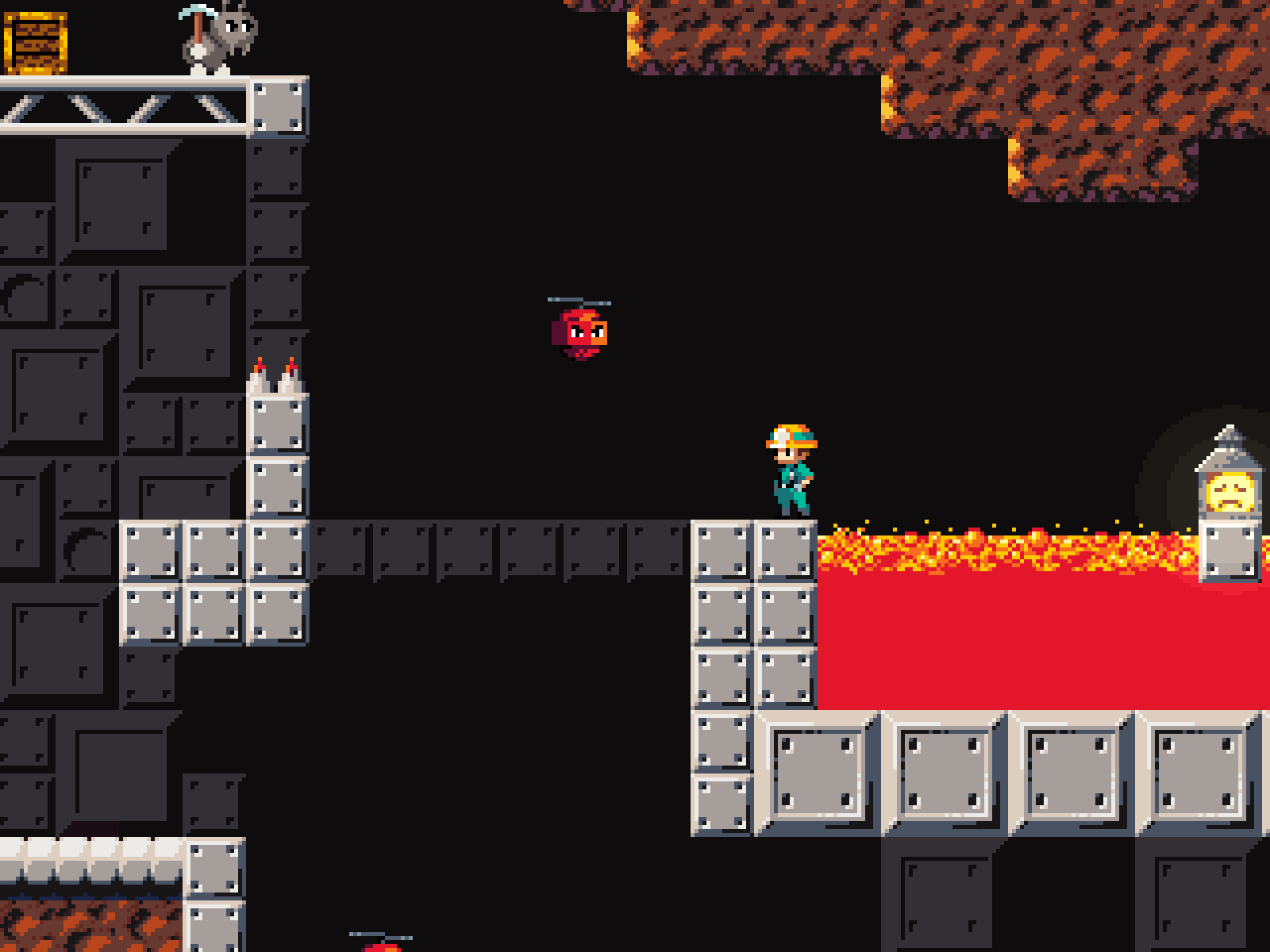
>See my reply to Vesuvius, that was never intended to be cleared by a normal jump. Maybe a bit advanced of a mechanic to introduce in the fifth level. There's actually a similar jump early in the volcanic level across lava, you can just take a shortcut to bypass it though.

I thought this was the only way to do it. I don't think there was any indication or opportunity to discover that you can preserve momentum like that.

>Go to the right from the double-wide fan. There's a horizontal fan that'll push you left towards the lantern. Using the crate is a shortcut.

I tried using the fan a few times, but I couldn't get it to work. It's the first time you come across a horizontal fan, and if you mess up the jump you either go all the way down or die.

>lava jump

The rest of the level was pretty easy, but that one jump is unreasonably hard, again mostly because it's the first time you have to do something like that without being given the chance to get a feel for it in a safe environment.

  • Why can't I use the D-pad in menus? Who uses the stick to navigate menus?
  • Why is there a button to quit the game from the level select screen?
  • Why does B confirm in menus and X go back?
  • The back button on the file select screen is redundant and definitely shouldn't be selected by default.
  • Pressing A before a line of dialogue is fully displayed should skip the animation instead of going to the next line.
  • Needs D-pad movement.
  • Is holding X at the end of a combo supposed to make the character attack again afterwards?
  • Make jump height dependent on how long you hold the button.
  • If you mash A, you can "double jump," but your jump height is reduced.
  • The buffer window for jumping is way too big and the character shouldn't jump unless you're still holding the button when you land.
  • Why does attacking in midair sometimes do a normal kick and kill your momentum?
  • What's with the jittering background? It looks like there's Z-fighting.
  • Hints are drawn above the pause menu. The pause menu should hide the HUD and other UI elements.
  • I don't get why the first boss's bombs sometimes bounce off of you.
  • The boss's spread shot attack feels unfair, because it's not telegraphed at all, and if you're not at the correct distance and/or in the middle of an attack when he does it, you're guaranteed to take damage.
  • Why is the options menu on the level select screen, and why do you have to navigate through the quit button to get to it? I thought there was no options menu yet at first.
  • Checkboxes should always be square to distinguish them from radio buttons.
  • I see comments talking about the other levels, but I just get kicked back to the main menu after beating the first level and the rest remain locked.
  • The Continue button should be the first item on the main menu.
  • Your checkboxes look like radio buttons and there's no way to tell whether they're checked or not at first.
  • Make RMB go back in menus.
  • Leaves can go in front of the HUD and pause menu.
  • I really don't like how the character slides forward after landing.  Try jumping onto the wall from the moped.
  • Pressing S while hanging should make you drop down.
  • You shouldn't be able to stand on bushes.
  • Your collision is too detailed; things like the gates should just be cuboids instead of per-poly. Even the metal bands around the light poles have collision. Collision should be as simple as possible to prevent the player from getting caught on things.
  • The character gets stuck for a moment before grabbing onto walls when standing right next to them. I can't tell if the character collider has a flat top and gets stuck on the little protrusion or if there's something else going on.
  • Jumped up into one of those signs(?) on the light poles and the character started repeatedly grabbing onto something, softlocking the game. Couldn't replicate it, but I managed to get her stuck wall sliding or falling inside the sign multiple times, although I could get out of those.
  • Sprinting needs to make more of a difference.
  • If you jump into an inside corner and hold W, the character will continuously grab or attempt to grab the ledge while floating in midair as long as you're holding W.
  • The "Loading" text doesn't scale properly to 16:10 and stays on screen after loading the detention area.
  • Does this game even need a loading screen?
  • The detention area, shop, and database all have the back button in different corners and with different labels.
  • The UI needs to be keyboard-navigable since the mouse isn't used during gameplay.
  • RMB should go back in menus.
  • The pause menu animations are way too slow.
  • Tried turning down the music volume since the sound effects were barely audible over it, and it muted the music entirely until I restarted the level. New volume doesn't apply until you open the settings again.
  • The character gets stuck when moving diagonally against the edges of the screen. Going over the HUD got me stuck entirely twice while fighting the miniboss, and only then.
  • The HUD should fade out when you're near it.
  • The player's sprite and projectiles should be drawn under enemy projectiles.
  • Reduce movement speed a bit more during slow motion to make it easier to make small adjustments and make it show your hitbox. The hitbox being shown at the start also needs to be more visible and last longer. It took me a while to notice it.
  • Music for the miniboss kept going after beating it. Went back to normal after dying.
  • Typewriter text is too slow to keep up with the voice lines.
  • Make boss intros skippable.
  • There doesn't seem to be any way to replay the level. It just puts me back right before the boss.
  • You can use the homing missiles during dialogue and damage the boss.
  • Too easy.
  • You can't close the game from the main menu except with Alt+F4.
(1 edit)
  • My immediate impression of the controls is that they're kind of awkward. I have to pull my keyboard way over to the right and my hands are too close together. WASD + arrow keys or 8456 would be a lot more comfortable.
  • I don't like how you have to press a button or interact with something again to make descriptions disappear. It should go away on its own and interacting with something else should replace it with the new description. The text also needs to be faster and it needs to be more out of the way.
  • "A thick wall of trees. I'm no Lumber-Jack, I can't clear these." --> "A thick wall of trees. I'm no lumberjack; I can't clear these." https://en.wikipedia.org/wiki/Comma_splice
  • Having two health bars is redundant. If you think the regular healthbar isn't noticeable enough, then make it more noticeable or move it somewhere else.
  • "Reloading" happens when you release the key instead of when you press it—I don't know if holding it is going to be used for something, but actions should always happen on press if possible.
  • I spoiled myself and read that the getting stuck when sprinting diagonally into walls is intentional. It feels like a glitch and is not a good solution to that problem at all. Make the player get stunned for a moment when running into a wall and decrease deceleration when sprinting or something.
  • It takes some time for the character to accelerate when switching to the opposite direction while sprinting, but you can skip it by quickly tapping a perpendicular direction first.
  • Health bars should be drawn above the character. You can't see the health bars of the logs if you're below them. The durability meter also blocks them from the left.
  • Needs a windowed fullscreen option. I don't want to have to resize all my windows every time I close a game.
  • Make RMB go back in menus.
  • The camera shake being much slower than the fire rate of the gun looks bad.
  • Yawing is useless. It's so slow it's barely even noticeable.
  • I still can't keep up with the other planes. I feel like they're way more maneuverable. As soon as I get one on screen it's gone in a second.
  • Needs an indicator to show where your target is when it's offscreen.
  • Camera pitch should be limited to +-90 degrees.
  • The game has no right using this many resources for the level of fidelity. Needs LODs for the terrain and a maximum draw distance for the vegetation (especially those bushes you can't see anyway at a distance).
  • Closed and reopened the game and yawing now suddenly works. Restarted it again and it went back to being slow.
  • When the yaw was actually doing something, the gun was shooting below the reticle and the range was lower than normal. 
  • Shells use local instead of global coordinates; they fall upwards if your plane is upside down.
  • The camera shouldn't switch sides until you've moved a certain distance or waited a certain amount of time. Having it switch immediately gets disorienting when you want to make small adjustments, especially in the air.
  • Signs should be behind the character so that the text faces towards him instead of away from him.
  • Why is there a sign with an arrow pointing towards a collectible in a dead end? My first assumption was that the arrow was pointing towards the exit and that the collectible was in the other direction.
  • It took me a lot of tries to figure out how to get past the spike pit in the second level without taking damage. I thought you had to drop down and hook onto the dirt tile at the edge; make the metal go all the way up. You should also remove the spikes and the ant since it's the first time the player has to make that kind of jump.
  • Spikes should hurt you from the sides, like for example if you walk off the tower above the collectible in the third level.
  • I still hate these enemies that stick to walls and fly across to the opposite side. Getting past them feels like pure trial and error, at least with the way they're used, and if they end up on the wrong side, you're forced to take damage a lot of the time.
  • Again there's an unnecessary ant after the above enemies. Introduce new mechanics and enemies on their own without any other obstacles.
  • The death animation can put you in the goal area and it'll count as beating the level. The transition animation plays again once you're already back on the level select screen.
  • On level 4 there's again some rushed level design pacing; the wall of alternating dirt and metal is introduced at the same time as having to hit a 1-tile ledge, and there's spikes and an ant as well. The shaft at the end that makes you do it again if you miss the next jump seems needlessly punishing, too.
  • The sprite of the wall enemies should show if they're ready to fly across or not. I died because I tried to bait one too early.
  • Broke the crate in the cliffside level and the helmet fell out of the level.
  • That first part of the cliffisde level where you have to do two nearly pixel-perfect jumps to avoid hitting your head on first the enemy and then the dirt above it is incredibly obnoxious.
  • It seems impossible to make it to the platform with the crate in the cliffside level without hooking onto the crate. What are you supposed to do if you fall down after breaking it?
  • Why is the collision for the large fan the same width as for the small fan?
  • The lack of input buffering for jumping before the hook has connected makes the game feel really unresponsive.
  • What's the point of letting you drop down to the ant at the start of the mushroom level? The wall enemy makes it seem like there's something there, and you can't get back without taking damage.
  • Making the helmet in the mushroom level inaccessible after you've broken the lantern is a very strange decision.
  • The hitbox for the ants is a few pixels too wide. The one at the start of the frozen caves shouldn't be able to hit you if stand next to the edge of its platform.
  • What in the hell are you supposed to do here? I don't see how there's any way you could get up there or break the lantern.


>Can you screenshot which door caused the squad to go all the way around?

It was the door north of the bottom right bomb. I'd left my squad at the starting location. I think previews like in Republic Commando as well as a line showing what path they'd take to get there would make things a lot clearer. Having icons at the edges of the screen for off-screen squadmates would be nice, too.

  • I suggested last time to use letters instead of numbers when giving orders, and after having to relearn how to do it for the third time, I'd say it's absolutely necessary. For example, ordering your squad to clear a room is on 5 when hovering over the center of the room, but when breaching a door it's on 4. Making it C for "clear" every time would make it a lot more intuitive and quicker to use.
  • I also still think the orders menu really needs to stop or at least heavily slow down time. Expecting the player to memorize the entire order tree and go through up to six sub-menus when an enemy can rush into the room and kill you in seconds is too much.
  • Warning a suspect from behind should make them much more likely to surrender and not instantly whip around and shoot you.
  • Told my squad to breach a door and clear a room, only for them to go through the room from the other side, gunning down all suspects, and then throwing a flashbang at me.
  • A door being opened should cancel a breach order.
  • Ran out of time several times in the bomb mission, mostly because giving orders takes so long even if you know what you want to do.
  • The clunkiness of giving orders makes it feel like I'm not working together with my squadmates. I'm alternating between clearing rooms on my own beause it's faster and letting them do it with their perfect aim and automatic warnings while I stay out of the way. It almost feels like you're playing two separate games at the same time. I've also never found any use for giving the red and blue teams separate orders, partly because the first team will be long finished with their task before I can finish telling the other team what to do.
  • I see you removed all the books, but my CPU (not GPU) usage is still hovering between 80-90%, and the main menu is still in that range like it was before. Still stuttering. It's definitely not a graphics issue.
  • You should be able to use the D-pad in menus.
  • Get rid of the delay before you can move after going through a door.
  • Those "holes in the wall" behind the pictures look more like scratches.
  • Tomo talks about it rapidly filling up RAM, but for me it went up to 260MB on one try and stayed at 350MB with the occasional spike up to 500MB on another. Still seems high, though.

Still can't play it for more than a few minutes at a time and there's no saving, so I'm not getting much further than that.

(1 edit)
  • Who uses ASDF instead of ZXC?
  • The character should stick to stairs instead of flying off the edge when you walk down them.
  • I think it would be more intuitive to do the dive kick with the attack button.
  • Don't explain what other types of artifacts do until you pick one up. It's just distracting.
  • Movement speed is too high.
  • Air control is way too high.
  • I can't put my finger on what's wrong with the camera movement and don't know how much the player's speed and jumping physics are to blame, but it needs to be smoother.
  • The game crashed the first time I died and when I entered the door after the minotaur.
  • The character's shoes blend in with the environment.
  • I don't like the inconsistent contact damage.
  • Level 1 throws way too many enemies at you right at the start.
  • New enemies should be introduced without any other enemies around so you actually get a chance to figure out how to fight them.
  • Decrease the delay when looking up/down and make the camera move slightly faster.
  • There's too many enemies in general. A significant percentage of my playtime is spent just waiting for these fucking eyeballs to come down/get out of the walls so I can kill them. You need to have some downtime inbetween fights.
  • Get rid of the knockback when hitting the eyeballs so you can hit them twice and don't have to wait for them to come back.
  • Needs coyote time.
  • These elves are bullshit. They attack too fast, can shoot you from three screens away, and have too much health.
  • Elves can shoot through thin walls.
  • It took me more than an hour just to get through(?) 1-1 on Normal. Most of the time I died in the water area with the minotaur and two elves. Game crashed again after going through door after that.
  • Saw the comment below about the running animation; just tie the animation to the character's speed instead of inputs so she stops automatically when you run into a wall.
  • You need deadzones for the sticks. My camera is constantly spinning around.
  • The game somehow maxes out my CPU and causes constant stuttering once it loads the level, and even on the main menu, the CPU usage is about 4x higher than it has any business being. Its unplayable. I don't remember previous versions being like this.

>I can see If can make it an option, I assume hitstop on hit is fine?

The hitstop is fine. I saw you mentioned Hollow Knight as an inspiration, and I thought it was pretty jarring there as well. Maybe add some kind of effect to highlight the player and whatever hit you during the hitstop.

>I had another atk for the shield boss itself(cutted for reasons*), and I guess the boss is the problem? For example adding more type of Options that follow the boss won't solve the issue for you? Another example, if the boss had less life (so you would play phase one just two times) it would be better? My philosophy so far is to have quick but deadly boss encounters, like contra, not marathons like ddp and some touhou.

It's more that the second phase is just a lot more engaging. It can't really hurt you in phase 1 and you're mostly just flying in circles to get it to stop blocking your shots instead of dodging attacks.

I also noticed that boss projectiles don't despawn when the boss dies. Make them do that so you can't die after a boss is already dead.

  • Not a fan of the music stopping when you take damage.
  • Put some concurrency limits on the sound effects, Jesus Christ. Killing that huge swarm of enemies with a bomb in one of the challenges is permanent hearing damage territory.
  • The blue hitbox doesn't stand out great. Maybe add a larger circle around it to make it easier to judge where it is at a glance.
  • The shield boss's first phase lasts for too long compared to the second and is pretty repetitive.
  • The design for the shield boss is really bland. Good enemy design can go a long way in making them more interesting and motivating to fight.
(2 edits)
  • I don't remember if this is how it was last time, but the game is behind the taskbar in borderless mode.  When restarting the game, the window is centered on the bottom right quadrant of the screen. Enabling borderless mode should automatically set the resolution to the monitor's and make the window cover the whole screen instead of just hiding the borders.
  • The resolution doesn't take the window borders into account.
  • When maximizing the window and enabling borderless mode, the window is offset to the left by a few pixels so the left edge gets cut off while there's a gap on the right.
  • Why would I want to adjust my resolution pixel by pixel separately for X and Y? Just have a normal dropdown menu.
  • Make RMB go back in menus.
  • Your ammo should refill when the character puts in the new magazine, not when the animation ends. As it is now, kicking at the end of the reload animation forces you to redo the whole reload.
  • The loadout screen is clunky. Have the selection centered on the cursor, get rid of the "Accept" button, and make the info show up in a separate window by just hovering over the options.
  • You should be able to arrest stunned enemies.
  • Telling a squadmate to throw a grenade at a location should make him move into line of sight first instead of throwing it into a wall and hitting the whole team instead.
  • Opening the orders menu should pause the game.
  • Teammates should automatically arrest suspects if they're close and don't have anything else to do.
  • Add the order to arrest all suspects in a room.
  • Collision for suspects should be disabled as soon as you press the button to send them away.
  • Consider using letters instead of numbers for the orders to make it more consistent and easier to remember.
  • Dead enemies should be visible even if they're outside your field of view.
  • Add a cooldown for grenades so you can't throw two of them in half a second.
  • Add an order to make a squad move to a location and watch a direction.
  • The "move and hold" order doesn't seem to do anything.
  • Teammates should automatically take cover from grenades. Enemies, too, depending on the situation.
  • Add a preview for what route a squad will take to a location when giving orders, and put an icon at the target location after giving an order until it's executed.
  • Allow queuing orders.

>button remapping is finnicky at best

No idea what happened there. It works fine in the editor, and I'm pretty sure it worked in all previous builds.

>I think how to fight properly is not taught well enough.

It'll be explained better once there's an actual tutorial. I probably shouldn't have told players how to block at all at this point, because you can only block enemies with weapons, and blocking isn't very useful against the skeletons due to their range.

>Incorporating mouse movement for attacking is interesting but I don't see the purpose. 

Where you hit enemies and with what type of attack matters. Skeletons, for example, take a lot less damage from thrusts than from cuts, and you need to hit the turrets with overhead attacks or your sword will bounce off the metal parts. Overhead attacks also do more damage, but can only be chained into a thrust, whereas left and right attacks can be chained into each other.

>I think health bars & damage numbers would help a lot.  Especially the latter just to show how much more effective charged attacks are compared to uncharged ones. 

I might add some way to see (very) roughly how much health an enemy has left, but giving the player too much information would go against the intended tone. It's also not really necessary since all enemies should only take a few hits to kill if you're fighting them correctly and it's easy to compare yourself. Also, the amount of layers on the hit marker shows roughly what percentage of your damage went through to show what weapon/type of attack you should use.

>Finally, I suspect you're using ray/spherecasts to detect if an attack should hit an enemy instead of using attack boxes that mimic the swing & kick--there were a lot of dissatisfying "looks like it should've hit" moments.

You can't have locational damage with overlaps. The reason you felt that the kick wasn't working is because it takes two kicks to stagger those enemies unless they're in the middle of an attack. Did you feel the same way with the sword? If so, why/when?


What did you do to clip through the wall at the end? It doesn't really matter since it's just a BSP placeholder, but I can't do it no matter how much I try.

>I don't understand what you mean by that? Do you mean the walking and looking at the moon animation?

Yes.

>I don't understand exactly, like a fast attack right after a dash? because I thought you can attack after a dash, also dashing does a little damage as well.

I mean pressing Z during a dash to attack while keeping some momentum from the dash. It's just something you'd expect would happen and would make the game feel more responsive. I never would have assumed the dash did damage since the character doesn't hold his weapon out during  it.

(1 edit)

>I could maybe magnetize them to player but you can pick them up with your weapon as well, unless it's too deep in the walls.

It kind of breaks the sense of depth and perspective when an item overlaps the walls.

>Do you mean in dungeons or certain specific room? I don't know what's wonky about them but I remember you or someone else telling me something.


The collision extends too far down. You can't pass through doors all the way down to this height, while the character overlaps all other objects. The trigger zone is also too far in; you have to go almost entirely off-screen before it switches screens.

>Genie boss only takes damage from the eye, you can actually spam attack and win fast. His body doesn't have any collusion.

No, I know about the collision. I'm saying there's no way to avoid his projectiles when you're in melee range, or even any way of knowing when he's going to do it. Also, you probably don't want to encourage or enable DPS racing. What's the point of bosses having mechanics if you can just ignore them and stand in place while mashing Z?

>It attacks in a wider area and sends tiny projectiles that goes through shielded enemies. Although I've been thinking about putting something in the game that lets you upgrade the projectiles into something more convenient like sword beam attack. 

Pretty much everything about it needs fixing. The charge time is extremely long; It's just not worth using it when you could do more damage by just attacking normally. A long charge time also encourages a passive hit-and-run playstyle where you wait for it to charge far away from enemies and only get close to hit them once and then back off again. The random spread makes it keep missing; either make the angles fixed or have it home in on enemies. The range is so short and the projectile speed is so slow I'm not sure if I ever managed to actually hit anything with it. The sword hits the enemies before the projectiles and knocks them out of reach.

>Those are invisible enemies, they get visible once you dash through the star spell but the item isn't in the game yet and you need to unlock it from the menu before you die. But there are enemies that's shooting the blue rings so you can hit them even if you can't see them.

That's a bad way of introducing invisible enemies. Put just one or two of them in a room with nothing else to distract you.


Some more things:

  • The animation before the main menu appears should be skippable.
  • Just let me pause the goddamn game. Not pausing while the menu is open adds nothing to game.
  • The pose the character does when picking up an item lasts for slightly too long.

I somehow managed to miss the path to the snow area entirely.

  • Wouldn't let me give the pearl to the guy in the cave.
  • You should be able to switch spells while moving. For example, if I'm moving left, I should be able to press Space and up to switch to the star spell while still holding the left arrow key, and then continue moving left.
  • The page flipping animation should only play once instead of repeatedly flipping to the same page.
  • The frost giant's contact damage hitbox is too big.
  • Some areas are too dark. The woods where the cat is are pitch black when playing in daylight.
  • Sacrificing the fairies to the altar didn't seem to do anything.
  • You should be able to attack at the end of a dash.
  • Don't make it seem like the turtle miniboss is taking damage from attacks if he's not actually taking damage.
  • It's not that obvious when the octopus boss is vulnerable and when he isn't.
(1 edit)
  • The way the ocean on the main menu freezes on two nearly identical frames between waves looks bad.  The water needs to recede more and with more frames.
  • Add a proper options menu instead of just two buttons on the pause menu to change resolution (what exactly does "low resolution" even mean?
  • Pressing X should close the pause menu.
  • Only enable vibration when detecting controller inputs, and disable it again on keyboard inputs. Don't make me unplug my controller.
  • I don't like these shadows originating from the center of each screen. That's not how sunlight works. Why don't the braziers cast shadows?
  • Fade out the HUD if it overlaps the player.
  • If a flying enemy drops an item in a non-navigable location, it should be teleported to the nearest navigable location.
  • Left/right door collision is still wonky.
  • Are you meant to have to use the lightning spell for the genie boss? That kind of attack doesn't really work when fighting him in melee, and there's no telegraph. What if you run out of crystals? Do you expect the player to go farm some more before letting him retry the boss?
  • The HUD icon for the ring is too small to be useful. Add a sound and/or particle effect to indicate when it's ready again.
  • Who's the trickster the water fairy's talking about? Is it the genie? Does she give you the sword just for killing the frogs, or does the dialogue not update?
  • Fade out/fade in subtitles between lines. It helps a lot with readability and ensures that you can't miss when a new line appears.
  • The charge attack seems pretty useless.
  • I managed to keep a charge after letting go of Z, but I couldn't replicate it. I think it happened when I got hit by an enemy.
  • I don't like how the carpet boss's bullets block yours. I just circled around her the entire just so I could hit her. It doesn't add any challenge; in fact, it undermines any attempts at making the boss challenging, because if the bullet density was high enough that you couldn't dodge them in your sleep, you'd never be able to hit the boss.
  • Does the carpet that lets you cross lava need to be aligned to the grid? If you're inbetween two tiles (like you'll always be when entering a screen), it spawns too far to the side for you to cross.
  • Enemies need to move around less. It's really annoying trying to hit an enemy with the long windup when it could instantly change direction at any moment. A lot of the time you end up taking contact damage because the enemy decided to go towards you with no warning.
  • There's no indication that the ring only works with the star spell other than the description. 
  • The walk back to the volcano dungeon is really fucking annoying.
  • Stunned enemies shouldn't cause contact damage.
  • The blue ring projectiles in the room with the laser statue shouldn't be able to spawn right next to you. Sometimes they even spawn inside you and you take damage for seemingly no reason.
  • I ended up leaving and re-entering certains screens until no enemies spawned rather than bothering fighting them.

Couldn't figure what I was supposed to with the laser statue, and the bottle, candle, and item that lets you push blocks all seem to have vanished, so I had to stop there.

  • The jumping is awful. Mario figured it out nearly 40 years ago; don't try to reinvent the wheel.
  • Why is the angle on the fireball random? Getting hit because the game decided your shot should go over the enemy's head is bullshit.
  • The fireball hitbox lingers. Explosion hitboxes should only last for one frame.
  • Depending on how the hay bales spawn, if you destroy the topmost one of the first group, you can get stuck between the two below it. Why do they even spawn in slightly diffrent locations each time you restart? They also sometimes move a bit when the camera does.
  • It's never too early for an options menu.
  • Mouse sensitivity is really low.
  • The jumping is too floaty.
  • I doubt this is how the movement is supposed to be, but the bunnyhopping is way too fast. Also, bunnyhopping where you just mash/hold Space sucks. Implement proper strafe jumping instead. Can't remember exactly how I found it, but there's a working implementation on blueprintUE.
  • Only being to attack while an enemy is enflamed (not sure what exactly triggers that) makes no sense. Not being able to hurt them is one thing, but what prevents the character from moving his arms?
  • Not sure how to kill the shield enemies. It says they're only vulnerable while falling; does that mean while you're falling? That doesn't make a lot of sense. I hit one bunch of times, but I didn't see any indication that it was taking damage and it didn't die.
  • It's hard to test individual mechanics when it throws everything at you at once.
  • Having to wait for an energy bar to refill to be able to attack seems like it'd just needlessly slow down the gameplay.
  • Not sure what the gravity redirecting is supposed to be for. It seems useless for combat, but too unrestrictive for platforming.
  • Where's the download? The web player is trash.
  • Why does the character stop when you press two movement keys at the same time? If you want to change direction, you have to let go of the key you're holding before pressing the new one.
  • It's hard to tell which ledges can be climbed.
  • Movement is too slow.
  • The camera movement when going in and out of throwing mode is too slow, especially when leaving it.
  • Why can you only throw bombs in the direction the character is facing? Just rotate the character if you move the cursor too far.
  • Not sure what changing bomb formation is for, but it's also too slow, and no matter what I set it to, they just go back to the same formation.
  • My camera got stuck at some point while messing with the formations.
  • The bomb explosion is slow and anemic.
  • What's "Herøes" supposed to mean? Why does the Itch page say "Heroes" instead?
  • Motion blur is shit. Get rid of it.
  • How do you get a game that consists of a flat plane and a dozen or so character models to run this poorly?
  • Upgraded my movement speed to 1000, but I still can't get the enemies off my ass for a second.
  • The way you interpolate the yaw makes it so that a 90° turn will take the same amount of time as a 180° turn.  The rotation rate needs to be constant. Also, even with a 2.0 turn rate, it's way too slow (~4s).
  • The camera is too close. It takes less than 2 seconds for an enemy to start attacking you after entering your view.
  • The rocks can block the camera.
  • Attacking is extremely unresponsive. Why do I have to hold down the buttons for half a second before it attacks?
  • Why does attacking use the same energy bar as boosting? Is having an energy cost on attacks really necessary?
(1 edit)
  • The player indicator at the start is even more annoying this time. I know which character is mine when there's only one.
  • Get rid of the pause at the start of each level. It's not needed. It just breaks the flow of the game. Put the level name in the top left instead.
  • Add a restart option to the pause menu.
  • The enemy counter is unnecessary.
  • It took me a couple seconds to realize the L and R icons in the shop were referring to the mouse buttons and not clicking the sticks on a controller. I've never seen anyone do that before.
  • I didn't even realize I died the first time it happened. It just kicks you back to the main menu without even telling you why.
  • Needs a frame rate limit option.
  • The alt fire shouldn't lock you in place. It can slow down your movement, but it shouldn't stop you completely.
  • Items you already have shouldn't spawn in the shop.
  • You enter the dungeon by just walking into the door, but you have to click to leave the shop. Make it consistent.
  • The hitbox on the secondary shot explosion lingers. Hitboxes for explosions should only last for one frame.
  • The player's hitbox is too big. It should be slightly smaller than the model.
  • Bought the book item and my first aid kit disappeared.
  • The alt fire is still useless in combat even with the book. The speed is barely increase and it just gets shot down by enemies even if you try to aim to their side.
  • The alt fire projectile explodes when you complete a level; I hope that can't damage you.
  • If you only have two inventory slots, what are you meant to spend your money on other than health? If you're planning on adding better items that only become available later, then spending money on early items is just a waste of money.

You said you wanted this to be a methodical game that slowly builds up in intensity, but that's undermined by the rogueshite mechanics. Why do you have to suffer through the boring early game to get to the part that's actually challenging every time you die? Instead of a smooth increase in intensity, you just end up repeating the low-medium-intensity parts over and over. It's disrespectful of the player's time, as well. Just make it linear and let me save the goddamn game. You seem to want it to be some kind of puzzle-like type of thing, but like I said last time, there's no incentive to bounce projectiles other than saving yourself from the arduous hike needed to get a direct line of  sight. No scoring system, no time limit, no limited movement, no bonuses from bounce kills. Regardless of what your intentions were, at its current state the game is simply a painfully slow shooter, and that's what people will judge it as.