Indie game storeFree gamesFun gamesHorror games
Game developmentAssetsComics
SalesBundles
Jobs
TagsGame Engines

Shrine Dynamics

37
Posts
73
Followers
4
Following
A member registered Jul 21, 2022 · View creator page →

Creator of

Recent community posts

Thanks for checking it out ,especially considering you beat it 4 times!

Unfortunately there's only a single ending in the current build, with a slight dialogue change after the first ending to hint to the player that it's a 'time-loop', and an extra dialogue option after 3-4 loops that allows you to skip the intro discussion with the elders.

I was planning on expanding the game with more optional endings but decided to move on to other projects for now. I can't say if I'll come back to ATROPOS but it's not out of the question.

(1 edit)

I just finished watching your playthough - I really enjoyed it! I have a few notes that might be helpful for anyone attempting to complete RADIOTOMB themselves - some spoilers below.

  • You can actually destroy padlocks with metal pipes (and by shooting them with the gun)! Unfortunately, it's my fault as the designer that it's never made clear that padlocks can even be damaged. I'm planning on an update to the 'tutorial' section to help elucidate this.
  • There's only a single 'light entity' that stalks you, but more of the 'shamblers' spawn the lower your sanity gets.
  • The kaleidoscope-like sanity effect is actually an indicator that you've reached the lowest level of sanity and lost the game, and it's meant to close the game entirely. The current build has an issue which sometimes causes the animation to fail and requires you to press ALT-F4 to exit the game instead.
  • You can sneak around enemies, and throwing objects will make a sound that distracts them (this includes the 'light entity', but he's a bit smarter than the 'shamblers'). 
  • When not investigating a sound or chasing down the player, the 'shamblers' always follow a set 'patrol' path.
  • You *can* crawl into the vents, you sometimes have to 'crouch-jump' in a bit of an awkward way in order to enter them. Again, apologies that this was never explained.
  • There are many different ways to complete each objective, and the game is almost entirely non-linear - you don't need to enter every room or even open a majority of the doors to complete the main objective.

Thanks again for the valuable feedback, I really appreciate your persistence in finishing the game despite some of the more frustrating elements. I hope you enjoyed your experience overall.

Thanks a lot for making a video, it's extremely useful to me to get high-quality feedback like this!

I really enjoy the nonlinearity of this one - like a sandbox with exploration, resource management, and the whole chemistry system. I think this could be excellent with a bit more time.

I really like your art style, music, and especially animations.

I'm not sure about spamming a button to regain energy as a mechanic - it seems a bit tedious. I enjoy the combat but I wasn't sure how much each special move cost, or if they did different amounts of damage. If the specials are different at all it should be communicated. The UI bar is really helpful at communicating the distances you can trigger the C, M and F special moves, though, which I appreciate. Special moves seem to be a majority of the combat - in that case, some of their animations might be a bit over-long, but I do really enjoy the variety of equipment and animations for each.

The space map is a great framing device for the fights, and the fuel system, with mining asteroids and such, is really cool and fits the 'Resourceful' secondary theme of the jam.

Overall, very good entry.

I consider this game and Rise of the Blade to be 'side-stories'. It's possible I'll take a Mech Encounter game to market, and in that case it will be a complete, singleplayer version of the Mech Encounter (WIP) that I showed off a while back. Thanks for taking interest.

Some initial thoughts:

- Main menu is a bit confusing. Should have options as well.

- When adding turrets to a ship, it zooms the camera to their position, but makes it difficult to know where on the ship it's being placed. I like the top-down view better, but to get back to it you have to click back and then edit turrets again.

- The depth of field is really ugly in my opinion, but I get why it's there. An option to disable it would be nice. The screen dirt, bloom, sharpening and grain are also very overpowering at the moment. I get what you're going for - like a diegetic "camera" - but with post processing subtlety is really the key.

- I don't really like the camera controls. There needs to be a simple orbit button, or the ability to rotate the camera - unless I'm missing it. 

- I like the ship customization - the different turrets and abilities, being able to buy more stuff and upgrade it, etc. For me, that's a large part of the fun of this type of game, and this is a great start. Custom ship name is a nice touch too.

- The combat is pretty interesting, and the gamefeel is pretty good with the camera shake, visuals, and audio.

- I didn't try much of 'Outlaw Frontiers' but it seems like a cool idea. With that and the story mode there will certainly be no shortage of content, which is good.

Overall: Clean up the graphics a bit, make the camera less janky, and you'll have a pretty good game.

Never played this before, so a lot of this will be stuff you've already heard. Hope some of it is useful at least. Initial impressions below:

- Gamefeel is great. You definitely understand how to juice up your shooting.

- Game's audio is quite low to start, but that's probably better than it immediately blasting your ears.

- When killing the little green dudes, I was spooked by the runes that fly towards you. Would be nice if they were somehow more distinct so people didn't mistake them for enemies.

- Render scale is a weird setting to include in a pixel-art game. Not sure if it's for performance or what.

- Art is great so far. I like the smaller sprite sizes. Not sure about the rixels on the runes etc. but I think only devs get annoyed at those. HUD is a bit of a weak spot for me. Could also use a 'dash' animation.

- Destructible environment is great. I love how you can dig with the shield gun, or blow holes in the wall with the rocket launcher.

- Mowing down enemies is extremely satisfying and surprisingly performant. Well done on the optimization front so far.

- It's hard to tell how much ammo I'm about to use when I reload at a glance.

- Really like the progression so far, being able to move freely around a map and then choose the next map to travel to. It's a massive improvement from vampire survivors, as there's significantly more player agency.

- Is there any reason *not* to level up immediately once you've gotten enough points? If there isn't, you should just auto-level the player. - After seeing the "rune interest rate" power, I can somewhat understand this, but I'm still not sure if it wouldn't just be better to auto-level.

- Music is pretty good, although it doesn't play very often.

Overall: The GAME is GOOD. I think this has a very large market, and even with this early version it's very addictive and enjoyable. Keep on it.

A few thoughts: 

- No fullscreen? It would help a lot.

- I really like the art style. It's got a classic feel but the shadows add a lot of detail somehow. Terrain looks good, trees are a bit out of place though. Overall very aesthetic enginedev look.

- Flight model feels pretty good to me - not too difficult or 'simmy' but not super arcade-esque either. I'm not much of a flight sim player so I can't help much here.

- Space doesn't seem to actually shoot unless I'm just not seeing it / not targeted right or something.

- Enemies are pretty crazy, I couldn't get any of them down but I did dodge a missile once. Again, I'm not a flight gamer so I'm not really your audience here, and I can't say too much on the gameplay.

Overall: Nice little project so far. I'm interested in seeing where this goes.

(2 edits)

Just some thoughts while playing:

- Immediately cool concept and mechanics prototype. Awkward controls right now, but I like this kind of shit.

- Holding an apple, it seems strange I can't eat it, but rather force others to eat.

- You can grab static interactable objects like the windows (or, obviously, the ladders) to climb. I think this should actually be a feature - being able to climb on everything would be great. Could modulate it by a stat or something, if you're adding those. Also, I actually kinda like the left click, then right click, etc. climbing system.

- A quick note about the graphics: if you're going to go for the pixelated art style (which I personally really enjoy), you'll want to attempt to make your nearby mipmapping on textures 'linear' or 'nearest' filtered. This will make distant shit look crispier, often times noisy even - which can be mitigated a few other ways while retaining the 'sharp' feel.

- Kinda feels weird that pressing 1,2,3 goes "interact, grab, attack" when the buttons aren't in that order.

- I'm not 100% sure you would need to use both hands for a majority of tasks, especially setting both hands to separate modes, but I suppose it is nice to have the option in an imsim like this.

- I think you've found a good system here with each grabbable item having a single 'special' function. Works pretty well for most things. An inventory would help but I'm not sure how you would integrate it with your current interaction system.

- Aside from many bits of jank, the AI is amazing. The fact that I can ask for what they're holding or give them shit, ask questions about any of the topics I know, fuck with disposition, etc. And that they react to everything, like calling security on you or saying "Are you here to grab me again, creep?", moving stuff around like a broken vent (to presumably repair it?), amazing shit in general, and the foundations for a really good sim game.

- "Airlocking" people or breaking windows is an awesome feature. Wondering if there's going to be some atmospheric simulation like SS13. At the very least, being able to vent specific rooms by hacking into or destroying an O2 control system would be very cool.

- The AI has trouble with stuff like repairing the vent I broke up on the ladder area. Poor bot is having a crisis - he can't figure out how to fix it because he can't climb. Security also doesn't really like stunning me even after telling me I'm going to the brig over and over. After he's already dragged me to the brig, he just keeps telling me that I'm going to the brig over and over, and eventually lets me go.

- Got the rat by luring patti away with a terminal, lockpicking the door to the supply closet (difficult-ass minigame, by the way - probably a good thing), getting the screwdriver, moving the boxes from the pile and unscrewing the panel behind them (I actually love that you have to unscrew each individual screw) without the robot getting too curious, climbed the ladder, grabbed the rat fucker and threw him at patti.

Overall: My favorite game of DD49 so far - I love a good immersive sim and these mechanics are a great basis for a potentially amazing game.

(1 edit)

First time playing so my feedback might not be super useful compared to people who have played for a while. Nobody else was online, so I just explored on my own for a bit.

- A 'play' button next to the chat sound in the appearance settings so you don't have to drag the pitch or change the sound to preview it

- Art style is great. Love the tents and little dudes. Morrowclone esque.

- The little dudes' heads turn a full 180 when you walk close behind them (at least the seated ones in the tent)

- I like that you can spam drugs until your screen is entirely bloom and you float into space.

- Dialogue and the expressions on characters is top notch.

- Loving the tools and movement options.

- The characters and world is very interesting. I like the idea of exploring this weird shit with friends - reminds me of exploring WORLDS and other 'metaverses' after they're abandoned.

Overall: Not much to say other than I like where it's going and I feel like there's definitely a market for this kind of thing. Comfy game.

(2 edits)

Some random thoughts. I didn't read the comments, so I'm sure there's a lot you've already heard.

- Shouldn't switch to SMG every time I pick it up if I already have it. Just give me the ammo.

- Art style is very appealing. As long as you keep texel size consistent it will look great. Only missing link for me right now is the skybox.

- Love the details like the shells and mags you leave behind.

- Movement and shooting feel great. Very solid foundation.

- Enemies should probably hear your footsteps when you're running - you can run around behind the guys in the convience store and they won't notice. Might also give them a higher detection FOV, or modulate this stuff by a difficulty setting.

- Keeps feeling like I need a flashlight - but if you'd rather not add a flashlight for level design purposes I get it. Maybe a very dim point light that follows the player would be good to help differentiate walls when in pitch darkness. You could also make shooting generate a flash of light.

- Death sound is excessive but funny.

- Level design is good so far, I like the way things loop back around on eachother sometimes. I like the variety in encounters - larger, more open areas contrasting with the tight corridor parts. I feel Duke Nukem influence.

- Weapons are all somewhat interesting, but do still fall into the generic "standard boomer shooter" archetypes. I like things like the plasma gun's stun feature, although I'm not sure how often it would come in handy unless there's bosses. 

Overall: Nice entry - I'd like to see more.

Thanks for checking out my demo Tomo.

>I also don't know what Ammo what Gun needs

>I have no Idea what half of the Stuff is supposed to be

You can see more details about weapons and equipment by holding right click on them, it shows their ammo requirement and a description of what they do, as well as some stats. I definitely need to improve this though, I didn't have time to add an 'ammo warning' icon in the mechbay that tells you if a weapon requires ammo after placing it.

Stuff like armor and structure type currently don't have descriptions unfortunately.

>Weapons and other Equipment doesn't show up on your Mech, shame.

Yeah, sorry. That's supposed to happen but I haven't set up the weapon spawning system in a good enough way to be able to re-use it for the mechbay yet, but I'll be fixing that soon with a refactor.

>Its also empty at the Moment which is boring for the Combat, I think it should have some Stuff to cover behind and/or blow up

I'm definitely working towards that. This map is generally just empty as a 'free-for-all' type thing, but most actual missions and instant action maps will have much more stuff to use for tactical positioning.

>Overheating doesn't do anything if you override it. I can easily go to 500% without anything happening.

I think it's tweaked to be a bit too forgiving at the moment, but you can actually stay above 100% for a while due to the RNG. 

When you overheat, all of your component's internal structure slowly takes random amounts of damage, bypassing armor, and doing random critical hits. If you have any equipment - such as heatsinks, or explosive ammo - the critical hits can destroy them and cause essentially a chain reaction. If you're already overheating and your heatsinks blow up, it's going to be a lot harder to *stop* overheating - etc.

>1v1 Combat quickly turns into just strafing around the Enemy in case they have Directionlocked Weapons and firing away in bursts. Don't know if thats intended, but it feels a bit same-y and boring. Maybe better AI and different Terrain alongside proper Team battles instead of only 1v1 could fix this more. Or different Achievements to Win then just destroy the Enemy.

Yeah, that's essentially exactly what I was thinking. I'm going to be adding more interesting mission objectives, more enemy 'roles', like a mech that might hide behind a hill and fire missiles at you, or a scout that harasses you, etc. There will also be ally commands you can give to your team for better strategy, and the maps will be much more complex and less empty. I'm hoping that will alleviate the issue a bit, but we'll have to see. It's going to be a while before all of that falls into place.

Also, if you wanted to play 2v2, there's already an option in the game to enable that if you check the "gameplay" tab in the settings.


Anyway, thank you for the in-depth feedback, I appreciate it a lot.

Thanks for trying it. 

I'm also having issues figuring out how to encourage customization. My idea for a campaign at the moment involves a lot of 'looking ahead' to see what types of enemy and environment you'll be up against, so you can plan and build the right type of mechs for the job.

>an issue I had which I want to point out was that using the automatic weapons overheats my mech instantly whereas auto-lasers and single shot weapons work fine

First thing's first - the game has exactly zero balance at the moment, and I'm waiting until a few more major features are done before I'm going to make any changes. So, it's probably just a lack of balance issue.

That being said, how many heatsinks did your mech have? I do a pretty bad job at explaining heat mechanics in-game, but a mech without heatsinks can only dissipate something like 4 heat per second.
Which automatic weapons were they? Some single-shots like the Gauss Cannon and Particle Cannon generate a large burst of heat per-shot, and some automatics produce very little, such as the Chaingun and Autobeam Laser.

It's going to be quite hard for me to determine what is and isn't a bug with such a large variety of possible mech builds. If you want, you could send me the .mvar file of your mech design, which is located in:

C:\Users\YOURUSERNAME\AppData\LocalLow\Shrine Dynamics\Mech Encounter\VariantData

Either way, thank you again for the helpful feedback.

Thanks a lot for the feedback. It's very useful to have the perspective of someone who's played many mech games in the past.

I'm definitely going to be overhauling the UI many times until I get to a point where I feel it's easy enough to understand. There are already tooltips if you hold right-click on equipment / weapons, but there definitely need to be more, and there's a bunch of areas where the mechbay UI has major failings - like, for example, the game doesn't explain what the different armor types (composite, KREM, reflective, EDA) even do, same with structure type and engines, etc. A lot of this is on my radar, and a lot of development time is going to go towards making the mechbay more comfortable and simple to use, considering it will account for 30-40% of the game.

I'm limiting the size of battles at the moment as anything beyond 1v1 is almost entirely untested, and may lead to performance or weird AI problems - but there is a setting in the 'gameplay' tab to enable 2v2 battles, if you'd like to try that out.

Thanks for checking it out!

(1 edit)

Thanks for checking it out! I really like the fact that you played it on a 4:3 CRT, I decided from the outset to support 4:3 aspect ratios and I even design the UI elements around it.

The prebuilt types are unfortunately kinda shit right now, and don't feature very many of the possible weapons - it's one of the easiest things to update, so I'll try and get some better ones out in a bit.

>it quickly grew stale once I realized it was just circle strafe around eachother until someone dies

Yeah, this is my biggest issue right now, too. My current plan is to add more passive equipment and also some active equipment that you can use for defensive, movement, team support, or further offensive purposes. I'm also going to add maps with better cover, and more complex mission objectives than just "kill everyone".

Additionally, having more complex team formations, both friendly and enemy, may help - I'm planning on some pretty cool 'role' based AI, where you can get for example a missile mech hiding behind a hill, and a scout mech that runs around you to get a target lock so the missilier can blind-fire you. You will be able to, hopefully, tell your AI teammates to do things like this, too. 

I've already noticed the game gets significantly more fun when playing with AI teammates, even if they're pretty dumb. (You can enable the secret 2v2 setting in the menu if you want)

I'm hoping this will get some semblance of strategy out of the current systems. As of now, It's definitely more in an 'rpg' direction of having your stats, all pre-determined before the fight, matter significantly more than your actual performance. I'd like to even that out.

>might be interesting if overheat is affected by the location

It's absolutely going to be!

>might add some strategy if you can customize your mech for a campaign

You'll be able to see a bit about what you're going up against, and the environment before you start a mission. A large portion of the 'strategy' will be planning ahead effectively with a decent build and fitting fireteam roles.

Last thing - there's actually a mechbay tutorial if you press the "help" button in the bottom left of the mechbay, but It's definitely going to be overwhelming to most people, especially if you haven't played a Mechwarrior title. I need to find a way to onboard people into the mechbay better, considering it's going to account for easily 30-40% of the entire game.

Again, thanks for the feedback!

I absolutely agree with a majority of this. Thank you for the feedback.

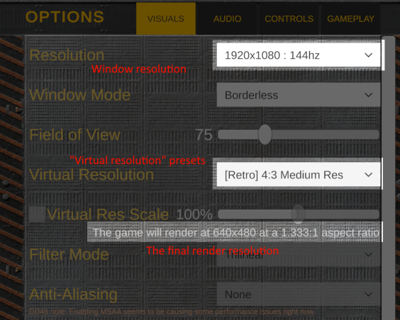
>List actual resolutions instead of just Low/Medium/High

The actual resolution of the game window is modifiable with the resolution dropdown. The "virtual resolution" dropdown allows you to preset resolution / aspect / filter settings. It shows the actual in-game resolution below.

I'm sorry that I really don't explain this in-game, same with stuff like "filter mode", which changes the virtual res upscale/downscale filter, which I added last minute and didn't really think about it making sense.

>Actually, just drop the "retro" bullshit entirely

I agree somewhat, but I'm targeting a specific audience which played mech games in the 90's. All of the [Retro] 4:3 presets were actually options in Mechwarrior 2.

I'm going to be keeping it for "nostalgia factor", and because I've already implemented it and I don't like removing options from the player, but I've been starting to move away from it. The 'welcome' screen that has you pick 'classic', etc. will not exist in the final game, making the retro feature optional and essentially hidden.

>Being able to adjust armor values this precisely doesn't make sense

Armor can be used as 'filler' for when you have, for example, 64t / 70t used by equipment / weapons and want to simply fill the remaining space - that's why it has to be granular like it is.

Unfortunately I forgot to re-add a feature that would have made this make more sense. You should in the future be able to just click a button to 'auto-fill' armor into components, up to the tonnage limit.

>Mechs overheating from firing guns/missiles makes no sense.

I agree, and my original game jam version had each weapon take heat damage separately, but I decided to go back towards a single heat bar because it's a decent enough abstraction and leads to more interesting gameplay decisions. It's not going to be a "strictly simulation" game.

>The TTK is absurd.

You're absolutely right, and the main answer to this is that I have not balanced the game whatsoever, and the default stock designs are shit. If you were to use two particle cannons, you could almost instakill most mechs. I'm not going to be balancing (at least, not much) until I've finished two more features that will drastically effect the balance, otherwise I'll have to do it all over again. Features such as...

>How are you supposed to avoid damage? Combat just seems like a DPS race.

Active and passive equipment should be one solution to this, but I know it's an issue. My other plans are improved maps with cover, team coordination with your battery of mechs, and more complex mission objectives that will hopefully lead to interesting encounters.

>Wish it had actual penetration mechanics

Weapons are going to be customizable with a "tag" system and I'm considering adding penetration so that the gauss cannon can be tagged to become a railgun that goes straight through armor and does high crit to destroy equipment easily.


Sorry for the longform response, once again I really appreciate it - It's difficult to get quality feedback, especially honest feedback, while working on a project like this.

(3 edits)

Password is "aggy"

Please bear with me as I add more info to the page and fix glaring issues in-game.

EDIT: Removed the password requirement

(2 edits)

Hello - I'd like to first say thank you for streaming my game.

I'd also like to apologize for the frustrating controls.

The original intention with the 'hands' was to make a system that completely replaced a traditional user interface - your left hand acting as your 'inventory' and your right hand acting as your 'currently equipped item'.

I wanted to experiment with something unique that also required no 'context-sensitive' inputs. I feel that within the genre of survival horror there is a bit more freedom to subvert control standards.
I intended to cause the player to 'fumble' and feel a degree of stress when frantically attempting to use an item while being chased by a creature.

Unfortunately, as you know, I wasn't able to achieve the careful balance of making the in-game management of items just stressful enough without making the control scheme itself deeply frustrating.
I had very little time to improve on this system - due to the game jam's two week duration - and I had precious little feedback during development. I got so used to the way it worked that I didn't even realize it was obnoxious to use.

As far as the world itself being somewhat confusing - the game is not meant to be completed in 20 minutes the first time you play it. You explore, fail, and repeat until you've learned how to do the entire sequence in 20 minutes. Outer Wilds was a big inspiration of mine.

Regarding the issue where the green key was stuck under planks - I'm really sorry. That issue is something I've known about, but haven't been able to fix yet - ATROPOS is on the backburner for me at the moment.

During the stream you mentioned that you wanted to know how others reviewed ATROPOS. Here's a link to the reviews I received during Cosmic Horrors Jam.

I've also recorded a playthrough for you that includes the ending, if you're still curious. There are multiple ways to complete every 'objective' in ATROPOS, so this is only one way you could have completed the game.

Finally - I'm sorry for causing you such frustration. I hope you gleaned at least some enjoyment from the parts that were playable.
I've been a casual fan of yours since your deep rock galactic co-op with Vinesauce years ago - despite the negative reception, I still really appreciate you taking the time to check out ATROPOS.

-Shrine Dynamics

(2 edits)

SPOILERS BELOW For anyone who is interested in figuring it out for themselves:

To get inside the library, you can either:

  • Throw a rock at the key sitting on the protruding plank on the roof to the right of the library's front door, hopefully causing it to drop, then using said key on the front door itself

Or...

  • Climb up the scaffolding to the left of the library's front door (which requires you to push some boxes around to jump on, and then break a plank half way up the scaffolding by throwing an object or using a dagger, causing a piece of the scaffolding to fall and form a ramp),
  • Enter the library either through falling down a level to the front balcony (taking some fall damage) and entering through the broken window, or landing on the 'side roof' on the right side of the library
  • If you land on the side roof, you can either break the boards covering the hole with a crate sitting on it (by throwing an object or using the dagger) to enter the green key room, or, alternatively...

To get on the second floor:

  • When entering the library from the front door, if you go left up the broken stairs and look straight ahead, you may notice a pile of books on the second floor landing. That pile of books holds the white key - either make a few jumps and try to grab it, or throw something at it until it falls.
  • Now that you have the white key, you can go up to the side roof and unlock the door to the library's second floor.

Hope that explains it well enough. If anyone is interested, now that the jam is essentially over, I could post a video walkthrough of all possible solutions in the current build.

Thank you for a very fair review.
I wanted to mention that the ability to scale walls is unfortunately a bug in this version. I only caught it last night with the help of a friend and haven't been able to release a hotfix - but it should be up soon.

I agree with the other issues you mentioned. Unfortunately, I neglected to get enough proper feedback during development and rushed near the end, resulting in something quite messy that was burdened by only being able to see the game through a single lens, my own. As always, it's a learning process, and I know what to improve on for next time. 

I'm glad you enjoyed.

(2 edits)

Thank you for the in-depth report. I've just released a new version of the game, v1.0.3, that fixes many areas you would get stuck on and improves the character logic to reduce the possibility to get stuck in general, fixes some clipping areas, makes it no longer possible to get stuck in the library, and should fix the arm disappearance bug. Thanks again for the feedback, it's been really helpful.

Hello, apologies for the wait. I have included a linux native build in version v1.0.3, which I just released here. I only had time to test it on Manjaro KDE, but it should function fine elsewhere. If you encounter any issues, feel free to point them out. Thanks!

(2 edits)

Thank you for the detailed feedback.

How did you clip out of the map? What area specifically, if you can remember?

The yellow key should be used by holding it in your right hand and then clicking the left mouse button while aiming at either of the library's front doors. If this is not what you were doing, could you please explain what you spammed before your right arm disappeared?

The issue with the getting stuck on the bookshelves has hopefully been resolved for the next version, and I will release a patch soon after I fix a few more things.

Very nice. I like the visuals a lot - and the puzzles are just the right amount of difficult, making you really think and engage with the game.

Very nice. The traffic light creature is quite original, and genuinely creepy. Being able to see the creature in the rear-view mirror was a great decision. 

Viscera cleanup detail with extra horror. Very cool.

Immersive, atmospheric, and highly interactive. I love the tension of fumbling around with canisters while being attacked by an unknown creature. Excellent entry.

Very nice. I would have preferred if it had more gameplay, but it works on it's own as a self contained piece telling a story. 

The visuals are fantastic - I always love seeing how far you can push this kind of thing and still have something be legible. The smooth 'vision cone' effect on the light was a great choice over a simple point light.

The audio was a particular highlight for me. The directionality of the pickaxe clanging, the shuffling sounds when moving with a broken leg, the music stingers, they were all perfectly done.

Great entry.

(1 edit)

The mech is meant to 'drift' more when the ordnance weight is higher, to make it feel heavier - but it seems like there's a bug that makes it drift the same at all weights, and it's tuned a bit too high across the board. Thanks for pointing it out, I'll fix it for the next update. Glad to hear you enjoyed it otherwise, and I really liked your entry.

Pretty dither and very nice mech models. Simple, fast-paced, and enjoyable combat. I would however recommend that you add a bit of 'juice' to the combat, or else it ends up feeling a bit repetitive. Nice submission.

Visuals are very nice, combined with the audio this really captures the isolated feeling a lot of MW2 missions have. I love the mech models, too, they're very well animated. 

I also really enjoy the differences in how our games were inspired by MW2, the Jump Jets are always great to have, and having a third person + first person camera makes it much easier to navigate, plus the aiming system works pretty well. 

Despite this being a draft, I really enjoyed this.

This is really good. The gameplay feels good, and I like the cyberpunk atmosphere. The collateral damage element, killing people by falling into buildings, is really great too. Also I'm liking the idea of using Dall-E generated textures, that's awesome. Great submission.

I really enjoy the controls being diegetic, and the visuals are clean.

This is probably the best I've played from MechJam so far, and exactly the kind of game I was hoping for from this jam.

 I really like the classic tank controls, being able to look around in the cockpit with the mouse was a great decision. The environment is varied and looks interesting and the mech models are very nice. 

I really like the combat, the mech systems like heat and coolant charges are on point. The HUD being part of the cockpit is very cool, and the low-pass effect is perfect.

This game's aesthetic is excellent, and the water mechanic is really nice. The different biomes having unique sounds and visuals helped a lot, too. I'm also really impressed you managed to fit every secondary theme in. 

Very good. I appreciate the classic mech tank controls, which when combined with the multi-camera layout makes for a very disorienting experience (in a way that definitely suits the horror atmosphere). The multi-camera system is both an interesting gameplay element, allowing you to modify them and drastically change how you have to play, and a perfect vehicle for scares.

I also really like the idea of tornados being some sort of horrible eldrich force.