Thank you for playing.
Those blue extra dash markers are neat but you should make them look more fitting for a dungeon. I'll assume the way they look currently is a placeholder.I actually thought they worked as they are. What do you think would be more fitting look for them?
Yes, I understand menus are still too much. The reason why hearts open a whole window with more options, unlike single click like the magic mirror, is because they also show requirements for lewd content (the kind of things most people don't really test). I am going to cut down on confirmations during the dungeon run.
Likewise there's of course the lengthy introduction and I really think you don't need another confirmation dialog when the player presses the skip button. The player already has to press escape and then click skip, that's more than enough to make sure he's certain he wants to skip.but what if the player pressed skip button on accident?... yeah, you're probably right about that.
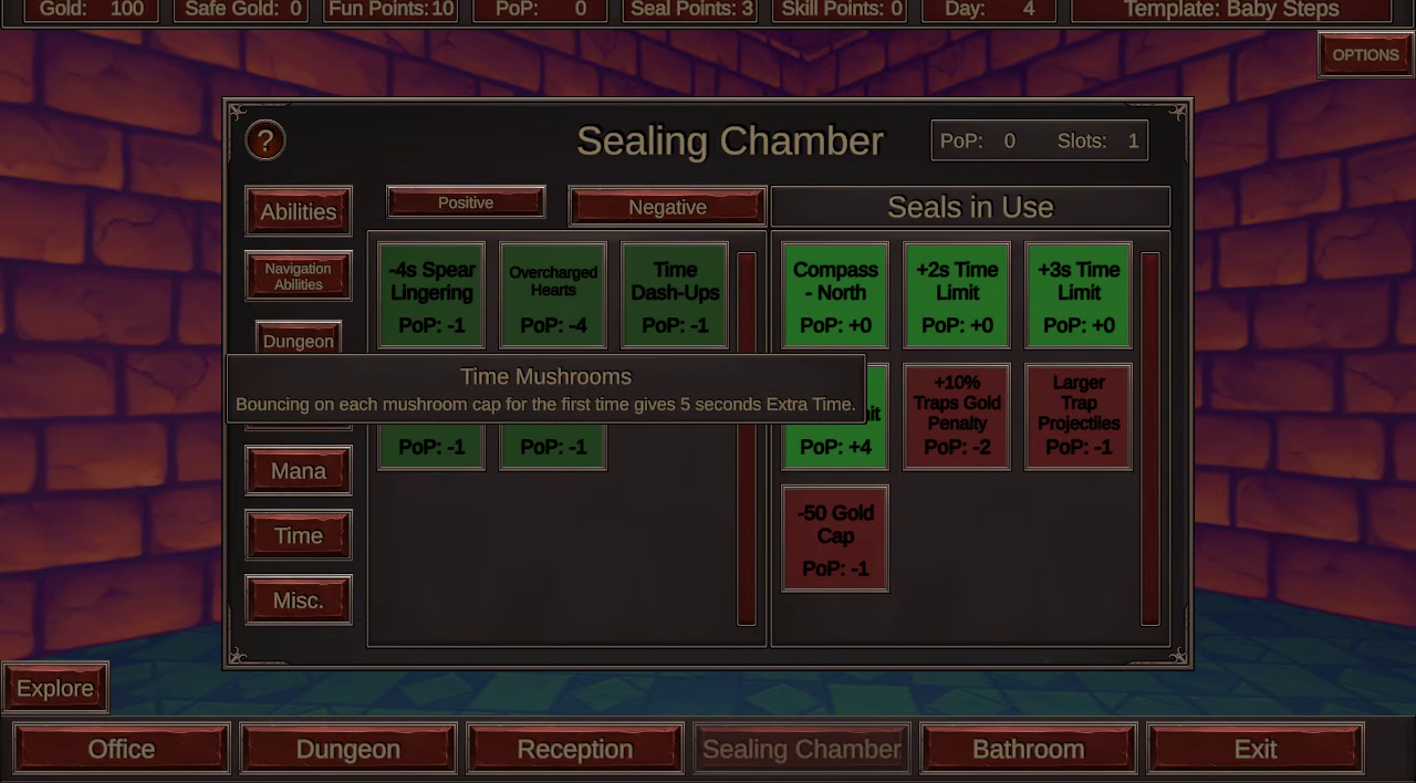
Seals are cool. I always like systems like that in games because they add a ton of replayability but you need some descriptions on them. I have little idea what half of them are supposed to do.
You hold right mouse button while hovering over a seal to show its detailed description. Not sure if you missed me explaining that, or you thought some of their descriptions were not enough.


