The new dash feels far better. Good improvement there.
Thanks for adding that crouch option.
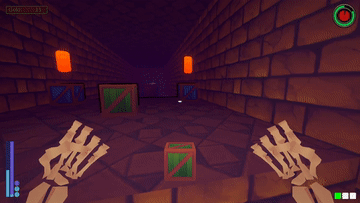
I like the new dungeon layouts. Those blue extra dash markers are neat but you should make them look more fitting for a dungeon. I'll assume the way they look currently is a placeholder.
Menus are still too much, but you've heard that all before. I'll still urge you to at least minimize the menuing while in the dungeon. There's something really grating about frantically running through there because you're on a timer and then having to click through a few fullscreen menus when you get to a gobbo or the exit. Just doing it like the mirror where it's a single key press should honestly suffice. Just don't press the E key if it's not the right gobbo or you don't wanna leave bro. No need to ask for confirmation twice.
Likewise there's of course the lengthy introduction and I really think you don't need another confirmation dialog when the player presses the skip button. The player already has to press escape and then click skip, that's more than enough to make sure he's certain he wants to skip.
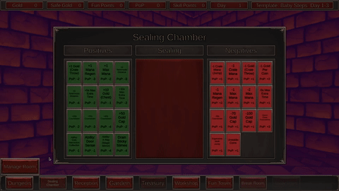
Seals are cool. I always like systems like that in games because they add a ton of replayability but you need some descriptions on them. I have little idea what half of them are supposed to do.
The dynamic difficulty seems fine. I like that it prompts you instead of just changing it behind the scenes.
Those blue extra dash markers are neat but you should make them look more fitting for a dungeon. I'll assume the way they look currently is a placeholder.
I actually thought they worked as they are. What do you think would be more fitting look for them?
Yes, I understand menus are still too much. The reason why hearts open a whole window with more options, unlike single click like the magic mirror, is because they also show requirements for lewd content (the kind of things most people don't really test). I am going to cut down on confirmations during the dungeon run.
Likewise there's of course the lengthy introduction and I really think you don't need another confirmation dialog when the player presses the skip button. The player already has to press escape and then click skip, that's more than enough to make sure he's certain he wants to skip.
but what if the player pressed skip button on accident?... yeah, you're probably right about that.
Seals are cool. I always like systems like that in games because they add a ton of replayability but you need some descriptions on them. I have little idea what half of them are supposed to do.
You hold right mouse button while hovering over a seal to show its detailed description. Not sure if you missed me explaining that, or you thought some of their descriptions were not enough.
What do you think would be more fitting look for them?
Dunno, maybe just make them look more magical lol
The reason why hearts open a whole window with more options, unlike single click like the magic mirror, is because they also show requirements for lewd content (the kind of things most people don't really test)
Probably because that lewd content just isn't there yet. Guess we might have to withhold judgement until then.
Not sure if you missed me explaining that
Yeah, I must have skipped that. Seems like an odd place to put the descriptions.
Thinking about it, I feel like all my criticisms of your game just boil down to me really liking the core gameplay of the dungeon runs and literally not giving a shit about anything else. Your game probably just isn't made for people like me. I do feel like the two aspects clash a bit though, even if you're into both.
I mean the game is mainly about dungeon runs. What you do in the hub is just spending your resources, and preparing for the next run. I cannot see how those clash with each other, but thank you for your feedback.
I find this game a bit prickly. dungeon running is dope, and this objective of seeing a face then trying to find it is fresh and novel, I like it. But everything outside of the dungeon running eeeh, even skipping it takes a while. and it seems like it's at least mildly important even though I sort of can't stand it
oh yeah and little things you can grab to get extra time whilst in the dungeon, that's good too. hard time limits are a bit crap I think
Thank you for playing. I am aware many players dislike time limits in general. I am going to try balance beginner dungeons so they don't feel too hard for new players.
But everything outside of the dungeon running eeeh, even skipping it takes a while. and it seems like it's at least mildly important even though I sort of can't stand it
Did you mean the general hub experience? Could you elaborate on which parts you cannot stand?
I gave Goblin Resort a nice long playthrough. I think I clocked in somewhere around 90 minutes, which included some breaks for me to take notes and such. Since I reviewed the game before, I'll focus on the new things and your improvements.
For this playthrough, I went through the movement tutorial, dungeon tutorial, and the first 5 days of dungeoneering.
Anyways, to start:
Movement tutorial isn't particularly complex, mechanics wise. I think the weirdest bit you have is the different jump types, and even that is not that weird. I think you can basically trim everything down to just the crate types, jump types, and the difficult jumps. Keep the one the streamers struggle with, I think that's the most important part of the tutorial. Things such as walking over gaps, crouching, bouncing over boxes, etc. can be condensed into 1-2 rooms (or as few as possible), since most people will know the basis of these mechanics (if you've ever heard of Mario, you will understand how bouncing off a thing works)
I think you can easily combine the dungeon tutorial, and just have it begin at the end of the movement tutorial. Really, the only important bits of it is "see heart -> find matching guest -> leave". Have a goblin at the end of some parkour jump, a tip saying "remember her face", next room is a heart room, explain what it goes, player walks back to guest, matches, leaves, bam.
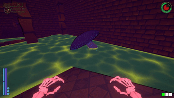
So, tutorial done. Off to a dungeon. First dungeon absolutely slaps my shit. The very first room I encounter (apart from the start room) is a mushroom/goo room, with the mushroom being in the middle of the room encouraging me to bounce off it. I miss it. Twice. at this point my run is destroyed, but I press on. I'm sure you have some system of "only do X rooms on Y difficulty", but that room is a nightmare for a first player. In general, I think the goo is crazy punishing. Landing in it, with no mana and no nearby vine means your run is over and you may as well ignore searching for guests. I think it calls for a number tweak, i'd personally make it 50% power, but I'm also dogshit at these games. Anyway, moving on to the next room, a simple room, no issues there. Door at the end, cool beans. Open door, and another goo+ mushroom room. This one is U shaped, with 2 mushrooms and spikes. It's actually mean how hard this chain of rooms is, and I ran out of time when going backwards after clearing this room (the mirror was in the following room). Anyway, the run failed, off to day 2.
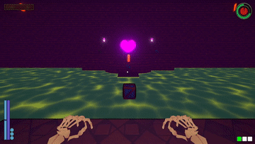
Day 2 dungeon was a bit easier than day 1, but again I got griefed by a mushroom+ goo room, this time the one shown in your first gif - 2 shrooms and some pillars. It wasn't as bad but it slowed me down to the point that I needed one extra second or so to reach the exit. anyway, during this run I had time to find a guest and the mirror. The guests bounce around! Adorable. Anyway, I went to match them, and I don't like that I need to go through two checks to match. I think that no matter what, you should only get one popup, along the lines of "Match Guest to mirror? Yes/No/I dont want to match". I noticed that you have a lot of popups that serve no purpose except checking, even in cases where its not needed. Another example is when I did all the quests (found mirror, matched guest, reached exit) and on the exit door, a prompt asks me if I want to proceed. I think this should only appear if something major is missed (no mirror/no guest), because otherwise you're confusing the player by showing them this. They'd think they have missed the main objective or something, instead of being positively reinforced for having done everything.
Anyway, my main takeaways are the following:
>Merge the tutorials into one
>Start the gameplay as soon as possible - probably worth to have some small, set "introductory" dungeons that tie in to the story. Just "oh go to the 2nd floor and get this thing for whatever", and it's just a difficult jump, or an intro to water, etc. Don't make them tutorials, but more like tiny challenges that slowly showcase the difficulty of the game in a safe, not timed (or leniently timed) environments.
>Your menu looks much better than before. Keep going - simplify everything as much as you possibly can. At this point I'm used to it, but I'm sure a brand new player would still get faced with a lot at once.
>Consider having Shift-running be the default speed, and toggling shift or something could slow you down instead. I didn't see many reasons to walk instead of run (perhaps those are shown later or I missed the rooms that highlight this?) so it feel like running should be the default.
>Room balance. I assume you have your prefabs marked as easy/difficult or something, but it can use more fine tuning. I think it's a mistake if Dungeon 2 is easier than Dungeon 1, but sometimes RNG just works that way - I mean it happens all the time in my game. I still thought I should point this out, though.
Thank you for the detailed description of your experience. The tutorials used to be one part, just like the stand alone one on the title screen, but people were suggesting dividing them into smaller sections, and I also split them with the story, so that feedback gives me mixed feelings.
I will look into removing rooms requiring mushrooms from the first 1 or 2 templates.
You are not always required to use mushrooms, like the room with a mushroom in the middle can be progressed through with using your jump abilities or dash instead. Same goes for the u-turn room. Bouncing on mushrooms is pretty much required when you play with no mana, but other than that I give players freedom to move in different ways.
Another thing makes bouncing on mushrooms different is if you use sprinting, or not. I can see why those rooms can be too difficult to new players, and need to be removed from beginner rooms. On the other hand I don't want to just have only boring, flat rooms left (I want to show off the cool rooms as soon as possible, damn it), but I see introducing them later is going to be needed.
I will add more checks to only show the "are you sure?" messages when it makes sense.
Sprinting as default running speed is probably a good option to add, not sure abut making it default thou. I did add option to make shift as a toggle so players wouldn't need to hold it. I personally prefer holding it, and releasing for all the extra control.
Your menu looks much better than before. Keep going - simplify everything as much as you possibly can.
Any ideas on how I could make it less overwhelming? UI is always a struggle.
Reduce submenus and combine them into one as much as possible If no reduction is possible, group things together and show that group on the menu (such as: "Dungeon Stuff" contains the start dungeon submenu, all the modifiers, etc) Hide the things you have no access to (or heavily gray out the buttons) Don't give player the ability to edit the UI until you're sure they're ready for it Show don't tell: remove text boxes telling you how to use the UI and instead have the player learn from objectives (this is hard to do) Example: Instead of clicking a submenu and having a textbox appear and say This is where you do X, have a popup while you're doing something somewhere else telling you "Hey go do this. It's in X menu, it does Y" and leave it at that. Highlights around a button in a strong obvious color when the button wants to be clicked for progression reasons, or if it unlocked. Think of a blinking red button from the movies - you need to steer the player's movements when your UI is huge.
Your inspiration should be modern releases. They have soulless, but incredibly functional UIs. A player is NEVER getting lost in a modern release's UI, and it's not because they're not complicated. Just make sure to keep the soul!
Reduce submenus and combine them into one as much as possible
I added more submenus because that was the only solution I came up with for decreasing the amount of information displayed at the same time.
Hide the things you have no access to (or heavily gray out the buttons)
Don't give player the ability to edit the UI until you're sure they're ready for it
Yeah, I got some ideas for adding an option for hiding all the yet to be unlocked locations from the office.
Highlights around a button in a strong obvious color when the button wants to be clicked for progression reasons, or if it unlocked. Think of a blinking red button from the movies
I added blinking "!" on some buttons, but I guess that was not enough.
Your inspiration should be modern releases. They have soulless, but incredibly functional UIs.
Yep, my ui is basically homm3 ui if it had text instead of all the nice icons. I might need to add placeholder icons after all.
Linux version. No crashes or slowdowns to speak of.
When the standalone tutorial mentioned a “Crouch Jump” I tried jumping and crounching mid-air as I was taught in Half Life tutorial. No biggie though, I figured it out. The ambiguity of what a “crouch jump” is just might lead to some confusion for boomers like me.
Movement feels good. I suck and had a bit of trouble moving fast enough to finish the level objectives, but I got better. Overall, time limits just aren’t my thing.
I tried jumping and crounching mid-air as I was taught in Half Life tutorial.
Semi-secret mechanic spoiler: you can in fact crouch mid-air, and use air jump to get more height from it if you are fast enough.
I used to explain all the crouch jumping in more words, but people kept telling me to cut down on words. Out of curiosity, what would you call it instead now that you know how it works?
It's good you got better. I want players too feel like they really get better by getting used to rooms, mechanics, and figure out the most efficient ways of progressing.
Overall, time limits just aren’t my thing.
That's understandable, I imagine that is the case for most people. Time limit gets easier later when you unlock different seals, especially time ones, but also others. I try to balance it out by changing dungeon templates of course. There is also going to be other meta progression added to the game after I introduce skill trees, which should also make the time more manageable in future.
Played through to day 20-something. It was fun, but man, did it kick my ass.
Gameplay:
Solid tutorial.
I also appreciate the ability to keep the tutorial for the individual rooms on. It was a bit of an information overload.
Hold crouch should really be default with how often you have to switch.
It really really really needs a slide mechanic. It hurts my soul every time I go from sprinting to crouching and lose all momentum instantly.
The difficulty ramps up way too fast for me. I wasn't able to even find the magic mirror within the time limit most of the time, but it was still throwing more and more complex dungeons at me. At least make it count succesful dungeon runs rather than just days when it forces you to upgrade.
Or maybe have the seal that disables the timer be on by default. It's really stressful for newbies.
There's a tab in the reception called "roleplay" but I couldn't figure out what it does. Idle animations for the guests in the dungeon? Or is it not implemented?
I encountered a single bug: After a failed dungeon generation, it let me start a run, but it just spawned me in a void, falling forever. It can't have been completely empty - I saw some arrows from a trap off in the distance falling alongside me - but I never saw any level geometry. Also, the timer didn't start. I was able to abort the level through the menu just fine though.
Story/writing:
Very slow start. Please condense the cutscenes. There's like four before your first real dungeon run.
I don't know how weeaboo you're going with this, but the Shop Keeper going "ano..." is maybe a little much for a game in English.
Audio/Video:
Love the music.
The rooms could stand to have some vaulted ceilings imo. Things feel a little too boxy atm
The "boing" sound effect better not be a place holder, because it's great.
The use lever animation sounds like the Boss is snapping his fingers, but it looks like just finger guns with no snap.
Played through to day 20-something. It was fun, but man, did it kick my ass.
Wow man, thanks. That's a lot of playtesting.
Hold crouch should really be default with how often you have to switch.
The idea for crouching is to slow you down to offset its benefits e.g. most jumps from ground where you would use one air jump could be dealt with crouch jump + ledge climb.
It really really really needs a slide mechanic. It hurts my soul every time I go from sprinting to crouching and lose all momentum instantly.
You can still dash while crouching. You really shouldn't be walking while crouching too much with how slow it is. I will see playtest if maybe I can keep the velocity.
The difficulty ramps up way too fast for me. I wasn't able to even find the magic mirror within the time limit most of the time, but it was still throwing more and more complex dungeons at me. At least make it count succesful dungeon runs rather than just days when it forces you to upgrade.
Damn, I thought this update addressed that well. You get put on harder difficulty based on either collected gold, fun/lust points, and eventually days. After you unlock more templates for randomization I don't expect players to succeed every run. Some templates require more planning, and different tactics. At what day did you feel the difficulty ramped up by a lot? Any specific templates you found much harder? Did you always refuse to amp up the difficulty?
Or maybe have the seal that disables the timer be on by default. It's really stressful for newbies.
Are you talking about the Unlimited Time setting in Dungeon/Time? The only downside of using it in current version is it makes you collect far less gold, and it costs gold too. Maybe add a reminder message telling players they can use it? Make it free for more days?
There's a tab in the reception called "roleplay" but I couldn't figure out what it does. Idle animations for the guests in the dungeon? Or is it not implemented?
By default, if you hold right mouse button on some ui elements, like that "roleplay" button is going to show you tooltip explanations. There is an option in settings to make tooltips show up automatically on hover after some time. To unlock the "Roleplay" tags you need to unlock higher tier in fun/lust tower. And yes those tags act as requirements for different idle animation, or at least will be in future when I add content beyond placeholder models.
I encountered a single bug: After a failed dungeon generation, it let me start a run, but it just spawned me in a void, falling forever. It can't have been completely empty - I saw some arrows from a trap off in the distance falling alongside me - but I never saw any level geometry. Also, the timer didn't start. I was able to abort the level through the menu just fine though.
Thank you for reporting this. It shouldn't let you to start if the generation failed, so I must have broken it at some point. Your description helps me narrow it down. By the way do you remember which template you were on when the generation failed? I am asking because it is possible my template rules were too restrictive, and I didn't have needed rooms for the generation to complete. I hope the failed generation happened only once.
Very slow start. Please condense the cutscenes. There's like four before your first real dungeon run.
I thought the inbetween tutorials break them down well. I actually cut down a lot from my inidial drafts, so I am out of ideas what else I could cut out. I am open to suggestions. Maybe if I add visuals it wouldn't feel so long?
the Shop Keeper going "ano..." is maybe a little much for a game in English.
I do try not to be too weeby, but it was hard to help myself. What would you replace it with anyway?
Love the music.
That's great. I went with 3 different songs for runs to see which type would work best, but I think most people feel they all work, so I am happy.
The rooms could stand to have some vaulted ceilings
Yeah, it's mainly because the generation has every room essentially in a box, and I tried to maximize their sizes without changing them to bigger room types. I will see if I can change some of the rooms ceilings where it wouldn't change platforming. It was also jarring to me when every room had differently angled ceilings after put together in the dungeon, so flat ceiling were to keep them consistent.
The "boing" sound effect better not be a place holder, because it's great.
It grew on me too. I have no idea what I would replace it with.
The use lever animation sounds like the Boss is snapping his fingers, but it looks like just finger guns with no snap.
Yeah, that was me basically trying to get away with not animating all the fingers by having a sound cue. Maybe I should have Boss going "pew" instead, because so many people said they love finger gun.
That helps from a game balance perspective, but on a visceral lizard-brain level it just feels really bad to instantly lose all my momentum.
At what day did you feel the difficulty ramped up by a lot? Any specific templates you found much harder? Did you always refuse to amp up the difficulty?
I accepted the first one I got (don't remember the specific day) because I didn't know what I was in for, but then I started getting overwhelmed and rejected the rest. I'm not gonna lie, I got a little tilted when I'd fail a run due to something like getting stuck in a huge vertical room for 30 seconds and being unable to get out, then having the game ask me if I wanted to make it more difficult.
It shouldn't let you to start if the generation failed, so I must have broken it at some point
Well, it didn't let me start after it failed; it asked me to click a button to retry, and then it said ok, and then it failed. Come to think of it, I think I tabbed out of the game to make a note of it while it was generating, which might have caused it?
I think it must've been Baby Steps+ or ++.
Maybe if I add visuals it(the cutscenes) wouldn't feel so long?
Giving it some thought, I think the main thing is that you have to go through them
Line
By
Line.
Maybe if you structured it more like a comic panel or full page instead it'd feel a lot faster?
What would you replace it(ano...) with anyway?
If in doubt, go with uh, um, uhm, er, ah, or eh.
Maybe I should have Boss going "pew" instead, because so many people said they love finger gun.
I thought he was supposed to be doing a snap into finger guns, which seemed completely appropriate. I think a single extra keyframe in the animation where he puts his thumb and middle finger together before the index reaches full extension would do the trick.
Alright I will see about the momentum, and of course try to fix the failed generation bug.
I'm not gonna lie, I got a little tilted when I'd fail a run due to something like getting stuck in a huge vertical room for 30 seconds and being unable to get out, then having the game ask me if I wanted to make it more difficult.
Yeah, I can see where you are coming from.
The text goes line by line, because I plan for artwork to change after every line. So they are like short speech bubble that characters always react to. I guess I will need to add the visuals first to see if that works.
If in doubt, go with uh, um, uhm, er, ah, or eh.
I thought people hated those.
I will flesh out the animation. Thank you for all the feedback
Reached day 5 (bath unlock) so far, I'll do an edit if I discover more:
Great tutorial, everything is well put together. Only sore note it's the very start with that looong conversation, It's funny but too long. Ihmo in the beginning let me play asap.
Audio levels are fine, music choice too.
I like dungeon mode a lot, second difficulty tier feels harder. I encountered a vertical water corridor that wasn't connected to any other room up or down; dunno if it's a bug or a clever trap to lose time.
Ihmo resort management needs more streamlining. The game is dense, maybe too dense. You cleverly introduce a new location each day, but after a while it feels overwhelming because I don't have time to adjust for new mechanics.
Thanks for playing. I don't have any idea how I could make those conversations shorter to put the player right into action. I thought just having skip option would be enough, and 2 tutorials inbetween cutscenes would give break to the whole reading.
I am glad to hear people are happy with the audio, and music choice so far.
I encountered a vertical water corridor that wasn't connected to any other room up or down
I can only guess which room that was, because I made multiple rooms with vertical water, but there should be no "dead ends" on that template. As in that room should have an entrance, and exit. Now if the water was necessary to get to it is a different conversation.
Ihmo resort management needs more streamlining.
After you unlock the bathroom, the game loop should go like this:
come back from the dungeon
unlock seals if you got any seal points
change seals if you want
spend gold/put gold in treasury
go back to the dungeon
I don't know how you would like it to be more streamlined. Are you suggesting it should take more in-game days to unlock those hub locations?
I don't know how you would like it to be more streamlined. Are you suggesting it should take more in-game days to unlock those hub locations?
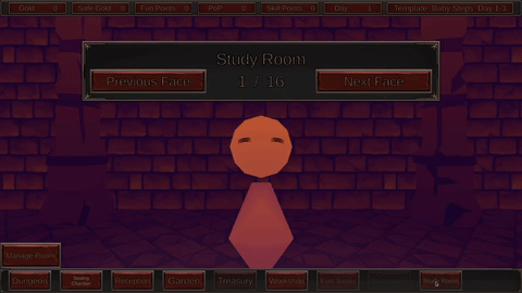
I thought of that(and I agree that demo pacing and real game pacing can differ), but the problem is deeper than that. When I open the office its a nightmare (as a new player) because there are fifteen location, aka a ton of buttons. Same thing for the seal menu. Both give me this sensation:
This sensation ihmo is the big problem with your game. I suggest you to check a game from akabur, there too there is a lot of stuff, but it's not intimidating.
Well, the addition of the office was supposed to fix that i.e. moved all the location buttons to one place, so that the bottom bar can be less overwhelming. The only thing I can think of to improve it is hiding more buttons by making players scroll down, but then I risk them just missing them.
No clue how the sealing chamber can be made so less information is displayed. Which akabur game should I check out?
By the way, I thought that photo was cool, but I get what you mean.
The photo was a classic way to imply "confusion by data overload".
The problem is not to have less info, but making it visual, "gamy". FUN. The clarity you have now is very good, but its an excel spreadsheet. You need to make the spreadsheet fun. The seals could have different shapes/ colors; the office and locations could be a "real" place in the world via map, and every location has an actual building icon that you can memorize by shape and placement in the world map. Akabur games are simpler(in a broad sense they are just an excel spreadsheet game/ vn) and are structured like that. About akabur, I won't get into that because fans can kill (I personally like princess trainer and four elements, because I like the characters). There is an H game general on vg you can ask for more info.
To conclude, I'm a function over beauty guy myself, but we need to accept that games mostly sells for art/presentation. Ihmo if you work on the art side of your project in a few months you could open a patreon and chill.
Yeah, my plan was to eventually get someone to make UI for me, because that's really something I am not good at. Trust me, I would love to have many different icons, and flare.
There is an H game general on vg you can ask for more info.
I had no idea. I will need to take a look. Thank you
Played this a couple demodays back so I skipped the tutorials, got to day 6. The progression felt better than before, though it's hard to say whether that's due to it being better or for having played it before. At any rate, my success rate was higher and I didn't have much frustration at the challenge. The sound levels are fine as they are. Having the quick UI be empty from the start is a good choice I think, it allows the player to not feel overwhelmed from all the locations at once.
I don't know if this was the case previously, but the way negative seals go from + to - feels wrong and pointless to do, vice versa for positive seals. I can't see any reason to make them switch their sign on equipping them. It also doesn't make sense since negative seals DO increase your PoP, not drain it on equip. At best it's distracting and at worst it could potentially confuse a player. Though to be fair there could be a decent reasoning and I'm just not seeing it.
Thank you for playing. It seems you are happy with most changes.
As for the seals my logic is this:
The negative seals are called negative because they are negative modifiers, not because they deduct PoP. In your screenshot clicking on "Larger Trap Projectiles" would give 1 PoP, but removing "+10% Traps Gold Penalty" deducts 2 PoP. Basically the + and - shows what it is going to happen to your PoP after clicking the button no matter if it's a seal in use or not.
So that's my reasoning. I am open to suggestions on how I can improve it.
I can see the reasoning now. I suppose the reason I felt so weirded out by it is that it looks like a static stat on a card, not a changing transaction cost/benefit. If I were to do it, I'd probably do something like
a). Keep signs at default (negative seals are +, positive seals -), and add a floating then dissipating red(-) or green(+) text that states the effect on the current PoP. ie Negative seal with +2 on it is equipped. When sent to the other side, red text with 'Current PoP: -2' would show.
b).Instead of just 'PoP: +2' on a negative seal, it would be 'Provides(\n)PoP: + 2' which would make it unambiguous and let the player just math it out in their heads when they equip or unequip it.
Thanks for suggestions. I just thought I could drop the +- symbols, and have players memorize the difference between positive and negative seals. I should be cutting down on text so b) would not work.
I am bad at UI, making it read well has been challenging, so I appreciate your feedback.
I was able to make the woman my dreams. She had a slender stick body, and a melon for a head. She could scare away crows with ease. And her face, was so motherly, it put me at peace.
I mainly need feedback on the new “adaptable” difficulty curve (let me know how you progressed), ui changes, and audio (do songs feel right, are audio levels even throughout the game).
For those who don’t care for testing the changing difficulty from the start of the game, there is new cheat code “AGDG DD48”
You can input it in the text field in Hub -> Dungeon -> Seed Options, and pressing enter key.
The cheat is going to skip one last text cutscene, give you 100 Gold, 10 Fun/Lust Points, 11 Seal Points, unlock some hub locations and skip to day 4, which should make it quicker to see UI changes.
If you have any other feedback, or general thoughts, or just want to let me know what you think I greatly appreciate your comments.


Comments
The new dash feels far better. Good improvement there.
Thanks for adding that crouch option.
I like the new dungeon layouts. Those blue extra dash markers are neat but you should make them look more fitting for a dungeon. I'll assume the way they look currently is a placeholder.
Menus are still too much, but you've heard that all before. I'll still urge you to at least minimize the menuing while in the dungeon. There's something really grating about frantically running through there because you're on a timer and then having to click through a few fullscreen menus when you get to a gobbo or the exit. Just doing it like the mirror where it's a single key press should honestly suffice. Just don't press the E key if it's not the right gobbo or you don't wanna leave bro. No need to ask for confirmation twice.
Likewise there's of course the lengthy introduction and I really think you don't need another confirmation dialog when the player presses the skip button. The player already has to press escape and then click skip, that's more than enough to make sure he's certain he wants to skip.
Seals are cool. I always like systems like that in games because they add a ton of replayability but you need some descriptions on them. I have little idea what half of them are supposed to do.
The dynamic difficulty seems fine. I like that it prompts you instead of just changing it behind the scenes.
Thank you for playing.
I actually thought they worked as they are. What do you think would be more fitting look for them?Yes, I understand menus are still too much. The reason why hearts open a whole window with more options, unlike single click like the magic mirror, is because they also show requirements for lewd content (the kind of things most people don't really test). I am going to cut down on confirmations during the dungeon run.
but what if the player pressed skip button on accident?... yeah, you're probably right about that.You hold right mouse button while hovering over a seal to show its detailed description. Not sure if you missed me explaining that, or you thought some of their descriptions were not enough.
Dunno, maybe just make them look more magical lol
Probably because that lewd content just isn't there yet. Guess we might have to withhold judgement until then.
Yeah, I must have skipped that. Seems like an odd place to put the descriptions.
Thinking about it, I feel like all my criticisms of your game just boil down to me really liking the core gameplay of the dungeon runs and literally not giving a shit about anything else. Your game probably just isn't made for people like me. I do feel like the two aspects clash a bit though, even if you're into both.
I mean the game is mainly about dungeon runs. What you do in the hub is just spending your resources, and preparing for the next run. I cannot see how those clash with each other, but thank you for your feedback.
I find this game a bit prickly. dungeon running is dope, and this objective of seeing a face then trying to find it is fresh and novel, I like it. But everything outside of the dungeon running eeeh, even skipping it takes a while. and it seems like it's at least mildly important even though I sort of can't stand it
oh yeah and little things you can grab to get extra time whilst in the dungeon, that's good too. hard time limits are a bit crap I think
Thank you for playing. I am aware many players dislike time limits in general. I am going to try balance beginner dungeons so they don't feel too hard for new players.
Did you mean the general hub experience? Could you elaborate on which parts you cannot stand?Ahoy my Gobbo enjoyer
I gave Goblin Resort a nice long playthrough. I think I clocked in somewhere around 90 minutes, which included some breaks for me to take notes and such. Since I reviewed the game before, I'll focus on the new things and your improvements.
For this playthrough, I went through the movement tutorial, dungeon tutorial, and the first 5 days of dungeoneering.
Anyways, to start:
Movement tutorial isn't particularly complex, mechanics wise. I think the weirdest bit you have is the different jump types, and even that is not that weird. I think you can basically trim everything down to just the crate types, jump types, and the difficult jumps. Keep the one the streamers struggle with, I think that's the most important part of the tutorial. Things such as walking over gaps, crouching, bouncing over boxes, etc. can be condensed into 1-2 rooms (or as few as possible), since most people will know the basis of these mechanics (if you've ever heard of Mario, you will understand how bouncing off a thing works)
I think you can easily combine the dungeon tutorial, and just have it begin at the end of the movement tutorial. Really, the only important bits of it is "see heart -> find matching guest -> leave". Have a goblin at the end of some parkour jump, a tip saying "remember her face", next room is a heart room, explain what it goes, player walks back to guest, matches, leaves, bam.
So, tutorial done. Off to a dungeon. First dungeon absolutely slaps my shit. The very first room I encounter (apart from the start room) is a mushroom/goo room, with the mushroom being in the middle of the room encouraging me to bounce off it. I miss it. Twice. at this point my run is destroyed, but I press on. I'm sure you have some system of "only do X rooms on Y difficulty", but that room is a nightmare for a first player. In general, I think the goo is crazy punishing. Landing in it, with no mana and no nearby vine means your run is over and you may as well ignore searching for guests. I think it calls for a number tweak, i'd personally make it 50% power, but I'm also dogshit at these games. Anyway, moving on to the next room, a simple room, no issues there. Door at the end, cool beans. Open door, and another goo+ mushroom room. This one is U shaped, with 2 mushrooms and spikes. It's actually mean how hard this chain of rooms is, and I ran out of time when going backwards after clearing this room (the mirror was in the following room). Anyway, the run failed, off to day 2.
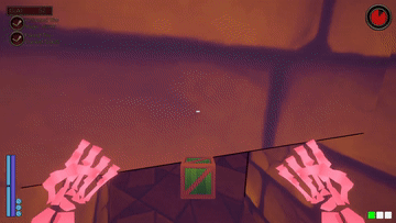
Day 2 dungeon was a bit easier than day 1, but again I got griefed by a mushroom+ goo room, this time the one shown in your first gif - 2 shrooms and some pillars. It wasn't as bad but it slowed me down to the point that I needed one extra second or so to reach the exit. anyway, during this run I had time to find a guest and the mirror. The guests bounce around! Adorable. Anyway, I went to match them, and I don't like that I need to go through two checks to match. I think that no matter what, you should only get one popup, along the lines of "Match Guest to mirror? Yes/No/I dont want to match". I noticed that you have a lot of popups that serve no purpose except checking, even in cases where its not needed. Another example is when I did all the quests (found mirror, matched guest, reached exit) and on the exit door, a prompt asks me if I want to proceed. I think this should only appear if something major is missed (no mirror/no guest), because otherwise you're confusing the player by showing them this. They'd think they have missed the main objective or something, instead of being positively reinforced for having done everything.
Anyway, my main takeaways are the following:
>Merge the tutorials into one
>Start the gameplay as soon as possible - probably worth to have some small, set "introductory" dungeons that tie in to the story. Just "oh go to the 2nd floor and get this thing for whatever", and it's just a difficult jump, or an intro to water, etc. Don't make them tutorials, but more like tiny challenges that slowly showcase the difficulty of the game in a safe, not timed (or leniently timed) environments.
>Your menu looks much better than before. Keep going - simplify everything as much as you possibly can. At this point I'm used to it, but I'm sure a brand new player would still get faced with a lot at once.
>Consider having Shift-running be the default speed, and toggling shift or something could slow you down instead. I didn't see many reasons to walk instead of run (perhaps those are shown later or I missed the rooms that highlight this?) so it feel like running should be the default.
>Room balance. I assume you have your prefabs marked as easy/difficult or something, but it can use more fine tuning. I think it's a mistake if Dungeon 2 is easier than Dungeon 1, but sometimes RNG just works that way - I mean it happens all the time in my game. I still thought I should point this out, though.
Keep up the good work!
Thank you for the detailed description of your experience. The tutorials used to be one part, just like the stand alone one on the title screen, but people were suggesting dividing them into smaller sections, and I also split them with the story, so that feedback gives me mixed feelings.
I will look into removing rooms requiring mushrooms from the first 1 or 2 templates.
You are not always required to use mushrooms, like the room with a mushroom in the middle can be progressed through with using your jump abilities or dash instead. Same goes for the u-turn room. Bouncing on mushrooms is pretty much required when you play with no mana, but other than that I give players freedom to move in different ways.
Another thing makes bouncing on mushrooms different is if you use sprinting, or not. I can see why those rooms can be too difficult to new players, and need to be removed from beginner rooms. On the other hand I don't want to just have only boring, flat rooms left (I want to show off the cool rooms as soon as possible, damn it), but I see introducing them later is going to be needed.
I will add more checks to only show the "are you sure?" messages when it makes sense.
Sprinting as default running speed is probably a good option to add, not sure abut making it default thou. I did add option to make shift as a toggle so players wouldn't need to hold it. I personally prefer holding it, and releasing for all the extra control.
Any ideas on how I could make it less overwhelming? UI is always a struggle.
>UI
I'd say, in no particular order:
Reduce submenus and combine them into one as much as possible
If no reduction is possible, group things together and show that group on the menu (such as: "Dungeon Stuff" contains the start dungeon submenu, all the modifiers, etc)
Hide the things you have no access to (or heavily gray out the buttons)
Don't give player the ability to edit the UI until you're sure they're ready for it
Show don't tell: remove text boxes telling you how to use the UI and instead have the player learn from objectives (this is hard to do)
Example: Instead of clicking a submenu and having a textbox appear and say This is where you do X, have a popup while you're doing something somewhere else telling you "Hey go do this. It's in X menu, it does Y" and leave it at that.
Highlights around a button in a strong obvious color when the button wants to be clicked for progression reasons, or if it unlocked. Think of a blinking red button from the movies - you need to steer the player's movements when your UI is huge.
Your inspiration should be modern releases. They have soulless, but incredibly functional UIs. A player is NEVER getting lost in a modern release's UI, and it's not because they're not complicated. Just make sure to keep the soul!
I added more submenus because that was the only solution I came up with for decreasing the amount of information displayed at the same time.
Yeah, I got some ideas for adding an option for hiding all the yet to be unlocked locations from the office.I added blinking "!" on some buttons, but I guess that was not enough.Yep, my ui is basically homm3 ui if it had text instead of all the nice icons. I might need to add placeholder icons after all.
Thanks for all the tips.
Linux version. No crashes or slowdowns to speak of.
Movement feels good. I suck and had a bit of trouble moving fast enough to finish the level objectives, but I got better. Overall, time limits just aren’t my thing.
It is always great to hear there were no crashes.
Semi-secret mechanic spoiler: you can in fact crouch mid-air, and use air jump to get more height from it if you are fast enough.
I used to explain all the crouch jumping in more words, but people kept telling me to cut down on words. Out of curiosity, what would you call it instead now that you know how it works?
It's good you got better. I want players too feel like they really get better by getting used to rooms, mechanics, and figure out the most efficient ways of progressing.
That's understandable, I imagine that is the case for most people. Time limit gets easier later when you unlock different seals, especially time ones, but also others. I try to balance it out by changing dungeon templates of course. There is also going to be other meta progression added to the game after I introduce skill trees, which should also make the time more manageable in future.
Thank you for playing
Played through to day 20-something. It was fun, but man, did it kick my ass.
Gameplay:
Solid tutorial.
I also appreciate the ability to keep the tutorial for the individual rooms on. It was a bit of an information overload.
Hold crouch should really be default with how often you have to switch.
It really really really needs a slide mechanic. It hurts my soul every time I go from sprinting to crouching and lose all momentum instantly.
The difficulty ramps up way too fast for me. I wasn't able to even find the magic mirror within the time limit most of the time, but it was still throwing more and more complex dungeons at me. At least make it count succesful dungeon runs rather than just days when it forces you to upgrade.
Or maybe have the seal that disables the timer be on by default. It's really stressful for newbies.
There's a tab in the reception called "roleplay" but I couldn't figure out what it does. Idle animations for the guests in the dungeon? Or is it not implemented?
I encountered a single bug: After a failed dungeon generation, it let me start a run, but it just spawned me in a void, falling forever. It can't have been completely empty - I saw some arrows from a trap off in the distance falling alongside me - but I never saw any level geometry. Also, the timer didn't start. I was able to abort the level through the menu just fine though.
Story/writing:
Very slow start. Please condense the cutscenes. There's like four before your first real dungeon run.
I don't know how weeaboo you're going with this, but the Shop Keeper going "ano..." is maybe a little much for a game in English.
Audio/Video:
Love the music.
The rooms could stand to have some vaulted ceilings imo. Things feel a little too boxy atm
The "boing" sound effect better not be a place holder, because it's great.
The use lever animation sounds like the Boss is snapping his fingers, but it looks like just finger guns with no snap.
I look forward to playing it again.
Played through to day 20-something. It was fun, but man, did it kick my ass.
Wow man, thanks. That's a lot of playtesting.
The idea for crouching is to slow you down to offset its benefits e.g. most jumps from ground where you would use one air jump could be dealt with crouch jump + ledge climb.
You can still dash while crouching. You really shouldn't be walking while crouching too much with how slow it is. I will see playtest if maybe I can keep the velocity.
Damn, I thought this update addressed that well. You get put on harder difficulty based on either collected gold, fun/lust points, and eventually days. After you unlock more templates for randomization I don't expect players to succeed every run. Some templates require more planning, and different tactics. At what day did you feel the difficulty ramped up by a lot? Any specific templates you found much harder? Did you always refuse to amp up the difficulty?Are you talking about the Unlimited Time setting in Dungeon/Time? The only downside of using it in current version is it makes you collect far less gold, and it costs gold too. Maybe add a reminder message telling players they can use it? Make it free for more days?
By default, if you hold right mouse button on some ui elements, like that "roleplay" button is going to show you tooltip explanations. There is an option in settings to make tooltips show up automatically on hover after some time. To unlock the "Roleplay" tags you need to unlock higher tier in fun/lust tower. And yes those tags act as requirements for different idle animation, or at least will be in future when I add content beyond placeholder models.
Thank you for reporting this. It shouldn't let you to start if the generation failed, so I must have broken it at some point. Your description helps me narrow it down. By the way do you remember which template you were on when the generation failed? I am asking because it is possible my template rules were too restrictive, and I didn't have needed rooms for the generation to complete. I hope the failed generation happened only once.I thought the inbetween tutorials break them down well. I actually cut down a lot from my inidial drafts, so I am out of ideas what else I could cut out. I am open to suggestions. Maybe if I add visuals it wouldn't feel so long?
I do try not to be too weeby, but it was hard to help myself. What would you replace it with anyway?
That's great. I went with 3 different songs for runs to see which type would work best, but I think most people feel they all work, so I am happy.
Yeah, it's mainly because the generation has every room essentially in a box, and I tried to maximize their sizes without changing them to bigger room types. I will see if I can change some of the rooms ceilings where it wouldn't change platforming. It was also jarring to me when every room had differently angled ceilings after put together in the dungeon, so flat ceiling were to keep them consistent.
It grew on me too. I have no idea what I would replace it with.
Yeah, that was me basically trying to get away with not animating all the fingers by having a sound cue. Maybe I should have Boss going "pew" instead, because so many people said they love finger gun.
Thanks for all the testing, very helpful.
That helps from a game balance perspective, but on a visceral lizard-brain level it just feels really bad to instantly lose all my momentum.
I accepted the first one I got (don't remember the specific day) because I didn't know what I was in for, but then I started getting overwhelmed and rejected the rest. I'm not gonna lie, I got a little tilted when I'd fail a run due to something like getting stuck in a huge vertical room for 30 seconds and being unable to get out, then having the game ask me if I wanted to make it more difficult.
Well, it didn't let me start after it failed; it asked me to click a button to retry, and then it said ok, and then it failed. Come to think of it, I think I tabbed out of the game to make a note of it while it was generating, which might have caused it?
I think it must've been Baby Steps+ or ++.
Giving it some thought, I think the main thing is that you have to go through them
Line
By
Line.
Maybe if you structured it more like a comic panel or full page instead it'd feel a lot faster?
If in doubt, go with uh, um, uhm, er, ah, or eh.
I thought he was supposed to be doing a snap into finger guns, which seemed completely appropriate. I think a single extra keyframe in the animation where he puts his thumb and middle finger together before the index reaches full extension would do the trick.
Alright I will see about the momentum, and of course try to fix the failed generation bug.
Yeah, I can see where you are coming from.The text goes line by line, because I plan for artwork to change after every line. So they are like short speech bubble that characters always react to. I guess I will need to add the visuals first to see if that works.
I thought people hated those.
I will flesh out the animation. Thank you for all the feedback
Reached day 5 (bath unlock) so far, I'll do an edit if I discover more:
Great tutorial, everything is well put together. Only sore note it's the very start with that looong conversation, It's funny but too long. Ihmo in the beginning let me play asap.
Audio levels are fine, music choice too.
I like dungeon mode a lot, second difficulty tier feels harder. I encountered a vertical water corridor that wasn't connected to any other room up or down; dunno if it's a bug or a clever trap to lose time.
Ihmo resort management needs more streamlining. The game is dense, maybe too dense. You cleverly introduce a new location each day, but after a while it feels overwhelming because I don't have time to adjust for new mechanics.
Thanks for playing. I don't have any idea how I could make those conversations shorter to put the player right into action. I thought just having skip option would be enough, and 2 tutorials inbetween cutscenes would give break to the whole reading.
I am glad to hear people are happy with the audio, and music choice so far.
I can only guess which room that was, because I made multiple rooms with vertical water, but there should be no "dead ends" on that template. As in that room should have an entrance, and exit. Now if the water was necessary to get to it is a different conversation.
After you unlock the bathroom, the game loop should go like this:
I don't know how you would like it to be more streamlined. Are you suggesting it should take more in-game days to unlock those hub locations?
I don't know how you would like it to be more streamlined. Are you suggesting it should take more in-game days to unlock those hub locations?
I thought of that(and I agree that demo pacing and real game pacing can differ), but the problem is deeper than that. When I open the office its a nightmare (as a new player) because there are fifteen location, aka a ton of buttons. Same thing for the seal menu. Both give me this sensation:
This sensation ihmo is the big problem with your game. I suggest you to check a game from akabur, there too there is a lot of stuff, but it's not intimidating.
Well, the addition of the office was supposed to fix that i.e. moved all the location buttons to one place, so that the bottom bar can be less overwhelming. The only thing I can think of to improve it is hiding more buttons by making players scroll down, but then I risk them just missing them.
No clue how the sealing chamber can be made so less information is displayed. Which akabur game should I check out?
By the way, I thought that photo was cool, but I get what you mean.
The photo was a classic way to imply "confusion by data overload".
The problem is not to have less info, but making it visual, "gamy". FUN. The clarity you have now is very good, but its an excel spreadsheet. You need to make the spreadsheet fun. The seals could have different shapes/ colors; the office and locations could be a "real" place in the world via map, and every location has an actual building icon that you can memorize by shape and placement in the world map. Akabur games are simpler(in a broad sense they are just an excel spreadsheet game/ vn) and are structured like that. About akabur, I won't get into that because fans can kill (I personally like princess trainer and four elements, because I like the characters). There is an H game general on vg you can ask for more info.
To conclude, I'm a function over beauty guy myself, but we need to accept that games mostly sells for art/presentation. Ihmo if you work on the art side of your project in a few months you could open a patreon and chill.
Yeah, my plan was to eventually get someone to make UI for me, because that's really something I am not good at. Trust me, I would love to have many different icons, and flare.
I had no idea. I will need to take a look. Thank you
Played this a couple demodays back so I skipped the tutorials, got to day 6. The progression felt better than before, though it's hard to say whether that's due to it being better or for having played it before. At any rate, my success rate was higher and I didn't have much frustration at the challenge. The sound levels are fine as they are. Having the quick UI be empty from the start is a good choice I think, it allows the player to not feel overwhelmed from all the locations at once.
I don't know if this was the case previously, but the way negative seals go from + to - feels wrong and pointless to do, vice versa for positive seals. I can't see any reason to make them switch their sign on equipping them. It also doesn't make sense since negative seals DO increase your PoP, not drain it on equip. At best it's distracting and at worst it could potentially confuse a player. Though to be fair there could be a decent reasoning and I'm just not seeing it.
Thank you for playing. It seems you are happy with most changes.
As for the seals my logic is this:
The negative seals are called negative because they are negative modifiers, not because they deduct PoP. In your screenshot clicking on "Larger Trap Projectiles" would give 1 PoP, but removing "+10% Traps Gold Penalty" deducts 2 PoP. Basically the + and - shows what it is going to happen to your PoP after clicking the button no matter if it's a seal in use or not.
So that's my reasoning. I am open to suggestions on how I can improve it.
I can see the reasoning now. I suppose the reason I felt so weirded out by it is that it looks like a static stat on a card, not a changing transaction cost/benefit. If I were to do it, I'd probably do something like
a). Keep signs at default (negative seals are +, positive seals -), and add a floating then dissipating red(-) or green(+) text that states the effect on the current PoP. ie Negative seal with +2 on it is equipped. When sent to the other side, red text with 'Current PoP: -2' would show.
b).Instead of just 'PoP: +2' on a negative seal, it would be 'Provides(\n)PoP: + 2' which would make it unambiguous and let the player just math it out in their heads when they equip or unequip it.
Hope one of those sounds good, if not, so be it.
Thanks for suggestions. I just thought I could drop the +- symbols, and have players memorize the difference between positive and negative seals. I should be cutting down on text so b) would not work.
I am bad at UI, making it read well has been challenging, so I appreciate your feedback.
I was able to make the woman my dreams. She had a slender stick body, and a melon for a head. She could scare away crows with ease. And her face, was so motherly, it put me at peace.
Thanks for the stream, and funny comment.
Detailed changes between this Demo Day, and last are covered in following devlogs:
https://webcough.itch.io/goblin-resort/devlog/472751/version-028
https://webcough.itch.io/goblin-resort/devlog/467522/version-027
https://webcough.itch.io/goblin-resort/devlog/461460/version-026
https://webcough.itch.io/goblin-resort/devlog/456408/version-025
https://webcough.itch.io/goblin-resort/devlog/450504/version-024
I mainly need feedback on the new “adaptable” difficulty curve (let me know how you progressed), ui changes, and audio (do songs feel right, are audio levels even throughout the game).
For those who don’t care for testing the changing difficulty from the start of the game, there is new cheat code “AGDG DD48”
You can input it in the text field in Hub -> Dungeon -> Seed Options, and pressing enter key.
The cheat is going to skip one last text cutscene, give you 100 Gold, 10 Fun/Lust Points, 11 Seal Points, unlock some hub locations and skip to day 4, which should make it quicker to see UI changes.
If you have any other feedback, or general thoughts, or just want to let me know what you think I greatly appreciate your comments.