Hey there! Just letting you know v1.0.3.2 is up! I fixed all the things you listed, I ended up getting rid of fall damage, fixed the types and made the attacks faster. I would like to keep the Hitstops (slight pause on the attacks when they hit) just because I love that in retro games! If its too much for a metroidvania I will remove it completely.
Thanks again for the Feedback!
(I noticed some more things this time around, so forgive me for the long post.)
1. Noticed another small typo in the resolutions. The 'x' is missing for 366 x 760.

2. "Space" is really hard to read here.

3. In the tutorial section with the Knight's father, I'd recommend showing button prompts for each of the available actions. At the moment, I can't recall anywhere where the player is taught how to attack, use magic, use relics, or interact with characters and objects. I also had no idea about grabbing onto walls and ceilings until this playthrough. Rather than hitting 'E' to do that, you may want to find a different way to activate it, since it's awkward to move right by pressing 'D' and hitting 'E' to grab a wall.
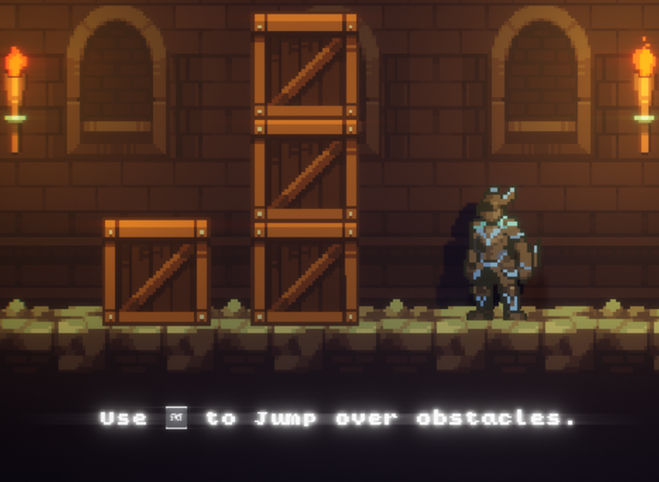
4. I'm not sure what causes this, but I've found that if I'm holding a direction when I jump, ledges that are the exact height of the player's jump can't be reached. However, if I jump then hold the direction I can make it. This particular ledge near the beginning could really confuse the player if that happened to them.

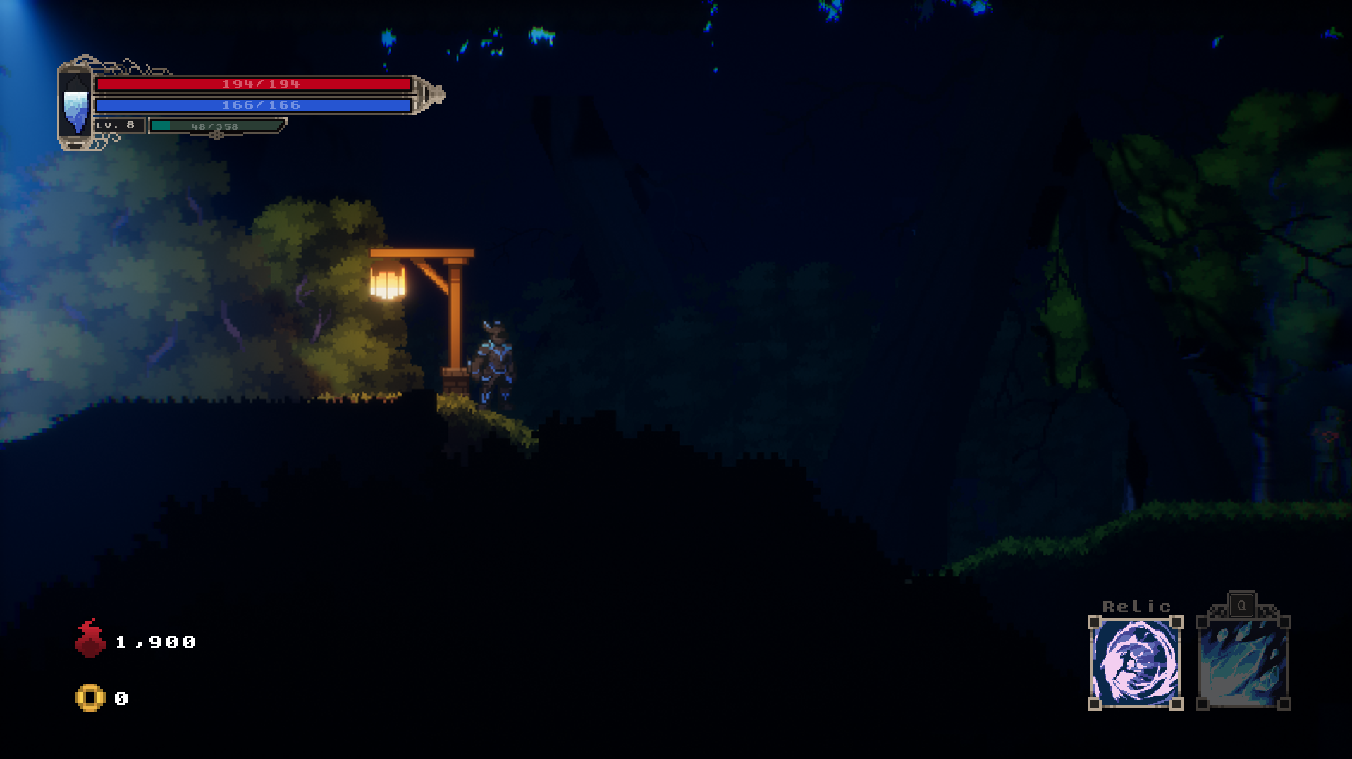
5. I'm not sure if you'd like there to be some cheap deaths--some games are into that kind of design, after all--but I found this pit to be in an unfair spot since it's obscured by the foreground.

6. Speaking of the foreground, I'd recommend toning down how much of the screen is blocked by the foreground unless you have a specific reason for doing so. This is what the house looks like when first entering, and it's just too much. 
6. Unfortunately, I couldn't make it through the castle because I got lost after defeating the possessed puppet. (Very cool design, and a solid boss fight, btw). If you intend to have larger environments, I'd recommend ether: implementing a Metroidvania map system OR simplifying the player's path forward so they're less likely to lose their place or sense of direction.
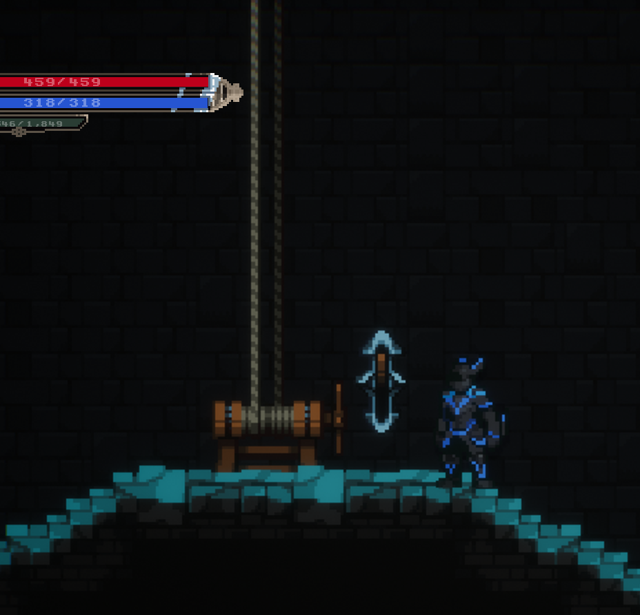
7. When possible, adding a simple animation to these ropes when the lever is flipped would help let the player know something is happening. Currently, I could see impatient players walking away before the elevator arrives. If you're not able to add an animation, you could cut down the elevator's waiting time by having it essentially warp in just off screen and then move normally down to the player.

Once again, this is pretty awesome stuff, and I hope I get to play the final game someday! The change(s) you made to the combat make everything feel much smoother, so I definitely think you're on the right track.

