
It doesn't feel like the Font itself is blurry in the Title anymore, but I don't know what or if you changed anything. But the inside of the Outline feels like it at a few Points. Like the horizontal Lines on the P, second O and N on the big Options Titlescreen when I open that up i.e. seem to have an extra halfway dark Pixelline next to the outline on the inside, like the Font is just scaled poorly there.
Don't know if the swapping sounds were there before, but they feel nice. I also like the new HUD, gives much more Vision of the Screen it seems. Don't know why the Borders are inconsistend tho. It looks like you reused the 'Gun-selected' Border for the Stamina Bar, which works on highlighting that the Bar is full again, nice effect, but don't know if its necessary, and dimmed for the Map instead of the same one as everywhere else. And your Borders inner grey transitions a bit too apruptly from dark to light on the upper left. Here the blurryness also returns a bit on the Rune counter Text. This makes me assume it has something to do with poor Fontscaling on specific Sizes only.
Holding Tab for Information when not hovering the Weapon has the little info Window of the currently equipped Weapon blink. I'd prefer it if it staid visible.
When the map is finished, it would be nice if Weapons don't consume any Ammo, so I can try out what dropped in the Level without loosing Ressources.
Since you have a Info window on the Weapons, one for the Levels you can choose would be nice, so I know if its a Shop/Boss/Whatever without just knowing the Icons and Colors by Heart.
Picked up piercing+2 which ruined my explosive Pistol for me, nice. Seems to be the Gun drop rate and level difficulty got both reduced tho, which is nice.
I like the Ruins Levels, good to see new Variation in the Leveldesigns.
Your Tab info window sometimes seems to not work properly, and stick on screen. But it fixes itself when you just tab again.
Your Overworld Map also sometimes generate poorly, with progression Lines being right on top of one another, and Nodes being just slightly behind each other. Works well, but looks odd.
Death needs more of an Impact, you immediately jump to the Death Screen when you died, some slow motion explosion or whatever before might be good.
Your Crosshair can become pretty difficult to see if you're on a red Weapon in a red Level with lots of bloddy Corpses.
Overall, it's still as addiciting as the last Times.
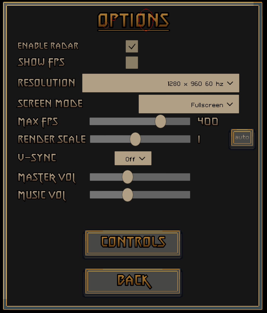 I should've probably provided a Screenshot of the blurriness etc. in the first Place. I'm playing at 2560x1440, Heres a capture of the Options Screen, I cycled some of the most problematic Areas in red. Zooming in in Aseprite indeed revealed it to have blurred Edges there.