I realize now I should've asked you to take screenshots of any weird things... You're still the only one that I've heard having the blur issues, but if you have it some one else can too, and its really annoying me. But I did change some things around and it sounds like its fixed it in some places. I use pixel fonts with a fixed size and never scale it, but not everywhere; might change that. What resolution did you play in?
The rune border effect in the UI is meant to signify activity/ready, the health bar has an effect too when you get hit but people probably don't notice that heh. I've been a bit indecisive about how I want to look on the radar. Haven't done much with the look of the UI since I made it, so will do another pass.
The info button works on press and not hold, maybe it should be an option to change.
Unlimited ammo on clearing a map is a good idea. I watched a vid of someone playing and he picked up and dropped an extremely good gun without even trying it out and it made me really sad...
A lot of people have commented on the same thing about map tooltips (the icons being pretty bad doesn't help either I guess).
Some skills only being good for some guns is intended, there'll be more of that later. Sorry.
I'd like to have a lot more variety in the maps yeah, this is meant to be the first map of several with the environments getting more abstract.
Yeah there's some bugs I know about with the info screen, will fix. Same with the map.
Haven't gotten around to making the death screen better yet!
I noticed that about the crosshair too only after updating the death animations, will have to improve it somehow.
I know this genre isn't one you really play, but I enjoy hearing your perspective on the game. Thanks for playing and for the feedback!


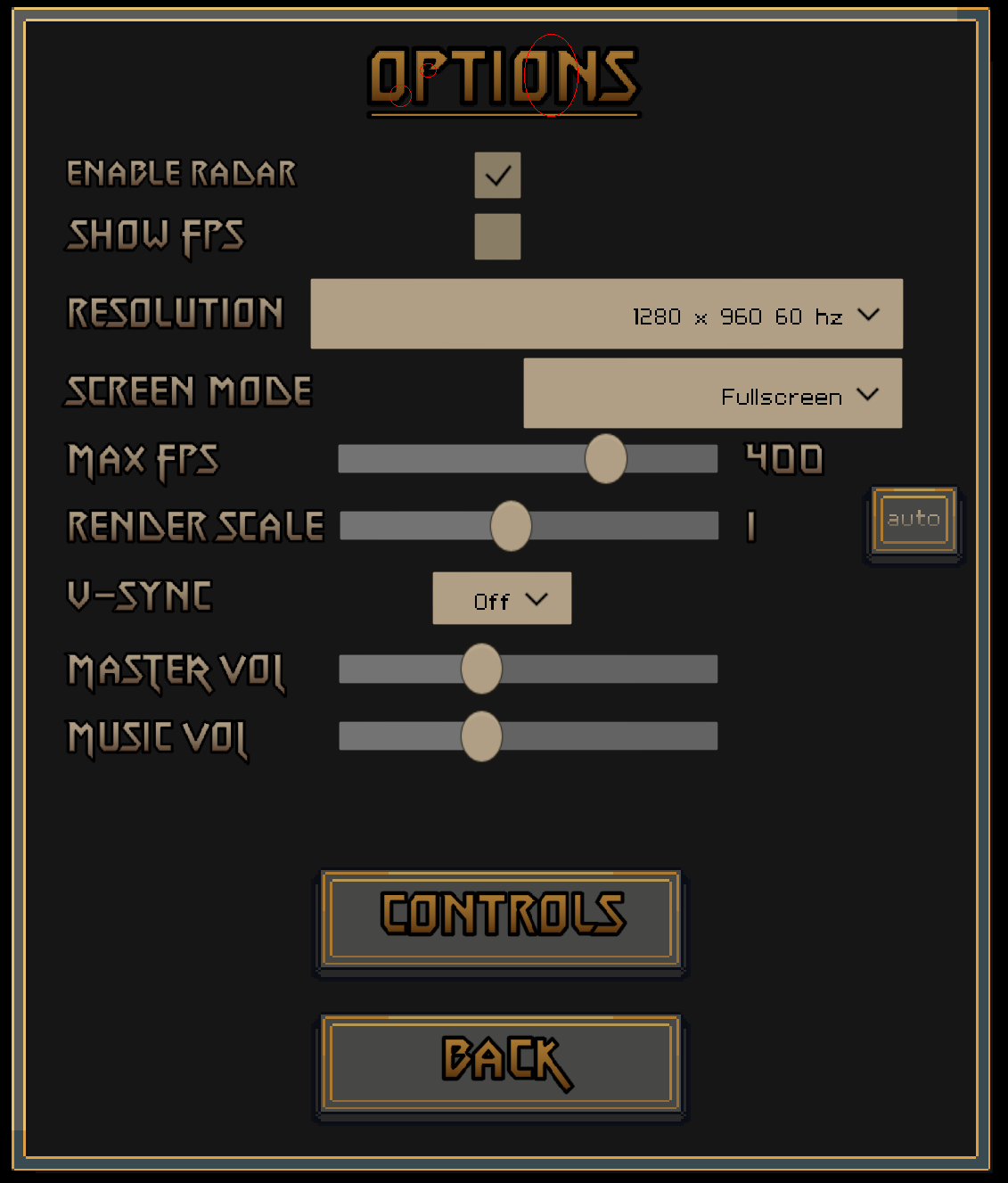
 I should've probably provided a Screenshot of the blurriness etc. in the first Place. I'm playing at 2560x1440, Heres a capture of the Options Screen, I cycled some of the most problematic Areas in red. Zooming in in Aseprite indeed revealed it to have blurred Edges there.