Indie game storeFree gamesFun gamesHorror games
Game developmentAssetsComics
SalesBundles
Jobs
TagsGame Engines
(+1)

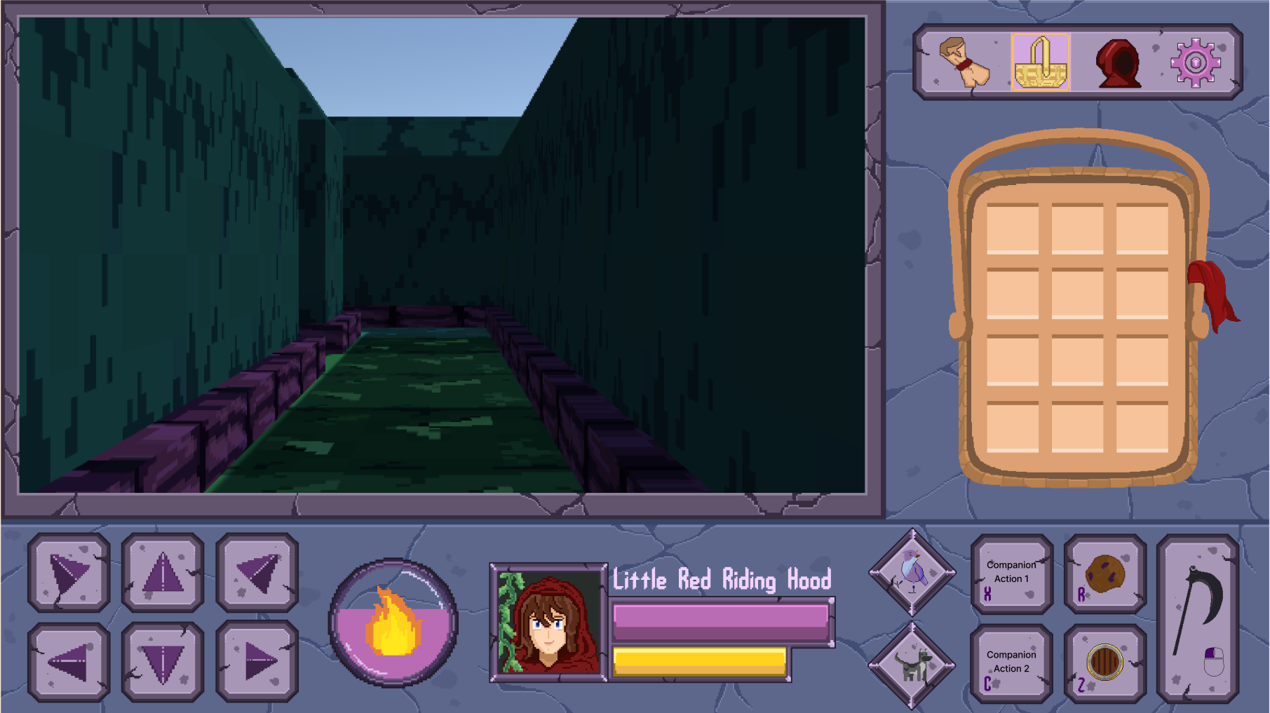
I had a lot of trouble with the UI - when I open the inventory, I was unable to close it easily, it seems I need to find the location hiding behind the inventory where the inventory icon was now covered up.  This might be an aspect ratio issue.  If you're only going to support exactly 1 resolution or aspect ratio, it would be best if it started in windowed mode to avoid these issues =).

I really liked seeing the woodcutter's place looming over the dungeon in the distance when I got closer, gave me a nice sense of progress and destination.  It seems I stayed alive after "dying", however clearly a bug (unless it was some weird duality theme I missed...), it did make it easier to preview the content you've got in there =).  I really like the character art!

(1 edit)

I agree and thank you for the feedback, the UI wasn't quite where we wanted it to be at the end of the jam. Over the past week it's been a major area of focus that we've had and I'd like to show you some of those changes, which we'll have finished this weekend and ready to showcase a lot of the new mechanics we've been able to work in when we post a massive update next weekend.

We opted to go for a much more classical look and feel while expanding the options available. We're going to have separate windows for settings, map, inventory, and equipment so that the main screen can stay visible without covering a bunch of things.

Looks really nice!