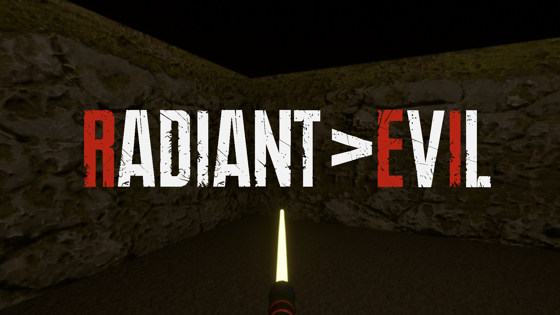
Looking awesome, Doug! Can't wait to try this out!
Curious, do you think you could add the saber/light sword into the logotype itself? Maybe in one of the "I"s? Give it that Yellow color. Or you could place it right under the typeface in full length. Just some ideas. I really like what you're doing!


