Indie game storeFree gamesFun gamesHorror games
Game developmentAssetsComics
SalesBundles
Jobs
Tags
(1 edit) (+1)

I'm playing right now to make sure I got everything, stuck on a Graffiti that says "Aut Furit...", mind giving me a hint?

And I'm writing a simple text guide today. So I can get something out ASAP for folks, and then I'll start making the flowchart,hopefully tomorrow.

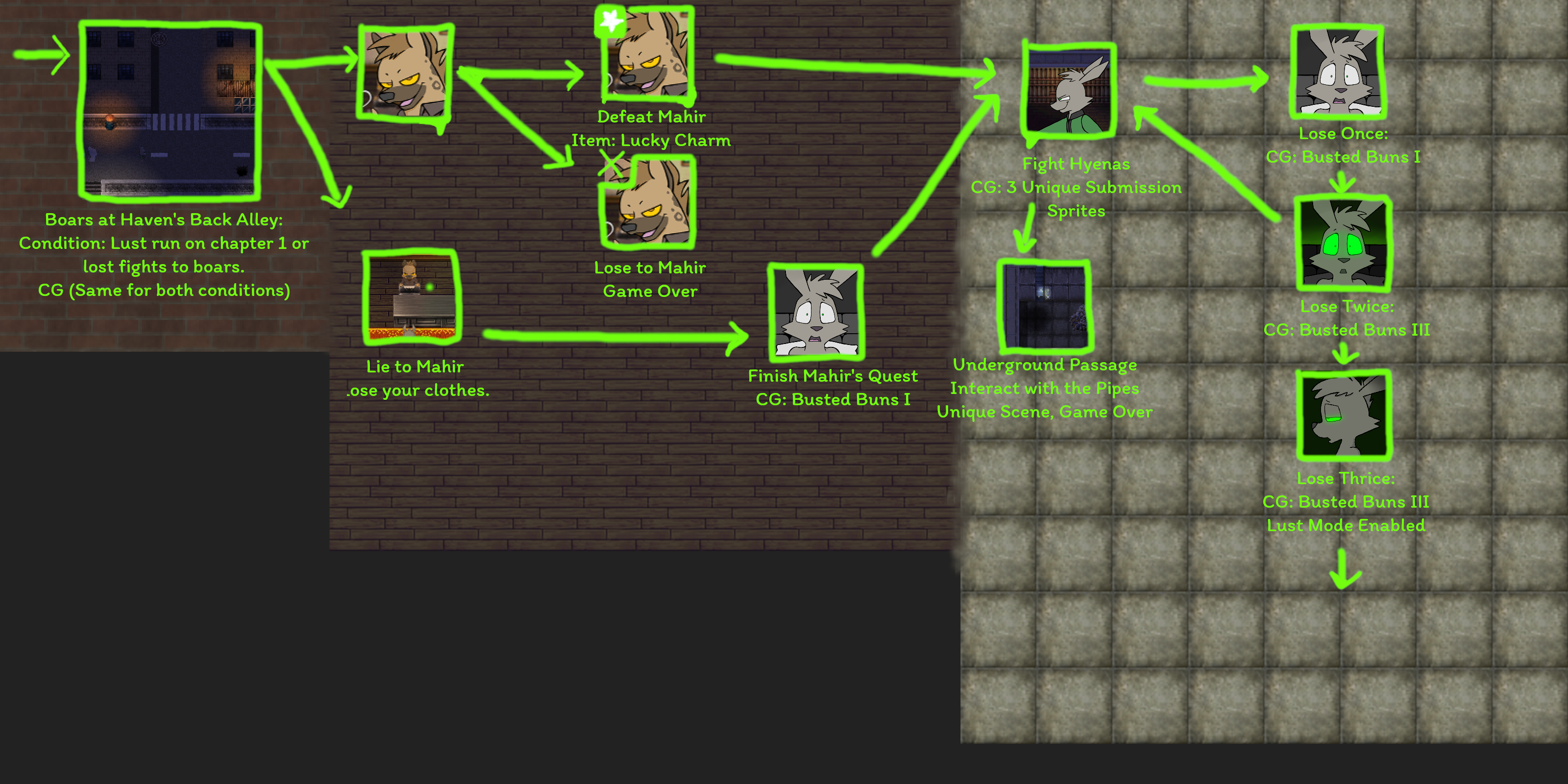
I can definitely do something artistic like that, and I'm going for a purple colorscheme for CS1, and a green one for CS2. If you'd like it, and you'd want it to the point of poking me for work, that's no problem, I'll even provide the .PSD publicly, or directly to you. 

If anyone else reading this has the same desire to write up a guide, just reply to this! We can work together!

Excellent! That graffiti is just flavor, ties into something later. No scenes or items though.

To be clear/pedantic, the main theme color for CS1 is actually purple/pink, or "hot pink". It's the pure pink on most graphics programs color wheel. Proper purple, or cool purple, ended up being a secondary theme color for GT (as seen in the hyena's shirts and the theming of the store page here.) But that's probably what you were thinking.

(1 edit) (+2)

I'm very sleepy right now, so I'm going to rest, before I go, I managed to make the written guide, I made it verbose, may have been a bad call - but It's the way I think it helps the most - besides if I can get the flowchart looking good, It'll be easier for folks.

This is the very early on draft, so my main ideas here are: Gooey arrows and borders that drip, and special symbols indicating what each scene is.

Because It is gooey I want to hand-draw it, and maybe even shade the goop, the example bellow I did carelessly with my mouse, but I can whip a Wacom I got here and do it better.

The flowchart is unfinished ATM as you can see. I'll shift and space things around once I place everything on it, the right and bottom might increase or decrease as I find good resolutions to post it at on Itch.io, so far going for 2:1 (1600x800)

I may also iconize things differently.

Just tell me if you like the idea, I'll fix the color pallete I know it isn't the right green, for the background I wanted them to be sprites of the areas the "nodes" in them tend to be/are in, I may put some gradient/vignette/extra textures to spice it up.

I think you seem to have an idea of something, by suggesting "bitcrushing it", so if you have a particular direction in mind - stylistic - feel free to describe it to me!

But to make what you currently expressed so far a reality with what I came up with, I'll try the following: After having all the borders, arrows, and goop drawn I'll try to pixelize it. I'll also see what more I can do for a pixel aesthetics - the background's a  good place to look at.

Expect, some borders, a title on top, a legend for the special symbols on the bottom... 

Oh and maybe you'd like to suggest a font? The one bellow is called "Itim", I like it so far. Might increase font size.


(1 edit)

For a rough draft this is already looking pretty great. Obviously you'll be cleaning up the arrows and outlines a bit, and like you said, giving an overall header and so-on, but I'm liking the look in general. I'm not sure I buy the floortile background entirely, though it is a clever idea. A solid color, even just black would probably work better, but experiment on your end and see what looks good. You may win me over.

I'd also say: let's stick to JUST the scenes, ie the stuff with art. That's what people are most looking for, and I like to keep the other stuff a bit more obscure. Also, though just a draft obviously, this chart is actually inaccurate: Lying to Mahir is, as the Silicon Valley people love to say, "orthogonal" to any of the actual scenes with art. It DOES unlock some text stuff in the plaza, but for simplicity and fun of discovery, again, let's leave that stuff off.

I'm also mixed on having everything connected in one flow, though I suppose that makes more sense for a visual rep. Maybe one straight line, horizontally or vertically, representing a totally un-eventful playthrough to a win at the end, and then branches off that for each event, some which re-join the main line, some which don't, and some of which branch off further as appropriate. But a bunch of stuff kind of clustered around a center (or side-aligned) line. That's the added challenge of doing a graphic though, you have to ponder how to actually express the flow accurately visually instead of just briefly mentioning the conditions for each scene.

And yeah, you can give the pixel look a try, but it isn't required, just a possibility that might be neat depending on how it ends up looking.

Can't offer much on font, typography's a weakness of mine, as shown by the...mediocre credits. Font seems fine though.

And thanks for all the work put in so far, do think this has potential.

(+1)

Oh It's latin, of course! Hm...