Indie game storeFree gamesFun gamesHorror games
Game developmentAssetsComics
SalesBundles
Jobs
TagsGame Engines

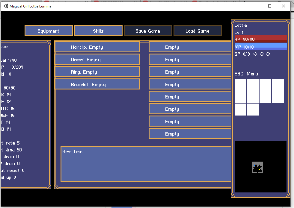
also the UI scaling cropped off some of the stats on the left, and make the tooltip ignore mouse clicks so you can click the skill through the tooltip underneath
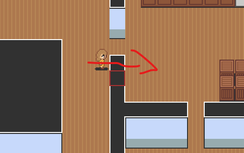
also it'd be nice if the top wall block was not collision so you could walk through it like this

Interesting, the UI shouldn't crop off like that. Did you by any chance resize the window?

I will take into account the suggestions with the top wall and being able to advance dialogue with the keyboard.

Anyways, thanks for the feedback!