First time trying this game. There's an insane amount to cover, but i'm not capable of writing any of it elegantly. I recorded my thoughts a bit in realtime as I was playing and I am going to paste it down below.
I picked custom character because of course I want to try the cool custom options.
i made a max height character but every door is too small, camera collides with everything
the biggest meme about the game is the grass so i immediately took out the scythe and started chopping grass
it is in fact, very well made grass, very cool
ok so i go to the tutorial area now and it shows me to go to an area and cut grass........except i cut it all, oops lol at least i can skip this tooltip
when watering i would like to see important info like water level instead of time to harvest, which i assume would be a visual thing
scale just feels off in general
why do i not get all my stamina when sleeping
very hard to interact with certain things due to the way interactions are 'chosen'
character looks goofy running with maul
town is massive, confusing, layout is terrible, the only bed you can sleep in is in a strange place
I legitimately feel like it is an SCP backrooms situation for how big and empty the place is
there's like 10 NPCs and the town could fit like 500 people in it
like for instance, why is there a giant asian temple in the back of the town that serves basically no purpose
why are things like that in the game before even cementing a purpose for all the other things
If you had to give everything in this town a purpose, you would not finish until many years
a lot of houses just don't make sense from any angle on the inside, it seems like things are just kind of placed arbitrarily without any sense of reason
like at first I wanted to play the game because cute life farming sim but now I want to keep playing because of how strange and weird the city architecture and layout is and why is it so damn empty and big; I spent so long just walking around the city finding new weird buildings to explore
as I walk through it, ideas pop into my head. 'oh there's a giant bell in the center with a rope, maybe there would be a quest to ring it' or something, and i'm sure these ideas have been planned or thought of as well, but there's just too much of it with no purpose
I think the main town needs to be 90% purpose and 10% filler but currently it's like 95% filler and 5% purpose
the rest of the map can have filler, but just make it seem purposeful; like an abandoned ruin or broken windmill or something
before you tell me to open the map and use the funny guide feature: that's not the point. you should not have to have these things in your game. the player should actively be excited to go exactly where their comfy bed is at the end of a hard day of collecting and stuff, and thus, it should be in an easily accessible and notable area
likewise with NPCs. their houses should have defining traits like a gardener would be in a giant greenhouse, an apothecary might have cauldrons and fumes spewing out of it, etc, i think that idea is present here, but not quite compatible with the way things are placed in the city
graphically, it's pretty rough
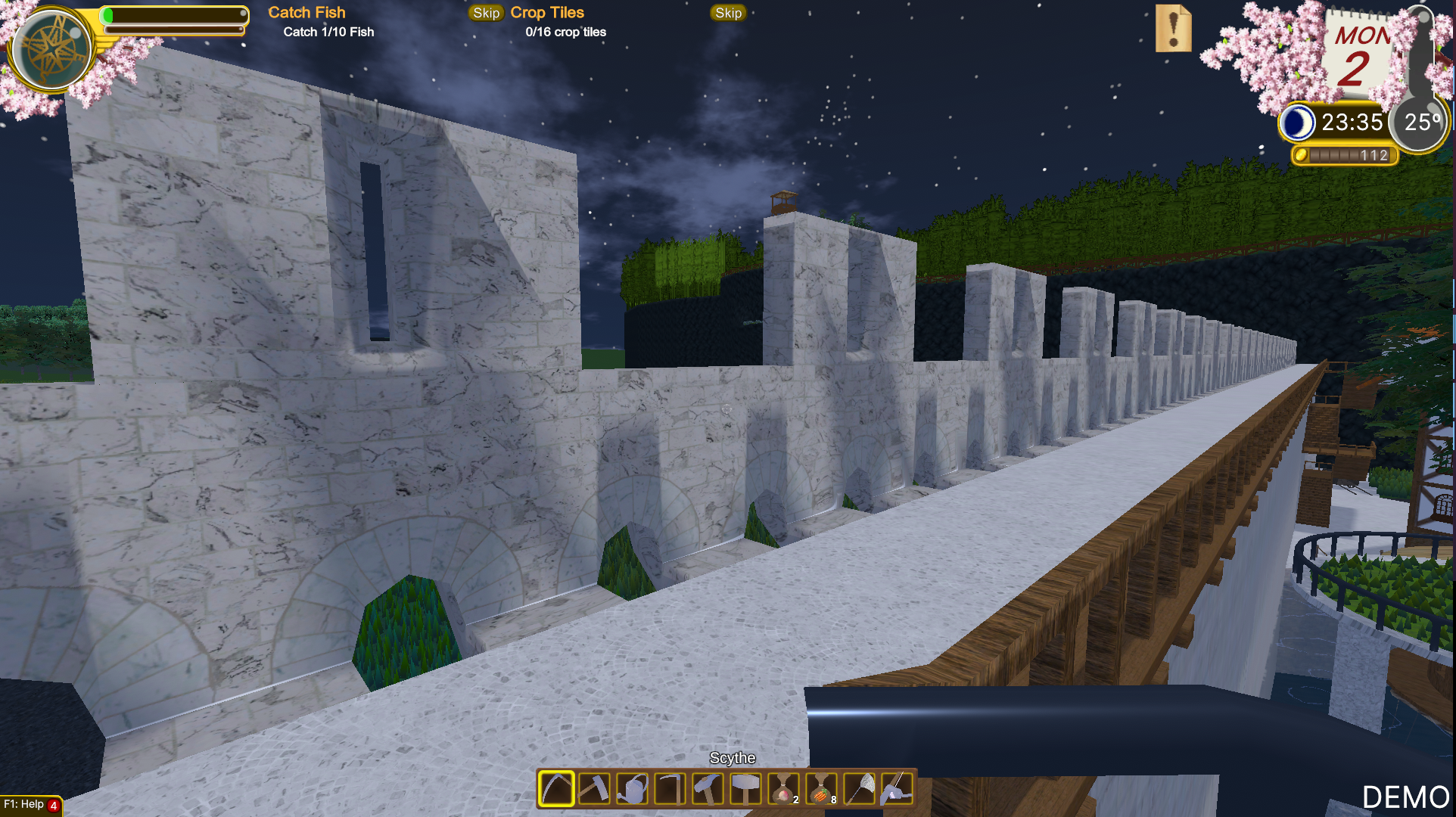
the aesthetics are fine, but using one directional light and using unlit models without any secondary layer like vertex lighting looks abhorrent
i did see some weird stuff that was like baked shadows? but it didn't seem right, more like a glitch (included a picture below)
it's sometimes hard for me to tell when im going up stairs, when im turning a corner, etc because the textures blend together because there is no light data there
I would recommend vertex lighting if you want to go with this type of style but you might want to rethink your realtime direction lighting if that is the case
anything would be better than the way it is now though
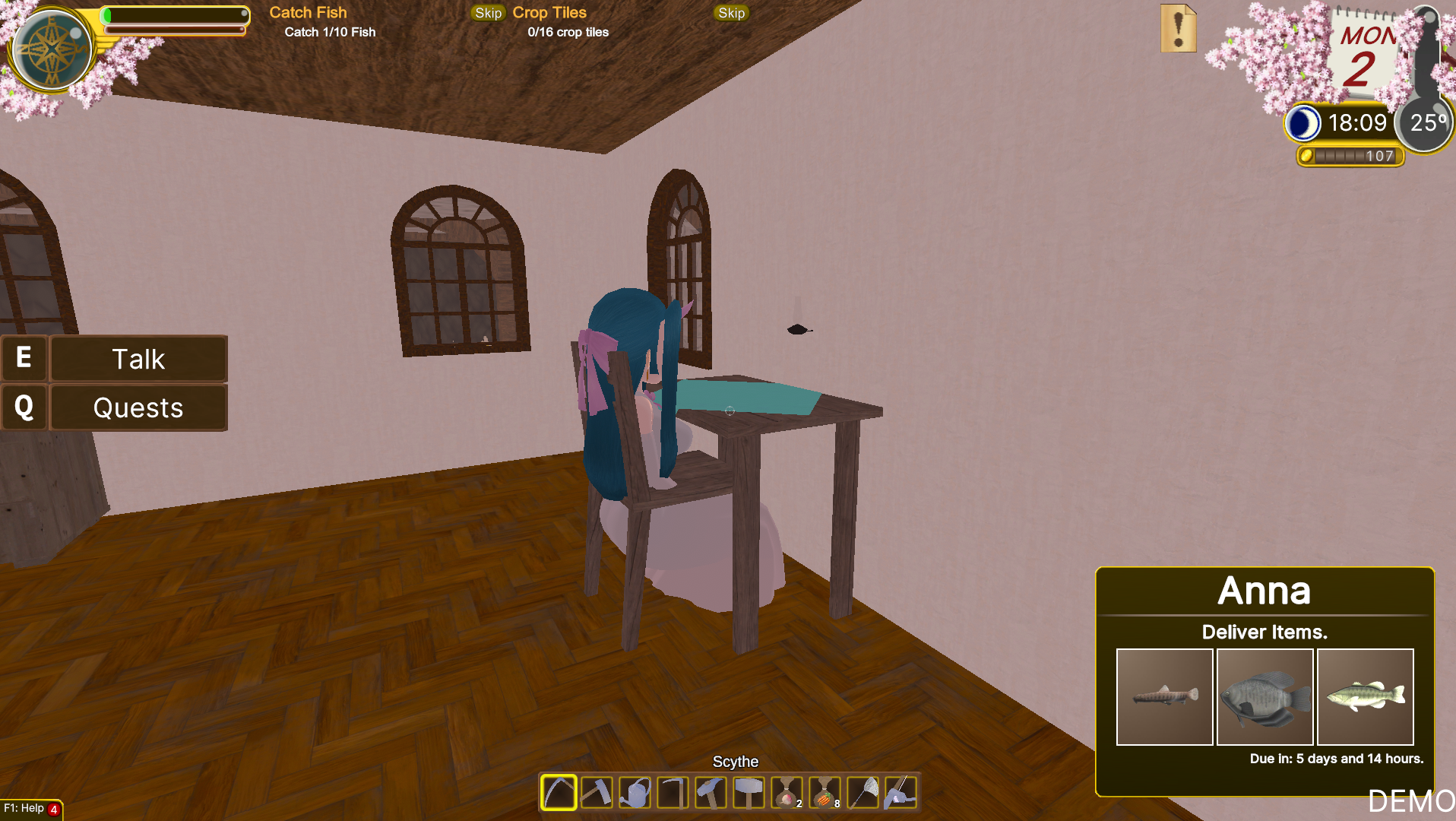
found another NPC and shes glitched into a chair (included a picture below)

THE SUN IS GIGANTIC HOLY SHIT everyone on this planet would be dead if the sun was that close lmao
WAIT THERE'S MORE STUFF UP HERE??? THERE'S AN ENTIRE FARMHOUSE AND LIKE A SMALL BARN AND A SILO
BUT IT SERVES ZERO PURPOSE AND IS COMPLETELY EMPTY
the actual crafting systems are incredibly detailed
now as I understand, this is the 'catch' of the game and it is very true, it is absolutely bottomlessly detailed
i personally find it offputting in a game that is meant to be a 'comfy life sim', and i have played many modpacks in minecraft that have vast expansive crafting/harvesting systems
but, as said in the game's screen, it's not for everyone, and i respect the decision and it seems well made. you can tell a lot of thought and careful consideration was put into it and it does kind of scratch a type of itch
my closing thoughts are that this is a very endearing game but the eyes are entirely too big for the stomach and it has spiraled out of control
if nothing else, the entire city needs to be redesigned or pruned. even for the most die-hard fan of an intricate life sim like this, they would be put off by the excessive unused space. likewise, the not die-hard fan of intricate life sims would not find ANY appeal in this game because it's too complex AND hard to navigate
it feels like there are two parts at play: there's a person who wants to design this intricate, bustling city and it's outlying areas, filled with content and NPCs; and there's a person who is struggling to realize their dream farming game with insanely detailed crafting mechanics
and those two people are not communicating or working together, but rather doing their own independent things
I think a lot of people would like to see you succeed and I am one of those people.
if you want more feedback on something let me know, I look forward to playing your game next demoday as well.

