Very dangerously addicting game.
Great concept, lots to work with. I really appreciated the little bomb puzzle in that one level. The dopamine hits when balls start chaining together over and over is very strong.
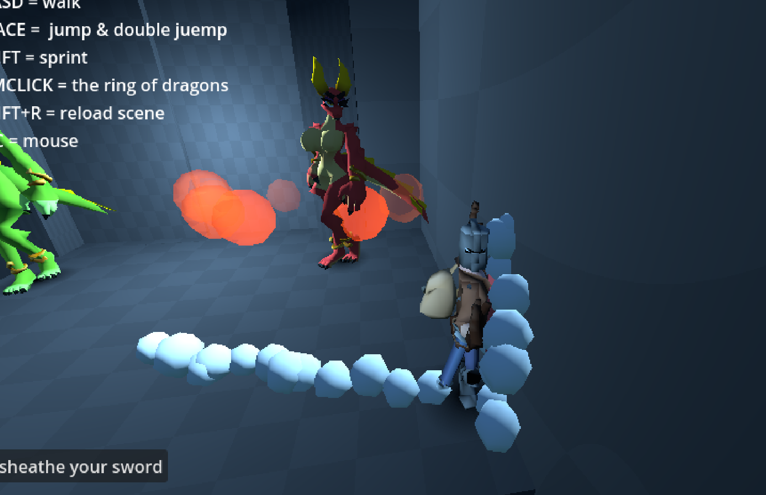
Item equip system is a little weird but can easily be ironed out. Only bug I found was that my knight somehow shot backwards one time outside of the safety zone? and he stayed there until the next turn, which was weird.
This is a sleeper hit for sure. Not following through on this one would be a travesty. Very fun game I hope I get to play more of it in the future.
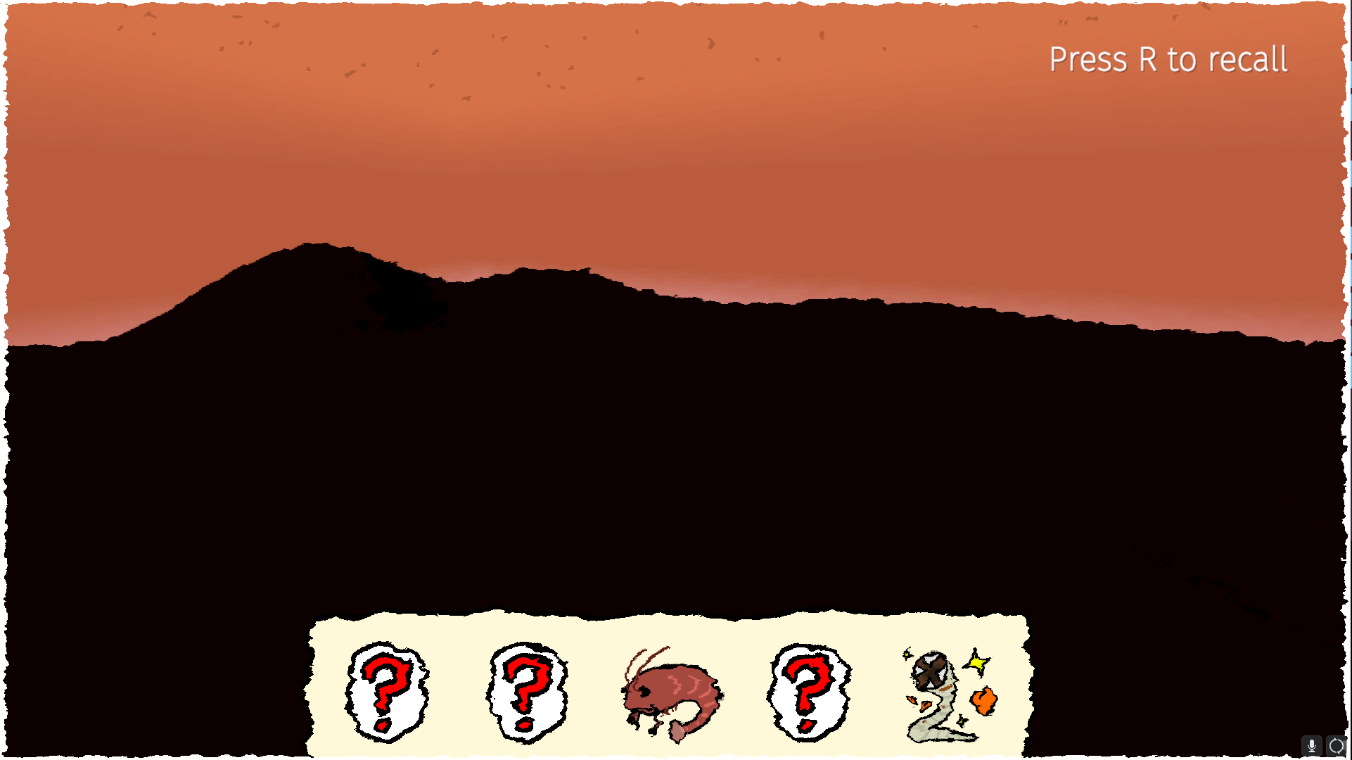
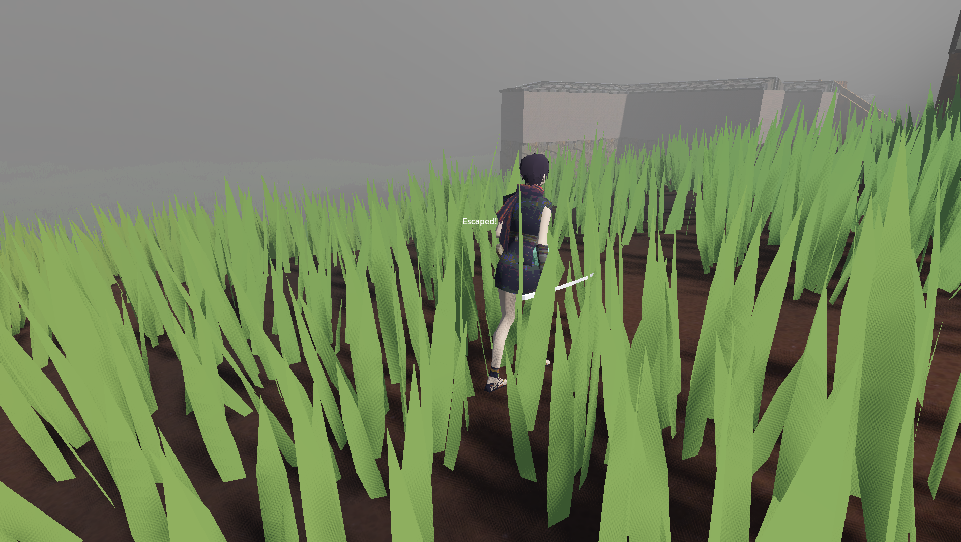
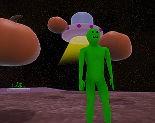
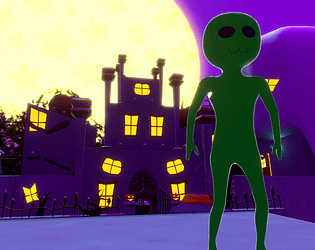
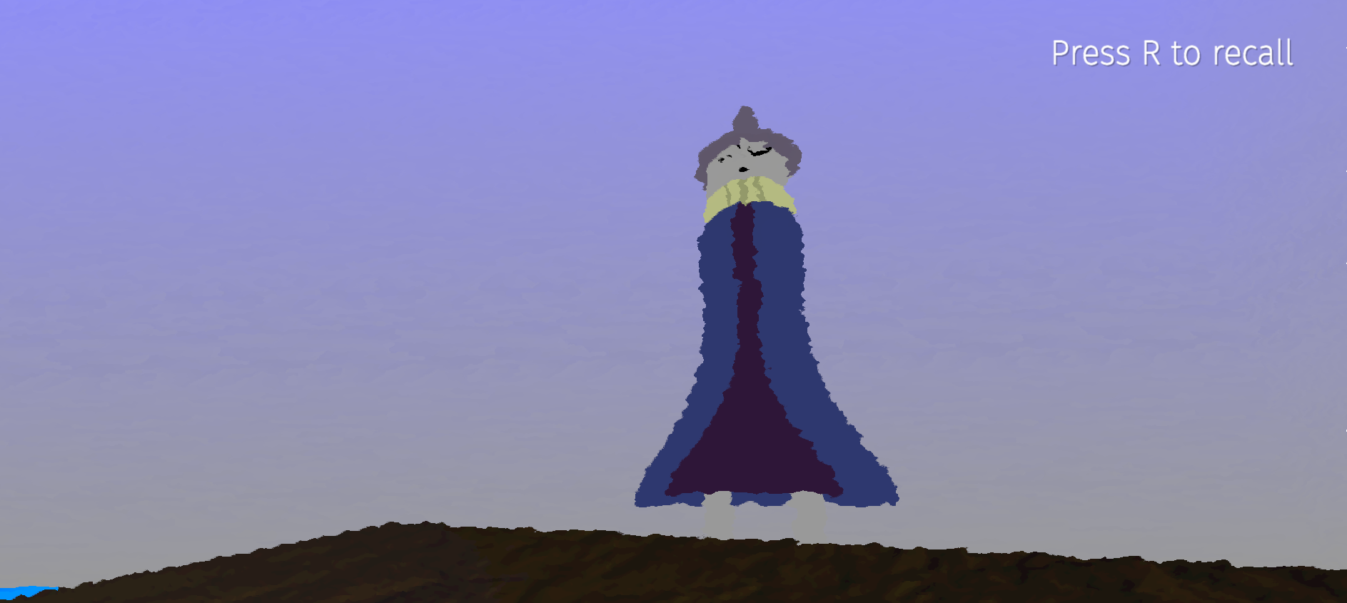 I think my favorite part is the filter. It makes things in the distance seem dream-like and surreal. That's a very powerful thing.