I played this for a while as a mage. I enjoyed it enough to play it for more than an hour. The following are just my opinions and I'm not an experienced gamer or game developer so take them with a grain of salt.
Well, a few things are: the ui needs some work (especially the skills menu is confusing) and the style doesn't really fit the fantasy theme, although I assume you're aware of that. I'd like to be able to carry more weight (or at least make the potions lighter. 20 potions for health, 20 for mana occupy 80% of space and I don't think that's such an outrageous amount to carry) and the spells need some variety imo. I'm not a great fan of the skyrim approach to elemental spells being separate but essentially all the same except for some minor side-effect. How about this: you get one active "energy orb" skill that you can combine with elemental support skills like "poison", "fire", "cold". Or just make the projectiles different enough for a separation to make sense (like for lightning)
But that's not the main problem: your spell system and interface is confusing as hell. While playing I did not realize that it was extremely stupid to level up my lightning bolt skill as I could achieve the same effect buying the passive lightning mastery skill with the same effect which however does not drain additional mana at cast. You see, in 99% of video games "level up" means "gets better", here I'd argue it gets worse. In my playthrough I found that using anything over lvl 2-3 was just not cost efficient, as a big chunk of damage was due to INT anyway and the added value had a big spread (1:3) making it feel unreliable. Gambling a third of your mana when taking a shot isn't wise. Also I did not realize projectile skills were both active and support at the same time. I did read the explanation in the menu, it just did not clear that up for me... And right now I'm combining a 2 mana bolt with a 2 mana "chain shot" support and the resulting cost is 6 mana+1 stamina. How? Why? Another thing is the way you present the classes is a bit disorienting to me. I would've been less confused by having a central menu showing all the classes and then each class leading back to that screen. You also have an "inquisitor" tab with no skills. You should've changed that tab's name to "Nodev". Get it? Nodevs... have no skills! haha...
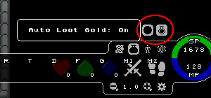
Coins are a bit difficult to pick up. Sometimes I click them and they don't get picked up. I don't know maybe it's just the hitbox being a little too small or something. In titan quest there's a key shortcut for picking up all the stuff that you obviously want such as gold and potions. You could do that, or maybe make the gold get picked up automatically within some moderately large range to speed up the process.
I've found that running in a circle around an enemy confuses him so much he doesn't do anything but spin around, he doesn't shoot or move. It doesn't affect gameplay since I need to stop to cast, but it's just a little silly I guess. (I had 10%+ movespeed btw).
Enemies sometimes miss when casting the clouds of poison smoke. They cast it behind me occasionally. Just letting you know if this is not intentional. Also it doesn't really make sense to give enemies spells with multiple shots since I'm just one player anyway, but I guess that's really a nitpick.
Overall I still enjoyed it to some extent. I'm looking forward to playing this in feature demo days.


