Part 7
Affected by my own Ethos.
I took a few days off to clear my head and center myself. I was struggling to see the vision and I knew it was burn out. I had been going for a little more than 2 weeks and I hit a wall.
in times like this a lot of questions come up and cloud the vision, "Can i finish in time?, did i blow out the scope too much for a solo project, if i crunch against the struggles am i betraying the message of the game i am making?" i knew if i tried to push against that wall i would only burn out harder , and taking breaks for your mental health is literally the game.
so a few days off, binging the Walking Dead's final season. still fun enough to keep me engaged, yes i know its like not great but I love bad things, and so should you.
i also messed around with the sprite stacking demo.
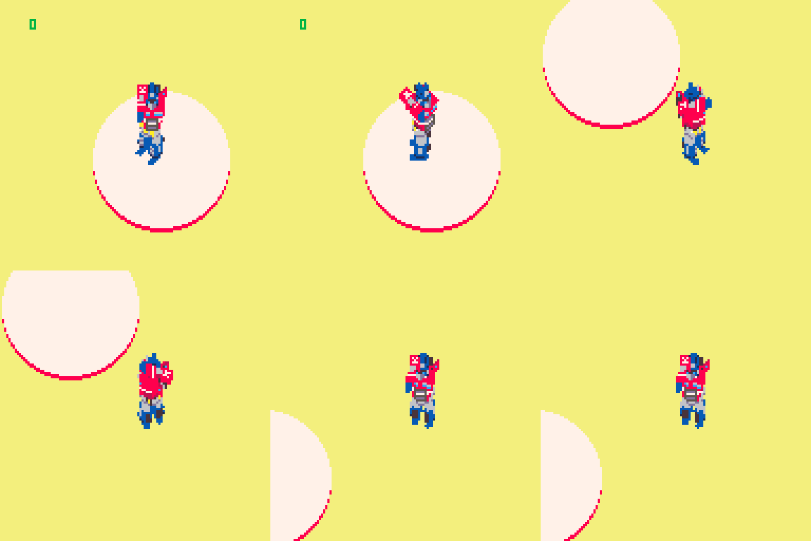
little attempt at Optimus Prime
just some ideas for how to make a mech game, inspired by Loki's work on his tank game.
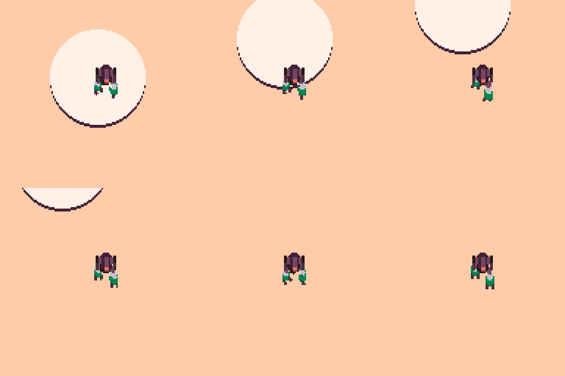
i want to see if there's a way to create sprites for a full walk cycle, but its a time sink and ill get back to it later.
getting back to it.
effort and authenticity are greater markers for quality than polish and hype. I think this is why games like undertale can be hits, because it came from somewhere real, and you could tell the creator cared to make something that showed that.
I aim someday to do the same.
refreshed I came back to the game , but now I had some clearer picture of steps to take moving forward.
I refocused my todo list and got to work.
“I began furiously making lists, and more lists, until I was making lists of lists . . . .”
“The best part of making a list is, you guessed it, crossing things off.”
― Adam Savage, Every Tool's a Hammer: Life Is What You Make It
Clouds ,clouds, and more clouds.
I had planned from an early point to use SSPR to draw my cloud sprite larger, and then to use FillP to dither it.
I had messed around with dring it procedurally, but it was more work than I had time for.
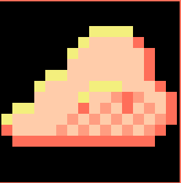
this is the cloud sprite. we will now blow it up
this had some unfortunate effect with the dithering pattern in the back making for fun but distracting shapes.

this is better but the shadowed part breaks down in the dithered section of those two colors.
I left in the highlight,and flipped the sprite because it felt like the cloud should billow towards its movement direction.
i think this looks pretty good, and when the light changes the clouds look darker, and when they stack it looks like a larger cloud shape.
Custom Font because Pico is in all caps and feels like its yelling.
This is supposed to have a chill vibe...sorta. so it feels like i should have a softer less intense font .

I wanted a soft edged , minimal hard corners, lowercase font, that i could use as Puny font in Pico. this would allow me to capitalize names and first words like a normal sentence.

I like this. it looks more like a traditional font. dont love the M and W situation, ill address those maybe.
i went on the Pico-8 BBs and looked for a text box display option, since i felt trying to code one from scratch would eat up too much time.
https://www.lexaloffle.com/bbs/?tid=38668
found this simple one that does what i need. little noises when it prints the letters, and a skip to display all text option. no built in word wrap but i'll live.
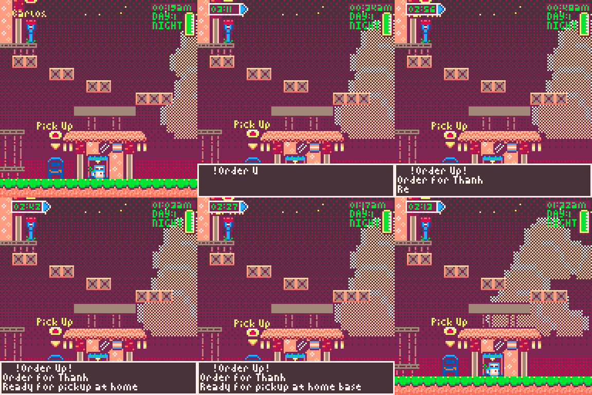
I don't like how it overlaps the player. so i might write something to move it based on where you are on screen.
I added some changes to the map lay out. put the player start and return position in the center with a few delivery locations on each side.
added an Amazon themed mail pick up box.
i like these changes. now it feels more like you are receiving a job when an order comes in, plus its an opportunity to use the title of the game. ORDER UP!
Where am i going! Why am I here!
I needed some way to tell the player where to go. its all well and good that i know where things are headed but the player needs to know as well.
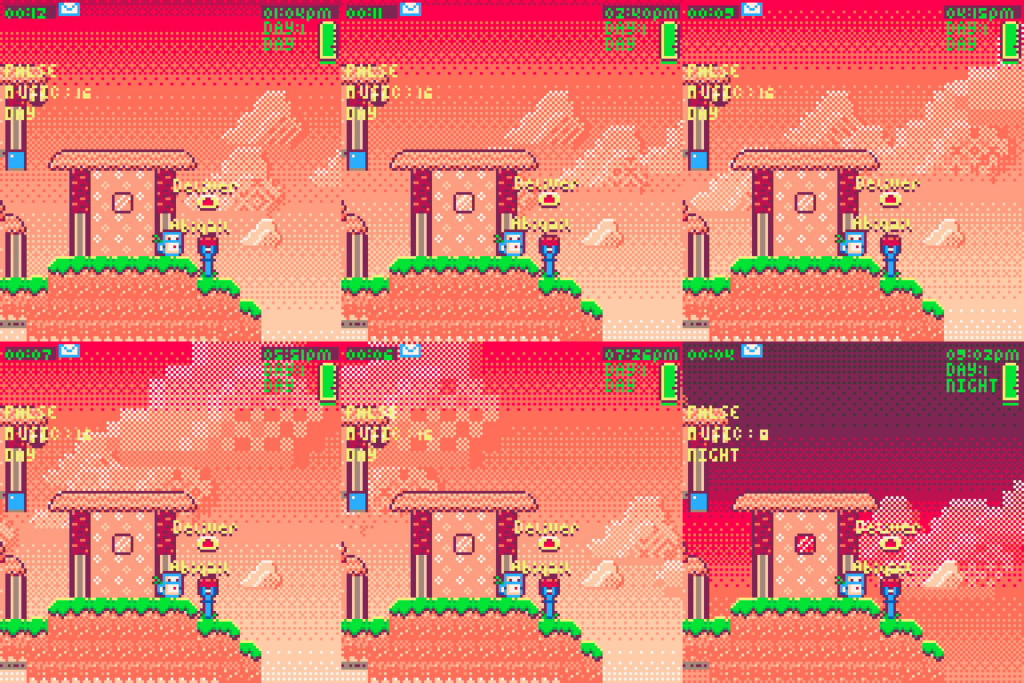
Several things would help here. Labels for the Mailbox's seem like a first step.
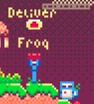
I'll be making these proximity based soon. for now they all appear. but it should only be the ones you currently have a package for and only when you are nearby.
I used a sin function to make them bob up and down. real nice and simple
- text y value=text y value + sin(time()) -
real easy way for some less static elements.
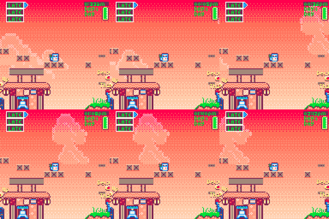
Now I need some sort of direction marker saying which way your delivery is . telling me their name is nice. but lets also get a pointer. Its a bit easier than I had wanted the game to be but heck I don't expect anyone to play this long enough to learn where people are.
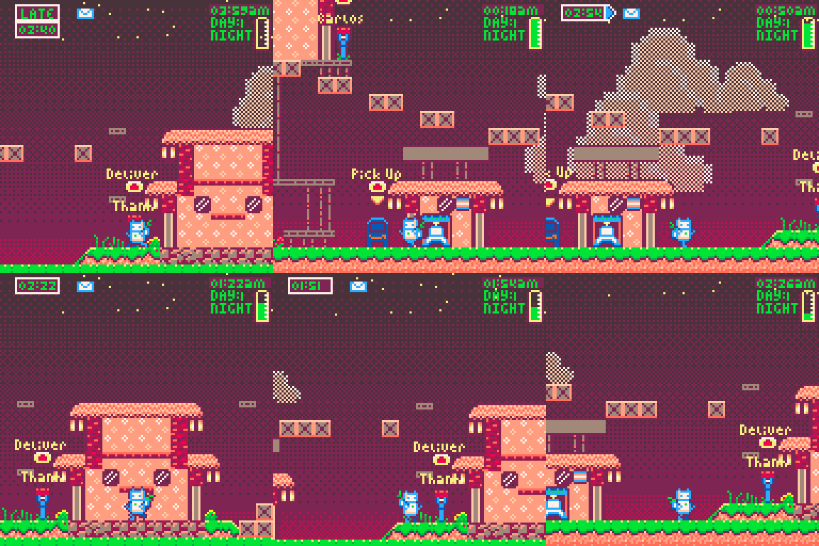
currently it points towards the orders reception point. I gotta add in ones in different colors for each order, eventually when the mailbox is on screen I want the timer to move over and hover above the mailbox.
The world has people in it , and so should my game.
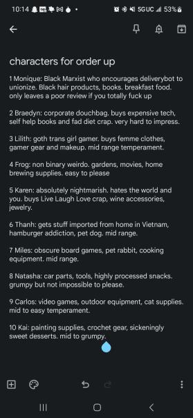
I requested to my Writer girlfriend a set of characters. i needed about 6-8 people with distinct personalities who could become the NPC's in my village . these are what she came up with.
The goal would be for at the end of the day, you get a set of reviews and it affects your bosses view of you. each review would be positive or negative based on how early or late you turned in the order. maybe some reference to what they bought, that helps define them.
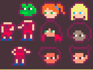
left to right , top to bottom we have
Frog,Natasha,Karen,Lilith,Monique,Carlos,and Thanh
we will see if i end up needing more but for now 7 will do.
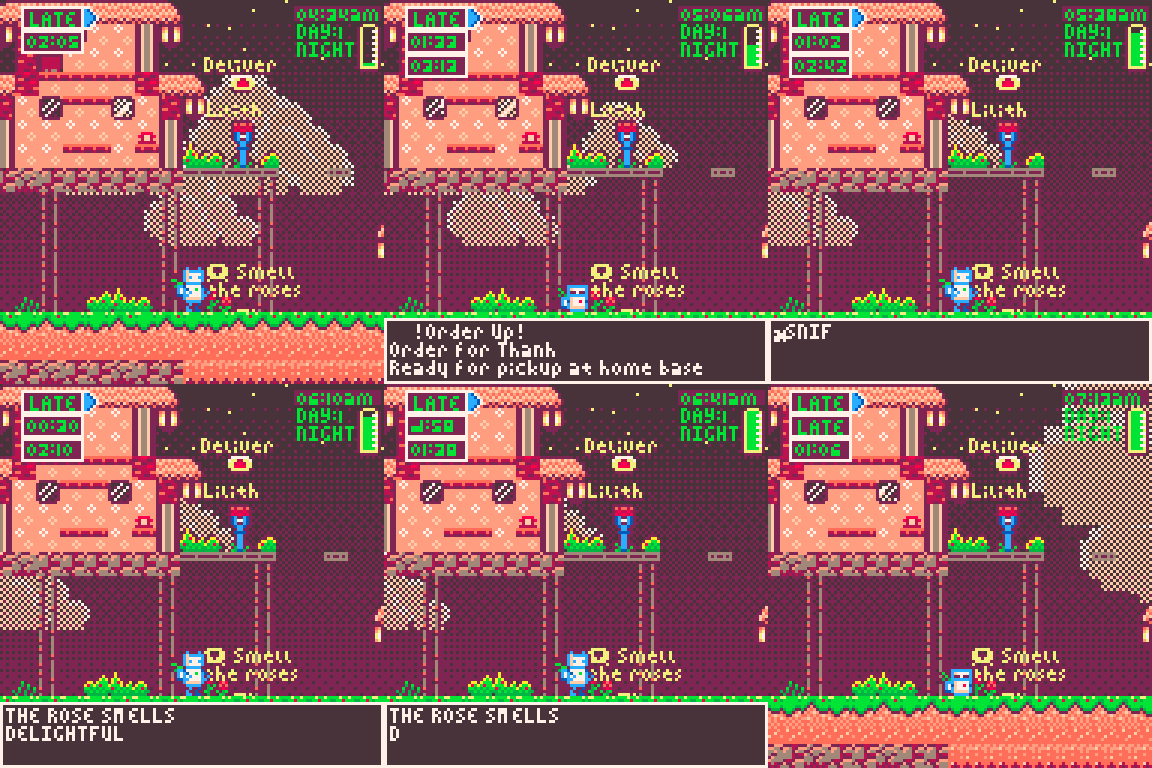
stop and smell the roses, literally.
flowers! and other things.
A big part of this whole thing is taking time out of your day to enjoy life that helps you recharge . so i added in markers and interaction points for the roses i had on the ground. it's a start but now i need to populate the game with small joys of life to soak up.
here are some of the sprites i made, little chickens to feed, frogs to catch, a fox to encounter. there will be more flowers, a spot that becomes available at sunrise and sunset to stop and enjoy that.
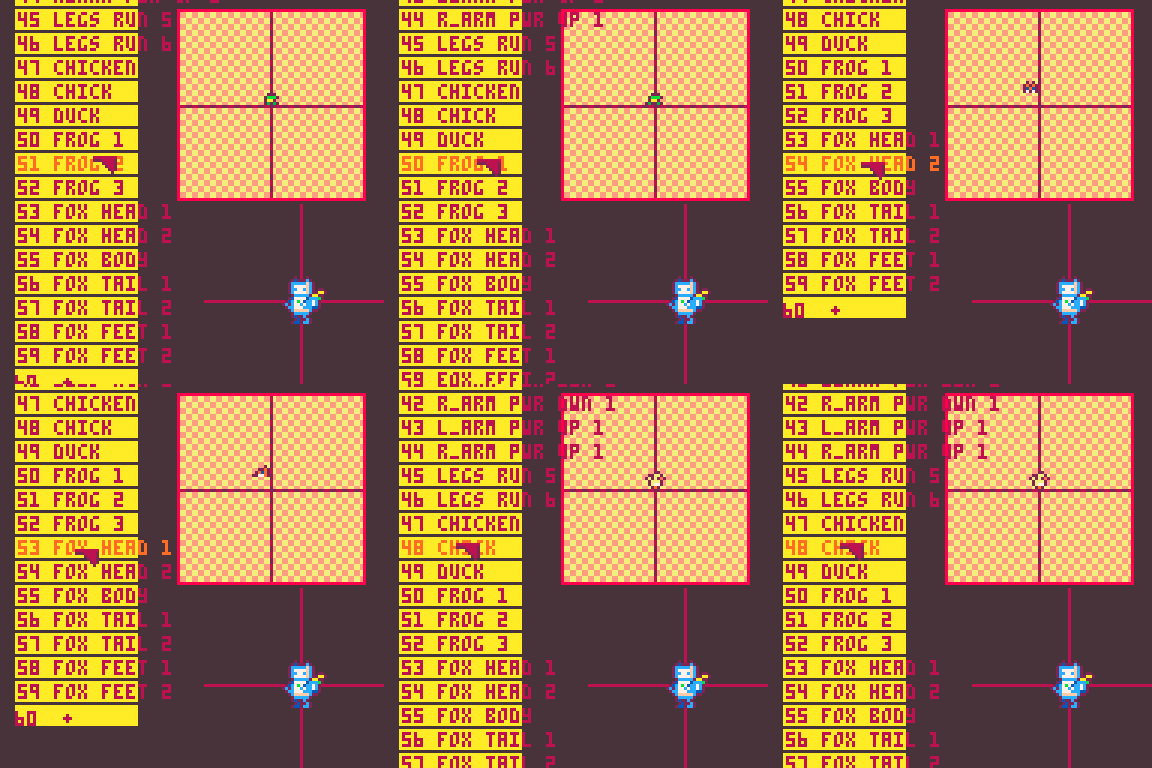
i also went in and used the new system to add the opposite leg in the walk cycle.
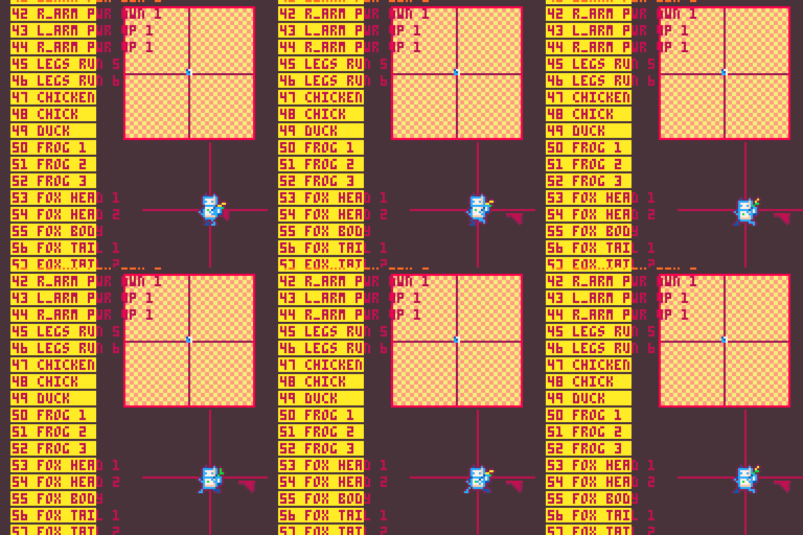
much nicer!
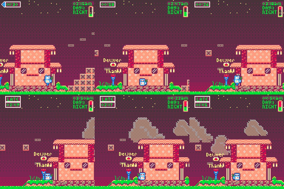
ok so , if you are running your battery out, not stopping to enjoy the pleasures of life and being forced to shut down, it wears out your battery. this degrades your overall charge. I aim to have this be something you can undo with 8 hours on the charger at home.
I got a lot done, sorry i didn't check in more frequently but managing burnout also means making space and sometimes that space was this devlog.
only a week left. lets see if i can cross the finish line with something worth my time.
-Alice- <3


