you can in the code for any element target the grey scale values and replace them
pretty much viable in every engine.
Here we are once again. its a day after the original submission date. I don't know if i missed that it was going to have a two week submission window or if that came up midway through this past month, it's kind of been a blur. Well now I know, so I put some expansions on my "scope achievable by the submission date". i Asked my girlfriend that is a writer to whip up some more dialog,reviews,boss lines,book quotes and generally give each of the NPC's i had wanted in my world some character and a foundation on which to base things.
Before I could bring my NPC's to life i had to create their sprites.
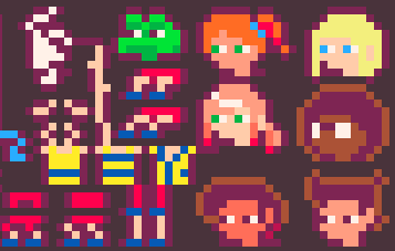
i updated the art for them. refined the outfit body diversity and then set to work.
only to realize i had so many more sprites i still needed to get into my system. so now for hours and hours of finding the space, enting the numbers, testing offsets. i kinda wish now that id take the 3-4 days to make the editor to do this easier.
All too often miners, and indeed other trade unionists, underestimate the economic strength they have.
a hundred is sprites later i had a whole host of sprites selected and set.
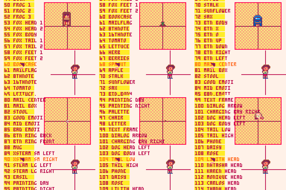
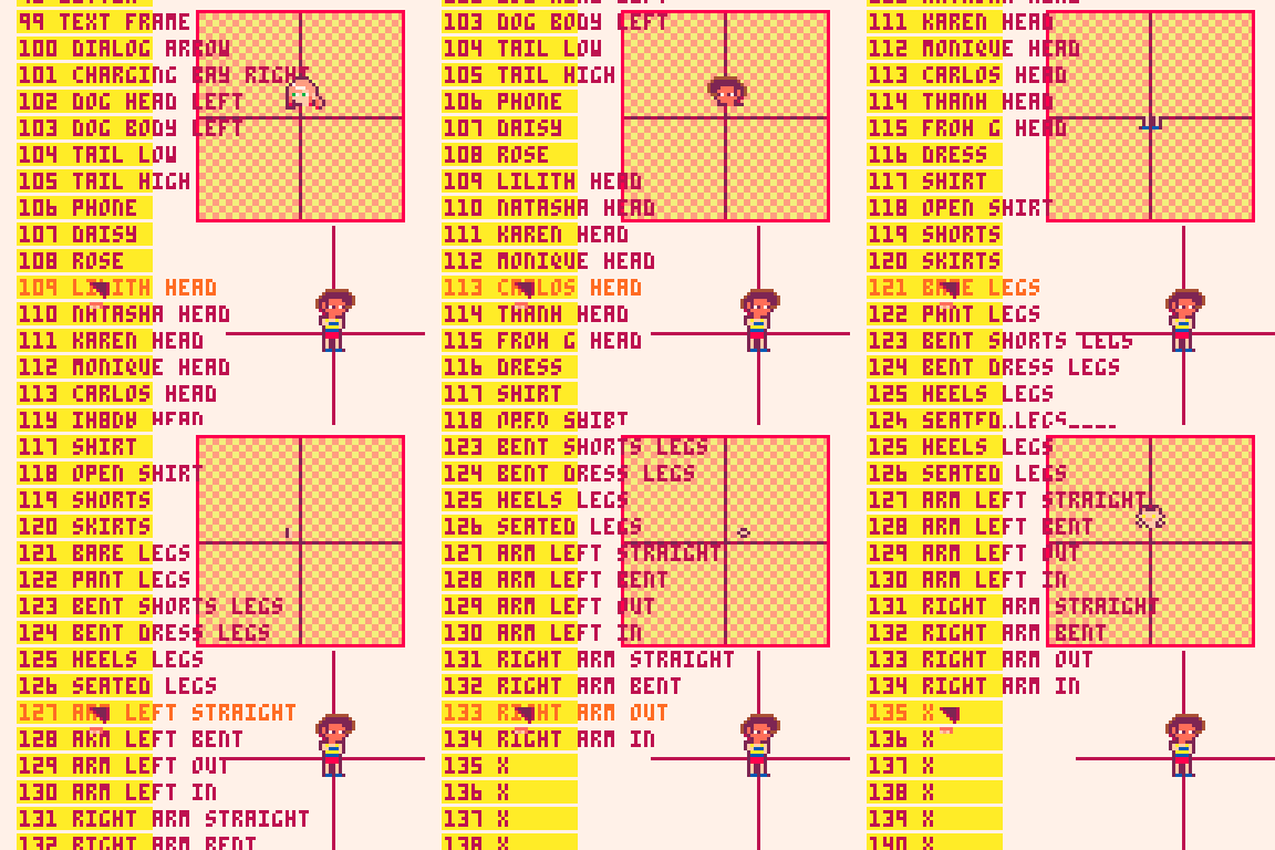
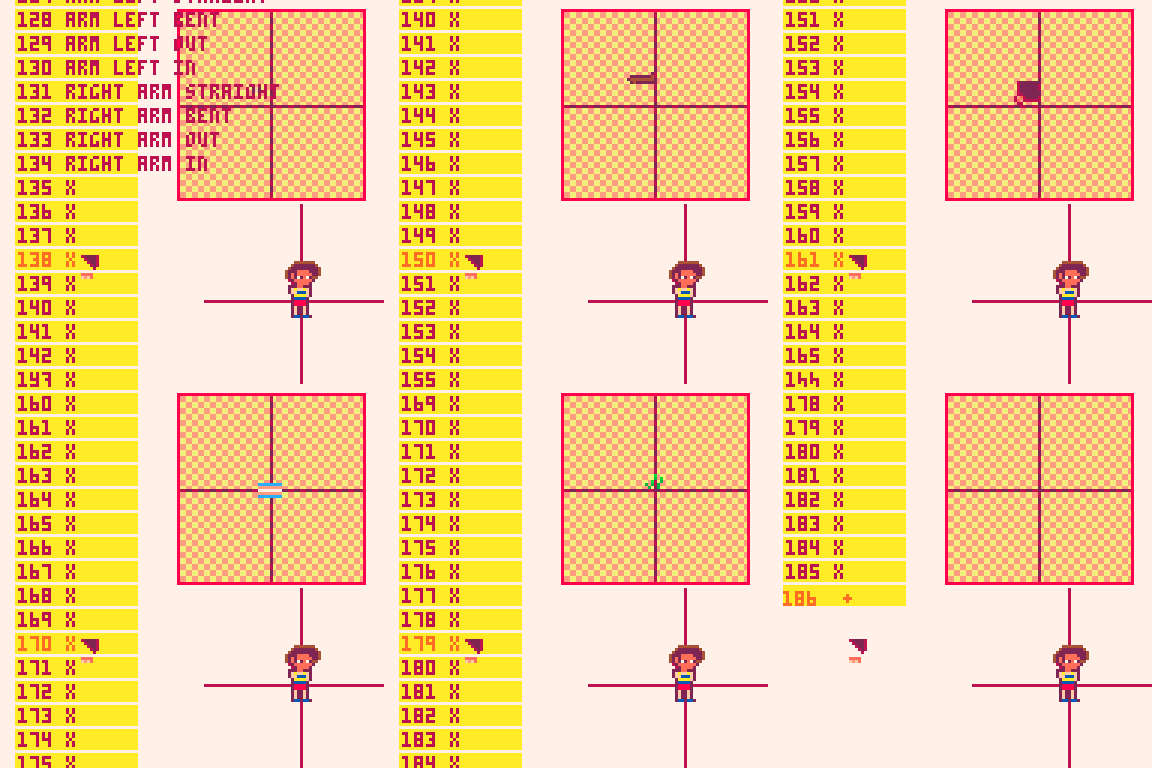
ok , well i guess it was about at this point that i started to become impacted by the process and needed to do something else.
i went and designed the main menu, but for continuity ill show that in a second. lets jump back to the part where i did the compound sprites. (im still not done , but this has to be done in chunks or ill die. )

so the way i designed it ill be able to pal shift the outfits and skin tones to match the heads when they are drawn.
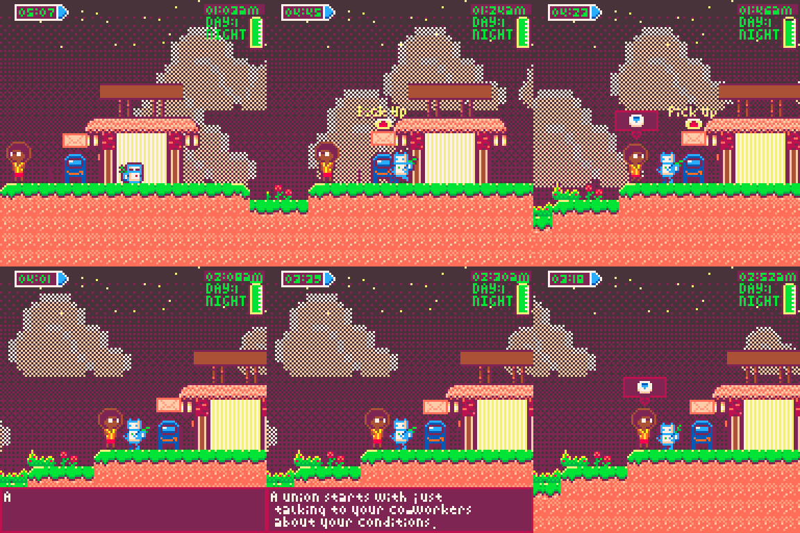
i also quickly added in a little activation prompt for the NPC,s as well as a facing behavior so they are always facing you. i want them to mill about when you aren't talking to them but we will see if i can get there. long term, i want them to move around and have different lines based on what they are doing, right now it's a generic set of things they feel and believe.
if the game didn't feel political before, its definitely does now.
trigger warning: wokeness
That's kind of as far as i got with the Npc system. I still need to hook up their reviews and bookcases.
original concept
cleaned up art.
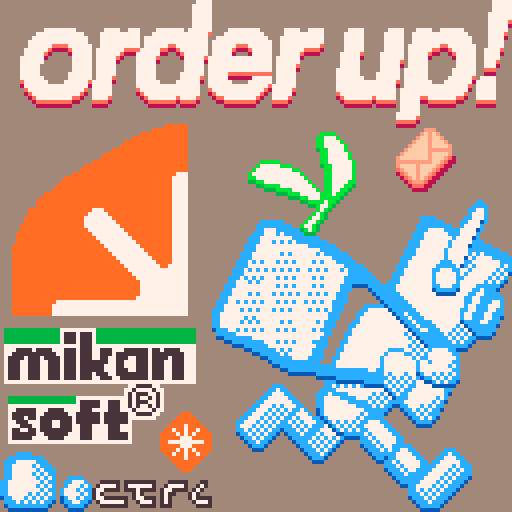
I split the Mikan soft logo into quarters, since i can just draw them flipped. i really wanted the company logo fade in and out, then the menu comes up, the way so many games do. (im reminded to put a 1992 somewhere in this. )
so i had each element move in using Lerps. went for something urgent feeling. Also the main theme kicks in when the mikan logo come up.

i used pal shifting to get the fade in and out, i just had to make an array of step colors to shift to for every color in the pico palette.
the background felt a little empty so lets get some sort of repeating moving background image. like a letter or something?

I really like how that looks. I think it get across the ideas at play. mail moving, running around. Press X to "Go to Work" is very fun.
there will be instruction and thank you pages after this. ill show them when they are done. thats all for now.
thanks for reading :)
tune in for more soon.
~Alice<3
I finished the game, I think it's really important we share our stories. i think trans narratives in media so often fail to authentically capture the experience. there's so much shame and trauma along the path for so many of us. this game touched me, I'm proud of you for opening up. thank you for sharing.
I took a few days off to clear my head and center myself. I was struggling to see the vision and I knew it was burn out. I had been going for a little more than 2 weeks and I hit a wall.
in times like this a lot of questions come up and cloud the vision, "Can i finish in time?, did i blow out the scope too much for a solo project, if i crunch against the struggles am i betraying the message of the game i am making?" i knew if i tried to push against that wall i would only burn out harder , and taking breaks for your mental health is literally the game.
so a few days off, binging the Walking Dead's final season. still fun enough to keep me engaged, yes i know its like not great but I love bad things, and so should you.
i also messed around with the sprite stacking demo.
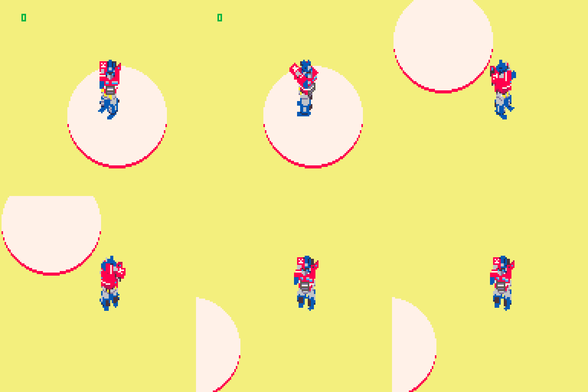
little attempt at Optimus Prime
just some ideas for how to make a mech game, inspired by Loki's work on his tank game.
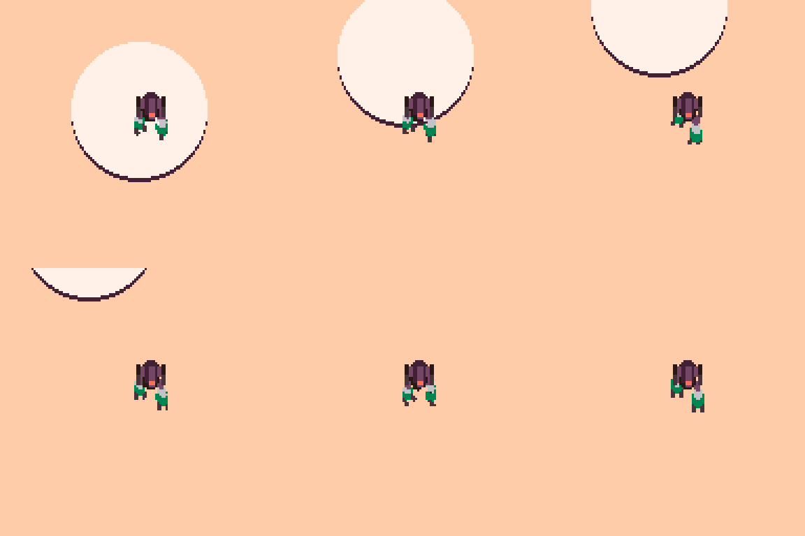
i want to see if there's a way to create sprites for a full walk cycle, but its a time sink and ill get back to it later.
getting back to it.
effort and authenticity are greater markers for quality than polish and hype. I think this is why games like undertale can be hits, because it came from somewhere real, and you could tell the creator cared to make something that showed that.
I aim someday to do the same.
refreshed I came back to the game , but now I had some clearer picture of steps to take moving forward.
I refocused my todo list and got to work.
“I began furiously making lists, and more lists, until I was making lists of lists . . . .”
“The best part of making a list is, you guessed it, crossing things off.”
― Adam Savage, Every Tool's a Hammer: Life Is What You Make It
I had planned from an early point to use SSPR to draw my cloud sprite larger, and then to use FillP to dither it.
I had messed around with dring it procedurally, but it was more work than I had time for.

this is the cloud sprite. we will now blow it up
this had some unfortunate effect with the dithering pattern in the back making for fun but distracting shapes.

this is better but the shadowed part breaks down in the dithered section of those two colors.
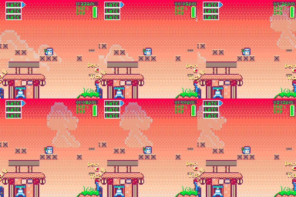
I left in the highlight,and flipped the sprite because it felt like the cloud should billow towards its movement direction.
i think this looks pretty good, and when the light changes the clouds look darker, and when they stack it looks like a larger cloud shape.
This is supposed to have a chill vibe...sorta. so it feels like i should have a softer less intense font .

I wanted a soft edged , minimal hard corners, lowercase font, that i could use as Puny font in Pico. this would allow me to capitalize names and first words like a normal sentence.

I like this. it looks more like a traditional font. dont love the M and W situation, ill address those maybe.
i went on the Pico-8 BBs and looked for a text box display option, since i felt trying to code one from scratch would eat up too much time.
https://www.lexaloffle.com/bbs/?tid=38668
found this simple one that does what i need. little noises when it prints the letters, and a skip to display all text option. no built in word wrap but i'll live.
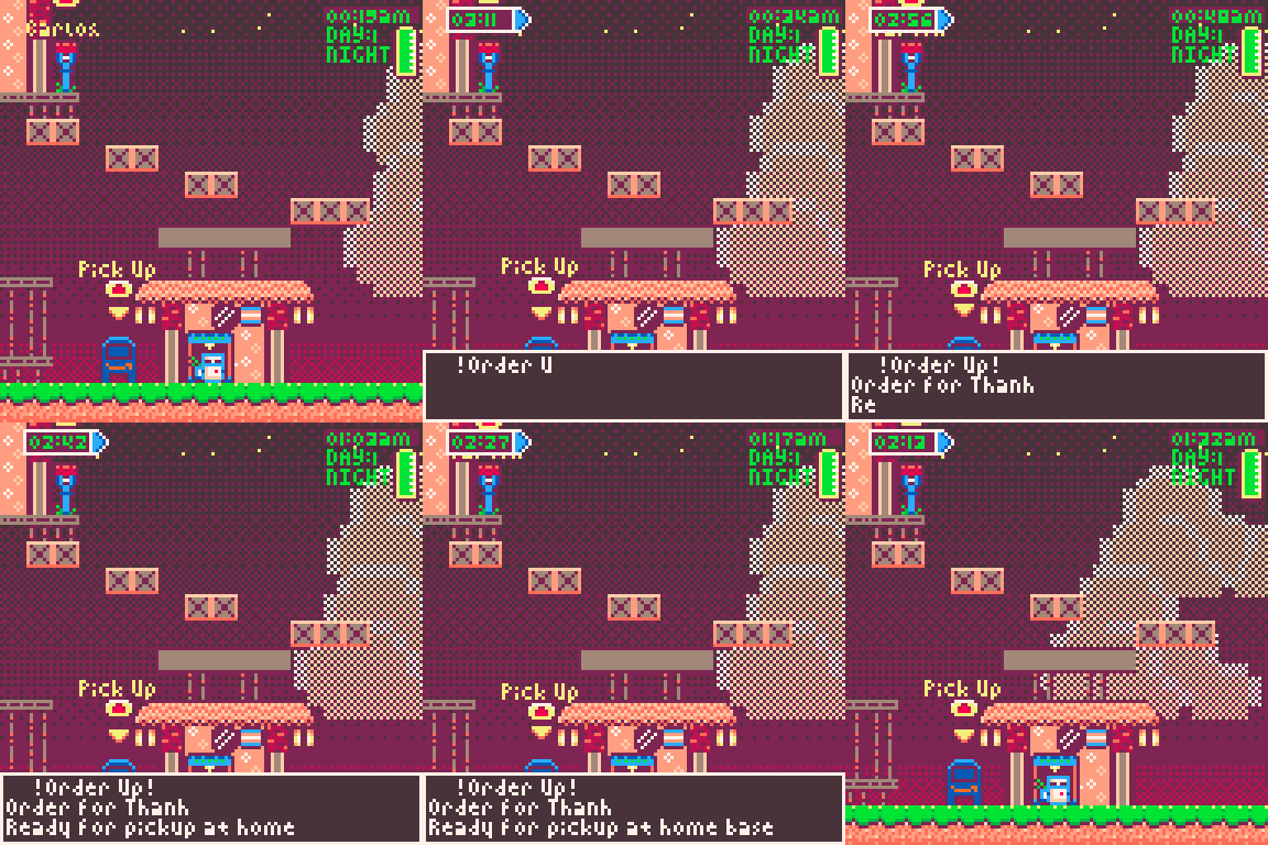
I don't like how it overlaps the player. so i might write something to move it based on where you are on screen.
I added some changes to the map lay out. put the player start and return position in the center with a few delivery locations on each side.
added an Amazon themed mail pick up box.
i like these changes. now it feels more like you are receiving a job when an order comes in, plus its an opportunity to use the title of the game. ORDER UP!
I needed some way to tell the player where to go. its all well and good that i know where things are headed but the player needs to know as well.
Several things would help here. Labels for the Mailbox's seem like a first step.
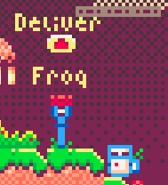
I'll be making these proximity based soon. for now they all appear. but it should only be the ones you currently have a package for and only when you are nearby.
I used a sin function to make them bob up and down. real nice and simple
- text y value=text y value + sin(time()) -
real easy way for some less static elements.
Now I need some sort of direction marker saying which way your delivery is . telling me their name is nice. but lets also get a pointer. Its a bit easier than I had wanted the game to be but heck I don't expect anyone to play this long enough to learn where people are.
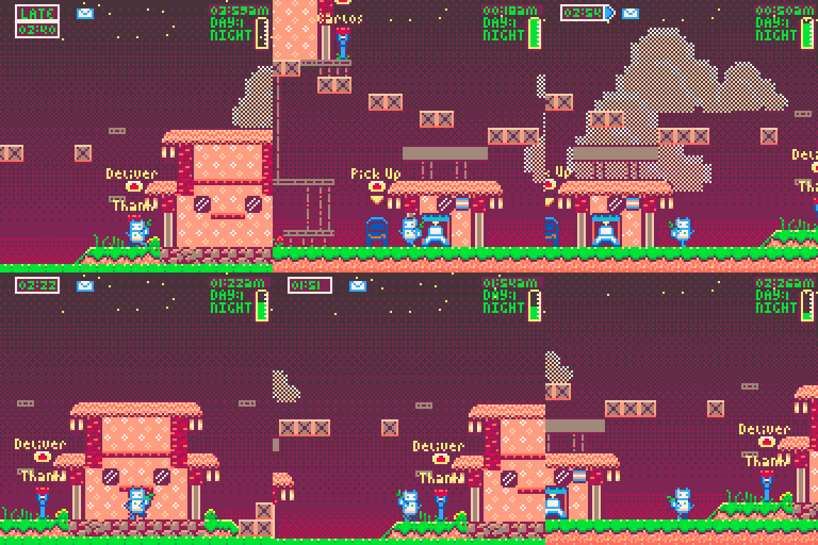
currently it points towards the orders reception point. I gotta add in ones in different colors for each order, eventually when the mailbox is on screen I want the timer to move over and hover above the mailbox.
I requested to my Writer girlfriend a set of characters. i needed about 6-8 people with distinct personalities who could become the NPC's in my village . these are what she came up with.
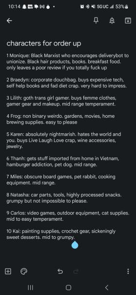
The goal would be for at the end of the day, you get a set of reviews and it affects your bosses view of you. each review would be positive or negative based on how early or late you turned in the order. maybe some reference to what they bought, that helps define them.
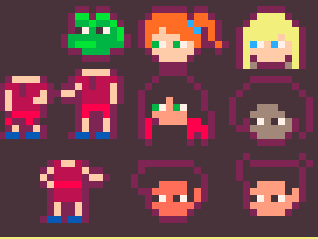
left to right , top to bottom we have
Frog,Natasha,Karen,Lilith,Monique,Carlos,and Thanh
we will see if i end up needing more but for now 7 will do.
flowers! and other things.
A big part of this whole thing is taking time out of your day to enjoy life that helps you recharge . so i added in markers and interaction points for the roses i had on the ground. it's a start but now i need to populate the game with small joys of life to soak up.
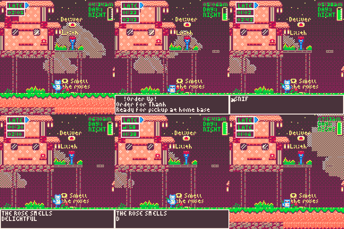
here are some of the sprites i made, little chickens to feed, frogs to catch, a fox to encounter. there will be more flowers, a spot that becomes available at sunrise and sunset to stop and enjoy that.
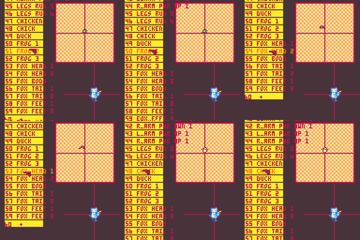
i also went in and used the new system to add the opposite leg in the walk cycle.
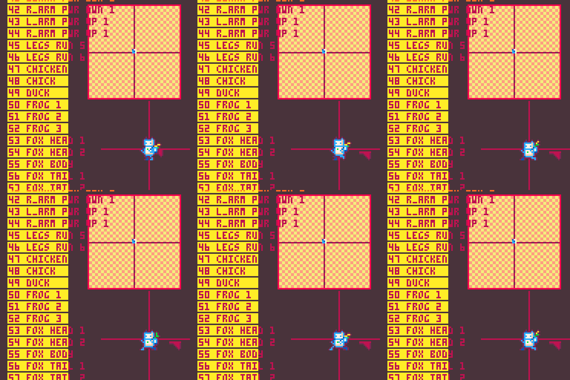
much nicer!
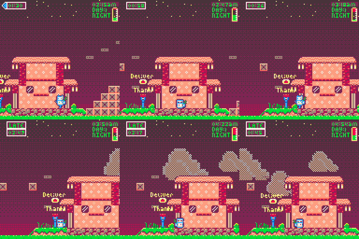
ok so , if you are running your battery out, not stopping to enjoy the pleasures of life and being forced to shut down, it wears out your battery. this degrades your overall charge. I aim to have this be something you can undo with 8 hours on the charger at home.
I got a lot done, sorry i didn't check in more frequently but managing burnout also means making space and sometimes that space was this devlog.
only a week left. lets see if i can cross the finish line with something worth my time.
-Alice- <3
Up next I needed to add the New Compound sprite system back into the main game. I designed this to take the exact same type of input as the previous system. i set all my animation frame arrays to the new corresponding sprite numbers. it should work now right?
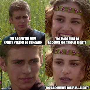
NOPE.
-- (flip0-1,mirrorx0-1,mirrory) don't need for order up yet, include soon....... This is the actual line in my code lmao, how wrong you were me from yesterday.
well i headed back into my sprite code and added a flip offset x value, so i can give each part a custom offset based on where it needs to be when flipped.
this worked a charm but i basically had to do the whole sprite sheet again but backwards lol. at least the bodies were always in the same spot.
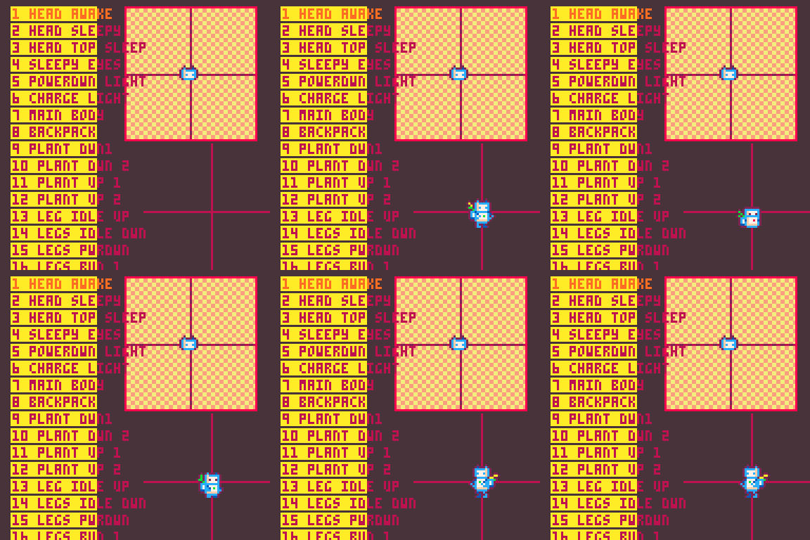
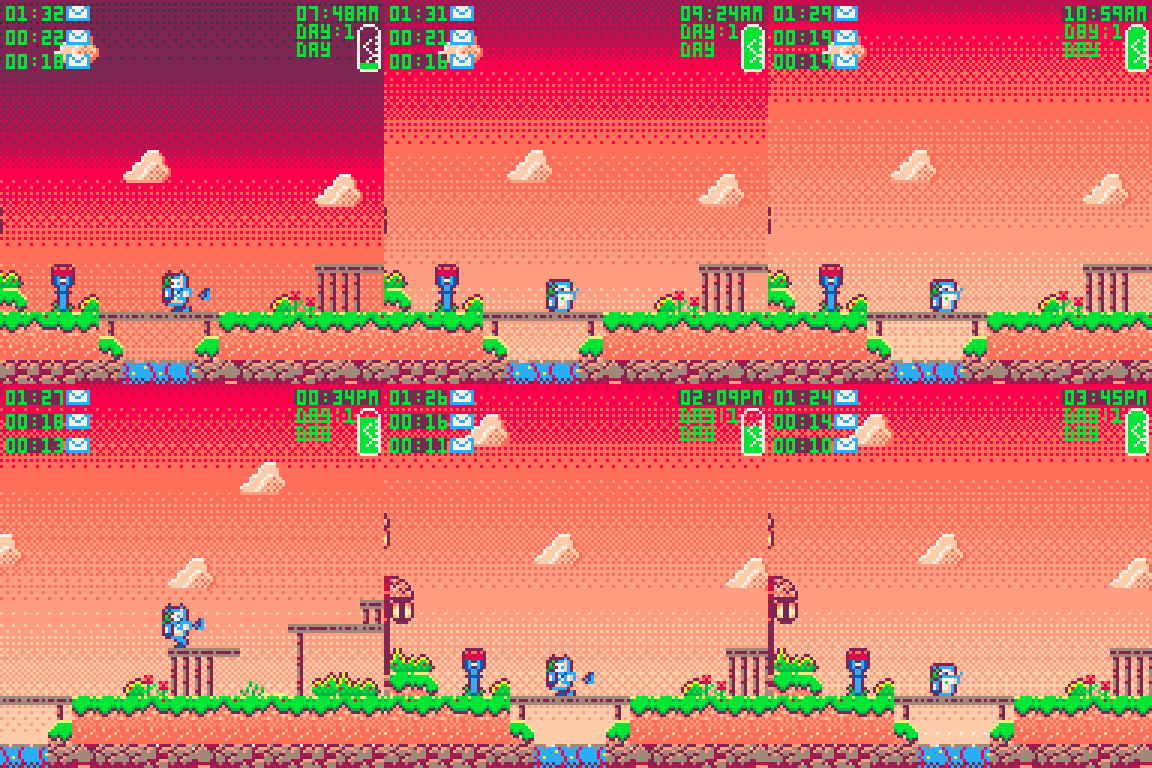
ok got those figured out. i added a frame to the shut down and made it even sleepier.
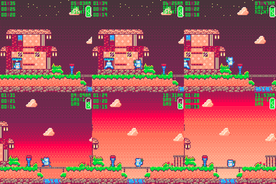
now this is in the game i can address things like the run cycle is looping like half of a run cycle, now i can put the rest in. account for the return back to the start point.
wish me luck, tomorrow is beginning the rest of the games art.
see ya soon,
-Alice-<3
Today we are focused on redoing the sprite sheet with a more compact and versatile sprite draw style. this one required me to do some complications to previous systems that we had.
Basically i wanted to draw my sprites no tin one large piece, but made up from smaller pieces.
the current usage of the sprite sheet is not economical. so much empty space and also large portions of each sprite are drawn over and over. mainly the things that change when you move is the hands, back pack and plant bounce, and head bob. with this in mind i tore up my sprite sheet and arranged all the unique sets of pixels for each pose so i could call each in an sspr call.
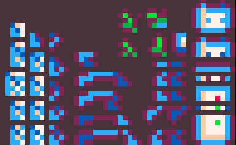
all redundant pieces removed and organized. I could pack things even tighter, but then it gets much harder to pick out the right sprite when doing the sprite making.
I put in the leg work and got every sprite written up into my data string for sprite custom sprite draws.

here's all the parts.
now the next bit. I had the function to read a string that was an array of arrays. storing large data sets at strings really helps reduce the cost of things on Pico-8.
this iterates though an array filled with arrays that are filled with arrays. so now its going to be given an array of custom sprite draws, that will look to another large set of data for the details on how to draw those. but to do that we have to figure out how to read it. so 3 dimensions of split function on 3 different separators. so 3d split calls 2d split who calls split. sure, not stupid at all whatever.
function split3d(s)
    local arr=split(s,"/")
        for i,v in ipairs(arr) do
            local arr2=split2d(v)
                for k,v in pairs(arr) do
                    arr2[k] = split(v)
                end
        end
return arr
end
function split2d(s)
    local arr=split(s,"|",false)
        for k,v in pairs(arr) do
            arr[k] = split(v)
        end
    return arr
end
ok so we got that working. slight smooth brain around for loops and the pairs loop is even more so a thing havent used as much. theres like 5 for loops and i dont always know when to use the right one. gotta practice that.
I've started prototyping each new function outside of my game. it allows me a lot more clarity around how things work when i can just make a little raw math prototype. really helpful, plus then i have a little isolated tool to ad to my tool box.
so the custom sprite calls function I had was designed to look at an array for the dimensions and locations of my sprites in my sprite sheet. what I needed was to be able to run a for loop trough an array that takes the indexed sprite calls made by msspr and gives them a custom offset from center. so here is that.
the array for csspr looks like it does, so its nuts but it works. sprite,x,y and off we go.
cspr=split3d"1,0,4|7,0,0|8,5,-1|10,5,2|13,1,-5|23,2,-1|24,-2,-1/7,0,-1|1,0,2|5,0,-2|8,5,-2|11,5,1|14,1,-5|25,2,-2|26,-2,-2/"
function csspr(si,sx,sy)
    cs=split2d(cspr[si])
        for s,v in ipairs(cs) do
            msspr(cs[s][1],sx-cs[s][2],sy-cs[s][3])
        end
end
function msspr(si,sx,sy)
 local ms=myspr[si]
     sspr( ms[1],ms[2],ms[3],ms[4], sx-ms[5], sy-ms[6], ms[3],ms[4],flp)
 if flp then
     sspr( ms[1],ms[2],ms[3],ms[4], sx, sy-ms[7], ms[3],ms[4],true)
 end
end
The last thing needed was to create the array of information for csspr and bingo. Heres the result.
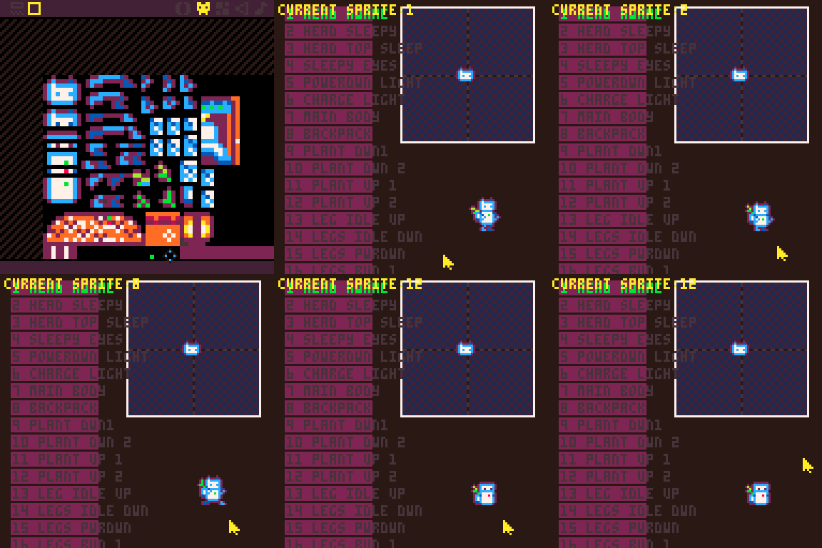
Im very happy, this gets me so much sprite space back on this and every other project im working on. huge win. love this.
Starting to near the halfway point of my code limits. but having all the main game systems handled and my sprite sheet cleared for use its the final runway of content. the "game" is made, but now it needs, menus, narrative, npc characters ,interactable objects, dialog and the like.

stay tuned for more.
Alice- <3
My next steps were to tackle the passage of time. we have timers but a timer without the context of linear time is meaningless.
Step one was to create a 24 hour time clock that moves the day forward, allows me to time sunrise and sunset and most importantly, allows me a way to schedule deliveries.
this 24 hour clock also gets wired up to the
I converted the timer system I built ,into an order syststem. this way at the indicated time of day the order will pop up, and you will need to pick up the package at your home, then deliver it to the destination.
orders have a start time, time to deliver, delivery location, and know if they have been picked up.
here we can see the orders coming in and me using manual controls to make them show as picked up and then delivering them ( the timers get deleted).
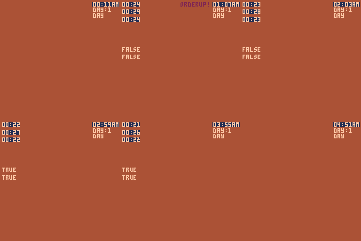
Next all i had to do was hook that system up to the main game. this went well enough.
i did forget to recode the music controls into the new time set up but i figured it out later.
so the biggest part of this game is the assigning of orders, then the delivery of them to the destination.
I used basic ABBA collision and an array of destinations to create a series of drop of points.

with that sorted it was a matter of creating delivery conditions and such and we were in business.
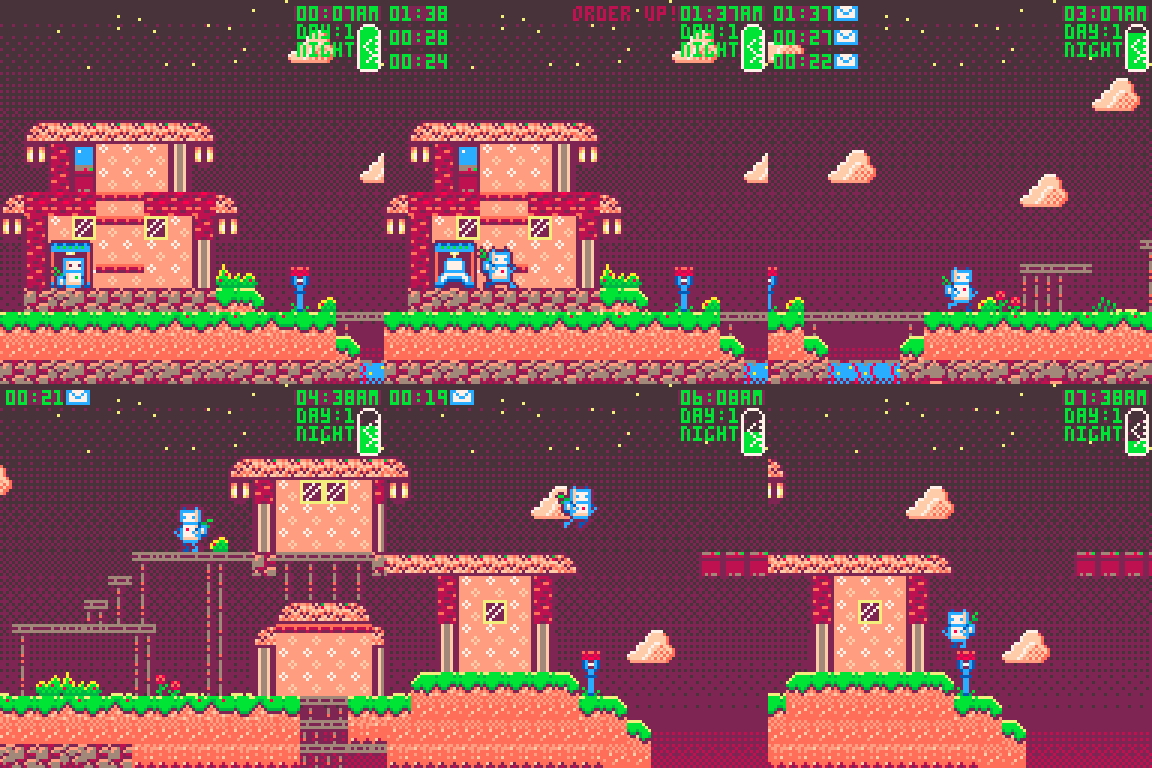
now that's set up, we can see that we have orders come in, the timer goes off, you have to go to your mailbox to collect the packages, you get an icon to shows that you have picked up the order, then the order gets deleted when delivered. we can start to flesh out the people in this little town and really dig into the level design for above and below ground. I also need to start building the Cast of this world. oh god and build a text display system for dialogue interactions.
That's all for today. unfortunately the demand on my time and thus my down time i steal to make this game are limited due to a very busy work week. Hoping for a productive day off tomorrow . need to recharge my battery
Alice-<3
Game, this was a game, I cannot forget. So much of my design is art centric, game second. So visually were well polished at this point, but we need to address the "what to do" of it all.
The heart of this game is Timers!

oh there it is, that was easy. were gonna be converting a number of seconds into a minutes/seconds format.
Next, I need to be able to create the timers as discrete objects that can have their own internal timers. this will be the backbone of the delivery system.
ive also done a thing so the top half and the bottom half of the numbers change with a delay. just a little visual distinction .

Sweet, I hate it. In a good way though. I just hate what the timers stand for.
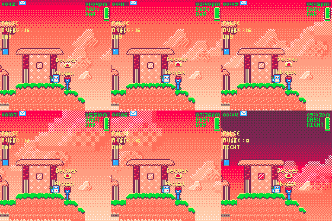
Now for some sky. I wanted to figure out a way to make the sky shift from day to night. I thought lerping the numbers in the array that makes the gradient might work, but it didnt, too much too keep track of. Instead I went with lerping the gradients y position and render double the screens length.
here's that
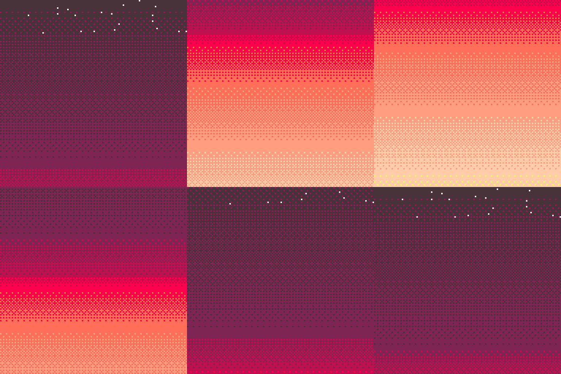
i added some stars to the night end with Srand used to make it the same stars every time. tossing around the idea of there being a sequence where you look up at the stars and see the constellations of this local system.
we will get to putting that into the game later.
I have to put the player to sleep when they run out of power. or to charge up. not 100% on the exact implementations of powering down. but for now, you wake up charged, you lose battery when you are awake, more when you sprint,then when you run out it forces you to shut down.
for now its on a timer but here is powering up and down.
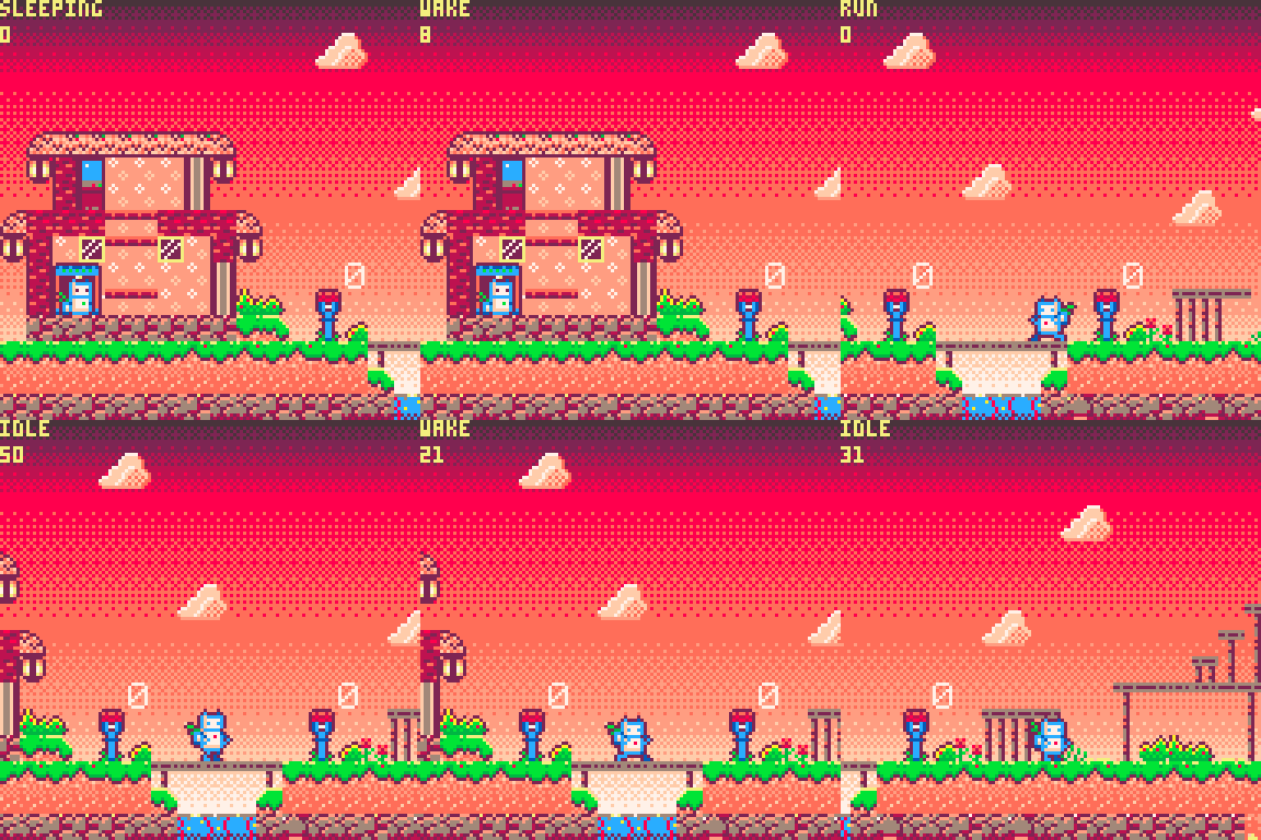
its just a simple 3 frame animation, but i think its really cute and adds a lot of character.
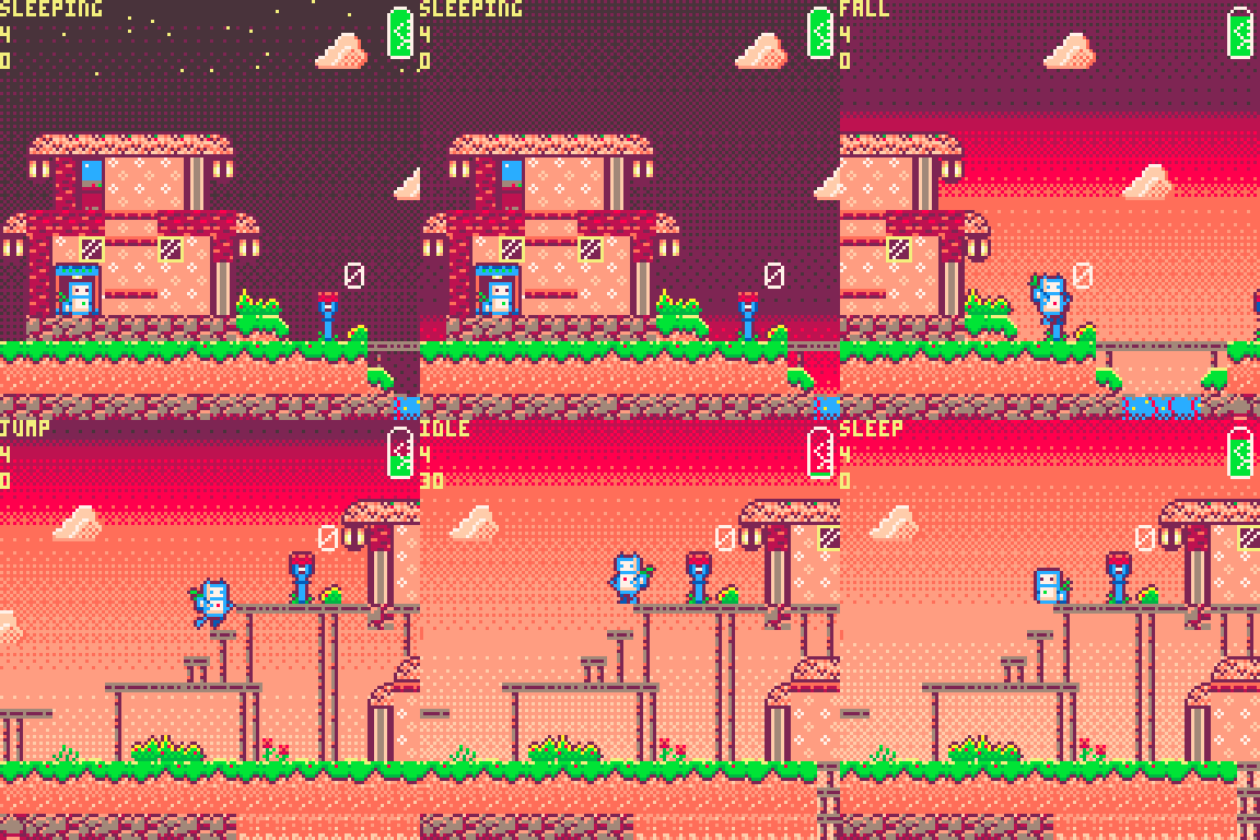
lastly I just need a placeholder visual representation of the battery left. and to add the Lerpy sky.
so bango there it is and the day ended. long day coding, feels like a lot of features out of the way.
tune in for more soon,
-Alice-<3

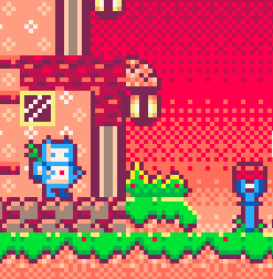
On day 2 we started with this. It still has a lot of the remains of my prototype so its time to shake off some of that.
first off I wanted to have a nice dithered gradient as the background. I intend to have some parallaxed elements but for now lets focus on some color and pizzazz.
Im a very big fan of sunsets and often design my palette around being able to make a good sunset gradient. I do this for all of my art actually. 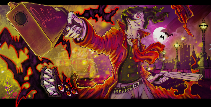
with this is mind i used the https://www.lexaloffle.com/bbs/?pid=70762 gradient maker to create this.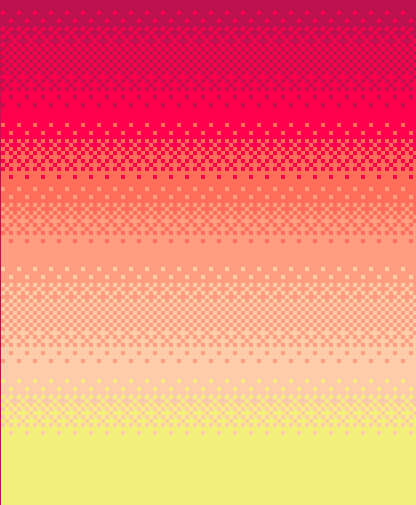
this really starts to get into what i enjoyed about Air Deliveries color scheme.
then i had to integrate it into my game.
im still struggling to get it to work as intended. I still haven't quite wrapped my head around how to alter the pal for just a single draw, then set it back, without issue. im sure ill figure it out and it will make some other really nice gradients nice. but for now were going to work with this and try to change the ratios of each color to make it seem like different times of day.
but that comes late, so for now we just try to get it in there and we get this.
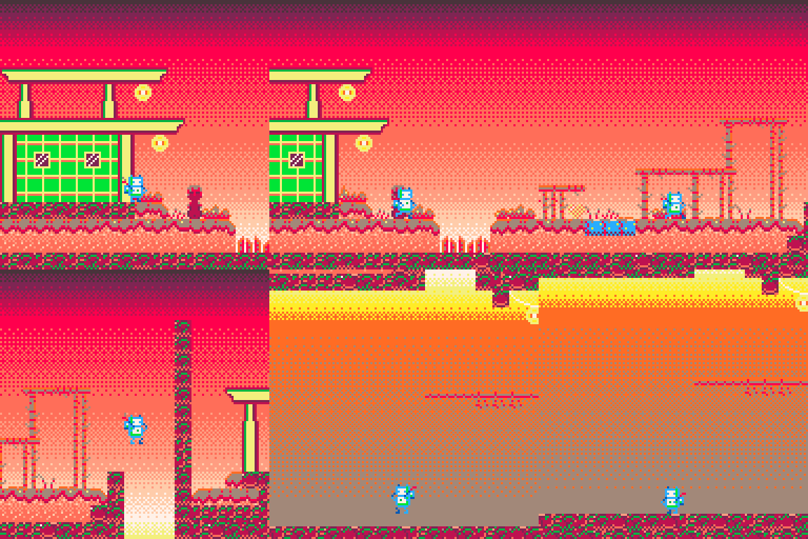
real funky. had to rearrange the main palette since i couldn't get the isolation to work so i made the whole palette in the order i needed for the BG. it works, its hacky and ill fix it later, maybe.
I also decided the player and key items require an outline, so i added an outline to the player and refined the animations in the sprite, adding more bounce and wiggle to the plant. i really think it brings it to life.

I had to start replacing all the old tiles with new ones, or at least recolor things to suit the new look and game. out with the Japanese themes and in with...idk everything bagel roofs.
it needs work but its there. 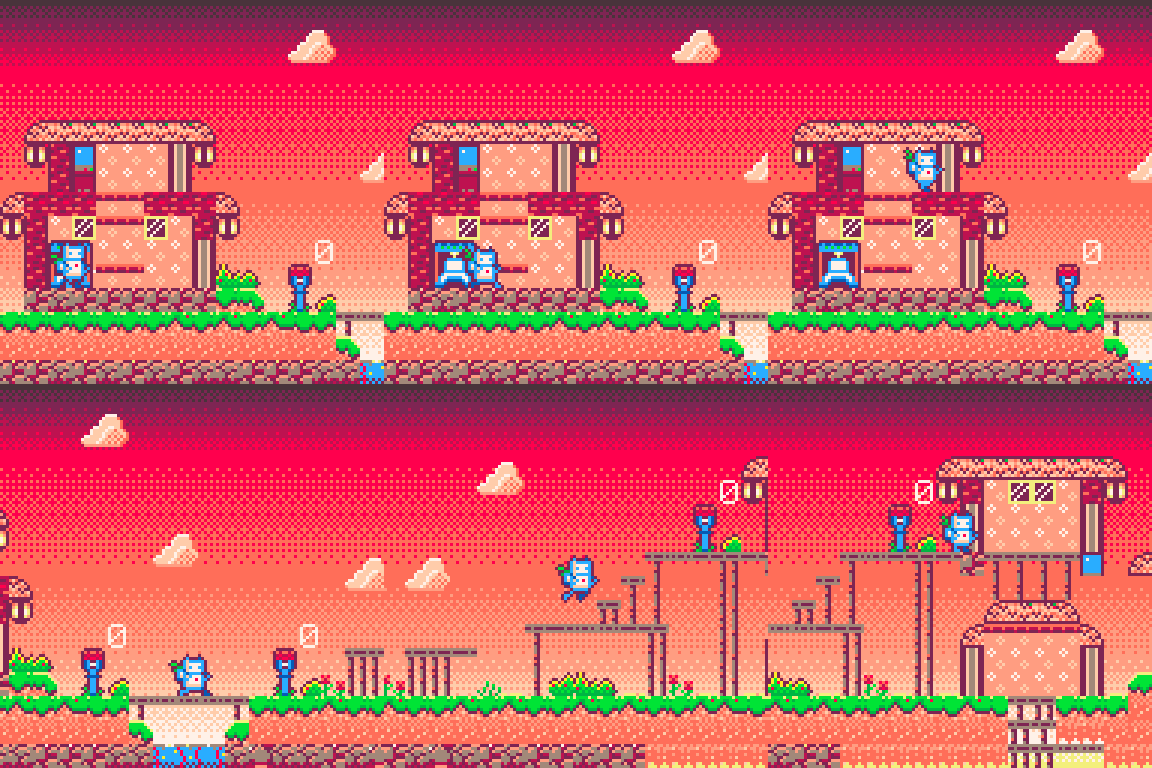
I added in the little mailboxes as for now that's the easiest "delivery" evoking item i can think of. So for now we are going to try to drop off deliveries at the mailboxes in front of each persons home. I think i will only be giving the player the recipients name and they have to remember where that is. so its important to engage with people if you want them to stick in your mind as unique people with a space they can be found in.
i've begun adding some cute little items like an arcade machine and flowers.
But the last bit for the day was to fiddle around and rig up the sky to shift between different states.
i have the basics of it worked out, it'll just require some designing and a few lerps to get the slow transition from day to night and back.
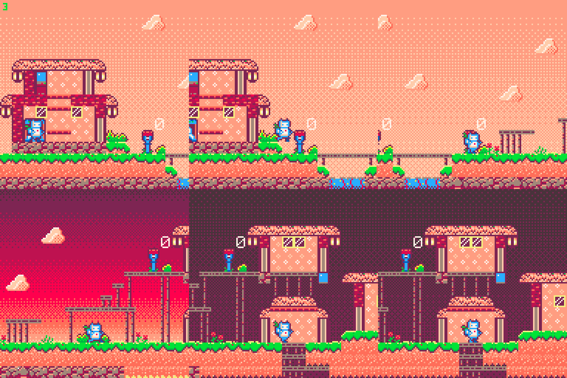
Thats where I am for now. Not a amount of progress. but I did make huge To DO list to work through, wish me luck
Alice-<3
I hope! first things first, I need to create some art. That's the easy part. Here's my interpretation of the games cart art as a main menu screens background, UI pending.

This is rough but it sets Gets the ball rolling.
Next I need some kind of little robot sprite , I envision this as a little platformer where you navigate a small community running around from building to building dropping things off and picking things up.

This is the first go at it, I think it should work. It will get tuned as we go along but that's a little bot, bobbin' along next I need some kind of system to gamify this. back in February when I first started Pico-8, programming in general, and this whole little game dev journey , I began with the Nerdy teachers platformer tutorial. I didn't finish it all but it did end up with a sorta working platformer base I could feed my sprite into.
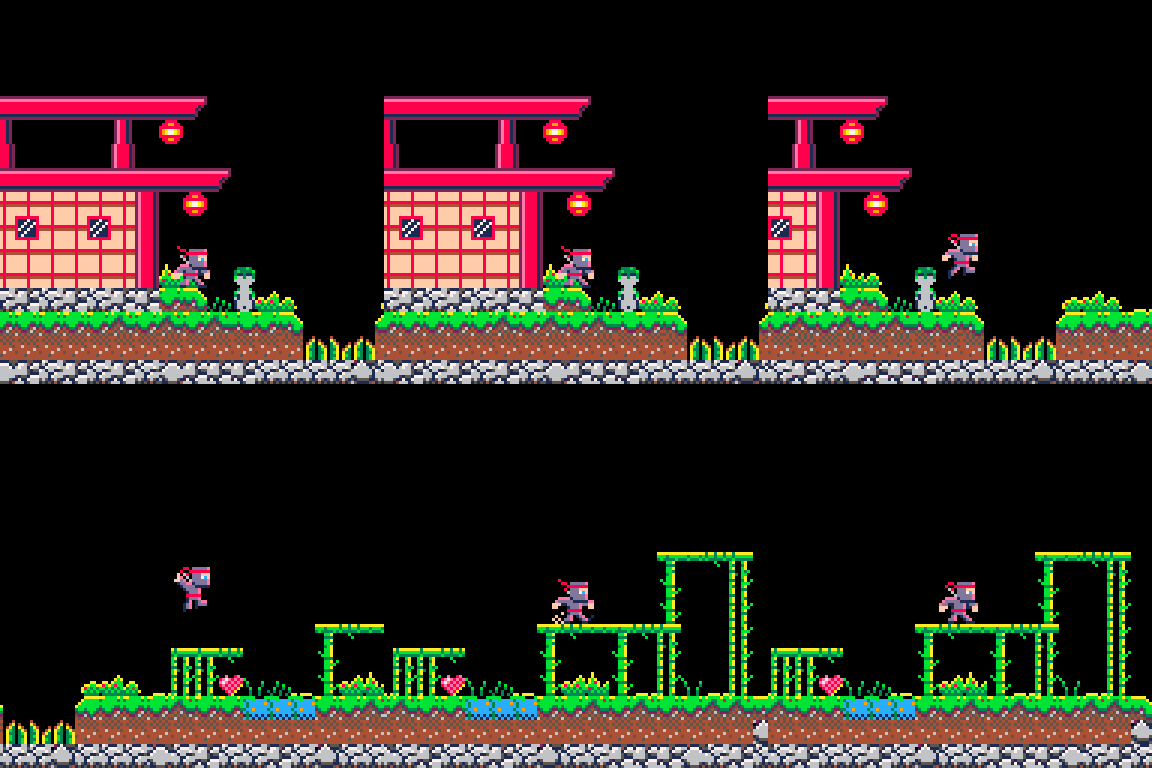
so this is my starting point. next i need to pick a palette for this project. I always think you should make something custom. I found the colors in this( https://www.lexaloffle.com/bbs/?uid=73699) game charming.

Air delivery uses all the peachy tones for good effect so I wanted to get some of that in my game.
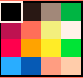
that was easy. Not the same, but I have all the peachy tones from the alt palette.
I transfer my Bot from Aseprite , They are cute. I tweak the art until I like it. and then we test it out. I tried to keep the colors in their original positions if they were similar to the color I had picked.
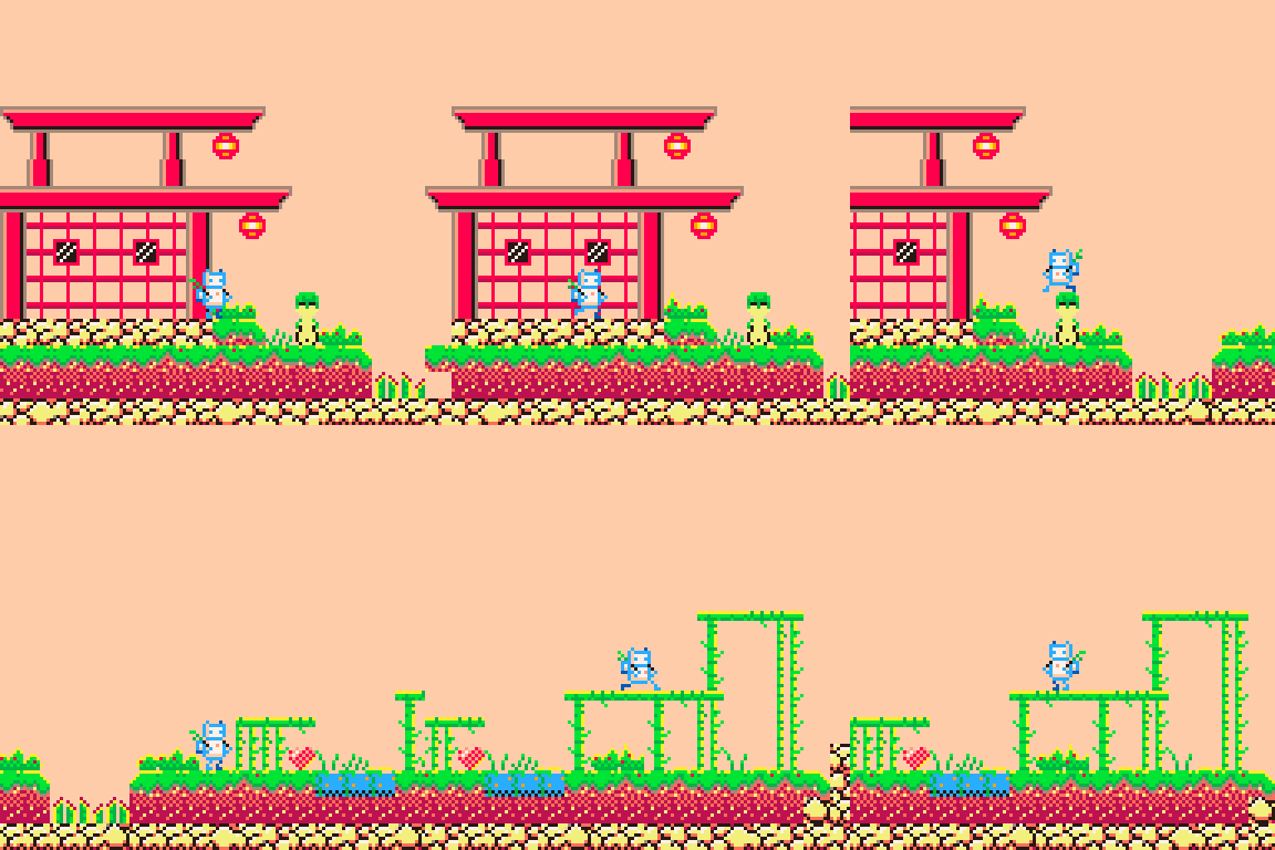
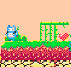
I tried to get some secondary motion in the backpack and the plant bobbing. Its cute, I like it but the map is wrong . next step is going to be building new tiles for the level, then we dig into coding the actual game.
Strap in for a wild ride.
I hope you enjoyed all the extra depth I've put into this, my first ever true devlog. ill be adding to this as time goes on with more updates.
-Alice <3
It's time for another jam it seems. last time was hectic , hopefully I can have a more relaxed time on this one. I'm new to AGBIC but I love the concept, I feel like I can look at the cartridge and see the game playing in my mind. I'm going to try to keep this as simple as I can.
This is the cart I've chosen, Paulo has graciously given me consent to make his little idea into a reality.
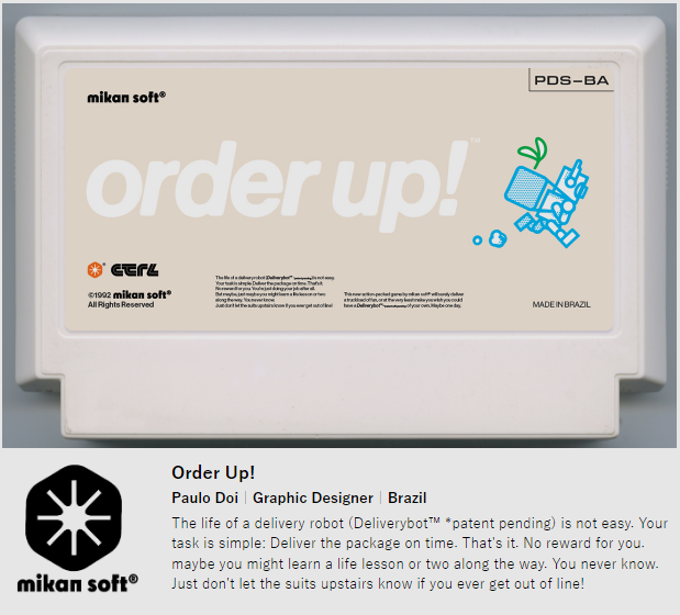
It's so charming in its bleakness, like you are not playing as someone, just a generic drone (Deliverybot™), lacking distinction and identity, but that still you should not hold back from growing and learning, even if its at the risk of punishment.
This is a sentiment I can relate to. I work in a near minimum wage job everyday, kinda turning my wheels, staying alive and not really much else, With the exception of the things to do to bring me joy. Its not that i do not have a happy life, it is full of love, but I feel very deeply in my bones that I am wasting my life every day earning money for someone else doing things that are not what brings me joy.
I live in a city that has become dominated by Amazon, everyone around me at work is a little drone that in some way or another spends their life working towards the goal of getting packages around. you can see where I'm going with this.
I spend a lot of my day coding Pico-8 games at my desk, selfishly stealing joy and personal growth at the expense of the potential that someday my management will decide that I need to do less of that and more of the actual work, little by little until the job no longer allows for joy at the workplace.

"I awaken into this world fully programmed yet completely innocent, unaware of the hardships I'll endure or the great potential I will one day fulfill." - Emergency Medical Hologram , Star trek voyager
SO! I believe good art comes from people who believe something or feel something deeply and they want to convey that to others, so they create a piece of art to do so. This is personal for me as an artist, since for the majority of my art life i feel like i haven't really expressed my ideas and feelings as art. I mostly lived in representational works derivative of branded IP and real life objects, making fan art and such ( https://www.artstation.com/alicemasters ) for example. What I am finding is that this games concept aligns with a lot of things i think and feel deeply. and I think i cam up with an idea how to represent this in gameplay and teach a lesson based on my views. That's like art stuff baby! Lets talk gameplay:
You wake up, in a little hut, on a charging dock, mostly charged, you drink a cup of something hot and it fills up the last little tick of your battery.
A robot has a battery because its electronic, but we all have one too in some way. We burn out if we work too much, if we sleep too little, if we cant make time for the things that recharge us. https://en.wikipedia.org/wiki/Spoon_theory Spoon theory describes us as people with a finite amount of energy to give, based on certain wellness factors. I believe we are all worked too much, and get too little out of life to not spend the majority of it on a slow downward trend towards less and less time and energy to enjoy things. Over time we have been made to be more efficient and have the value squeezed out of us in more horrific ways. I saw an article recently talking about amazon thinking of installing lights to shine on the next item a worker needs to pick in a warehouse to help eliminate "micro rests" aka the time it takes to locate the box , which they claim is where people were pausing too long. gross.
You are given an item to deliver, and a timer. you pick up the item from the slot and it goes into your little backpack. you make your way out into the world towards your goal.
Walking along in the world doesn't drain your battery very fast but time is ticking. At first its pretty easy to make the delivery on time, without much of a rush, but the next item needs to go further, quicker, you pick up the pace, this starts to burn your battery down.
Its getting low but you see a person playing a little banjo, so you stop and listen for a moment, it recharges your battery a bit, but time is ticking so off you go, maybe you quickly snatch up a flower to get a sliver of battery back. you sprint through the world hopefully able to stop long enough to smell the roses to eek out just enough joy to make it home at the end of the day with a little left in the tank. you do a little gaming then you hop on the charger and fade into the next day.
This time you have two packages, and two timers, and they are going to opposite ends of town. there's no way you can keep yourself alive, and make all the orders in on time. The boss isn't happy. When you turn in a delivery late, your boss gets angrier. the little bar builds up. If they get too mad they will decide that you are inefficient and not worth maintaining, so they will scrap you. Every day you wake up, trying to balance staying charged and happy, and also keeping the bosses happy. Every day it gets harder and harder till eventually the only thing you can do is die. ORRRRRR wait til later to find out about alternative options to letting the capitalists drive you into the dirt.
Ultimately I want to make a game about how the only way to survive the grind is to stop and seize joy for yourself. Whatever it is, hold onto it tight because its the only light in this dark world.
i really should have listed why the oil is there. the theme in mine was the limited ability for the ocean to deal with human pollution. so your score gets tanked if you don't scoop up the oil . originally i was planning to make it that youd fail if you let the water get too much oil in it. but it seemed too hard. i wish id have gotten this across in some sort of narrative or text box. but alas. it slipped me mind
you arent wrong, i was just panicking in the final hour and decided making it real hard was better then it being too easy. lol i can dodge it all without shooting, so i thought it was ok. but i did design the patterns so im sure its easiest for me. this is just the beginning. i cant wait to release an updated fixed and finished version of this someday.