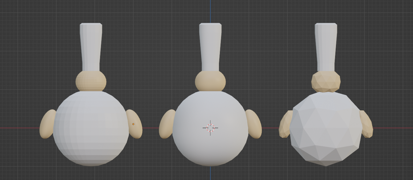
Right now, the chef looks like the left one (kinda) but it doesn't really fits the rest of the art (kitchen aso..) I thought maybe smoothing the chef like in the center would help but if it was intended, maybe using ico spheres instead of UV spheres (right chef) would fix the problem since the tomato is made from an ico sphere too


