Play game
Tomato Breakout's itch.io pageResults
| Criteria | Rank | Score* | Raw Score |
| Gameplay/Design | #8 | 4.188 | 4.188 |
| Fun | #11 | 4.125 | 4.125 |
| Overall | #14 | 3.813 | 3.813 |
| Audio | #29 | 3.563 | 3.563 |
| Graphics | #56 | 3.375 | 3.375 |
Ranked from 16 ratings. Score is adjusted from raw score by the median number of ratings per game in the jam.
What would you like feedback on?
Level design, enemy behaviour, and anything in general that you think could be better
What did you update?
- Fixed many many bugs
- NEW LEVEL!
- Made it easier to push enemies
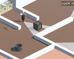
- Allowed player to hide in crates as well as push them (although currently pushing is a bit annoying but we're working on that)
- Added quick restart with r
- A bunch of other stuff that I can't exactly remember off the top of my head
Leave a comment
Log in with itch.io to leave a comment.



Comments
A very cute, fun stealth game!
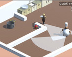
One suggestion I would have is to add temporary (glowing?) footprints to the floor as the chefs and waiters move around. There were plenty of times where I thought I put a mouse trap in the right spot, only for the chef to walk right past it.
That's actually a good idea, I'm just stuck on how it'd look so it matches the aesthetic of the game, do you have anything in mind?
Since everyone has ball bodies/feet without actual walking animations (so actual footprints would be weird), maybe just a trail? Like a solid line on the ground that fades out over time.
The extra objectives were great since they weren’t required, but added to the experience. There were a few close calls that weren’t consistent with being chased or not. Overall a fun time with a great twist. Yes chef! 👨🍳🍅🍲
great stealth game!
This game had me laughing out hard. This was a great idea and very well executed. Excellent level design. Pretty polished. Really like the characters and the aesthetics. Just a darn good game with room to eat. I mean grow
Managed to three-star every level! The stealth gameplay is pretty standard, but it's framed in a pretty funny way and I enjoyed playing it. It's mostly well-designed, though the last level took me many tries because I wasn't sure how to get past the waiter on the return trip, but I eventually figured out a strategy.
Thank you for the feedback, I'm curious about what strategy you figured out for the last level, I was stuck on it myself for a bit :)
It's hard to put into words what exactly I did, but I found that placing the box around here gave me the leeway I needed.
Amazing game!
Funny idea for a game, good presentation and fun to play well done! :)
Nice game!!!
The game is pretty easy to understand but very fun, everything is elegantly efficient. I just have one doubt: Can I use the corpses like a box? I noticed that it blocked the npcs' vision. I think it's pretty strange someone see a dead body and do nothing, but that's just me being boring lol.
Thank you, yea you can block the enemy's vision and have some strategies with them. they do react when they see a dead body for the first time they just assume their coworkers are lazy or sleeping but I suppose they could become more alert in some way.
Nice game! Controls was very smooth, presentation is pretty nice and overall it is very fun to play. I think star system is pretty good, but just as a suggestion: maybe you could add level specific stars to make each level feel unique? Also I figured out the box mechanic while questioning the existence of waiter in level 4, so a visual indicator for it could be nice. Oh also getting out of the fridge first time and all little dialogues are so fun. Overall, great job!
That's actually a good idea making more meaningful and unique star levels would be quite nice. thank you. the box mechanic we added it last minute so wasn't introduced very well I agree.
Great game! I had a lot of fun playing it!
- The art style is clean (I love the menus)
- The music really fits the game
- The tomato is very fun to control
- The text bubbles add a lot to the game
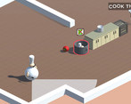
- Although you can grab them, I find it really fun to just push chefs and make them roll to the put.
You should just try to smooth your models in blender (right-click, shade smooth)
Thank you, yea originally we only had manually pushing them around but it was hard in some levels specially in longer distances. When you say smooth out the models do you mean change it from low-poly? cause that was intended as the art style of the game but I suppose we can try to see how it looks
Right now, the chef looks like the left one (kinda) but it doesn't really fits the rest of the art (kitchen aso..) I thought maybe smoothing the chef like in the center would help but if it was intended, maybe using ico spheres instead of UV spheres (right chef) would fix the problem since the tomato is made from an ico sphere too
Playing your game was so much fun!
Took some general notes:
Oh I just saw in your update notes that character can hide in crates and can push them. I was missing this one completely. So finally a chance for a suggestion :-) Maybe put an arrow or something even more expressive over the first crate in game. Just to signal "there is something special with this crates". Or - if possible - introduce it more subtle, by building a level where players have to stumble over these mechanics.
And the game logo doesn't reflect the quality of your game in my oppinion. All the other art is so well done, maybe there is a chance to incorporate the low-poly assets also in the logo to let your game shine even more?
That's it , I think. Thanks for your entry. Enjoyed it a lot!
I definitely agree the box should be introduced in a much better way and incorporated into the gameplay. right now we added it last minute so there wasn't much time to make it intuitive to the levels. The logo we will improve too I agree it doesn't say much about the game, thanks for the input.
Great game! The level structure is good and varied. The comments in between from the NPC's are good, could maybe happen a bit more often.
The enemy behavior is building and works differently in radius and speed. Maybe the cook could be given a bit more randomness in his movement.
What I would still change would be that you can run in the between walls. Maybe it would be interesting if you could not only pick up the traps in the box, but also transport them (maybe it would be too easy then).
Clear menu, you know immediately what you can do. Maybe there should be a visual feedback when you select a button.
Yea we're thinking of adding more meaningful enemy behaviours and actually relate it to the things they do in the kitchen so they're more varied. I'm not sure I understand what you mean "you can run in between walls".
I really enjoyed it!
Wouldn't hurt if trap's hitbox was bigger.
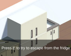
The part when you break out of the fridge is so satisfying every time.
Also it can be annoying when an enemy patrols back and forth, so if your standing next to their patrol line you shouldn't get seen. Well, you can because when they turn the see you. It feels like a cheap death for me.
Also have to complement the music, well done. Good job!
> Wouldn't hurt if trap's hitbox was bigger.
Had to smile about this one :-) I expect, the chefs would have a different oppinion on that!
I played this during the gmtk jam and its still as funny as ever. Were you always able to kind of "dribble" the enemies? Even if that was always in the game since then its still worth praise because it works so well.
Thank you :) no, we had some complaints that pushing the dead enemies to the pot was hard and annoying to do so now they're attached and you can roll them around easier. Let me know if you have any other thoughts.
You're getting somewhere, keep going!
Thank you, did you find anything annoying or any features that made you not enjoy the game as much? Also, anything you think would improve it too. Good job on your game btw it looks really cool
Probably too much inertia in the movement, but i guess it is intentional.
Improvements, surely, can be made in graphics: learning about how to smooth the mesh would be great!
Thank You!