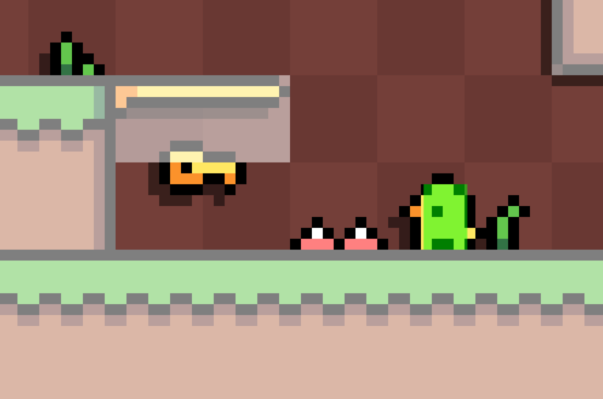
I intentionally made the hitboxes on the spikes, blades, enemies smaller than their actual sprites to make the game feel more fair and lenient.
As you can infer from the screenshot, the hitboxes for the spikes are 3x1 which I think is fair considering that the player also has a bit smaller hitbox. Let me know if you still think it's larger than needed. I think my level design skills are to blame and the placements of the spikes wasn't ideal in certain places. (also there are no subpixels in the game, the hitboxes are updated to match the actual position, while the graphics are drawn at their rounded whole pixel values, thus not matching exactly in the screenshot)
Hmm... I think the placement of the spikes could be a factor as to why I felt the way that I felt. One thing I would try (but feel free not to) is make the spike's hit box only one pixel wide, but the full two pixels tall. I never felt like I couldn't jump over them more so that I felt like I'd hit them when jumping a couple pixels away from them, if that makes sense. It's always interesting how as gamedevs, we always make the game more fair than fair, but somehow even more lenience is required than originally thought.
Just want to reiterate though that I thought the game was very enjoyable as a whole, so good work!

