On Sale: GamesAssetsToolsTabletopComics
Indie game storeFree gamesFun gamesHorror games
Game developmentAssetsComics
SalesBundles
Jobs
TagsGame Engines
(+1)

The art style is simple but beautiful. You were able to cram quite a lot of character and detail into the 1-bit aesthetic within the constraints of the theme, bravo. The the application of the theme is great, the light and dark mechanics are combined to create a very satisfying puzzle experience. 

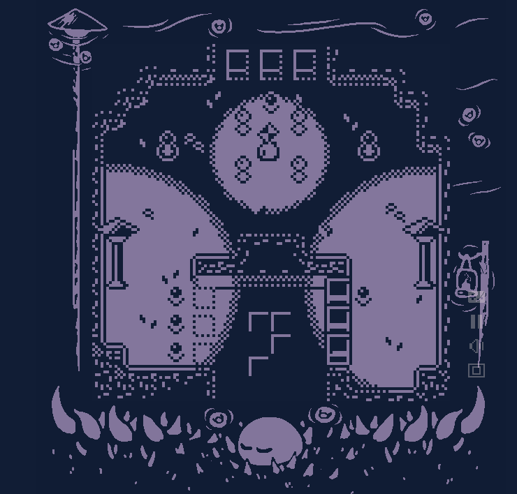
As for complaints, some of the level design could be simplified a little, or at least given better visual indicators. I got stuck on this level as I wasn't sure what to do. The previous levels had the wires sticking out on the ground to give you a hint on what each switch does. This has no wires, and has a LOT of switches. Makes it very difficult to sift through the possible combinations and figure out what each combination does. 


Despite that, it is still a very impressive entry and that achieves a lot within the limitations of the theme.

Thank you very much. :)

For that level, all of the sensors on the top half to be activated, so putting a lot of wires down felt like it would get too noisy. I originally just had 5 sensors, but realized there was a solution that skipped what it needed to teach, so I made the solution more restricted. Definitely should have made it simpler.

To actually get passed that door, you also need the lantern.

(+1)

Thanks for the hint. More feedback!

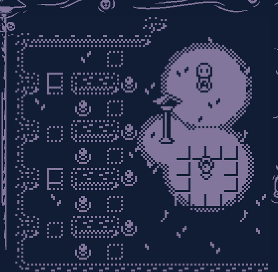
(I removed the lantern from the maze already, but the point still stands) Although very thematic, wandering around a large maze in the dark is just tedious, there is little to no skill in reaching the end of the maze, it is just a very slow, painful, process of elimination. The simpler maze in the start wasn't that bad because it was short, plus you had a switch that revealed the whole maze for a while.


Another puzzle that can be simplified. Once you find the solution, it's just repeating the process a couple more times to complete it.