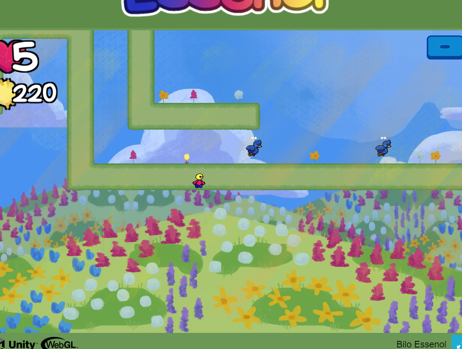
I agree with both Wasabi and SolarTest. Additionally i feel like a camera could be a little more zoomed in, the game is pretty and making it that small is a loss and makes playing a bit uncomfortable i feel. Other than that everything is cool art, music animations, oh about animations maybe the dying animation for enemy could be a bit faster or something? I just feel unsure whether i can go in it or not. Last thing i got a small bug, here's the screenshot, if i remember correctly i was spamming attack when falling and somehow fell down there
Hmm... Looks like some issue with the collision, it didn't happen to me or anyone who tested the game but I'll look into it.
About the camera size, I guess I really haven't considered the fact that different screen sizes would all run the game the same way therefore the game can look smaller on other computers, I might change it but I suggest the you play the game in full screen.
And the skipping was something I wanted to have because I didn't want people to get stuck on a certain section and not being able to beat the game... The dendis (the points you collect) are needed in the end of the game which is why you should skip only if you really have to.
Thank you for the comment!

