Nice! How many tries XD
Mayzavan
Creator of
Recent community posts
Hey, it's actually really good and polished in my opinion!
The only trouble I could find (I'm not an expert though) is that I believe that those ghosts should enter and leave the "feared" status at the same moment and here it happens very often that they are not, but the game is really good nonetheless good job!
So I played asteroids and I would say the ship really moves to fast and slows down too fast as well, I would make it a lot slower - both. As well as shooting because for now standing in place shooting and rotating seems to be the most optimal way to play :)
Other than that really works good, music is a bit loud (I tend to make all of my music and SFX at -15 from the very beginning) but it's nice fitting
Nice job!
Hi thanks a lot for playing and a nice comment:)
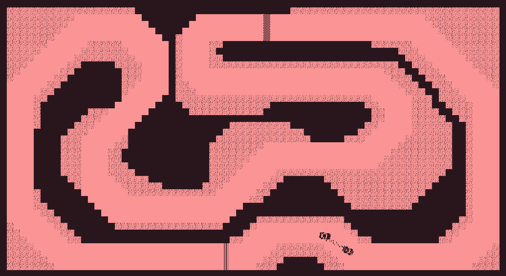
I honestly stopped the challenge in here because I just wanted to add an AI as a last thing, but working more on UI and setting up a laps etc wouldn't teach me anything new sooo I want to go to the another game, especially that I covered most of stretch goals (also other goals that I made up for myself). Music is only done for Menu and Drift and I'm letting my friend work on audio since he wants to practice and learn as well:)
Thanks a lot for the artstyle comment as well I started learning to draw alongside with programming:)
Hiiii so I played the game a bit (since I responded timer shows around 41 mins and I have to go now.
Soo my general thoughts are that the game is really great - in every aspect - easily for me making this kind of game is unimagineable right now so :))
Nonetheless few things I'd like different or didn't like:
- being attacked is quite random, maybe it should be faster and harder, but always manageable to do
right now every time I got hit was caused by RNG that left me on a tile from which I couldnt move anymore and it wasnt the one that survived:///
Maybe there is something i dont know but uh it didnt seem so
- after defeating the enemy it shows -1hp remains -3hp remains and so on. maybe it should be changed to enemy defeated or something cause it looks a bit weird i guess??
I can't tell if its intentional or not, but the world seems not to care about your actions in some way. After changing the scene a lot of events are reverted. For example i told a guy that i lied and he is not pretty or smth and his head blew off, after going to the scene on the right and going back he was standing there again in the state where we ended before i told him that i lied.
- items section seems to be workign a bit weird. For example while watching the photo, it is covered by the UI all the time and it looks a bit baaad? Another weird thing while clicking on the map the camera zooms already in some random place above the character for the time being until you press to open map or not.
For now thats all I can think of
Really great job and thanks for sharing the game:))
Hi, 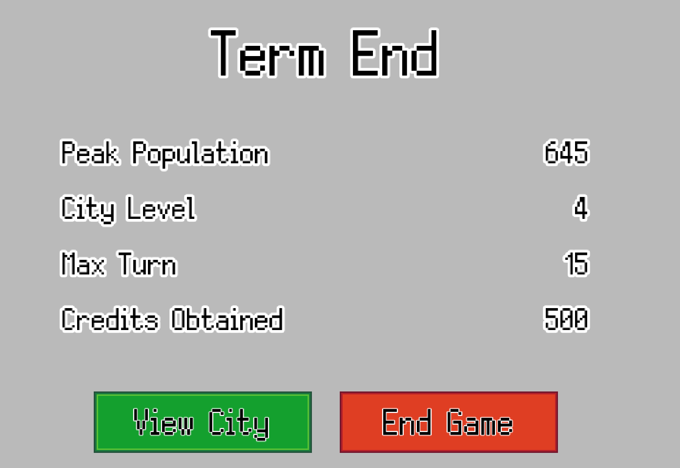
Sooo first of all it seemed for me that some effects didn't really work (or they didn't show the effect on the UI?) Or maybe I misunderstood them. For example population boom. For the gameplay - collecting the income growth alone by clicking from stores etc is really exhausting and making it not fast enough impacts Your turn to turn income which doesn't really seem convenient for this type of game at least for me.
I didn't really see any growth in attractiveness after building few pools as well. I didn't really see any level of my city, maybe there should be some big notification about it somewhere? With new unlocks, like in cities skylines. Also the biggest issue.
Other than that I didn't really see any effect caused by security education or health or leisure or attractiveness, but I assume it's all to come in future:))
Visual and sound side is really nice, the only flaw was clicking every single commercial building.
All in all it starts to look very good nice job and good luck with further dev :)
Hi, I'm checking the game right now, but first of all I believe there is a small mistake here:
I guess what You meant is that You want to build as many residential buildings around commercial ones as You can, but this phrase makes it sound like it's the other way around :)
maybe something like: place commercial building inside residential areas/ place commercial buildings near residential ones
The game is a lot better than the original!
I think this way is a lot more entertaining
Animations are really smooth and nice.
Only one problem - somehow I couldn't stop moving right XD Everything is okay with my "D" key I promise. But take a look if there is a way to get player moving all around by mistake. "A" key was only working as a STOP button. And I was permanently flying around clockwise :)
Hi, I will spare comments on the good stuff and move straight to all the flaws I found! (everything else is good or even better so :) )
- Blue paddle sometimes bugs and moves to the left when the ball is approaching it?
At this point it got stuck like that
- For breakout the game should probably start in the middle when the spacebar is pressed
Other than that great versions for 20 games challenge good job:) !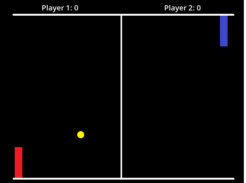
Hey nice work!!
I've been trying to find some problems or bugs, but it all really works together very nice.
The only issue is that the sound of hitting the paddle is being cut off by the sound of hitting wall if it happens in between, maybe it should be like that I dunno.
Other thing is that the game plays itself after the End. But maybe it's also a feature hahaha
Hard to tell! Very good work tho!!!
Easily a 5star pong
Hi thanks a lot about video feedback! It really gave me a smile especially hearing someone laugh while picking one of the fastest cars:))
Few notes for myself (and maybe You if You'd ever play again (I hope You might cause best times are saved between sessions :) )
- As for now I did not implement any kind of tutorial or controls options in game itself (although everything can be found in description below the game) - I will be working on that in the first place after seeing how much it disrupts the first time playing the game
- You are definetely right about the UI not lighting up when moving a mouse - added to do list on first position
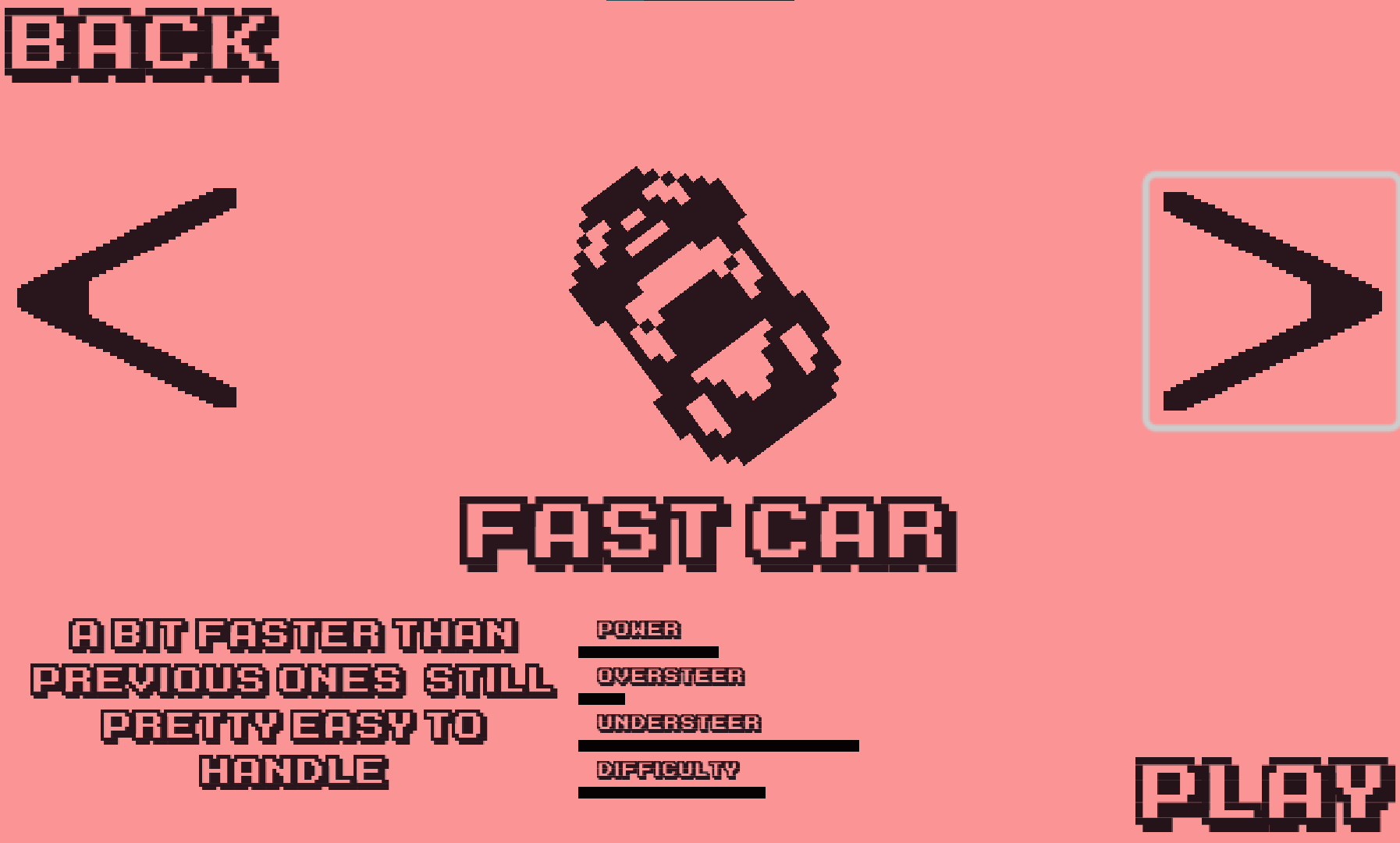
- The other part that You might have skipped are oversteer and understeed under each car which are bound to velocity of the car - F1 typa fast car really doesn't let You turn at all at high speeds (it basically should work as a simulation where when driving this type of car You want to stick to road right? And if You turned too much at too high speed You would lose traction. Thus I implemented simplistic version of losing traction and lowering the steering angle so it looks a lot more realistic when watching the game.
- Also I might just do it the way that when You turn the game for the first time I will just push the player right into the Test track with some hints on controls and cars
Thanks a lot again!
Hi the game changed a bit - if anyone wants to take a look into SHORT devlog feel free - https://mayzavan.itch.io/6-indy500/devlog/770102/1-bit-racers-big-update
And I'm still looking for someone to test it - pleaaaase and leave any of your projects in comment as well thanks in advance!


