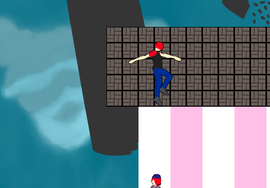
Really weird setting and I'll be frank the visuals are a little off-putting.
gameplay-wise, getting your follower to correctly get off ladders is really clunky and the levels are hard to read.
Like the wooden platforms you can stand on are very thin and hard to spot, while there's some walls you can go through and they don't really look much different than the ones that block you.
Similarly, the one retracting brick you have in I think the second level doesn't make it clear what it's going for, at least I didn't realize it was a timed platform until I missed the jump.
Towards the end I found this bug:

You can exit a swing and end up inside a wall, I suppose you could use the lack of collision while you're swinging as a puzzle mechanic.
Also the man o' war has some leftover black pixels at the bottom of the sprite.

