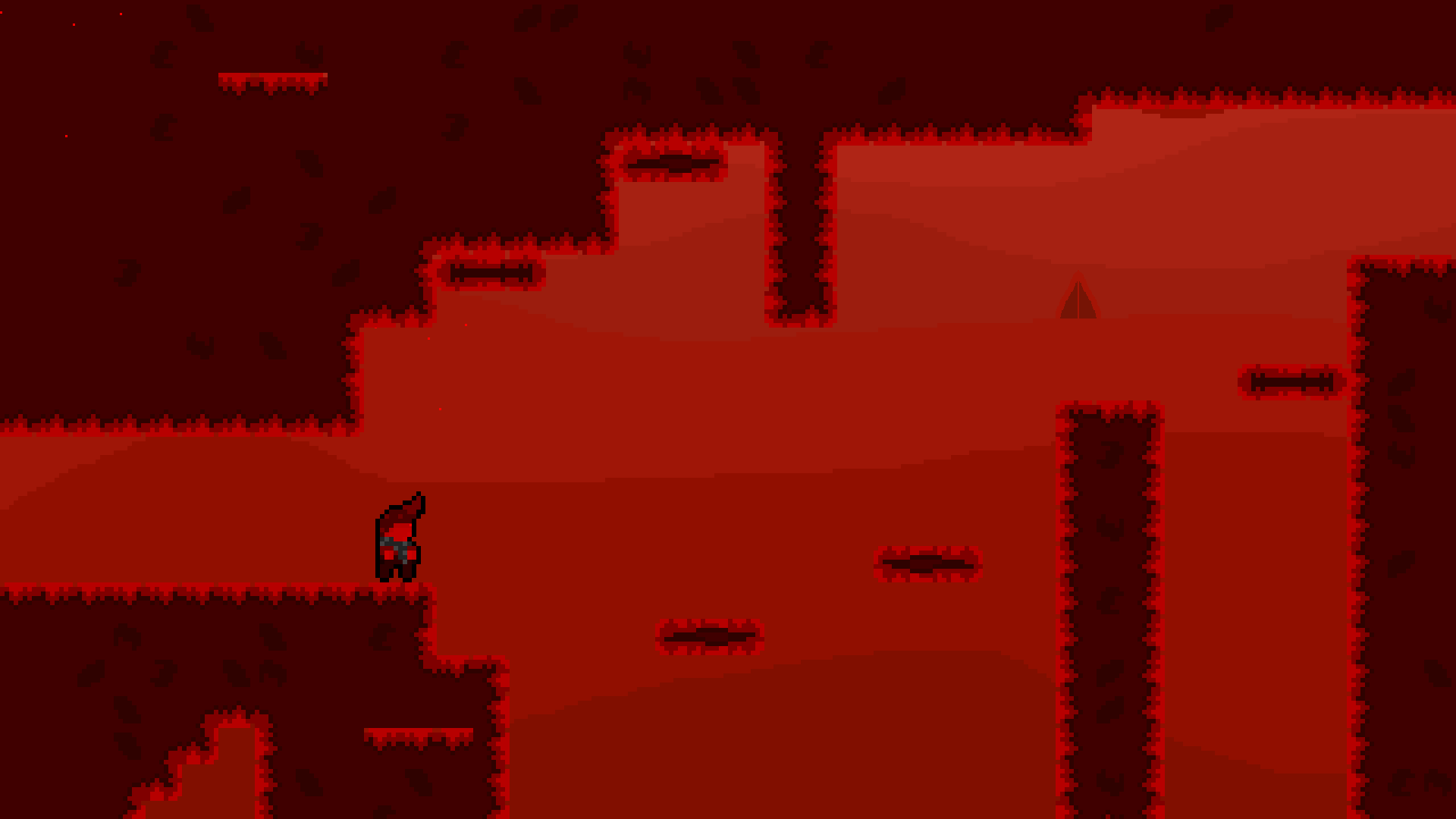
I changed the protagonists' sprite a bit to make some more detail apparent, and i also made the main empty face less big
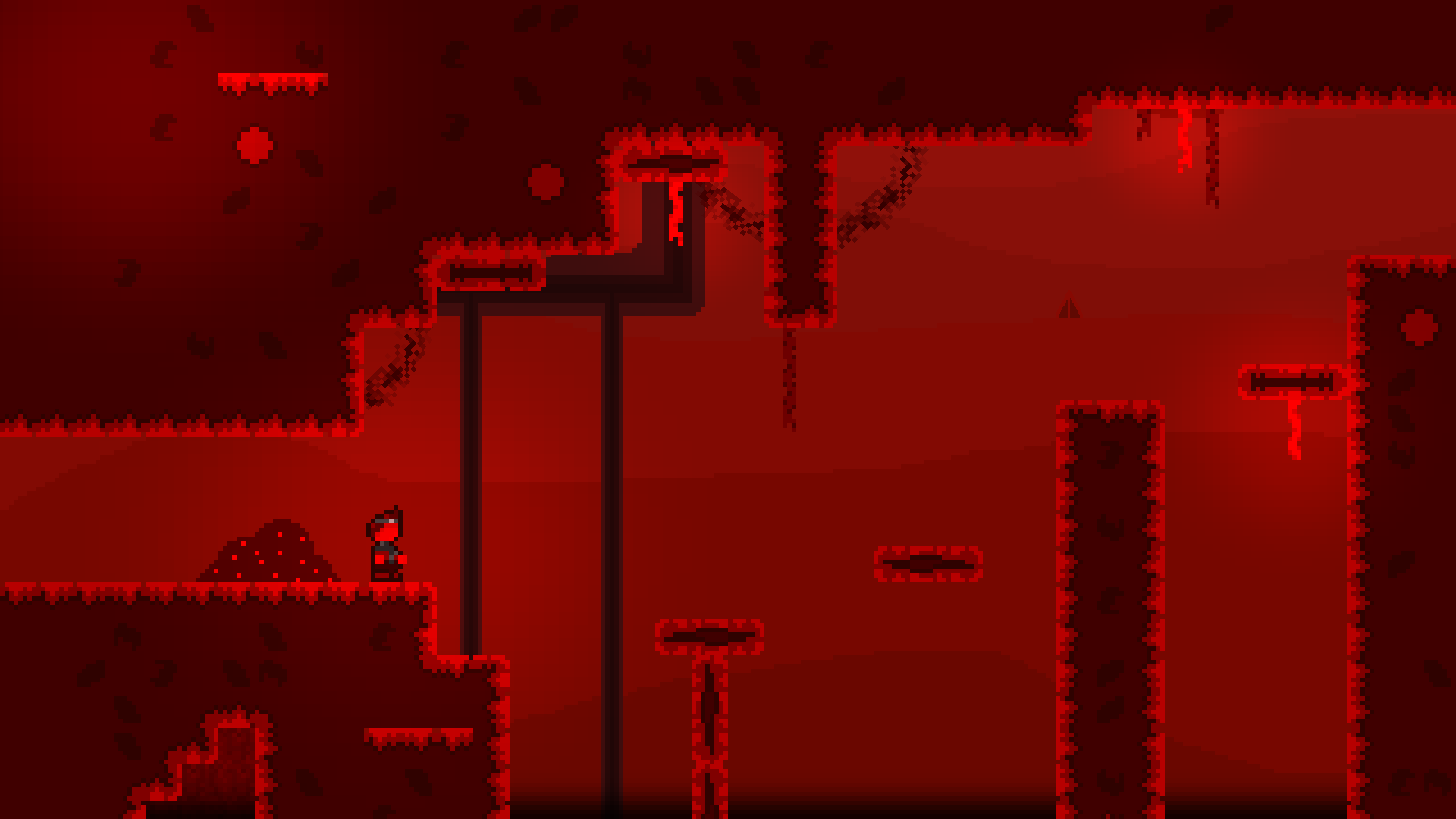
I like the direction the concept art is going, and the updated screenshot of the level: looks like you are in a deep furnace (OwlBoy's The Floating Continent - Lava music comes to mind lol)
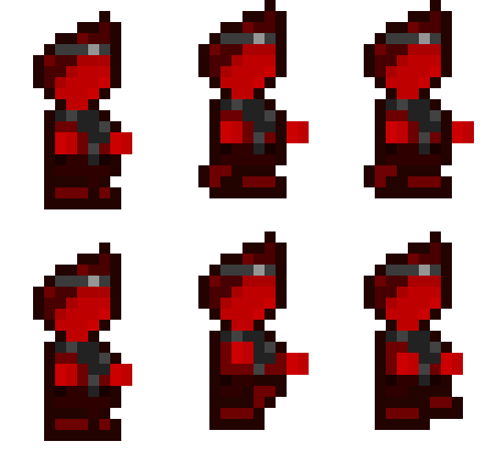
The outline helps, but it seems like you are using a ton of colors in your sprite work for him. While I think it does look good, I've heard advice floating out there to not go crazy with all these different shades of color. I think the underlying principle (at least my rationale) is that it makes working quickly more difficult.
eg. Imagining you have to now make individual sprites for the run animation or jump animation. It's gonna be really tough to produce all of them at the same granular detail. And making quick updates will take time. I imagine starting simpler will be better for iteration.
This post shows quite outdated versions of the sprite and layout xD
Here's a new version that has glow, a new character sprite, and more!

(Note: Sprite in image is at a transitioning frame in the Idle animation, so it looks a little off from what the main frame of the idle animation is.)
Also, here's the run animation!

Also, the more complex sprite shouldn't be an issue, the way I have my workflow set-up allows for easy and quick changes to be made!
Thanks for the Feedback!
Thanks!
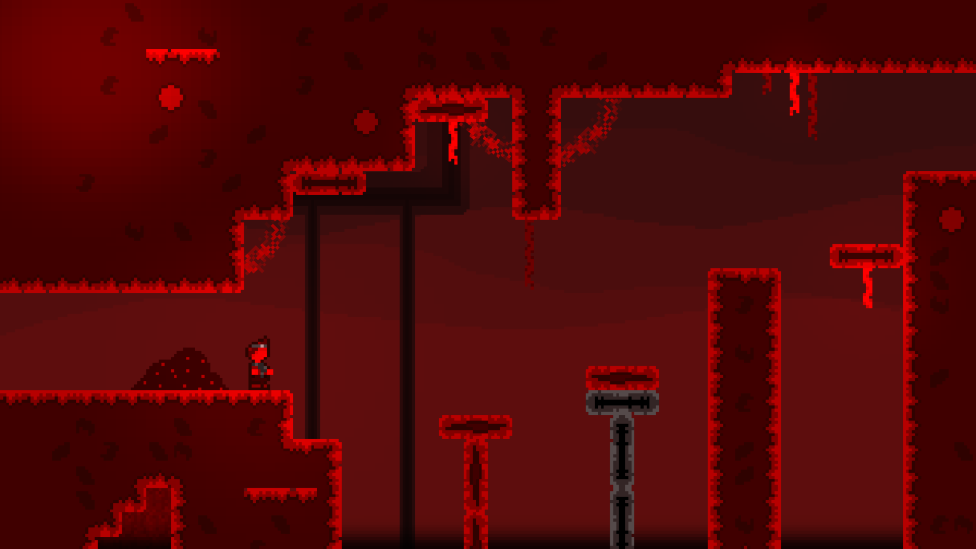
Actually, no need to wait because my next rendition of the concept art is done :P

I made a completely new BG that is darker this time, and also made some of the for-visual assets near the top of the screen lighter, and i think it helps with the atmosphere a lot!
I'll see if I can send a gif of the level moving later, not sure if I will be able to actually do it though