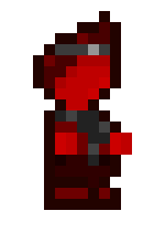
I've been starting to plan out what exactly i want my first commercial game to be (so far i am thinking of combining precision platforming and metroidvanias but that's not relevant to the current subject) and using aseprite and a bit of inspiration from Celeste, i've made some artwork for my Protagonist and some artwork for the Antagonist (which i will likely alter the proportions of)
How do they look? Is the players scarf a good enough standout feature of the character, or should i do something else? And does the antagonist look better in grayscale or purple?
Note: These characters are limited to 1 color, like the protagonist can only have a red palette ranging from White, Dark-Light Red and Black
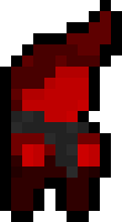 PROTAGONIST
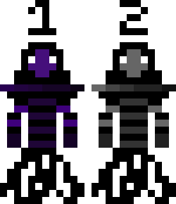 ANTAGONIST (The bottom looks weird but it makes sense when animated)
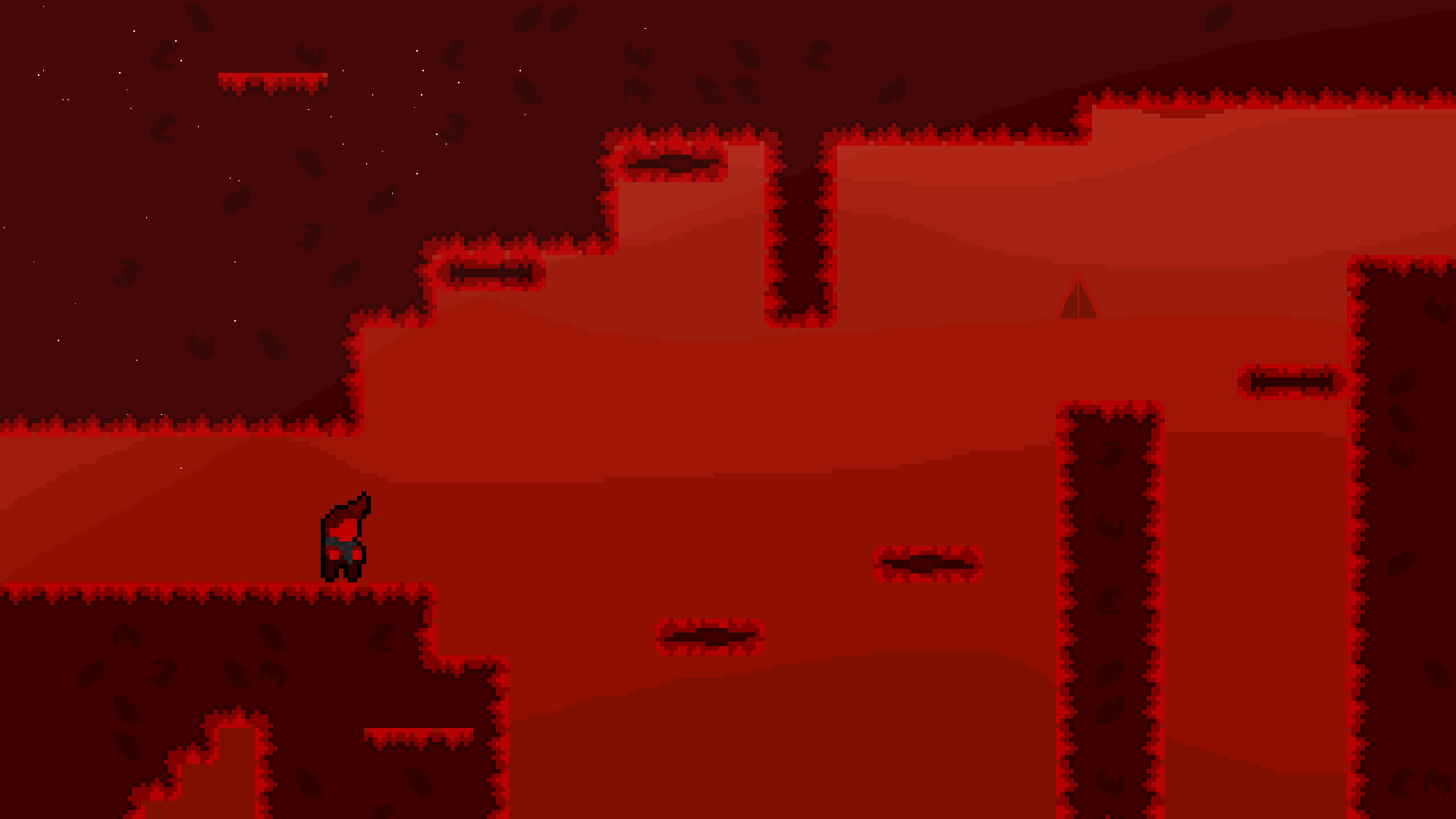
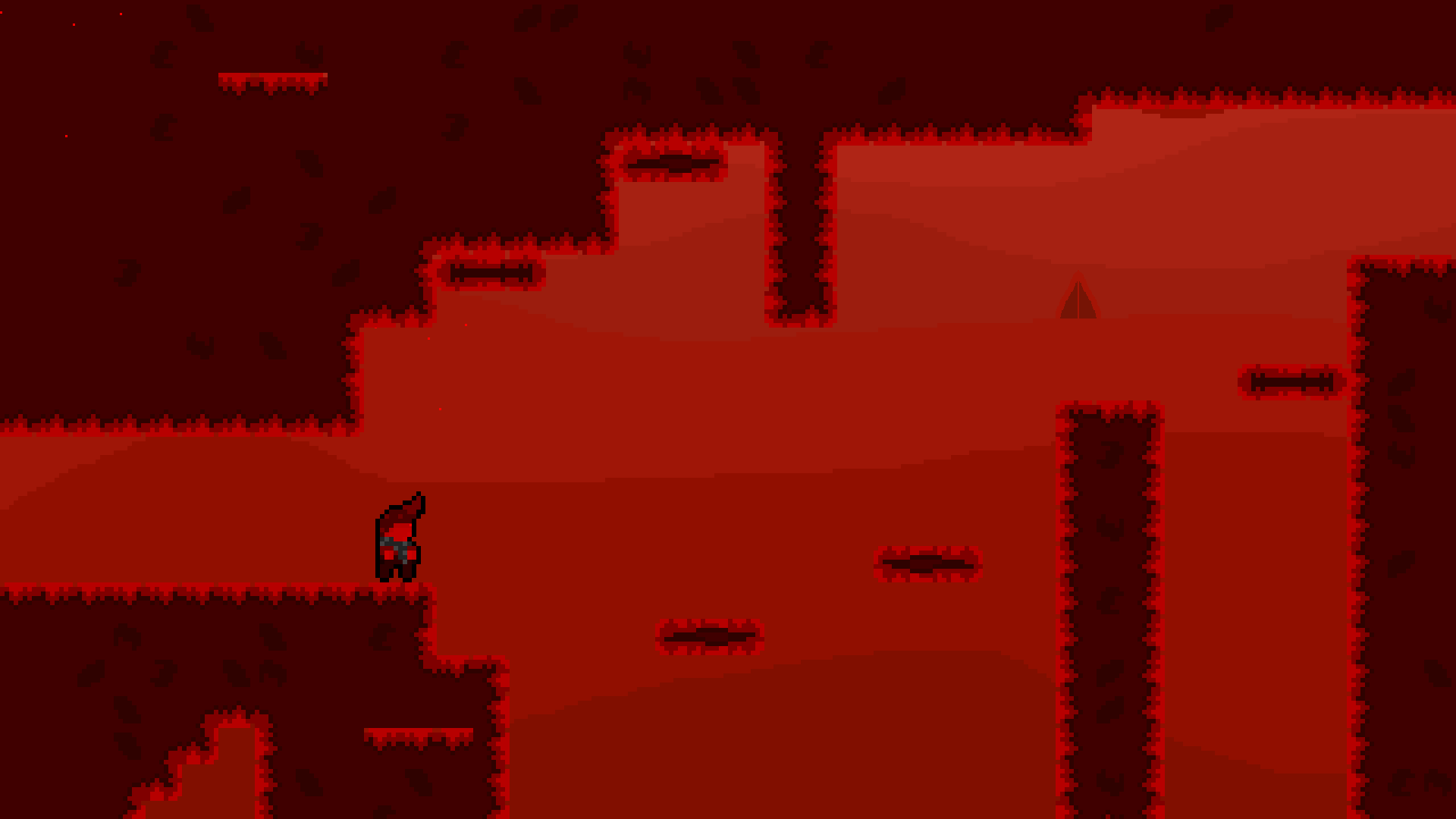
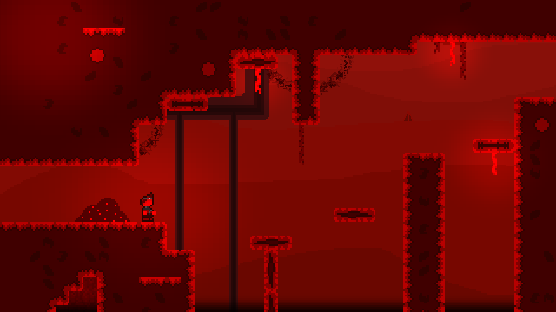
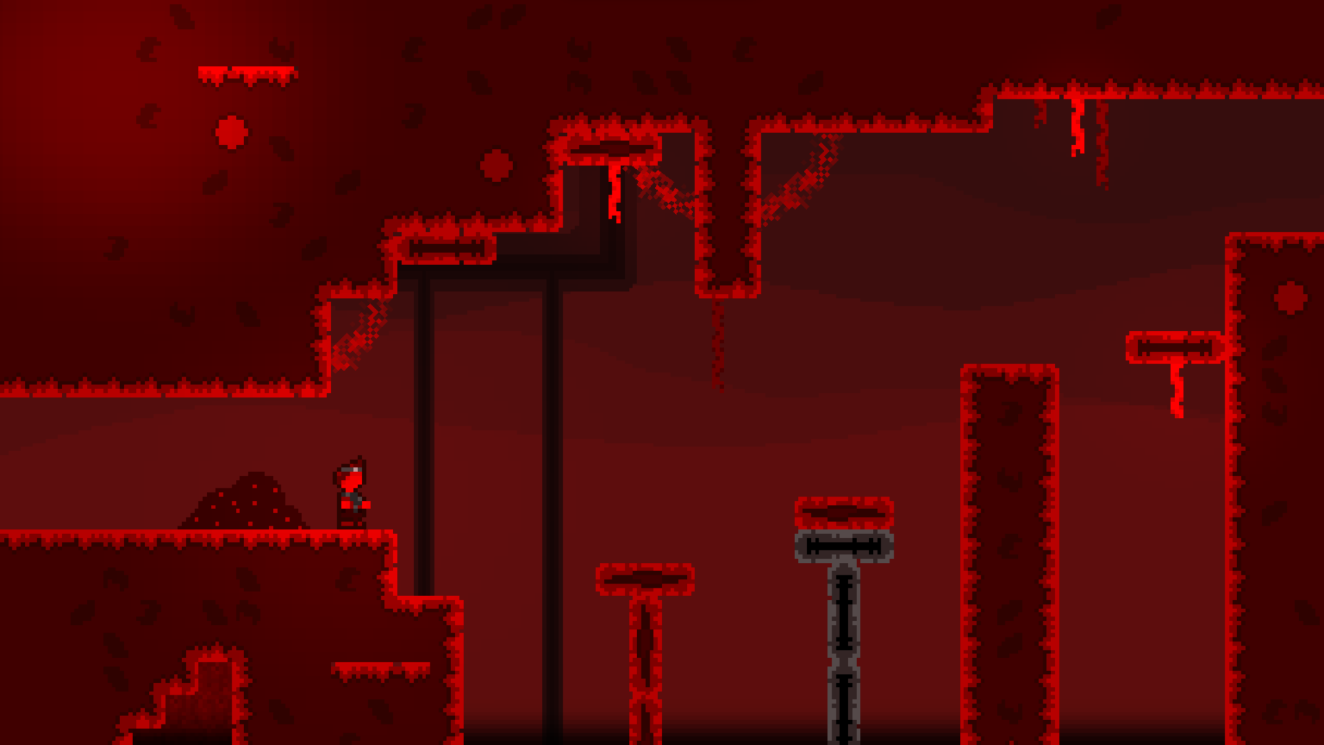
Edit: I also would like some feedback on how this screenshot looks! Its a piece of concept art for what the game could roughly look like (missing stuff like bloom and some additional art elements right now)
How does the background look, and how does the art of the ground look?