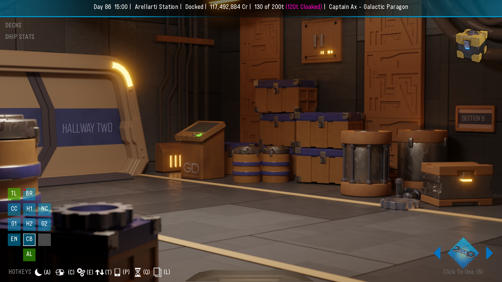
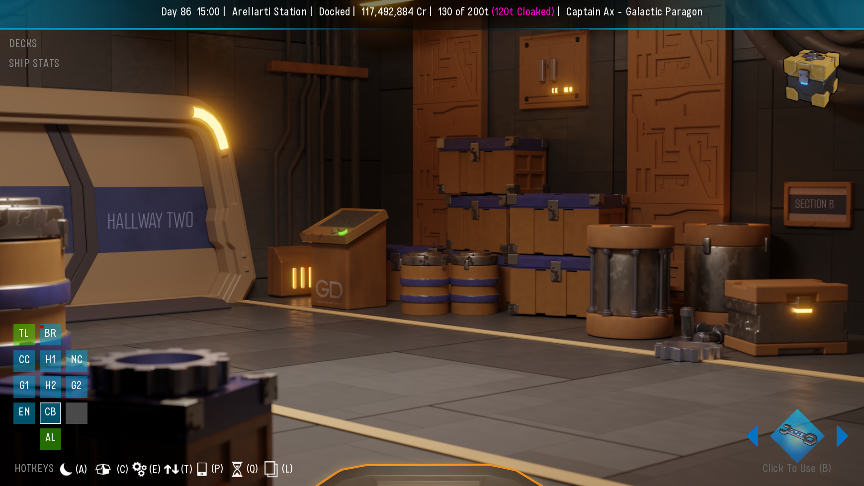
Ah, yeah, those arrows are ugly .. but, not an arrow, more like an area of the floor that gets highlighted, basically acts like a back step, and only visible when hovered, like the crew and door accents.
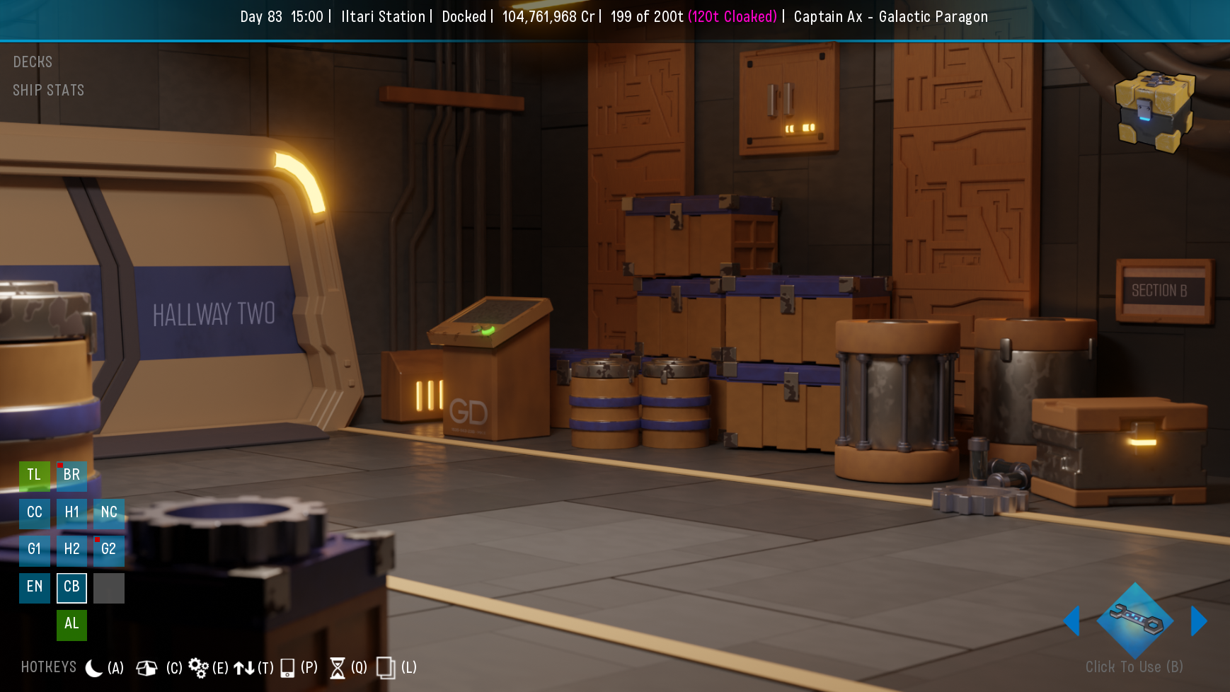
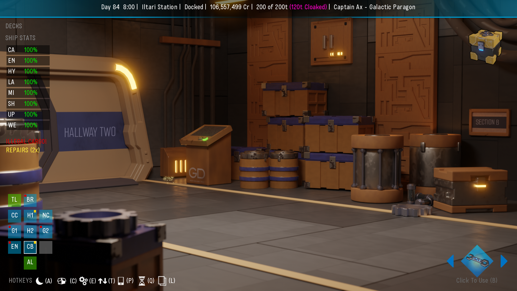
I solved my tripping over the mini-map by moving things around a bit. Basically I would miss the square and hit the door, or vice versa, it was worst in the hallways .. screen shots just for the sake of it.
Illegal Cargo and Repairs appear under Ship Stats, and drop with
the box when it's expanded, as does Ship Stats when Decks is
expanded .. also dropped the quick menu off the bottom of the screen 

this layout looks and works nice for me
(it's fun poking around in the code)


 .. i used the top of the Maintenance door frame ..
 with and without the quick menu ..
 no expectations obviously .. these are just to illustrate the basic idea i have/had