Indie game storeFree gamesFun gamesHorror games
Game developmentAssetsComics
SalesBundles
Jobs
TagsGame Engines

Hi again.  Some more ideas for you.  Hope they're helpful:

1. Gridlocked cars obscure the coloured traffic light arrows.  Maybe the coloured arrows could be overlaid "on top" of the cars so they are always visible? 

2. The "Final Report" window obscures the final scene, showing which cars/junctions are having problems.  I wish I could move it out of the way.


3. With the saved maps/layouts slots, it would be useful if they were labelled with the score they achieved (if any).

4. I really want to know if anyone can beat my scores!  It would be great if users could upload their best score, so the "Final Report" could say: "The highest score so far is 21,320."

5. Regarding AI/game logic, a user below said below that the cars aren't "crashy" enough in the latest (v0.21) release.  As you said, it's a delicate balance to get right.  I think the most important thing is that the best solutions make logical sense, and don't rely too heavily on random trial-and-error.  For example:

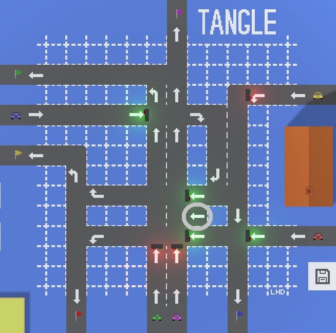
In the screenshot below, no cars are routed via the circled traffic light.  I can set that light to all red, or all green; or remove the light, or even remove the road square it's on.  I always get exactly the same score of 20,000, which makes sense.

But, if I set that traffic light to 1-on/1-off (x6), to match the lights above and below, I get a score of 20,900.  If I set that light out of phase (by rotating the wheel once), I get a score of 20,700.  That doesn't seem logical.

Then again, the restricted budget limits these "hacks", so maybe the possibility of discovering these illogical "Easter eggs" is intentional?  Or maybe I've misunderstood how the cars could stray into (and immediately out of) that lane, and how that might affect collisions...?  In any case, it's a very minor quirk that probably doesn't matter, but I thought I'd mention it.

Best wishes :-D
I always appreciate feedback thanks!

1. I'm not sure what you mean by "coloured traffic lights arrows"? Do you mean you can't tell if the traffic light is green or red when cars are under the traffic light?

If so, I'll try to come up with something to make it more obvious.

2. Good point, I'll try to add an option to minimise the final report window soon.

3. I'll be redoing the map save system soon, I'll try to include scores where appropriate.

4. Coming very soon in the Steam version! (either in the first steam release or the first steam update depending on how quickly I can work)

5.  Regarding the traffic light weirdness: That's an extremely strange circumstance that I haven't heard of/seen before. I'll look into it and try to fix it asap. Thank you for the report.

In regards to the general crashiness of the cars I am very conflicted at the moment. For me, I find it very odd that people are requesting the cars should be more crashy as it's the opposite of what I expected. I'm kind've stuck between what I think should be done to make the game more fun and what players are telling me. 

1. Yes.  :-)


5. I also noticed you can point that traffic light in the opposite direction, and still get the same scores.

Another thought:

It's really hard to see the differernce in colour between the red and purple cars/flags (on my monitor, at least).

---

ON CRASHY-NESS:

People don't like change, and crashy-ness is a fundamental part of gameplay.  When I played v0.21, I initially thought the cars weren't crashy enough, but only because I was used to v0.15.  After playing all the levels I changed my mind.

So, I think crashy-ness should be set at whatever level allows for the most interesting/varied/challenging maps.  For example, I love TANGLE because there's no single obvious solution, and lots of layouts get scores without gridlock.  :-D