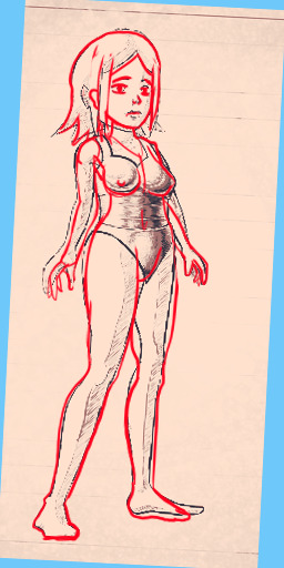
Some thoughts:
- The MC looks really, really bad. Which is a problem for an eroge. In general you should fix (even trace if needed) the naked version of your MC before drawing to many equipment on her body. The worst is her potato like face, but her stubby arm and skinny legs are also jarring. Here's a quick redraw. Though I wouldn't base myself on it and just redo the whole thing starting from a reference.

- The text style is also extremely jarring. It was fine in [REDACTED] but here it just takes you out of the game. It takes all the seriousness out of it.
- The monochrome style is nice, but the buttons on the side are very illegible, as are some restraints. The vines or chains or whatever look weird, and many others don't get the detail they deserve.
- Hitboxes are weird, I sometimes repeatedly slap the enemies and they don't move back, or the slap doesn't come out despite having stamina. The bolas also have a much larger than expected hitbox. The bolas also don't seem to take movement speed reductions of the character into account when aiming. And their bolas move to different rooms.
- I had a box give me knuckledusters, and then another box just take them away.
- The movement of the character looks very weird. It also makes it hard to avoid stuff and know where the hitbox of your character is.
- It has the problem of many bondage roguelikes where getting equipped leads to you getting equipped more. Getting slowed down often leads to a vicious cycle. You should probably find something against that.
Though some things above are just up to taste, there's still a lot of work to do here.

