-Menu font is aids to read. Why is it so short and wide? I thought the resolution was messed up, but no in windowed it looks the same. Also, the checkbox in the options is almost invisible if unchecked. And I can't exit it with ESC, I have to click back.
-Weapons screen is kind of neat, but why is there a horizontal scroll bar just to read the entire weapon name?
-Otherwise, I like the transition animations.
-In game, it feels a lot better. I like the attention to detail, the recoil, animations, etc. So far the enemies are easy pickings, it doesn't help you have a laser dot to pick them off from across the map. But even then, their AI seems rudimentary.
-Close quarters gets more hairy, that short time to kill goes both ways. I found out about sliding over tables, so that's neat. Not sure if it would be that useful in practice. I wish I could hold crouch while sliding over the table, so that I would immediately start crouching when getting on the other side. Right now, it will not crouch at all until you let go and press it again.
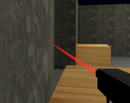
-Due to the gun being more on your right, you can hold a corner and blind fire to kill them before they can round it. Also, there's this visual error where the dot is visible when it shouldn't be.

So I cleared the map twice, was some fun. Good base to work on.

