I was almost at the end (last wave) and didn't notice that they 'burrowed' another entry, so I lost. Didn't want to replay from start again, but basically saw all mechanics for a feedback.
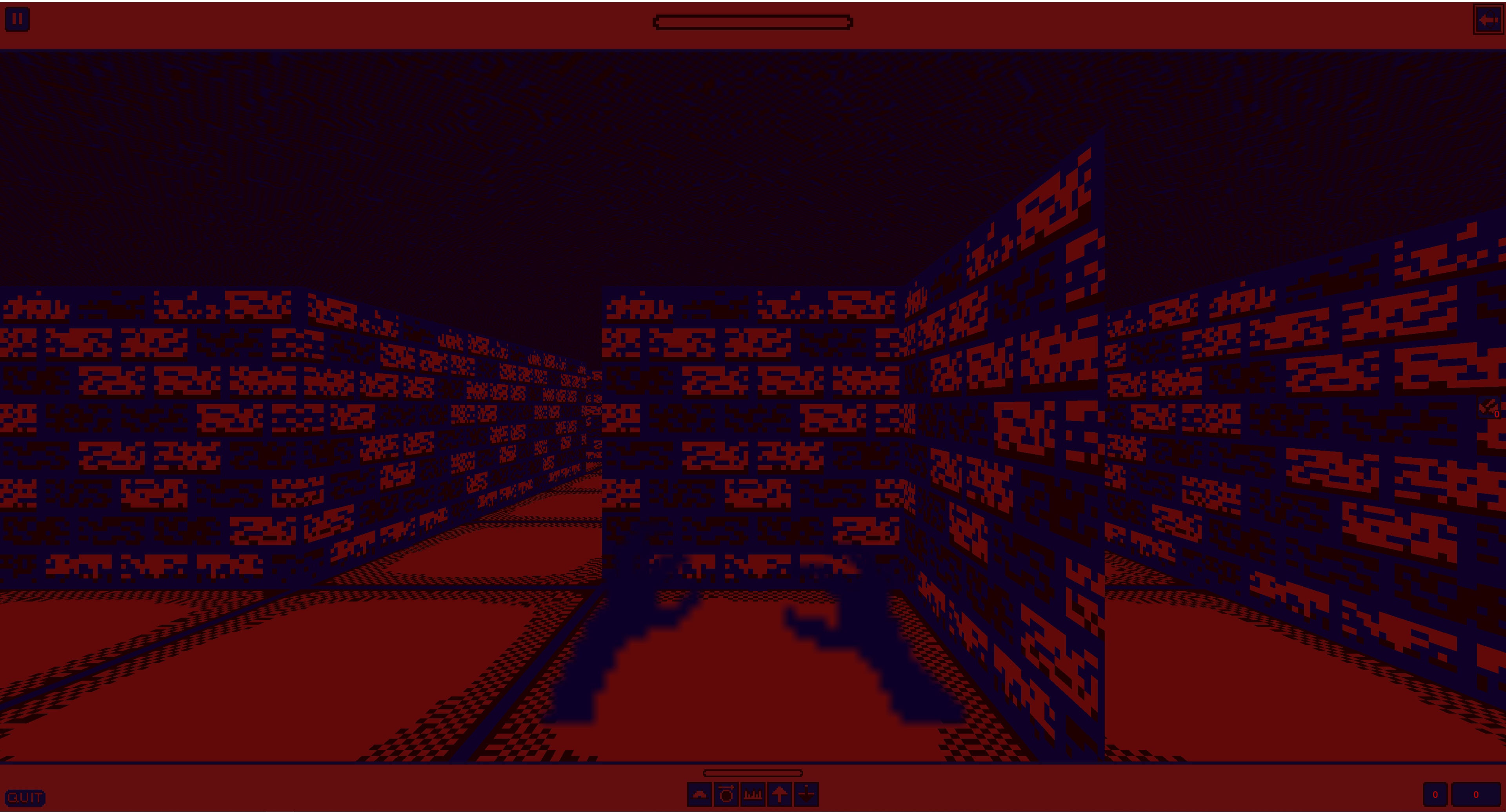
This game also suffers from UI not scalling with resolution. You can see how it looked on my screen, for example: 
Playing in tiny window was even harder :) But I apreciate how it looks in it and in screenshots that are available. Its really neat, cool looking little game.
One thing, though, I would move ore counter to somewhere where it will be visible at all times. You have those UI panels that you can attach it to. Either top or bottom one works, it just that sometimes its hard to see ore on top of the wall texture. It even apparent on provided screens. On mine - it was even worse, since it is so tiny. Its hard to locate it initially too.
A bit of more clarity on how to use traps would do good. It took me a moment to figure out that you select trap and then press space to place them... Also Space is 'return home' and when you mashing 'placing trap' and deselect trap after placing one... you return home and place new trap in a terrible possition. Its not a totally gamebreaking, but a bit annoying, especially at the start, when you try to fast-pace self into building first line of the defense.
I would love faster movement in general, since it feels a bit sluggish with how character is controlled. Unless, of course, that is designed that way to make it harder.
You also can stand at the side of the wave and hit everything without them hitting you in return. Maybe they should have a bit of aggro. Atleast one hit while passing through?
Making tower defense in dungeon crawler... as a jam entry! Its hard by its own. All traps had unique effects and I apreciate that. All in all - a very ambicious entry!

