Play game
Dungeon Creep's itch.io pageResults
| Criteria | Rank | Score* | Raw Score |
| Overall fun and playability | #123 | 2.334 | 2.571 |
Ranked from 14 ratings. Score is adjusted from raw score by the median number of ratings per game in the jam.
Theme incorporation
Theme implementation. This is primarily solitude for us, where you use traps to defend by your lonesome instead of fighting with a group. We also considered the Ancient Ruins theme through the game's setting.
Leave a comment
Log in with itch.io to leave a comment.



Comments
Very cool concept of TD with a crawler but, to be honest, I had no idea what I was supposed to be doing. I fought off a few waves manually and I gathered that there were supposed to be some traps, but I think I managed to construct one only? With some resources that I have no idea where I got. And uh, couldn't understand much else sadly :(
I really love the color choice. Sticking to very few colors gives the game a very distinctive look and feel.
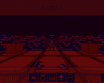
I wasn’t entirely sure what the bar on top nor the one below signified. At the end I’m still not sure what the bottom is, but I’m guessing the top one was “health”. So there might have been some indication of when the next wave was coming, but I didn’t understand it. At any rate, it would have been nice with some indication. It doesn’t have to be an exact countdown but something that indicated it would happen soon.
There were some numbers in the corner, but these weren’t explained.
I noticed I could clip through walls by repeatedly pressing forward against them, which allowed me to get outside the map at one point. I got the feel that it was easier to succeed at this by not facing the wall and strafing through it.
I think I also placed a spike trap without a wall but placing the spikes on the core. I was kind of expecting enemies to come from all directions, but they seems to mostly come from one direction.
The controls worked well and camera perspective looked good to me. Perhaps I would have liked the movement to be a bit faster though.
The idea of gathering resources to tower defend the core was really neat, but I think I would have liked some area awareness around the core to assist me, i.e. a little minimap that is always centered on the core and shows enemies approaching and preferably traps. I think that even if that would make the game easier in a sense, it would elevate the immersion as right now there was no strong feedback when anything was approaching or attacking the core. It ought to be screaming and making all sorts of visual effects on the screen so that I come and protect it.
At one point it felt like I pressed a button and teleported to the core, or some other core because it felt like the world looked differently. Perhaps I was just confused, and then there was a countdown and I got teleported back to the original core. Or so it seemed. Not at all sure what happened there.
All things considered, a solid entry.
Playthrough: https://youtu.be/OIS6nATzNF0
I was almost at the end (last wave) and didn't notice that they 'burrowed' another entry, so I lost. Didn't want to replay from start again, but basically saw all mechanics for a feedback.
This game also suffers from UI not scalling with resolution. You can see how it looked on my screen, for example: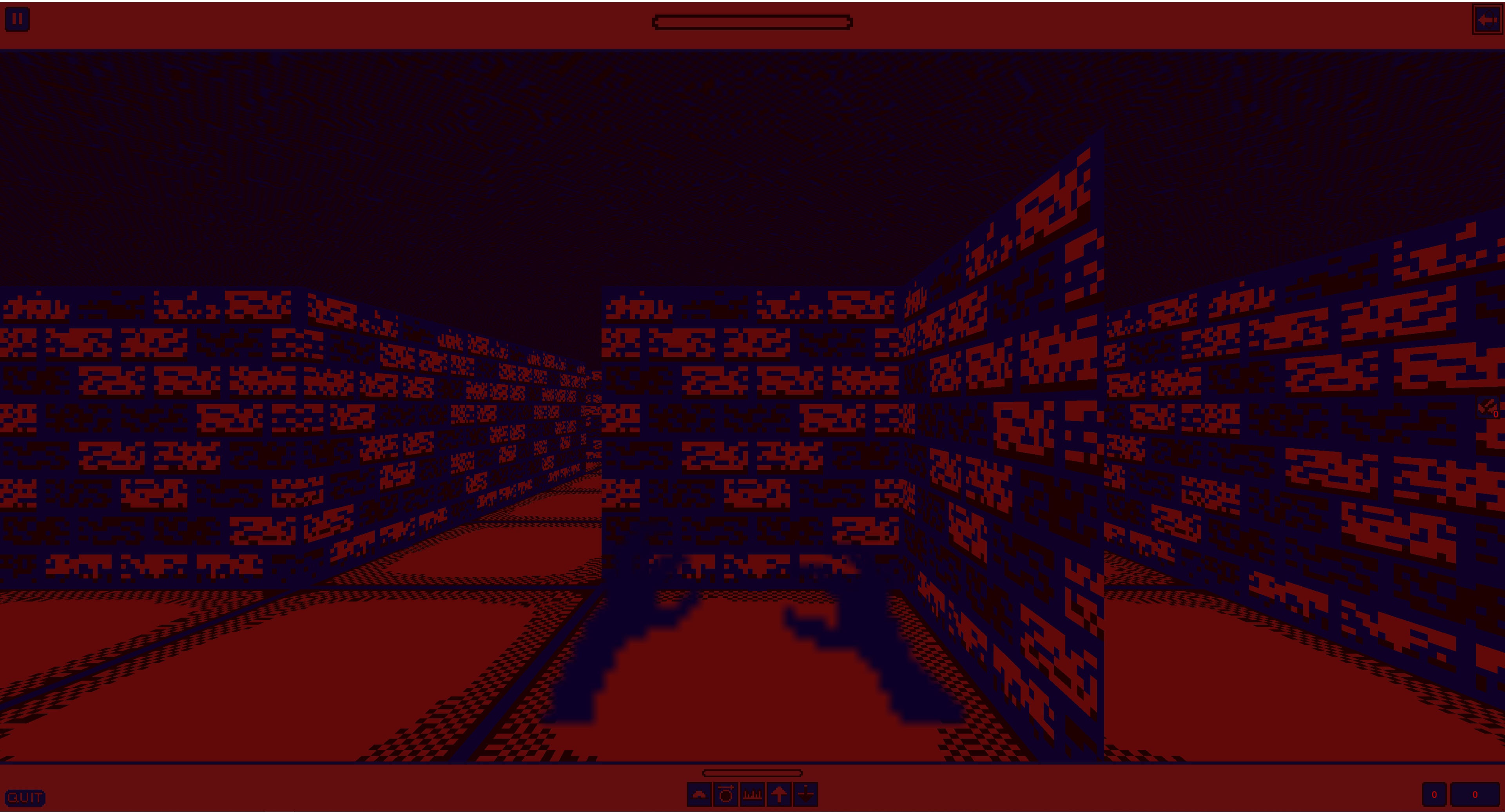
Playing in tiny window was even harder :) But I apreciate how it looks in it and in screenshots that are available. Its really neat, cool looking little game.
One thing, though, I would move ore counter to somewhere where it will be visible at all times. You have those UI panels that you can attach it to. Either top or bottom one works, it just that sometimes its hard to see ore on top of the wall texture. It even apparent on provided screens. On mine - it was even worse, since it is so tiny. Its hard to locate it initially too.
A bit of more clarity on how to use traps would do good. It took me a moment to figure out that you select trap and then press space to place them... Also Space is 'return home' and when you mashing 'placing trap' and deselect trap after placing one... you return home and place new trap in a terrible possition. Its not a totally gamebreaking, but a bit annoying, especially at the start, when you try to fast-pace self into building first line of the defense.
I would love faster movement in general, since it feels a bit sluggish with how character is controlled. Unless, of course, that is designed that way to make it harder.
You also can stand at the side of the wave and hit everything without them hitting you in return. Maybe they should have a bit of aggro. Atleast one hit while passing through?
Making tower defense in dungeon crawler... as a jam entry! Its hard by its own. All traps had unique effects and I apreciate that. All in all - a very ambicious entry!
Hey there, thanks for the feedback. Glad you were able to enjoy the game despite it's issues.
The UI problem is one I didn't discover until after release, but I'll be fixing that for after the jam. I still appreciate the feedback on it, and I'll look for somewhere else to move the ore counter to.
In terms of the accidental warping, space was an old input that was supposed to be disconnected because it also interacted with the UI, pressing the currently selected button, which often meant deselecting the current trap mode.
For faster movement, that can be done, but standing to the side of the enemies is an intentional strategy, since it means you aren't out finding more ore.
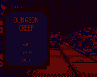
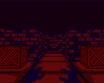
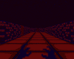
I really like the combination of dungeon crawler and tower defense! The graphics were nice too, but I agree witht the comment about using the wrong texture filter on some of the sprites. The players hands especially look blurry instead of pixellated.
The lack of a tutorial I think also hurts this game quite a bit. Like even from the controls list on the game page it took me a bit to figure out I needed to select an item and THEN press F.
You already listed the getting out of bounds bug, so I'm certain that will be fixed.
I think this was a great entry, it just needed some more explanation of the mechanics.
Good work!
Took me a hot minute to work out what was what and notice the ore display on the right. So whilst I am partial to monotone colour styles, the UI could be clearer.
That all said, once I did work it out, it was fun to play, and an interesting combination of tower defence and dungeon crawling.
Would be really cool to see this polished up and taken further post-jam.
Nice work.
Hm, the idea is very interesting, some sort of mix between tower defense and Dungeon Keeper, combined with a crawler. But I think the game is a bit too cryptic, the controls are hard to understand and there needs to be more feedback in terms of sound. The colors are more of an aquired taste. At least for me it hindered visibility quite a bit. And for such a hectic game, the movement needs to be more snappy. I did not have many problems with the clipping. Overall interesting game, but it needs a couple of more iterations, so it can really shine.
I want to share a quick note on controls here, since it seems to have been missed a few times, which is fair given the lack of a tutorial. Although you cannot queue inputs for future actions, you can hold most inputs down and they will continue triggering. Just figured some people would like to know this. Also, the UI for trap selection is made of buttons, so feel free to click on them if you want. My bad for not attaching sounds to them.
On another note, related to the wall clipping bug, a patch fixing the bug (along with a few other bugs) will be released after the game jam judging period is over, but for now, I guess you will have to just settle for self control.
I didn't quite finish this one, but got pretty close (and runs are kinda slow). The graphics were decent, although I think you used the wrong texture filter on a few? The trap graphics are pretty readable.
I didn't really personally enjoy having to search through a maze to find trap resources, especially since (at least from my experience), the amount available vs the amount you need is pretty tight.
You can watch my playthrough here:
"YOU
WON"
I think you actually win when the 12th wave starts (unless you count the 0 ;) ), not when it ends. I did not check my score, it might have been something like 5400, I think that's what it was the last time I took a look at it.
I had ton of fun playing the game, it took me quite some tries to finally win. I refined my strategy as I went further and realised where all the enemies would come from. I always feared some wave would come from the 4th direction at some point, when I was pretty confident it would eventually not and that there are exactly 3 entrances (or at least when close to the orb the enemies follow only 3 directions, but I think there are 3 entrances), no more, then I placed 2 arrows traps on the more open place in each of the 3 directions that I upgraded twice (among the 6 there's 1 I upgraded only once for a lack of money) and I think I did not lose any life during the winning run, I attacked a few big guys at the end but I would consistently win now. I think I know the map and the placement of most crates by heart at this point.
The game looks, sounds and controls fine, no problem, the vortex pixel art animation is pretty cool especially, but gameplay sure is where the game truly shines. The tower defense basis works fine, the set of traps is good enough. I like that you can directly hit enemies, not only it's in the spirit of the context but I liked adjusting my way to deal with the current wave this way. Same with looking for resource, I enjoyed trying to remember the map and thinking about optimal routes, I like that you really took the time to adapt the concept so that the game is also a traditional crawler kind of, it's more than just a first person tower defense game. Finally, and possibly one of the most important things to me, I think the difficulty is perfectly tuned. The game is mostly fair (you need to play to know what you'll really have to deal with, which is fine to me) and winnable but it's not easy, which is great.
This is a super cool entry, thanks for sharing.
An interesting visual, I suppose it was drawn on its own, and not on ready-made assets. Cool! But it was difficult to figure out how to fight enemies and without a map it was very difficult to navigate. I would also like to make the turn faster. In general, I wish you good luck in your development
This looked cool! I struggled a little bit to figure out what I was supposed to be doing though. However, I did find this interesting bug! Weeeeeee!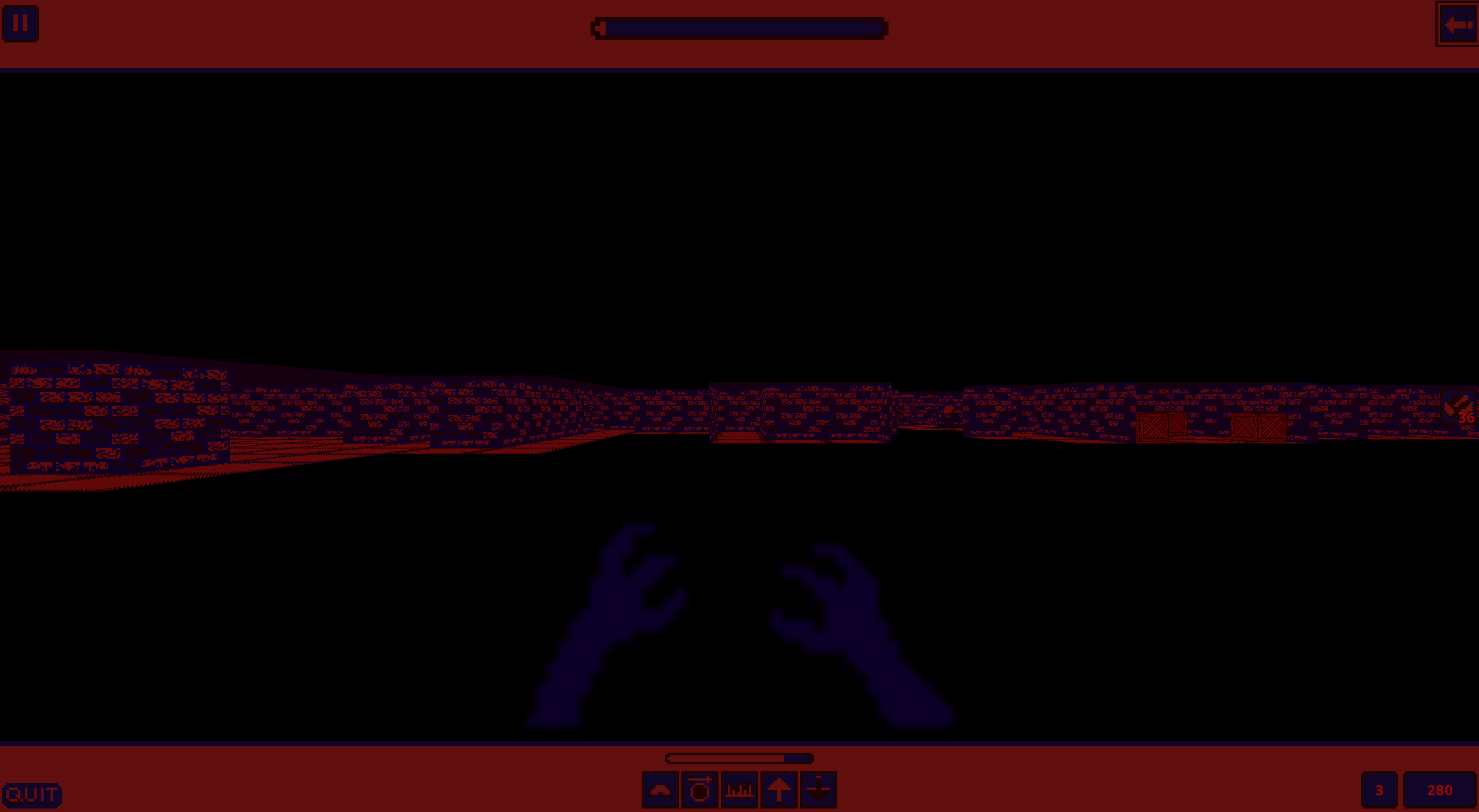
Hi. Nice theme. I like the colors in this game, can you tell from my logo?
Overall nice game, kinda like a tower defense and dungeon crawler combo.
It was a bit hard to figure out the key bindings and how it all fit together.
Suggestion - It would be nice with some way of distinguishing upgraded traps. The F to confirm an input feels a bit unnecessary, maybe have just the 0-5 buttons place or do the action directly, or if not maybe have spacebar as an option. The advancement to a new level is a bit unclear when it happens.
Bug - Strafing can take you OOB through some walls and you can enter wherever.
Controls - It feels a bit slow when moving around, and having inputs queued up would improve this. Not sure if you are supposed to spam Shift for attacking or if there is a delay there.
UI - The bottom right numbers I guess indicates level and score but it could be made clearer.
Tiles - The tiles could be a bit larger or view showing floor you stand on to make it more clear when placing traps below you or when orientating the maze.