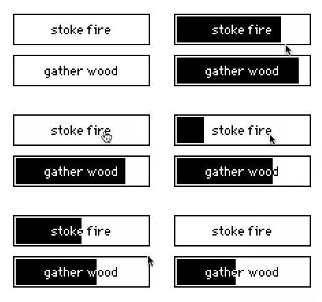
I made a simple version of this idea by creating a Contraption that consists of an invisible button layered on top of a "bar"-styled slider. When the button is clicked, it sets the slider to the maximum possible value and makes it "animated", so that it will tick down naturally. While the animation is in progress, the button is locked:

A paste-able version of this contraption is here:
%%WGT0{"w":[{"name":"cooldown1","type":"contraption","size":[100,25],"pos":[206,201],"def":"cooldown","widgets":{"s":{},"b":{},"l":{}}}],"d":{"cooldown":{"name":"cooldown","size":[100,25],"resizable":1,"margin":[5,5,5,5],"description":"a button which requires a configurable cooldown between clicks.","script":"on get_text do l.text end\non set_text x do s.format:l.text:x end\non get_cooldown do last s.interval end\non set_cooldown x do s.interval:0,1|x end\n\non view do\n s.font:card.font\n s.format:l.text\n if s.value\n s.animated:1\n s.value:s.value-1\n b.locked:1\n else\n s.animated:0\n b.locked:0\n end\nend\n\non click do\n s.value:last s.interval\n card.event[\"click\"]\n view[]\nend","template":"on click do\n \nend","attributes":{"name":["text","cooldown"],"label":["Text","Cooldown"],"type":["string","number"]},"widgets":{"s":{"type":"slider","size":[100,25],"pos":[0,0],"locked":1,"interval":[0,100],"format":"","style":"bar"},"b":{"type":"button","size":[100,25],"pos":[0,0],"style":"invisible"},"l":{"type":"field","size":[100,20],"pos":[111,0],"show":"none"}}}}}
How's that?
As written, this example doesn't include a "disabled" mode for the cooldown buttons, which might be useful for some applications. It is resizable, and respects the .font attribute. You could make a much fancier-looking version of this idea- possibly with color, etc- by using a canvas as the contraption's background and drawing the progress bar from scratch.

